Quantcast
Channel: Infragistics Community
Viewing all 2398 articles
Browse latest View live

Isn’t Usability Enough?

$
0
0

Traditional usability firms (or usability groups within large companies) tend to focus on evaluation, and their design process typically ends at the Discover phase with workflows and application screens created by researchers. For companies that tout themselves as “Human Factors” or “Usability,” the goal is to have research and data dictate design. After all, isn’t a research-based interface what we’re after? In this environment, the role of design is often an afterthought and always under-used. While traditional usability firms (and the software development industry in general) have recognized the need for designers, it has typically been either to create nice looking marketing materials or to make the designs created by researchers “look pretty.”

The reader can be forgiven if he or she has imagined me to be a (disgruntled) designer looking for a little respect. Not so. As a researcher with a classical background in experimental psychology (Ph.D. in Cognitive Psychology, 1991, The State University of New York at Buffalo) I have seen the field of ergonomics/human factors engineering/usability/design research/user experience architect develop and mature. However, in the 21 years I’ve being doing usability research, I’ve seen (and been party to) a great many applications that, while usable, were not innovative, inspiring, beautiful, or lasting regardless of the interaction models made possible by the technology du jour. Why? Because we were following a research process (or, dare I say, a technology-driven process) rather than a design process.

Who is Designing?

Traditionally, the field of software development has looked to the contributions of two types of individuals to ensure that applications meet the needs of users. These individuals are the Business Analyst and the Subject Matter Expert. Many industries continue to rely on these job roles to gather, develop and coordinate application requirements. Indeed, the claims made by industry that their applications are guaranteed to be usable because they have business analysts (collecting business/functional requirements) and experts (representing users) on their staff are both commonplace and misleading.

Unfortunately, the fact is that no matter how well intentioned, these individuals are neither trained nor qualified to design a system that is usable, innovative and supportive. In order to understand what is missing from this process, you need only look at what these two job roles are expected to bring to the development process.

Business Analysts

The role of the Business Analyst (BA) is to gather functional requirements from the point of the view of the business. In order to provide structure and guidance for the development team, these requirements are incorporated into “use cases.” A use case is a detailed description of what the application needs to present to the user and what data the user needs to provide in order to accomplish a task. For example, one might define the process of collecting patient information in terms of the fields on a screen that must be completed. These use cases typically represent a view from the system’s point of view—what does the system need to do for a task to be accomplished. This view of design ignores the needs of the user and the demands of the situation. It isn’t difficult to see how a task might require differing designs to support the different contexts of a clinician’s office, a trading floor, or a boardroom.

This is not to minimize the role of Business Analysts—it is extremely important to understand the needs of the business. However, accurate documentation of business requirements counts for little if users thumb their noses at the resulting application. Millions of dollars, years of development and crowds of dissatisfied users at companies all over the world are an unfortunate testament to this method of traditional software “design.”

Subject Matter Experts

As a way of addressing the problem of users and their stubborn refusal to use systems that do not support them, industry has inserted the role of Subject Matter Expert (SME) into the mix.

In the medical industry, for example, this means making sure that software development firms employ clinicians (MD, RN, etc.) whose role is to describe what the application needs to do, what data is required and how it should be presented. While this might certainly be a step in the right direction, these individuals are fundamentally like any other user group—they are not skilled design professionals and their appointment to this role in the design process is flawed.

It is flawed because the job of the SME is specifically to act in place of users. Experts are, at best, providing what they believe to be user requirements or, at worst, their own requirements. The point is that they are not providing user requirements. In addition, Subject Matter Experts are also asked to make decisions regarding design. We should be clear on this point; experts are not qualified to design any more than designers are qualified to be subject matter experts. My apologies to the experts put in this role. With this in mind, users (and purchasers of new applications) should be wary of the marketing phrase, "Designed by Expert X for Experts Y." Perhaps, as an industry, we should start insisting on “Designed by Designers for Experts!”

What All This Means

Good design doesn’t just happen. It is not a checklist of requirements, though it must certainly support the tasks that users need to accomplish. It is not a passing grade on a usability test; all the functionality in the world is meaningless if users can’t or won’t use the application. It is not a slick, natural-feeling interaction model. Most of all, good design is not “making it look pretty,” though a well-designed application should certainly be expected to look the part. And neither business analysts nor Subject Matter Experts can guarantee good design.

So what is good design? Design is a research-based, highly iterative process with a focus on exploring different models of the user-system interaction. It consists of gathering requirements from end users and business and technology stakeholders coupled with fast, early and iterative usability testing to determine the ultimate form of the design. Perhaps this design incorporates highly interactive models of the sort made possible by today's rich application frameworks. Perhaps not. Whatever the form, it must support a user's requirement to get something done. This ensures that the system is shaped not only by the opinions of design professionals, but also on the needs, expectations and requirements of users.

Modern UI Style - the new "Metro"

$
0
0

Modern UI Style

Recently it was reported that Microsoft would be replacing the Metro name for its design language for Windows 8, Windows Phone, Zune, Xbox, etc.  It now looks like Microsoft has decided on "Modern UI" to replace Metro.  The latest batch of Windows Dev Camps have been updated to reflect this choice.  I think this is a great naming decision and I'd like to take a moment to explain why.

It resonates with designers

Modern Design - Bauhaus

As I will explain in Part 2 of the Modern UI Design series (see, I'm committed to it now too), Microsoft's design language for Windows 8 has its roots in some fundamental design concepts and movements.  One of the major influences is the Bauhaus movement and the related Modern Design movement.  One of the major ideals of Modern Design is distilling things down to their essence and removing trivialities and flair.  Does this sound familiar?  It might if you've read any of Microsoft's principles for Modern UI design.  The phrase you have probably heard is favoring content over chrome.  The goal is to eliminate all of the extraneous chrome from the application and focus on the content.  This was the overarching goal of the Bauhaus movement and continues to be the focus of Modern Design.  Designers will get that.  They'll draw parallels to what they've learned studying Design and they'll bring those concepts forward in their Windows 8 and Windows Phone designs.  I think that's a wonderful thing.

It is easy to communicate to consumers

The name is perfectly marketable.  This is the "Modern" platform.  Forget what you know about what applications used to look like, this is what they're going to look like moving forward.  This is the design language for the future of computing.  For possibly the first time ever, Microsoft has picked a great name for something very important to their future.  Modern UI will be everywhere in all of their products.  It's a consistent, cohesive effort and now it has a fitting name.

What do you think about the name?  Catch me on Twitter @brentschooley, visit my CodeSnack blog, or comment below to let me know!

NetAdvantage Reporting Release Notes – August: 11.2, 12.1 Service Releases

$
0
0

With every release comes a set of release notes that reflects the state of resolved bugs and new additions from the previous release. You’ll find the notes useful to help determine the resolution of existing issues from a past release and as a means of determining where to test your applications when upgrading from one version to the next.

Release notes are available in PDF format and summarize the changes to this release along with a listing of each item.      In order to download release notes, use the following links:

Reporting 2011 Volume 2

Reporting 2012 Volume 1

jQuery Grid Checkbox Column alternatives

$
0
0

The checkbox column (introduced with the last release, see this post on Using Checkbox Columns with the Infragistics jQuery Grid) was created to provide a ‘shortcut’ for transforming columns with Boolean values into checkboxes and mostly became reality due to the great interest in such functionality from customers (and after all it does make perfect sense).

jQuery Grid Checkbox column

Of course, this isn’t a perfect world and creating defaults that can fit everyone’s needs is probably a lost cause. If you take a look at the introductory blog above, it is indeed saving tons of time – setting a single property is all it takes. That’s good and all, but as it can even be seen in the comments there and on our forums ( this post for example) there is a limitation – the checkbox column works just great, but it goes all shy when some templating is involved.

The problem

In the Grid API reference under ‘renderCheckboxes’ it says “That option is not available when jQueryTemplating is used.” That’s just a slight bit misleading and is most certainly going to get updated, since this does, in fact, include our own Templating Engine. So in essence the above should be read as ‘That option is not available when Templating is used’. That is because, by design, the Checkbox column feature is suppressed in such cases, as a row template may have its own rendering for the column.

That may or may not be an intuitive explanation as to why it will not be available with column template as well, but once you think about it – the grid renders rows, it has a default template to do that – a row template. You defining a column simply ends up being included somewhere along the way in that row template, instead of the default. That is why, templating in general will disable this feature.

But not to worry, there are options as always. I stumbled upon this and since customer feedback pointed this out for us (Keep it up, we like constructive feedback!) in this blog I’ll share my experience with coming up for alternative ways  to have such functionality.

A solution

Template Checkbox

Odd enough the problem is also main part of the solutions as it is the easiest way to alter the UI representation of your data and is also very flexible to be tweaked to your liking. Using this to add checkboxes in not all new (Forums » NetAdvantage for jQuery » igGrid » Infragistics IGGrid with checkbox) and as mentioned the feature itself is meant to be a shortcut for that.

A fair warning:  I'm sharing my experience and because of that I’ll go through two different approaches I took. Before diving in using one, make sure you have seen and considered both.

So the first approach is to use a plain HTML input of type checkbox tag and assign it our value. This is the approach you can see in both forum posts linked above as well. You can apply the template to your row template (if you are already using one) or simple assign it to a single column. For demonstration purposes I’ll use the Employees table from AdventureWorks (AdventureWorks Sample Databases (MSDN)) for the Salaried flag column and here is how a grid configuration would look like:

  1. $("#grid").igGrid({
  2.     primaryKey: "BusinessEntityID",
  3.     height: 550,
  4.     dataSource: "@Url.Action("Employees")",
  5.     autoGenerateColumns: false,
  6.     columns: [
  7.         { key: "BusinessEntityID", width: "50px", headerText: "ID", dataType: "number" , template: "${BusinessEntityID}'},
  8.         { key: "LoginID", width: "250px", headerText: "Login ID", dataType: "string" },
  9.         { key: "JobTitle", width: "220px" , headerText: "Job Title", dataType: "string" },
  10.         { key: "SalariedFlag", width: "120px", headerText: "SalariedFlag", dataType: "bool", template: "'}
  11.     ],
  12.     features: [
  13.         { name: "Filtering", mode: "advanced", type: "local" },
  14.         { name: "Sorting", type: "local" }]
  15. });

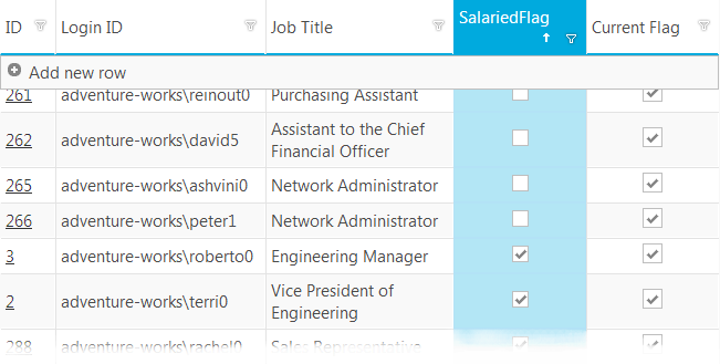
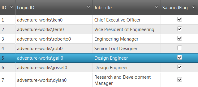
Do note that the first column also has a template – a link to the very same table’s description on MSDN – and, as it is visible, that does not stop the checkboxes from appearing in addition to working just fine with features such as sorting and filtering:

A basic alternative to the checkbox column using template and simple HTML input type checkbox.

Enhancements

The above template is but a mere rendering tweak and doesn’t come with an interaction package. One other fair point made by customers is that the default interaction can be improved as Checkbox column requires 3 clicks to update – which is how row editing with selection behaves – 1 click to select, another to enter edit and third to change the value. Event though this wasn’t the original issue, since you are now in control of the checkboxes, why not improve things a bit?

The first step is to remove the disabled part, of course. Then you would need to handle user interaction with the checkbox – so add something along the lines of:

  1. data-rowid=\"${BusinessEntityID}\" onchange=\"checkboxChanged(event);\"

to the template. For enabled checkbox inputs onchange and click events are basically interchangeable, so pick one, but the name of the parameter passed to the handle *must* be ‘event’. The ‘data-‘ attribute is the easiest way to store information for the checkbox location – the grid does the same thing with rows elements if you take a closer look and it’s much easier to store it at creation as you then have access to the separate row data entry and will hardly add any overhead. Now just how easy it is with the Updating API to put that template to use:

  1. function checkboxChanged(evt) {
  2.     // get rowID where change occured:
  3.     var rowId = $(evt.currentTarget).data().rowid;
  4.     $("#grid").igGridUpdating("updateRow", rowId, { "SalariedFlag": evt.currentTarget.checked });
  5. }

Using the jQuery data() method gives us that row Id in a snap and the passed event can tell us the state of the checkbox to assign to that column value. Do note that this requires Updating to be loaded as a resource and added to the grid features(NetAdvantage® jQuery Online Help : igGrid Updating). And that leads to some issues that may arise

When Updating enters the scene..

It’s fairly reasonable to assume, since editing the checkboxes and Updating are already involved, that the grid is supposed to provide the full editing experience. However, once edit mode activated the edited cell/row UI is separate one, which means that if you don’t implement a provider yourself you will get the default combo-style editor:

What happens with the template in edit mode.

Now that may or may not be a problem for you (it will work just fine and checkboxes will update once you exit edit mode), but the sake of consistent experience it would be nice if the editor could be a checkbox as well..preferably the same one. At this point you have quite a few options, really, I’ll just provide a few examples how I think this can be made better and usable.

One little trick to try is setting that very same column as read-only. You already have a control that sets the value of the cell regardless of edit state and therefore you can go ahead and set that very same column as read only! What that would do is prevent the cell from getting its UI replaced by editor and in row mode it will remain unchanged. That means no combo like above and the very same checkbox with the same event handler still there ready for action. One tweak required though – since the Update Row method is not meant to be called from within edit session it will update the UI. All good? Nope. The issue is that in the case where you have the grid with the above setup and attempt updating a row when editing is activated – then awkward behavior is guaranteed. The UI is updated, but the editing is still active even though the grid looks like it exited that one and since there are not buttons or other elements that handle the editing of the editing session.. well it’s stuck. I see a few options here, things like ending the editing (method is available of course) before calling the update row, but that immediately exits on checkbox change and that is probably not what the user would be expecting to happen. Then again you can disable the checkboxes while editing, but that’s not the way to go when editing is active.

What you can do is save the change directly to the data source transaction logs, after all the checkbox will take care of its UI, but it might require additional work (data dirty event, rebinding) to work properly with other features. You can also simply restart the editing on the very same row for the user:

  1. function checkboxChanged(evt) {
  2.     // get rowID where change occured:
  3.     var rowId = $(evt.currentTarget).data().rowid;
  4.     // if editing is active - update just the cell, otherwise use row update
  5.     if($("#grid").igGridUpdating("isEditing")){
  6.         $("#grid").igGridUpdating("endEdit");
  7.         $("#grid").igGridUpdating("setCellValue", rowId, "SalariedFlag", evt.currentTarget.checked);
  8.          
  9.         //optionally can start the editing on the same row again
  10.         //need row index:
  11.         var rows = $("#grid").igGrid("rows");
  12.         var rowIndex;
  13.         //var context = this;
  14.         $.each(rows, function (index, row) {
  15.             if ($(row).data().id == rowId) {
  16.                 rowIndex = index;
  17.             }
  18.         });
  19.         //make sure you let the calling code exit before attempting start edit,
  20.         // a few milliseconds should be enough
  21.         setTimeout(function () { $("#grid").igGridUpdating("startEdit", rowIndex, 1); }, 2);
  22.     }
  23.     else {
  24.         $("#grid").igGridUpdating("updateRow", rowId, { "SalariedFlag": evt.currentTarget.checked });
  25.     }
  26. }

Above snippet shows getting the row index from the ID and starting editing on that row with a small delay (event handler is called within anonymous function elsewhere). Ending and starting editing causes the change of UI, which in turn causes a slight flicker, but with some desire and CSS tweaking that can be changed.

Do note that you can explore the possibility of creating custom editor provider for even better experience and I will show some about that in the next part.

No Boolean? No problem!

If you noticed so far there’s a really weak connection between the actual value and the representation – our logic dictates both representation and interaction result. SO nothing is really stopping you to use more than just Boolean – strings, numbers, null values – all quite plausible. Perhaps explore more than two states of the checkbox as well. Let’s have AdventureWorks’ SpecialOffers table where a MaxQty property for each offer states a maximum OR ‘NULL’. I want to not just display that data, I want to display an result of assessment of that instead. Might not be the best example, but I will have a column that will instead show if the offer has a maximum at all:

  1. $.ig.loader(function () {
  2.     $("#grid").igGrid({
  3.         primaryKey: "SpecialOfferID",
  4.         height: 550,
  5.         dataSource: "@Url.Action("SpecialOffersData")",
  6.         autoGenerateColumns: false,
  7.         columns: [
  8.             { key: "SpecialOfferID", width: "100px", headerText: "ID", dataType: "number" , template: "${SpecialOfferID}'},
  9.             { key: "Description", width: "250px", headerText: "Description", dataType: "string" },
  10.             { key: "Type", width: "220px" , headerText: "Type", dataType: "string" },
  11.             { key: "MaxQty", width: "150px", headerText: "Has MaxQty", dataType: "string", template: "'}
  12.         ],
  13.         features: [
  14.             { name: "Filtering", mode: "advanced", type: "local" },
  15.             { name: "Sorting", type: "local" },
  16.             { name: "Updating"}]
  17.     });
  18. });

Note the checkbox is being checked only if the value is not one of the ‘false’ equivalents (parsing returns NaN for example when it fails). Also you can set the values in much the same way – add null for  false and default/calculated value for true:

  1. function checkboxChanged(evt) {
  2.     // get rowID where change occured:
  3.     var rowId = $(evt.currentTarget).data().rowid;
  4.     var newValue = evt.currentTarget.checked ? 10 : null;
  5.     $("#grid").igGridUpdating("updateRow", rowId, { "MaxQty": newValue });
  6. }

The results (both from SQL Management Studio and the running app with the jQuery Grid):

It's possible with checkbox template to display easily non-boolean values.

And again the mentioned Updating tricks can be implemented for this in an identical manner.

Moving on

Here’s a quick comparison between the DIY template vs. the default Checkbox column:

PROS

  • Will work with other templates.
  • Easy to implement - 1 line for simple scenarios.
  • Not Limited to just Boolean values.
  • As a custom solution it is not limited to a bi-state checkbox, an tri-state checkbox can be potentially implemented(JSFiddle showing a simple 3-state checkbox implementation.)

CONS

  • Does require some code to achieve similar results.
  • Can be somewhat complicated to implement IF it is also required to function within the Updating edit mode. Overall in tricky relationships with the Updating feature.
  • The browser implementations don’t look anything special and (correct me if I’m wrong) are not guaranteed to look the same either.

Hopefully this experience was helpful for all of those that have greater functionalities in mind in that defaults can provide. As I said above this is just me sharing experience, there’s a learning curve here and this is not the only or final solution. Stay tuned for another approach in upcoming blog!

Demo project is available for download. As always, you can follow us on Twitter @DamyanPetev and @Infragistics and stay in touch on Facebook, Google+ and LinkedIn!

XamGrid Performance Optimization Using Simplified Templates

$
0
0

The heart of the vast majority of Line of Business applications is the grid control. The XamGrid is a fully-featured, high-performance, highly-customizable grid control which is available as part of our NetAdvantage for Silverlight and NetAdvantage for WPF products. As the users spend a lot of their time examining lists of records, the perceived performance of an application is directly related to the performance of the grid. This blog post describes a simple method to give you a 30% performance improvement in XamGrid scrolling performance by using simpler templates. This blog post describes the approach and illustrates it with a sample project you can use to compare the scrolling performance of the XamGrid using the different setups.

In this blog post I will illustrate how to use simpler templates to replace DateColumn and DateTimeColumn cell templates in XamGrid, and demonstrate how this can significantly improve scrolling performance. Please download the sample project – it enables you to show/hide date columns in a XamGrid, and allows you to benchmark the time it takes to scroll through the dataset. Please remember to unblock the ZIP archive before extracting it. The project is built using Visual Studio 2010 and .NET Framework 4. It uses the latest available service release of the 12.1 WPF product, so you can build and run it without any additional downloads. Fully-functional free 30-day trial of the NetAdvantage for WPF product, which includes the XamGrid is available.

Please see below a screenshot of the XamGrid which uses DateTimeColumn columns to display date values, together with the time it takes for the grid to page through the entire dataset.

XamGridOptimization

Date value presentation

The default column type for date-typed columns is the DateColumn. Recently, we’ve introduced the DateTimeColumn as a replacement for this default column for visualization of date values. These editors provide a powerful UI for editing the date value, both using a formatted editor in the cell, and also using a date picker which is popped up when the user clicks the arrow button. However, this advanced functionality comes at the price of additional UI elements. Here’s an image showing the element tree of a cell in the DateTimeColumn. You can see it uses a total of 27 elements to represent this value and give the user the ability to edit it easily. When you have multiple date columns visible at one time, and when you have a number of records visible, this increased number of elements starts to have an impact on scrolling performance. When you need to edit these values, this may be a price you may be willing to pay. However, when you don’t need to edit these values, the extra functionality provided by the additional UI elements isn’t used. Simplifying the cell template to only present the value can yield a noticeable improvement in scrolling performance.

DateTimeColumnElementTree

Simplified Templates for Date value presentation

If we use a simple TextColumn to represent a Date value we don’t get the editing capabilities, but we cut down 27 UI elements the standard DateTimeColumn cell uses by 4 times to only 7 elements as shown in the element tree below:

TextColumnElementTree

Using the TextColumn instead of the DateTimeColumn enables us to significantly reduce the load on the CLR which needs to go through the measure and arrange passes for a significantly smaller number of UIElements. This results in better scrolling performance. How much better exactly?

Performance Benchmarking

The sample includes a grid containing columns of different types, which can be paged automatically, with the scrolling time displayed once scrolling has completed. The XamGrid has (among many more) 4 date-typed columns – the first one is shown using a TextColumn, the other four are shown using DateTimeColumn. The column chooser functionality is enabled, and you can hide a column by clicking the button on the right of its title in the column header cell (you can show a hidden column by clicking its name in the list that pops up when you click the region where the column was collapsed into). Adjust the sample to fit your requirements by setting the ColumnWidth, and RowHeight properties on the XamGrid. You can leave them as they are if you’d like to see the general effect on scrolling performance.

1. Click the Benchmark button to start the automatic paging to get a baseline performance level with 4 DateTimeColumns columns shown. You can repeat a few times to get a more accurate idea of the time it takes to page through.

2. Hide one or more of the DateTimeColumn columns (Date1, Date2, Date3, Date4)

3. Click the Benchmark button to start the automatic paging with the new column configuration. You can repeat a few times to get a more accurate idea of the time it takes to page through.

Results

5 date-typed columns are visible, 1 date value shown in a TextColumn, and 4 shown using DateTimeColumns. The scroll time averages at 5.6s.

4 date-typed columns are visible, 1 date value shown in a TextColumn, and 3 shown using DateTimeColumns. The scroll time averages at 3.9s.

3 date-typed columns are visible, 1 date value shown in a TextColumn, and 2 shown using DateTimeColumns. The scroll time averages at 2.9s.

2 date-typed columns are visible, 1 date value shown in a TextColumn, and 1 shown using DateTimeColumn. The scroll time averages at 1.8s.

1 date-typed columns are visible, 1 date value shown in a TextColumn, and none shown using DateTimeColumn. The scroll time averages at 1.1s.

You can easily see the dramatic effect on performance achieved by using a simple TextColumn for the visualization of date values instead of DateTimeColumn columns. This performance win is easily achievable when you don’t allow users to edit date values, because you don’t sacrifice any aspect of functionality by using a TextColumn instead of a DateTimeColumn. The fact that the date columns are hidden doesn’t mean we improved performance by showing less data – the grid has more than  40 columns, and it shows the same amount of data, since all columns have equal width. The values which are coming in from columns on the right now that we’ve hidden the DateTimeColumn columns are numbers and simple text, which are displayed using simple TextColumns, which only use 7 UIElements to present their values. This is why even though we’re showing the same amount of data, we’re able to improve scrolling performance by about 4 times, a multiple of the DateTimeColumn columns we’ve been able to replace by TextColumns in view (the fact that these previously hidden from view TextColumns show different data types doesn’t impact the results).

Summary

in this blog post, I presented a simple way to improve performance on your XamGrid by replacing DateColumn and DateTimeColumn with TextColumns. As demonstrated by the sample, this substantially cuts down the load on the CLR and results in greatly improved scrolling performance. In addition to the general approach, you can also use the sample project for its automatic paging logic, which will enable you to benchmark the effect of different settings/templates on performance. Using this approach in XamGrids displaying read-only date values, you can easily improve scrolling performance and thus increase user satisfaction.

jQuery Grid Checkbox Column alternatives (continue)

$
0
0

This is the second part covering the topic of jQuery Grid checkbox column alternatives and/or custom implementations. A quick recap: the Checkbox column is a feature that provides default setup to turn Boolean values in the jQuery grid into checkboxes. As I explained, however, defaults are never good enough for every scenario out there and the community brought up the limitation it has regarding coexistence with column and row templates. While there are valid reasons for that, there are also plenty of cases where  you want to go:

jQuery Grid checkbox column alternative using template to enchance funtionality and match experience.

Well, you are not seeing wrong – it does look essentially the same. It’s very simple really. Say, if an application has been using the checkboxes so far and (as it always happens) an idea emerges to add some additional functionality over existing/new column that requires using a template. So it’s reasonable to want keep the same UI as before, right?

Furthermore, as you may remember from the first blog, I don’t quite enjoy the looks on the default checkbox and god forbid the user is running some other OS… Now these checkboxes look just fantastic, so let’s see how we can use those instead.

The Checkbox column feature to the rescue!

Not seeing wrong again – what I realized while creating the input templates is that the default feature itself is one as well! The feature being there, the styles and other useful bits are there for us to put together as we see fit. With that said, the first and the easiest thing to reuse is the checkbox column template and its styles.

The template

That template uses styled HTML Span tags along with CSS to create that UI element, which means it is completely open for styling and independent of OS or browser implementation. Here’s how a template like that would look like:

  1. var checkboxTemplate = "' +
  2.     "" +
  3.     "" +
  4.     "";

Now the structure for the spans:

  • The outermost Span acts as a cell container spreading itself in the space available and allowing for the inner ones to be nicely centered. Optional.
  • The middle one acts as the checkbox border. Required.
  • The innermost is the empty/tick filling. The “ui-igcheckbox-small-off/on” are the respective styles. Note that the ‘off’ style overrides the ‘on’, so you can essentially have ‘on’ by default and add/remove ‘off’ as appropriate (that is exactly how it will be done later on). Also if you have noticed the ‘small’ component, there’s also a ‘normal’ version you can see in the Row Selectors feature. Required.

The result from this are not surprising (we were after those anyway). The best part is that you get the same look as before(if you have been using the feature), you get an UI control that looks much better than the default and even bleds with the style of other controls. Moreover, it does not only fit in style, it matches the style of the Row Selectors (which I view as essential is both are used) and it matches the theme, since the looks come from the CSS and it comes from the theme. A sample grid definition using the above:

  1. $.ig.loader(function () {
  2.     $("#grid").igGrid({
  3.         primaryKey: "BusinessEntityID",
  4.         height: 550,
  5.         dataSource: "@Url.Action("Employees")",
  6.         autoGenerateColumns: false,
  7.         columns: [
  8.             { key: "BusinessEntityID", width: "50px", headerText: "ID", dataType: "number" , template: "${BusinessEntityID}"},
  9.             { key: "LoginID", width: "250px", headerText: "Login ID", dataType: "string" },
  10.             { key: "JobTitle", width: "220px" , headerText: "Job Title", dataType: "string" },
  11.             { key: "SalariedFlag", width: "120px", headerText: "SalariedFlag", dataType: "bool", template: checkboxTemplate },
  12.             { key: "CurrentFlag", width: "100px",headerText: "Current Flag", dataType: "bool" , template: "'}
  13.              ],
  14.         features: [
  15.             { name: "Filtering", mode: "advanced", type: "local" },
  16.             { name: "Sorting", type: "local" },
  17.             { name: "Updating", editMode: 'none'}]
  18.     });
  19. });

The resulting grid with both small (default) checkboxes on the ‘Salaried’ column and ‘normal’ on the “Current Flag”:

Checkbox columns using the default feature's template.

And, yes, they go Metro or Modern UI (guess that is how it will be called now) if you apply the ‘metro’ theme:

Checkbox columns using the default feature's template with metro / modern theme applied.

As you can see since the values are Boolean the columns have no trouble with other Grid features.

One-click inline value updates

Of course, just like the previous solution you can hook up to the click event to handle user interaction without entering editing mode. Like before, using the Updating API will require the feature itself to be loaded and initialized with the grid (NetAdvantage® jQuery Online Help : igGrid Updating). This time, however we have two columns this time. The options are two – duplicate the event handler for each column or simply pass on the column key to the function and use that instead of static value:

  1. var checkboxTemplate = "' +
  2.     "" +
  3.     " +
  4.     " data-rowid=\"${BusinessEntityID}\"  onclick=\"checkboxChanged(event, 'SalariedFlag');\"/>";

The ‘data-‘ attribute will be used to keep track of the row key and the column is passed to the handler. Some minor tweaks regarding the different availability of properties for browser support and the final snippet looks like this:

  1. function checkboxChanged(evt, colId) {
  2.     // for IE < 9 currentTarget is srcElement
  3.     var element = evt.currentTarget || evt.srcElement;
  4.     // get rowID where change occured:
  5.     var rowId = $(element).data().rowid;
  6.     var newValue;
  7.     //IE doesn't have classList so check and use Name instead
  8.     if (element.classList){
  9.         newValue = element.classList.contains("ui-igcheckbox-small-on") ? false : true;
  10.     }
  11.     else{
  12.         newValue = element.className.indexOf("ui-igcheckbox-small-on") >= 0 ? false : true;
  13.     }
  14.     $("#grid").igGridUpdating("setCellValue", rowId, colId, newValue);
  15. }

The idea is very simple – if click has occurred it means the value should change and it should be the opposite of what it was right now – so we check if ‘on’ style is applied. Note, that I mentioned ‘off’ is the overwriting one, however in this case updating the cell value with an Updating method causes the UI to update and therefore the template is reapplied and the ‘on’ style won’t be there if the value is false.

Editing Action

There’s one more awesome part of the Checkbox column feature that can be reused. In the first blog I mentioned you can define your own Editor Provider. If you look up the Grid Updating API reference you can see a ‘columnSetting’ that allows to set an Editor Provider and it “should extend $.ig.EditorProviderDefault or it should have definitions of all its methods”. Now that can take some coding, but guess what – the Checkbox column already has one defined! So this is how you use it:

  1. $.ig.loader(function () {
  2.     $("#grid").igGrid({
  3.         primaryKey: "BusinessEntityID",
  4.         height: 550,
  5.         dataSource: "@Url.Action("Employees")",
  6.         autoGenerateColumns: false,
  7.         columns: [
  8.             { key: "BusinessEntityID", width: "50px", headerText: "ID", dataType: "number" , template: "${BusinessEntityID}'},
  9.             { key: "LoginID", width: "250px", headerText: "Login ID", dataType: "string" },
  10.             { key: "JobTitle", width: "220px" , headerText: "Job Title", dataType: "string" },
  11.             { key: "SalariedFlag", width: "150px", headerText: "SalariedFlag", dataType: "bool", template: checkboxTemplate}
  12.         ],
  13.         features: [
  14.             { name: "Filtering", mode: "advanced", type: "local" },
  15.             { name: "Sorting", type: "local" },
  16.             { name: "Updating", columnSettings: [{ columnKey: "SalariedFlag", editorProvider: new $.ig.CustomEditorProviderCheckbox()} ]}]
  17.     });
  18. });

At line 16 – simple and very effective. Now when you enter edit mode you get a proper (and consistent) experience. And it’s really that simple:

The editor created by the checkbox provider.

Editor provider

The default provider shown above doesn’t quite meet the requirements? Then we’ll use a custom one and throw in some non-Boolean values in the mix for a good measure. As explained, you have a whole bunch of Editor provider for the needs of updating along with a default one that is recommended for customization. In our case, however, we can extend the checkbox provider instead and only implement the differences. Let me explain the basics of a provider – it’s a class with a few essential methods – one for creating an editor (this one gets called by Updating when edit mode gets activated and returns the actual editing element), one for getting and one for setting values. Then you have focus, size and validation managing, but those are implemented or don’t concern our type of provider. This is the basic flow of method execution to give you an idea why each method does what it does:

Generalized flow of events and resulting method calls for the Updating editors.

For example, if again you need to support values different than Boolean, you can use your template as usual and override the get and set value methods of the provider to have a nice checkbox editor as well – no read-only and no flicker. Plus it’s even quite easy to implement as well. For the case from the last blog and any other case of random ‘acceptable’ values and false equivalents means we don’t need to modify the setValue method as..well numbers and strings will evaluate as true and null-s will evaluate as false and it’ll work just fine to display the value in the editor. So it’s just the get and it’s almost amusingly easy:

  1. $.ig.CustomEditorProviderCheckbox = $.ig.CustomEditorProviderCheckbox || $.ig.EditorProviderCheckbox.extend({
  2.     getValue: function () {
  3.         return this.value ? 10 : null;
  4.     }
  5. });

Now say that those values won’t evaluate as expected (even though they currently do), you will have to also override the setValue and call the super-class’ method with the desired output:

  1. $.ig.CustomEditorProviderCheckbox = $.ig.CustomEditorProviderCheckbox || $.ig.EditorProviderCheckbox.extend({
  2.     getValue: function () {
  3.         return this.value ? 10 : null;
  4.     },
  5.     setValue: function (val, updating) {
  6.       val = parseInt(val) ? true : false;
  7.       this._super(val, updating);
  8.     }
  9. });

And if all that is not enough you can always go further – change the UI rendered for the Editor in the create method, change the way  interaction affects the value in the set method and so on. But that’s a whole separate topic or more like a topic per type of provider as most of them have their special requirements and implementations.

The rest is pretty clear – same template style as in the ‘Editing Action’ part only with parseInt instead like in the previous blog. And again, using the column settings for Updating you set the provider of the desired column to be a new ‘$.ig.CustomEditorProviderCheckbox()’.

Comparison

PROS
  • Will work with other templates.
  • Easy to implement - 1 line for simple scenarios or one more to set the provider.
  • Consistent looks – fits with the rest of the grid parts and matches theme.
  • Excellent editing by reusing the default checkbox editor provider.
  • Again not limited to just Boolean values.
  • Also not limited to a bi-state checkbox, an tri-state checkbox can be potentially implemented(JSFiddle showing a simple 3-state checkbox implementation.)
CONS
  • Can require some code to implement with non-Boolean values, although as shown even there you can spare yourself most of the work.
  • Does require a little work to add that ‘single-click update’ functionality. I could argue it’s well worth it.
  • Nothing else I can see, really.

Conclusions

I hope this has been educational and occasionally useful. I also hope that it’s been made clear that defaults are not your only option and not only is it easy to create custom solutions but also recycling parts of available ones makes it that much better. The way the data is represented is completely arbitrary from the actual values and not only the good old forms elements or the modified ones with consistent looks can be used – at this point you can replace the checkbox with slider/toggle button and you can use similar approach to modify any other type of data representation. Because, in the end, the jQuery Grid and its features have proven to be very customizable and in most cases always have the right property, method or event to help a developer create awesome experiences!

Demo project is available for download. As always, you can follow us on Twitter @DamyanPetev and @Infragistics and stay in touch on Facebook, Google+ and LinkedIn!

Quickly visualizing column value changes in the Infragistics WPF grid

$
0
0

The vast majority line of business application rely on grids for showing record data. In your WPF applications, you can find the XamDataGrid (a part of NetAdvantage for WPF) especially useful for showing such data – it is a high-performance, fully-featured, richly stylable control. In many cases, the data you need to display is changing, showing the user an up-to-date status on a measurement value on a piece of equipment, a price on a stock, or the efficiency of an engine during a test. When a user makes a decision on whether to look more closely at a certain record in the grid, they need not only the latest value, but also the history of values to let them see the trend of the latest data. They’d like to know whether the trend is going up or down, or how often the values are outside of a given range. This is the kind of information that can only be displayed in a sparkline control.

This blogpost describes how you can add a XamSparkline control (WPF, Silverlight) to a WPF XamDataGrid column for a quick visualization of recent changes in the column values. This same functionality is available as standard using the XamGrid (available for both WPF and Silverlight), and is shown in this sample. Please download the sample project – it illustrates how to declare and bind a column to show the history of column value changes in a XamDataGrid. Please remember to unblock the ZIP archive before extracting it. The project is built using Visual Studio 2010 and .NET Framework 4. It uses a pre-release of the 12.2 WPF product, so you can build and run it without any additional downloads. Fully-functional free 30-day trial of the NetAdvantage for WPF product, which includes the XamDataGrid is available.

image

Keeping track of value history

You can easily enable the XamDataGrid to keep track of data value changes using the approach described here. This approach uses the DataValueChangedNotificationsActive, DataValueChangedHistoryLimit, and DataValueChangedScope properties. In the specific case, we’re tracking the last 15 values for columns ColumnC and ColumnD. These columns are set up as shown below:

<Style x:Key="graphingCVPStyle"
        TargetType="{x:Type igDP:CellValuePresenter}">
    <Setter Property="Height" Value="25" />
    <Setter Property="Template">
        <Setter.Value>
            <ControlTemplate TargetType="{x:Type igDP:CellValuePresenter}">
                <Border Height="{TemplateBinding Height}">
                    <Grid>
                        <Grid.ColumnDefinitions>
                            <ColumnDefinition Width="Auto" />
                            <ColumnDefinition Width="*" />
                        </Grid.ColumnDefinitions>
                        <TextBlock Grid.Column="0" VerticalAlignment="Center"
                            Text="{Binding Value, RelativeSource={RelativeSource TemplatedParent}}" />
                        <ig:XamSparkline Grid.Column="1"
                                ItemsSource="{Binding ValueHistory, RelativeSource={RelativeSource TemplatedParent}}"
                                ValueMemberPath="Value"
                                DisplayType="Line"
                                Width="80"
                                LineThickness="1" />
                    </Grid>
                </Border>
            </ControlTemplate>
        </Setter.Value>
    </Setter>
</Style>
 

The DataValueChangedScope property is set to a value of AllAllocatedRecords so the XamDataGrid keeps history for rows which are allocated, but aren’t currently visible. In order to have history kept for invisible records, we need to make sure the XamDataGrid instantiates records to represent all the records in the data source by setting the RecordLoadMode property to PreloadRecords. So this creates XamDataGrid rows for the entire dataset and keeps the data value changes for each cell in the ColumnC and ColumnD columns. This approach increases the memory footprint of our sample, because we’re no longer virtualizing the UI elements of the XamDataGrid. This is why I recommend using the PreloadRecords setting for the RecordLoadMode for relatively small datasets. I would suggest you try to strike a balance between what the user would like to have, and the size of the memory footprint required.

Visualizing value changes with XamSparkline

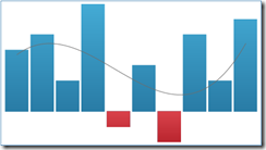
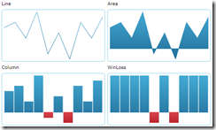
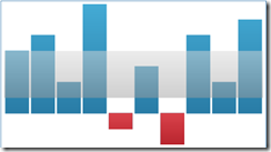
We’ll now have a XamSparkline (available for both Silverlight and WPF) added to the CellValuePresenter of the columns to display the value history for each cell in the ColumnC and ColumnD columns. The XamSparkline presents values in a small chart, where the goal is to show the values and richly format them, to give the user information about the trend and outliers, rather than a lot of interactivity (which is where a XamDataChart is more useful). Here’s are a few sample XamSparklines from our online samples:

imageimageimage

We’ll retemplate the cell to show the latest value next to a XamSparkline showing all the historic values for the cell. We’ll declare the template as shown below:

<Style x:Key="graphingCVPStyle"
    TargetType="{x:Type igDP:CellValuePresenter}">
    <Setter Property="Height" Value="25" />
    <Setter Property="Template">
        <Setter.Value>
            <ControlTemplate TargetType="{x:Type igDP:CellValuePresenter}">
                <Border Height="{TemplateBinding Height}">
                    <Grid>
                        <Grid.ColumnDefinitions>
                            <ColumnDefinition Width="Auto" />
                            <ColumnDefinition Width="*" />
                        </Grid.ColumnDefinitions>
                        <TextBlock Grid.Column="0" VerticalAlignment="Center"
                            Text="{Binding Value, RelativeSource={RelativeSource TemplatedParent}}" />
                        <ig:XamSparkline Grid.Column="1"
                                ItemsSource="{Binding ValueHistory, RelativeSource={RelativeSource TemplatedParent}}"
                                ValueMemberPath="Value"
                                DisplayType="Line"
                                Width="80"
                                LineThickness="1" />
                    </Grid>
                </Border>
            </ControlTemplate>
        </Setter.Value>
    </Setter>
</Style>

Please note the binding expressions for the TextBlock and XamSparkline controls. We’ve set a Width of 80 to comfortably show the 15 values, and we’re using a line to display the values in the XamSparkline, but you can set it to any of the other markers supported – area, column, WinLoss (sample). You can also add trendlines, highlight ranges and tooltips, as described in this walkthrough.

Having declared the template we’ll use for columns we’d like to have a sparkline in, we need to reference the style in the declarations of these columns – please note the reference to the static resource when setting the CellValuePresenterStyle.

<igDP:Field Name="ColumnD" Width="150">
  <igDP:Field.Settings>
      <igDP:FieldSettings 
        DataValueChangedHistoryLimit="15" 
        DataValueChangedScope="AllAllocatedRecords"
        CellValuePresenterStyle="{StaticResource graphingCVPStyle}"
        DataValueChangedNotificationsActive="True"/>
  </igDP:Field.Settings>
</igDP:Field>

Summary

In this blog post I demonstrated how to setup the XamDataGrid to track history changes and visualize them into a XamSparkline. This approach can readily be used to add context to your data, and enable your users to make better decisions based on a concise and rich presentation of data. You can add this enhanced presentation to grids in your applications where a user would benefit from seeing a history of value changes. Of course, you can customize the XamSparkline to visualize this data in a way to properly format and display its context, so that it can be easily understood by the user.


If you have any questions or comments, you can reach me at kmatev@infragistics.com

2 Step Process to Upgrade Windows 8 JavaScript Applications from RC to RTM

$
0
0

2 Step Process to Upgrade Windows 8 JavaScript Applications from RC to RTM

Now that Windows 8 and Visual Studio 2012 are in their final state you may have a number of Windows 8 JavaScript projects built with the RC of Visual Studio 2012 that now need an upgrade to RTM bits. The upgrade process is simple: update the WinJS project reference and update the markup.

Update the WinJS Reference

The Windows 8 JavaScript project template includes a reference to WinJS by default. When you open a project build with the RC in the final version of Visual Studio you’ll see a broken reference.

Broken WinJS Reference from RC project in Visual Studio 2012 RTM

To update the reference to RTM, delete the broken reference, open the Add Reference dialog and select the Windows Library for JavaScript 1.0 Windows Extension.

Add WinJS RTM reference

Update the Markup

HTML pages that accompany Windows 8 JavaScript applications include references to style sheets and JavaScript files that are embedded in WinJS itself. The RC markup includes a suffix of ".RC" in the HTML markup referencing these resources:

WinJS RC Markup

To upgrade the markup do a Search and Replace (throughout the entire solution) replacing Microsoft.WinJS.1.0.RC with Microsoft.WinJS.1.0 

WinJS RTM Markup

You’re all Done!

Now just run your app to test and ensure everything else works as expected.

Note: There may be some cases where other adjustments may be necessary if any API changes occurred between RC and RTM, these steps should your old projects at least running in the final environment.


How to add annotations with JavaScript and HTML in Infragistics jQuery Chart

$
0
0

This article will help you add annotations to igDataChart using HTML Canvas. This approach can be used to add graphic elements to other components using HTML Canvas

Introduction

Very often developers want to add text or graphics to the layout of an existing jQuery widget. To add annotations is not that difficult if you know the architecture of the component. This article refers to the Infragistics jQuery Chart (part of NetAdvantage for jQuery), but the approach can be used for different components. To understand the example you need a basic knowledge of HTML5, JavaScript and jQuery.

Background

In this example you will learn how to add annotation as Fibonacci retracement to the Infragistics jQuery Chart. Fibonacci retracement is created by taking two extreme points on a chart and dividing the vertical distance by the key Fibonacci ratios. 0.0% is considered to be the start of the retracement, while 100.0% is a complete reversal to the original part of the move. Fibonacci ratios are mathematical relationships, expressed as ratios, derived from the Fibonacci sequence. The key Fibonacci ratios are 0%, 23.6%, 38.2%, and 100%. More details about Fibonacci retracement you could find in Wikipedia.

fibonacci-retracement-downtrend-after-sm[1] 

The focus in this blog  is on how to add annotations, not on Fibonacci retracement. Code comments are mainly related to technical implementation.


Using the code

This is a pure HTML/JavaScript/jQuery example. You have no need to implement a server-side logic. The base application contains igDataChart with financial series inside it. The application uses test data from random values.

igChartAnnotations_Pic03[1]

To start you need to have references to Infragistics NetAdvantage for jQuery scripts and styles. The easiest approach is to use Infragistics Content Delivery Network (CDN) for NetAdvantage for jQuery. The files on the CDN are arranged with the same folder structure as is installed locally on a development machine. The best approach is add only Infragistics Loader (igLoader) as reference and after that to use this component to load references in the proper order.

<script src="http://cdn-na.infragistics.com/jquery/20121/2023/js/infragistics.loader.js"></script>

The Infragistics Loader resolves all the Infragistics resources (styles and scripts) for you. You just need to provide the path to required CSS and JavaScript files and declare which resources the loader will fetch for the page.


igLoader[1]

   1: $.ig.loader({
   2:     scriptPath: "http://cdn-na.infragistics.com/jquery/20121/2023/js/",
   3:     cssPath: "http://cdn-na.infragistics.com/jquery/20121/2023/css/",
   4:     resources: "igDataChart.*"
   5: });


Helper object

It is a good practice to have a helper, that contains all required code to add annotations. Helper is named “FibRetracer” (from Fibonacci retracement). This helper contains a method “attachCanvas” that adds an additional HTML canvas over the canvas elements, used inside the igDataChart.

   1: function FibRetracer() {
   2:     this.enabled = false;
   3:     this.attached = false;
   4: }
   5: FibRetracer.prototype.attachCanvas = function (chartElement) {
   6:     if (this.attached) {
   7:         return;
   8:     }
   9:     this.element = chartElement;
  10:     var canvases = chartElement.find("canvas");
  11:     this.renderCanvas = $("<canvas class='fibCanvas' style='position: absolute; top: 0; left: 0;'></canvas>");
  12:     if (canvases.length > 0) {
  13:         this.overlay = $(canvases[canvases.length - 1]);
  14:         this.overlay.before(this.renderCanvas);
  15:         this.renderCanvas.attr("width", this.overlay.attr("width"));
  16:         this.renderCanvas.attr("height", this.overlay.attr("height"));
  17:         this.attached = true;
  18:     }
  19: };


For annotations you need to translate coordinates from canvas coordinates to igDataChart axis values and back. Fortunately igDataChart widget has methods “scaleValue” and “unscaleValue” that can do all this work.

   1: FibRetracer.prototype.getUnscaled = function (point) {
   2:     return {
   3:         x: this.element.igDataChart("unscaleValue", "xAxis", point.x),
   4:         y: this.element.igDataChart("unscaleValue", "yAxis", point.y)
   5:     }
   6: },
   7: FibRetracer.prototype.getScaled = function (point) {
   8:     return {
   9:         x: this.element.igDataChart("scaleValue", "xAxis", point.x),
  10:         y: this.element.igDataChart("scaleValue", "yAxis", point.y)
  11:     }
  12: },


The main part (to generate annotations) is implemented in the method “draw”. In this method new elements are added inside the attached canvas

   1: FibRetracer.prototype.draw = function () {
   2:     if (this.context == null) {
   3:         this.context = this.renderCanvas[0].getContext("2d");
   4:     }
   5:  
   6:     if (this.fibPoint == null) {
   7:         return;
   8:     }
   9:  
  10:     this.context.clearRect(0, 0, this.renderCanvas.attr("width"), this.renderCanvas.attr("height"));
  11:  
  12:     var viewport = this.element.igDataChart("option", "gridAreaRect");
  13:     this.context.save();
  14:     this.context.beginPath();
  15:     this.context.moveTo(viewport.left, viewport.top);
  16:     this.context.lineTo(viewport.left + viewport.width, viewport.top);
  17:     this.context.lineTo(viewport.left + viewport.width, viewport.top + viewport.height);
  18:     this.context.lineTo(viewport.left, viewport.top + viewport.height);
  19:     this.context.lineTo(viewport.left, viewport.top);
  20:     this.context.clip();
  21:  
  22:     var scaledPoint = this.getScaled(this.fibPoint);
  23:     var scaledRightBottom = this.getScaled({
  24:         x: this.fibPoint.x + this.fibWidth,
  25:         y: this.fibPoint.y - this.fibHeight
  26:     });
  27:  
  28:     var viewport = {
  29:         top: scaledPoint.y,
  30:         left: scaledPoint.x,
  31:         width: scaledRightBottom.x - scaledPoint.x,
  32:         height: scaledRightBottom.y - scaledPoint.y
  33:     };
  34:  
  35:     var values = [
  36:             0.0,
  37:             23.6,
  38:             38.2,
  39:             100.0
  40:         ];
  41:  
  42:     var entries = [];
  43:     var entry;
  44:  
  45:     for (var i = 0; i < values.length; i++) {
  46:         var val = values[i];
  47:         entries.push(
  48:             {
  49:                 text: val.toString(),
  50:                 value: val
  51:             });
  52:  
  53:     }
  54:  
  55:     for (var j = 0; j < entries.length; j++) {
  56:         entry = entries[j];
  57:         entry.desiredWidth = this.context.measureText(entry.text).width;
  58:     }
  59:  
  60:     if (viewport.width == 0 ||
  61:     viewport.height == 0 ||
  62:     isNaN(viewport.width) ||
  63:     isNaN(viewport.height)) {
  64:         return;
  65:     }
  66:  
  67:     this.context.strokeStyle = "red";
  68:     this.context.fillStyle = "red";
  69:     this.context.lineWidth = 1.0;
  70:  
  71:     for (var j = 0; j < entries.length; j++) {
  72:         entry = entries[j];
  73:         var yPos = (viewport.top + viewport.height) -
  74:         (viewport.height * entry.value / 100.0);
  75:         var xLeft = viewport.left;
  76:         var xRight = viewport.left + viewport.width;
  77:         if (isNaN(yPos) ||
  78:         isNaN(xLeft) ||
  79:         isNaN(xRight)) {
  80:             continue;
  81:         }
  82:  
  83:         this.context.beginPath();
  84:         this.context.moveTo(xLeft, yPos);
  85:         this.context.lineTo(xRight, yPos);
  86:         this.context.stroke();
  87:  
  88:         this.context.textBaseline = "bottom";
  89:         this.context.fillText(entry.text, xRight - entry.desiredWidth, yPos);
  90:     }
  91:  
  92:     this.context.restore();
  93: };


When Infragistics igDataChart component is created you can attach a function to  “refreshCompleted” event. In this function the new canvas is attached.

   1: $("#priceChart").igDataChart({
   2:     width: "700px",
   3:     height: "500px",
   4:     dataSource: currDataSource,
   5:     axes: [{
   6:         name: "xAxis",
   7:         type: "categoryX",
   8:         label: "Date"
   9:     },
  10:     {
  11:         name: "yAxis",
  12:         type: "numericY",
  13:         labelExtent: 40
  14:     }],
  15:     series: [{
  16:         name: "series1",
  17:         title: "Financial Series",
  18:         type: "financial",
  19:         xAxis: "xAxis",
  20:         yAxis: "yAxis",
  21:         openMemberPath: "Open",
  22:         highMemberPath: "High",
  23:         lowMemberPath: "Low",
  24:         closeMemberPath: "Close",
  25:         diplayType: "ohlc"
  26:     }],
  27:     windowResponse: "immediate",
  28:     horizontalZoomable: true,
  29:     verticalZoomable: true,
  30:     overviewPlusDetailPaneVisibility: "visible",
  31:     rightMargin: 40,
  32:     refreshCompleted: function (e, ui) {
  33:         if (!retracer.attached) {
  34:             retracer.attachCanvas($("#priceChart"));
  35:         }
  36:         retracer.draw();
  37:     }
  38: });

You need also to add several methods to support mouse events when add annotations. Now you just  could use Infragistics jQuery Chart fiddle to look at the code and play with this sample.

Application

For this demo you do not need to install anything. Sample is placed in JS FIDDLE (http://jsfiddle.net ).
JsFiddle is a playground for web developers, a tool which may be used in many ways. One can use it as an online editor for snippets build from HTML, CSS and JavaScript.

 igChartAnnotations_Pic01[1]

When you click on button “Annotate” you could add a Fibonacci retracement as an annotation , dragging your mouse.

igChartAnnotations_Pic02[1]


Conclusions

To add new elements  to your jQuery control is not difficult – you just need to add to it’s DOM required HTML element. Data Visualization related components like charts, maps etc. use canvas to render graphics. You could add own canvas with additional elements.

Source code is available here. As always, you can follow us on Twitter @mihailmateev and @Infragistics and stay in touch on Facebook, Google+ and LinkedIn!

NetAdvantage for Silverlight Release Notes – August: 11.2, 12.1 Service Releases

$
0
0

Release notes reflect the state of resolved bugs and new additions from the previous release. You’ll find these notes useful to help determine the resolution of existing issues from a past release and as a means of determining where to test your applications when upgrading from one version to the next.

Release notes are available in both PDF and Excel formats. The PDF summarizes the changes to this release along with a listing of each item. The Excel sheet includes each change item and makes it easy for you to sort, filter and otherwise manipulate the data to your liking.

In order to download release notes, use the following links:

Silverlight 2012 Volume 1 Service Release

PDF - NetAdvantage for Silverlight 2012 Volume 1 (Build 12.1.20121.2101)
Excel - NetAdvantage for Silverlight 2012 Volume 1 (Build 12.1.20121.2101)

Silverlight 2011 DV Volume 2 Service Release

PDF - NetAdvantage for Silverlight DV 2011 Volume 2 (Build 11.2.20112.2134)
Excel - NetAdvantage for Silverlight DV 2011 Volume 2 (Build 11.2.20112.2134)

Silverlight 2011 LOB Volume 2 Service Release

PDF - NetAdvantage for Silverlight LOB 2011 Volume 2 (Build 11.2.20112.2134)
Excel - NetAdvantage for Silverlight LOB 2011 Volume 2 (Build 11.2.20112.2134)


NetAdvantage for WPF Release Notes – August: 11.2, 12.1 Service Releases

$
0
0

Release notes reflect the state of resolved bugs and new additions from the previous release. You’ll find these notes useful to help determine the resolution of existing issues from a past release and as a means of determining where to test your applications when upgrading from one version to the next.

Release notes are available in both PDF and Excel formats. The PDF summarizes the changes to this release along with a listing of each item. The Excel sheet includes each change item and makes it easy for you to sort, filter and otherwise manipulate the data to your liking.

In order to download release notes, use the following links:

WPF 2012 Volume 1 Service Release

PDF - NetAdvantage for WPF 2012 Volume 1 (Build 12.1.20121.2107)
Excel - NetAdvantage for WPF 2012 Volume 1 (Build 12.1.20121.2107)

WPF 2011 DV Volume 2 Service Release

PDF - NetAdvantage for WPF DV 2011 Volume 2 (Build 11.2.20112.2242)
Excel - NetAdvantage for WPF DV 2011 Volume 2 (Build 11.2.20112.2242)

WPF 2011 LOB Volume 2 Service Release

PDF - NetAdvantage for WPF LOB 2011 Volume 2 (Build 11.2.20112.2242)
Excel - NetAdvantage for WPF LOB 2011 Volume 2 (Build 11.2.20112.2242)

Avoiding Remote Desktop Connection Error: Console Session in Progress

$
0
0

I've recently ran into run into a remote desktop connection error where the error message:

Your computer could not connect to another console session on the remote computer because you already have a console session in progress.

...doesn't exactly do justice as to what was really happening. I detail the workaround here.

NetAdvantage for jQuery Release Notes - July: 11.1, 11.2, 12.1 Service Releases

$
0
0

With every release comes a set of release notes that reflects the state of resolved bugs and new additions from the previous release. You’ll find the notes useful to help determine the resolution of existing issues from a past release and as a means of determining where to test your applications when upgrading from one version to the next.

Release notes are available in both PDF and Excel formats. The PDF summarizes the changes to this release along with a listing of each item. The Excel sheet includes each change item and makes it easy for you to sort, filter and otherwise manipulate the data to your liking.

Download the Release Notes

jQuery 2011 Volume 1

jQuery 2011 Volume 2

jQuery 2012 Volume 1

NetAdvantage for ASP.NET Release Notes - July: 11.1, 11.2, 12.1 Service Releases

$
0
0

With every release comes a set of release notes that reflects the state of resolved bugs and new additions from the previous release. You’ll find the notes useful to help determine the resolution of existing issues from a past release and as a means of determining where to test your applications when upgrading from one version to the next.

Release notes are available in both PDF and Excel formats. The PDF summarizes the changes to this release along with a listing of each item. The Excel sheet includes each change item and makes it easy for you to sort, filter and otherwise manipulate the data to your liking.

Download the Release Notes

ASP.NET 2011 Volume 1

ASP.NET 2011 Volume 2

ASP.NET 2012 Volume 1

Sneak Peek: Indigo Studio by Infragistics!

$
0
0

Indigo Studio Sneak Peek

Have you ever found yourself in the situation where you had an app idea, but you didn’t have the time, or maybe even the skills, to prototype it? Have you tried using some of the existing app prototyping tools on the market today only to find that they were either too basic in their interactions support, too technical, or just too fiddly and complicated? Have you tried to give a set of static wireframes or mockups to be developed—annotated with descriptions about transitions and animations, only to find that the design you had in your head was very different from what was implemented? 

If you answered yes to any of these, or questions like them, then Indigo Studio is a tool for you!

Will the Real Interaction Design Tool Please Stand Up?

There are plenty of tools out there that people use today for interaction design—everything from paper and pen to hand coding prototypes on the target platform, and everything in between. Indigo Studio is the first tool that took doing interaction design as its core design problem and tries to support not only UI design in itself but situating UI design in the context of human living.

Indigo Studio Storyboard

As good interaction design starts from real, human stories, so Indigo starts you off with the ability to capture your stories, in storyboard format. You can start out by simply narrating your story/scenario, blocking it out on the storyboard.  Indigo Studio has hundreds of real-world “scenes” (sketches of people in real-world contexts) that you can just drop into your storyboard boxes to provide that context.

Once you get the basic story narrative down and spice it up with some real-world pictorial context, you can just double-click on any particular step and jump right into designing a UI concept for that part of the story. And as you may see in the screenshot above, the scenes that include a visible device screen let you literally show the screens you are designing in place, as if they were on that device in the scene.  Indigo creates a link between the state of the screen you design and that box in the storyboard, so it always stays up to date, and you can even run your prototype from any one of your steps.. but we’re getting ahead of ourselves.

While you don’t have to use the storyboarding part of Indigo, using a “storyboard first” approach helps keep the focus of design where it should be—on the people and their stories, but that’s just the beginning…

Serious Interactive Prototyping and Animations

What would an interaction design tool be if it didn’t support designing actual interactions?  Well, surprisingly, most tools that interaction designers use don’t really support this! Most let you at best create click through static mockups, but that’s hardly what is expected of rich, high-quality apps with great UX these days, right?  We thought so, too, so we made interactions absolutely core to Indigo Studio—not just a simple click through (though you can do that!), not just tacking some kind of “dynamic” content onto a mostly static design. No, interactions are the bread and butter of Indigo.

Add Interaction

Every element you put on a screen invites you (right there with no extra steps needed) to make it interactive, to respond to a user action with some kind of change in the prototype. You can respond to user actions in a number of ways, such as navigating to new screens, opening URLs, or you can just change the state of the current screen, for instance, by adding an overlay.

Making and Animating Changes

As you make changes to screens, those changes are recorded on the timeline for you. By default, of course, the changes are immediate, but all you have to do is drag or resize them to animate, and voila! you have not only an interactive prototype, but an interaction designed with a meaningful animation (assuming that was your intent, of course!).  All this without ever thinking once about writing a line of code, so you can stay focused on the interactions between the people you’re designing for and the awesome app you have in your head.

It takes just seconds to try out an interaction design concept in Indigo Studio. Of course you can still design static wireframes and just make them click through, but if you’re designing an interactive app, why would you choose to do that when you are empowered to easily and rapidly explore interactions? By getting not just the static screens but also the transitions out of your head and into some designed form, you can quickly try out multiple design ideas, validate if they will work like you think they do, and even give you something to go try with your target users, review with clients, and share with devs.

Interested?

Indigo Studio is currently in a limited private preview, but we are actively seeking out people who are interested in participating.  If it looks like something you’d find helpful, just send an email to indigo at infragistics dot com.  Tell us your name, a little bit about what you do, and how you think Indigo can help you, and we’ll see what we can do to get you onto the private preview.  At a minimum, this will get you on the first notification list for when we release Indigo (which is not far off!).


Infragistics Webinar Follow-up: WPF and Prism

$
0
0

imageI want to thank everyone that attended yesterdays Infragistics webinar on building composite applications in WPF using Prism.  We had a lot to cover in a short amount of time, and I think we did a pretty good job getting through it.  Although, I did have to go a little fast to make sure I covered all the basics.  We also had some audio issues for those trying to call in through the conference phone number.  Never fear, if I went too fast or if you couldn’t hear me, we have the whole thing recorded so you can watch it at your leisure.  Watch it here.

The main concepts we covered in this session were:

  • Bootstrapper
  • Shell
  • Regions
  • Modules
  • View injection/view discovery
  • Commanding

We just touched the surface of Prism, and based on all the positive feedback from all our great attendees, I will be hosting a Prism Part 2 webinar so I can cover other topics such as event aggregation and navigation.  I will provide more details on that when I get a date set.

For those of you ready to get started right now, you can get the Prism bits here:

http://compositewpf.codeplex.com/

Be sure to check out all the quick starts provided with the download.  Remember to ignore the StockTraderRI application.  It is a horrible example to try to learn from.  Not because the team that wrote it didn’t know what they were doing, but because they tried to show you every way to do everything with Prism in one application.  That makes it very difficult to follow and gain guidance from.

Be sure to check out my Introduction to Prism video course on Pluralsight.  It has over 4 hours of video instruction and covers just about everything you need to know to start writing a production Prism application.

Here is the download to the live demo we wrote and to the samples covering the DelegateCommand and the CompositeCommand.  There is also another sample in the download which includes the EventAggregator which we did not have time for.

Don’t forget about the IG Outlook video tutorials I am recording on Xaml TV.  So far I have only recorded 4 videos, but more are coming.  It is just taking longer than I was hoping.

Here is the download for the IG Outlook application that I have so far.  It’s not done, but it’s further along than part 4 of the video series.  Download it and have a look around.  Don’t forget, this application requires Infragistics NetAdvantage for WPF and NetAdvantage for Silverlight.

I hope everyone enjoyed the webinar and if you have any questions feel free to contact me on twitter @brianlagunas or just leave a comment below.

Metro Design Inspirations - Metro Design Series Part 2

$
0
0

In order to truly understand something it is often important to understand where it originated.  This is especially important when the subject at hand is design.  Almost everything designed today has its roots somewhere in the past.  The "Metro" design language is no exception.  In this article, I will introduce the three major design influences that contributed to the formation of the design language used in products ranging from the Zune all the way to Windows 8.

(Note: This post is the second part in a series.  If you haven't read the beginning of the series, you can find it here: What is Metro?)

But first, a note on naming...

Since I know the astute readers of this series are bound to ask why I'm using the term "Metro" still, I figured I'd get that out of the way right up front.  If you haven't heard, Microsoft is in the process of replacing the Metro name after a legal run-in with a company in Europe.  Some speculation says we should call it 'Windows 8' instead of Metro.  Other outlets, myself included have claimed the new name for Metro will be 'Modern UI'.  This seems short-sighted to me since Metro applies to many more things than just Windows 8.  As a design language, it has been used in the Zune, the Xbox, Windows Phone, and numerous Microsoft web properties including the new Outlook.com.  In fact, Metro has even been referred to as a philosophy.  At this point, given that Microsoft has not provided a replacement name and "Metro" is so widely used, I will continue to call it Metro.  As they say in cliché-land, it is what it is.

With that out of the way, let's dig into what design inspirations formed the foundation of the Metro design language.

Inspiration #1: Bauhaus

Bauhaus Book

Bauhaus was a design school in Germany founded by Walter Gropius that ran from 1919-1933.  In a time of great artistic exploration and experimentation, many designs started to favor form over function.  Designs like this feature heavy adornment and contortion of shapes for the sole purpose of looking fancy.  The goals of Gropius and the other members of the Bauhaus school was to focus on form and function working together holistically.  What this means is that the designs they came up with were simple but functional.  When a design was being created, the goal was to distill the concept down to its core and remove all extraneous elements.  When you do this, you end up with a design that directly conveys the function without any distracting bells and whistles or adornments.

…[a design] must be true to itself, logically transparent, and virginal of lies or trivialities.

Walter Gropius

Inspiration #2: International Typographic Style / Swiss Style

Swiss Design

International Typographic Style is a design style that originated in Switzerland in the 1950s.  It should come as very little surprise, given the name, that a major emphasis of International Typographic Style is typography.  Not just any typography though, clean and readable typography. The fonts used are sans-serif fonts such as Helvetica. The designs tend to feature a bold use of color as well.

Another strong component of the Swiss Style is the use of grid layouts.  Grid layouts are used by designers to add structure and organization to their designs.  Using vertical and horizontal (and sometimes diagonal) lines, a grid layout creates a structure along which elements can be placed.  Designs created using a grid layout have very crisp alignment which aids in readability and understandability.  International Typographic Style is employed heavily in signage.  Road signs, airport and railway (Metro!) signage, and even bathroom signs all stem from this style.  

A major portion of many designs in this style use either photographic imagery or iconography.  When photography is used, it is typically full-bleed and used in lieu of illustration.  When iconography is used, the icons tend to be simple and monochromatic.  The icon should cleanly and clearly represent the concept.  An example of this would be the male and female icons that you'll find on most bathroom doors or the airplane icon used at airports around the world.

Inspiration #3: Cinematography and Motion Design

The final major inspiration for the Metro design language is cinematography and motion design.  This is probably an inspirational piece that is best explained visually, but setting the stage with a few concepts never hurt.  Once upon a time, the opening title sequences for movies were highly artistic and used lots of animation to set the scene for the movie that a person was about to watch.  One of the masters of this technique was Saul Bass.  One of my favorite quotes by Saul Bass is:

My initial thoughts about what a title can do was to set mood and the prime underlying core of the film's story, to express the story in some metaphorical way.  I saw the title as a way of conditioning the audience, so that when the film actually began, viewers would already have an emotional resonance with it.

It is this emotional connection that cinematography and motion design create through the use of animation that is at the heart of why it is an inspiration for Metro.  I mentioned that this concept is best conveyed visually, so here is a great example showing off some of Saul Bass' greatest work: click here to view example on Vimeo

Wrap-up and a look ahead

In this post I briefly introduced the concepts from the design world that heavily influenced the Metro design language.  In the next post I'll begin to introduce the Metro Design Principles with the first: Pride in craftsmanship.  As the series moves forward, I will refer back to concepts introduced in this post and how they apply to Windows 8 application design.

If you have any questions or comments, please feel free to comment below or find me on Twitter @brentschooley.

Get a descendant FrameworkElement based on its name.

$
0
0

Back in July I wrote a blog post that showed how to add a checkbox to the row selector of the XamGrid and data bind to it.  The demo was written in WPF and used a method that exists inside a Utilities class.  Specifically Infragistics.Windows.Utilities.GetDescendantFromName.  I had a comment that asked me where the same Utilities.GetDescendantFromName method existed in Silverlight.  Well, I soon discovered that it didn’t.  We do not have a Utilities class for Silverlight.  No big deal though, because this is actually a very well known method.  You have probably seen it, or variations of it, on the web.  So if you are in Silverlight and trying to implement the Utilities.GetDescendantFromName method, use this implementation instead.

/// <summary>
/// Gets a descendant FrameworkElement based on its name.
/// </summary>
/// <returns>A descendant FrameworkElement with the specified name or null if not found.</returns>
public static FrameworkElement GetDescendantFromName(DependencyObject parent, string name)
{
    int count = VisualTreeHelper.GetChildrenCount(parent);

    if (count < 1)
        return null;

    FrameworkElement fe;

    for (int i = 0; i < count; i++)
    {
        fe = VisualTreeHelper.GetChild(parent, i) as FrameworkElement;
        if (fe != null)
        {
            if (fe.Name == name)
                return fe;

            fe = GetDescendantFromName(fe, name);
            if (fe != null)
                return fe;
        }
    }

    return null;
}

Call Me Maybe… A Geekified Parody

$
0
0

Most of us geeks have day jobs.  Mine is working as a product manager for Infragistics NetAdvantage for WPF and NetAdvantage for Silverlight.  Some of us also have things we like to do on the side.  In my case, I have many things I like to do.  One of them is being part of a great group of people that author courses for Pluralsight.  Just days ago someone got a wild idea and this is the result.

http://www.youtube.com/embed/35U2yIG5oJg

Yeah, that’s right… We did a “Call Me Maybe” video parody!

If you’re looking for me, you can find me at about :20 seconds in and again at about 1:56 in.  I didn’t realize this at the time, but some how an Infragistics sign made it into the video.  Weird….

call-me-maybe

Call me!

I had a blast and would like to thank everyone involved that help put this together.

Coordinators:

Director: Megan Russell @megbruss
Exec Producer: Aaron Skonnard @skonnard
Producer/Editor: Megan Russell @megbruss
Creative Assistant: Mari Sparkjoy @msparkjoy

Featured Pluarlsight Staff and Authors:

Megan Russell @megbruss
David Adsit @davidadsit
Amber Mac @ambermac
Fritz Onion @fritzonion
Brian Lagunas @brianlagunas
Sara Ridenour @SaraRidenour1
Ian Griffiths @idg10
Kate Gregory @gregcons
Dan Wahlin @DanWahlin
Pinal Dave @pinaldave
Julie Lerman @julielerman
Jim Cooper @jimthcoop
Michael Perry @michaellperry
Joe Eames @josepheames
Jason Salmond @bruthafish
Jon Flanders @jonflanders
Todd McLauchlin
Mitch Moore
James Cole
Mari Sparkjoy @MSparkjoy
Keith Brown @keithbrown42
Stacia Misner @StaciaMisner
John Petersen @johnvpetersen
John Sonmez @jsonmez
Dustin Davis @PrgrmrsUnlmtd
Tanelle Oliverson
Erik Olsen @erikols
Zoiner Tejada @ZoinerTejada
Jeff Ross @jeff13ross
Craig Shoemaker @craigshoemaker
Dustin Fullmer @dustinfullmer
Matt Milner @Milnertweet
David Starr @ElegantCoder
Sahil Malik @sahilmalik
Johnathan Kehayias @SQLPoolBoy
John Papa @John_Papa
Kim Tripp @KimberlyLTripp
Kathleen Dollard @KathleenDollard
Brian Lagunas @brianlagunas
Rob Windsor @robwindsor
Steve Woolley @stwool
Jim Wilson @HedgehogJim
Mike Woodring @mcwoodring
StacyAnn Allen @StacyAnnAllen
Robert Boedigheimer @boedie
Yacine Khammal
James Kovacs @JamesKovacs
Alicia Azulay
Darrel Miller @darrel_miller
Clemens Vasters @clemensv
Carlos Figueriera @carlos_figueira
Aaron Skonnard @skonnard

How to Use Different Background Content in the Infragistics jQuery Map

$
0
0

When you publish spatial data in WEB applications you often need to use public imagery services such as Bing Maps,   OpenStreetMap, CloudMade Maps and others. Last years jQuery is probably the most popular JavaScript framework, used from WEB developers. Despite the popularity of jQuery still has relatively few components for displaying spatial data (map controls) for this framework. This article will help you to use different types of imagery services with one of the new map controls for jQuery - igMap

Introduction

The igMap control allows you to display data that contains geographic locations from view models or geospatial data loaded from spatial data formats and geographic imagery maps.

Geographic Imagery Maps

Geographic imagery is a detailed representation of the world from a top view perspective. It can consist of an aerial-satellite map or road maps in a multi-scale imagery tiles structure. The Infragistics jQuery Map control can display geographic imagery in order to provide end-users with rich and interactive world maps and geographic context for geospatial data.

Infragistics jQuery control can display geographic imagery tiles from three supported mapping services (Bing Maps Open Street Maps, and CloudMade Map) or from other mapping services that can be easily implemented in an application.

 xamGeographicMap_1[1]

 Map Background Content

The igMap control’s "backgroundContent" property is used to display all supported types of geographic imagery sources. For each geographic imagery source, there is an imagery class used for rendering corresponding geographic imagery tiles.

By default, the backgroundContent property is set to Open Street Maps Imagery object and the igMap control displays geographic imagery tiles from the Open Street Maps service. In order to display different types of geographic imagery tiles, the Infragistics jQuery Map control must be re-configured.

Background

In this article you will learn how to change on the fly igMap background, using all supported imagery services: Bing Maps, OpenStreetMap, CloudMade Maps. Some Services like OpenStreetMap don’t require developer key and registration. Other imagery services like OpenStreetMap, CloudMade Maps need a special key.

Bing Maps

You can create two Bing Maps Keys. Go to the Bing Maps Account Center at https://www.bingmapsportal.com. If you have a Bing Maps Account, sign in with the Windows Live ID that you used to create the account. Follow the instructions in Creating a Bing Maps Account.

CloudMade Maps

Sign-up for a CloudMade API key, by following this link

Requirements

To understand the example you need a basic knowledge of HTML5, JavaScript and jQuery. You need also to refer jQuery (jQuery core library 1.4.4 version or above) , jQuery UI ( jQuery UI library 1.8.11 or above) and NetAdvantage for jQuery vol. 12.1 scripts (it is recommended to use the latest service release).

Using the code

Before you start:

This is a pure HTML/JavaScript/jQuery example. You have no need to implement a server-side logic. You just need to have script references.

To start you need to have references to Infragistics NetAdvantage for jQuery scripts and styles. The easiest approach is to use Infragistics Content Delivery Network (CDN) for NetAdvantage for jQuery. The files on the CDN are arranged with the same folder structure as is installed locally on a development machine. The best approach is add only Infragistics Loader (igLoader) as reference and after that to use this component to load references in the proper order.

Layout

Demo application has a simple layout with two HTML text elements for Bing Maps and CloudMade Maps  keys. In the HTML are add also elements for igCombo and igMap

 1: <label id="lblBing">BingMaps Key:label>
 2: <input id="txtBing" type="text" value="">input>
 3: <label id="lblCloudMade">CloudMade Maps Key:label>
 4: <input id="txtCloudMade" type="text" value="">input>
 5: <br/>
 6: <span id="imageryService">span>
 7: <div id="map">div>


Script Loader

The Infragistics Loader resolves all the Infragistics resources (styles and scripts) for you. You just need to provide the path to required CSS and JavaScript files and declare which resources the loader will fetch for the page.

 1: $.ig.loader({
 2:     scriptPath: "http://cdn-na.infragistics.com/jquery/20121/2049/js/",
 3:     cssPath: "http://cdn-na.infragistics.com/jquery/20121/2049/css/",
 4:     resources: "igMap,igCombo,igShared"
 5: });


jQuery Controls

Create igMap instance. If you have no “backgroundContent” option by default will be used Open Street Maps as an imagery service. This property can not be set to null.

 1: $("#map").igMap({
 2:         width: "700px",
 3:         height: "500px",
 4:         panModifier: "control",
 5:         horizontalZoomable: true,
 6:         verticalZoomable: true,
 7:         windowResponse: "immediate",
 8:         overviewPlusDetailPaneVisibility: "visible",
 9:         seriesMouseLeftButtonUp: function(ui, args) {
 10:         var tets = args;
 11:     }
 12: });


To select different imagery source you could use different elements. In this sample is implemented selection with Infragistics jQuery Combo component.

 1: $("#imageryService").igCombo({
 2:     width: '300px',
 3:     valueKey: 'ID',
 4:     textKey: 'Name',
 5:     mode: 'dropdown',
 6:     selectedItems: [{ value: "openStreet"}],
 7:     dataSource: [
 8:         { "Name": "OpenStreet Maps", "ID": "openStreet" },
 9:         { "Name": "CloudMade Maps", "ID": "cloudMade" },                   
 10:         { "Name": "Bing Maps", "ID": "bing" }
 11:     ]
 12: });


To maintain igMap background content is used igCombo selectionChanged live() event (As of jQuery 1.7, the .live() method is deprecated. It is better to use .on() to attach event handlers).

Background content is an object where you need to set different properties for different imagery service providers.

 1: $('#imageryService').live('igcomboselectionchanged', function (event, ui) {
 2: if(ui.items != null)
 3: {
 4:  
 5:    var imagery = ui.items[0];
 6:    var bgrCont = { type: "openStreet" }; 
 7:    switch (imagery.value)
 8:    {
 9:    case "openStreet":
 10:      bgrCont = { type: "openStreet" }; 
 11:      break;
 12:    case "cloudMade":
 13:      var val = $("#txtCloudMade").val()
 14:      bgrCont = { type: "cloudMade", key: val, parameter: 1};
 15:      break;
 16:    case "bing":
 17:      var val = $("#txtBing").val()
 18:      bgrCont = { type: "bing", key: val};
 19:      break;
 20:    default:
 21:      bgrCont = { type: "openStreet" }; 
 22:    }
 23:    setBackgroundContent(bgrCont);
 24: }                 
 25: });


The current of igMap version doesn’t support backgroundContent change “on the fly” You need to destroy the current map instance and create the new one.

 1: function setBackgroundContent(bgr)
 2:    {
 3:        $("#map").igMap("destroy");
 4:        $("#map").igMap({
 5:                width: "700px",
 6:                height: "500px",
 7:                panModifier: "control",
 8:                horizontalZoomable: true,
 9:                verticalZoomable: true,
 10:                windowResponse: "immediate",
 11:                overviewPlusDetailPaneVisibility: "visible", 
 12:                backgroundContent: bgr,
 13:                windowRect: {
 14:                    left: 0.15,
 15:                    top: 0.10,
 16:                    width: 0.7,
 17:                    height: 0.7
 18:                }
 19:        });
 20:    
 21:    }


Alternative approach

In NetAdvantage for jQuery vol.12.1 jQuery Map is CTP and you could expect many improvement for the new 12.2 release. Some of the new features are:

  • Set the “backgroundContent” option to null (with this value you could use only vector data in your map without imagery services)
  • Change the “backgroundContent” “on the fly” without need to recreate your map instance.

In the new igMap version you could maintain the background content more simpler.

Use Open Street Maps as imagery service

 1: $("#map").igMap("option", "backgroundContent", { type: "openStreet" });


Set Bing Maps as imagery service

 1: $("#map").igMap("option", "backgroundContent", { 
 2:     type: "bing", 
 3:     key: "[Your BingMaps Key]"
 4: });


Change the background content to use CloudMade maps

 1: $("#map").igMap("option", "backgroundContent", { 
 2:     type: "cloudMade",
 3:     key: "[Your CloudMadeMaps Key]",
 4:     parameter: 1
 5: });


Application

For this demo you do not need to install anything. Sample is placed in JS FIDDLE (http://jsfiddle.net ).
JsFiddle is a playground for web developers, a tool which may be used in many ways. One can use it as an online editor for snippets build from HTML, CSS and JavaScript. The live sample is available here.

igMap_BackgroundContent_Pic01[1]

Open Street Maps imagery source

igMap_BackgroundContent_Pic02[1]

CloudMade Maps imagery source

igMap_BackgroundContent_Pic04[1]

Bing Maps imagery source

igMap_BackgroundContent_Pic06[1] 

Conclusions

Modern WEB applications often use jQuery based UI components. Spatial data visualization is an area where developers recently proposed MAP components. To be successful, these components should provide visualization of vector data using different imagery services. In this article we explain at how igMap work with different imagery sources. I hope that the information will be useful for those of you who want to use effectively this component. I guess examples would be useful to those who compare different jQuery map widgets to make the right choice.

Source code is available here. As always, you can follow us on Twitter @mihailmateev and @Infragistics and stay in touch on Facebook, Google+ and LinkedIn!

Viewing all 2398 articles
Browse latest View live