Quantcast
Channel: Infragistics Community
Viewing all 2398 articles
Browse latest View live

Working with Ignite UI for Angular Toolbox extension in Visual Studio Code

$
0
0

Ignite UI for Angular is 50+ Material-based UI components to help you build enterprise Angular application faster.   Learn more about Ignite UI for Angular: here

You can add Ignite UI for Angular in your project in various ways:

  1. Use Ignite UI CLI : Learn more about Ignite UI CLI : here
  2. Use npm to add Ignite UI in existing project: Learn in detail here
  3. Use Ignite UI for Angular toolbox extension in Visual Studio Code.


In this post, we will follow steps by steps approach to work with Ignite UI for Angular toolbox extension.  You can learn more about extension: here . It allows you to add Ignite UI for Angular components easily to the template.

Let us start with browsing for the extension. To browse extensions preform click on the Extensions in activity either bar or click shortcut key Ctrl+ Shift+ x


Clicking this will open search screen to search an extension in marketplace. In the search box enter text Ignite UI and as a result you will find two results.

  1. Infragistics Ignite UI for Angular Tooltips
  2. Infragistics Ignite UI for Angular Toolbox

Feel free to install both extensions to speedup Angular development process with Ignite UI for Angular components.  To install just click on the Install button.

Now to add any Ignite UI for Angular component, right click on HTML file and select option “Open Ignite UI Angular Toolbox” as shown in the image below:


You should get Ignite UI for Angular toolbox opened as shown in the image below:

Select a component to add.  Let us say, we want to select Grid.  Double click on Grid and Ignite UI will start installing all the dependencies and will add reference code.  Essentially, it does following tasks for u


  1. Installs all modules dependencies using npm
  2. Import required modules for the added component to the application module or next available module.
  3. Creates reference code.

 You can verify that, it has added Ignite UI for Angular Grid modules in app.module as shown in the image below:

And on the HTML it has added reference code as shown in the image below:

In this way, you can work with Ignite UI for Angular Toolbox. Please give a try and let us know your feedback.


Saving Money With Consistent Enterprise Applications

$
0
0

In most companies, employees struggle to use a wide variety of inconsistent applications. Some are old enterprise software systems bought from the major vendors, some are internally-built applications developed over the years by different teams using a variety of platforms, and others are more modern, web-based applications. Typically the only thing they have in common is that they all have very inconsistent interaction and visual design. Adding your company’s header, logo, and colors to each application merely papers over the many interaction inconsistencies. 

When employees have to use inconsistent applications, they constantly need to adapt to different interactions. What worked successfully on Application A, doesn’t do anything on Application B, and may cause you to lose data on Application C. It results in lost time, inefficiency, lost productivity, and increased errors – all of which waste company money and resources. As new applications are developed by different teams, designers and developers waste additional time creating very different designs. 

Employees are very resilient at adapting to even the most cumbersome and inefficient software if they use it constantly. However, inefficiently working around system problems isn’t ideal, and no one adapts to applications that are used less frequently. Each time an employee switches to another application, with a completely different interface, they have to try to remember how they used it last time and adjust their behavior appropriately. 

The solution to all these problems is to study employees’ tasks, and then design consistent applications that help them accomplish their tasks easily and efficiently. Luckily, conducting user research with your employees is extremely easy and inexpensive, because they’re easily available, nearby, and they’re already being paid. All you need to do is go to them and observe them doing their work. 

Once you have an understanding of employees and their tasks, you can design applications around the tasks they perform. Establish a design system with consistent interactions and create standard elements to use when designing applications. As future applications are created, the designers and developers will save time by following the standards and using the established design components. 

It may sound overwhelming to think about redesigning all of your company’s applications, but you don’t need to it all at once. You can do it in a phased approach, designing all new applications using the consistent design system, and selectively redesigning older applications over time. 

Establishing a consistent design system across applications will allow employees to easily learn new applications and to effortlessly switch between the tools they need to use to accomplish their work. For the company, consistent applications save money in employee productivity, increased satisfaction, and in decreased design and development cost.

Nimble Prototyping Backed By Usability Studies & User-Videos

$
0
0

Creating wireframes or mock-ups before coding can make it much easier to collaborate on designs and requirements. By structuring discussions around what the user will see, fewer things are left to interpretation. However, without testing the designs with the target audience, it’s an incomplete UX process.

With Indigo.Design, all you need is a web-browser to go from prototyping to watching videos of how people used your prototype. And the best part is that you can create your designs in any tool you like. Yes, even Microsoft PowerPoint!

Create prototypes in the cloud

To start creating your prototypes, visit Indigo.Design to sign in or create a free user account.

Introducing prototyping in the cloud

After signing in, use the web-based editor to import your images. Then simply select an image, click+drag to create a hotspot and add an interaction to link to a destination screen/image. That’s how simple it is to create an interactive prototype.

When you are ready, click publish to get a link that can be shared with anyone to view the prototypes. Your reviewers can view the prototype on any device using a web-browser.

Learn more: Create your first prototype

Importing Sketch documents and flows

If you use Sketch app to create your designs and prototypes, you can easily publish it as an Indigo.Design prototype and get the all the benefits of collaboration, and usability testing with user-videos.

The best part is that you don’t have to recreate the flows that you created in Sketch. Simply drag and drop your Sketch file in the prototype editor, set a starting point, and hit publish. Now you are all set to kick-off a usability study or share a link with others!

Use Indigo.Design desktop to design your prototypes

The desktop app provides a WYSIWYG experience to create your prototypes from scratch. You can design screens by adding UI components from toolbox or from your own reusable design library.

Desktop app screenshot

More importantly, the desktop app allows you to easily create UI states to simulate rich interactivity and custom transitions using an animation timeline. You can even import from Sketch using our Sketch plugin to add more interactivity. And naturally, you can use the desktop app whether you are online or offline!

You can then publish your prototypes to the cloud or your on-prem server to get all the benefits of collaboration, commenting, and usability studies.

Learn more: Indigo.Design Desktop features

Unlimited usability testing

You can set up a usability study for any prototype published on Indigo.Design. Creating a study let’s you collect usability analytics and user-videos for each participant.

Task report

You do this by setting up tasks for people to complete with the prototype, and specifying an expected set of steps. Participants can complete the task however they like, but you will be able to learn whether the “expected path” is the popular one. And when watching video replays, our unique timeline visualization let’s you quickly jump to interesting events (e.g., misclicks)

If you add the usability study to a group workspace, you can let any invited member analyze the reports and videos. You can even delegate the usability study responsibility to another member of your team.

Video player

Study owners will receive email notifications with a study progress report as and when participants complete the study.

Learn more:

Get started with Indigo.Design!

Don't stop with prototypes; get it in the hands of real users with our 1-click sharing and the ability to view prototypes on any device. Harness the power of Indigo.Design Cloud for recording user sessions and task analytics.

Design-prototype-generate code

Use our Essential Plan for free or upgrade to Indigo.Design Professional starting at $39/mo. Want Code Generation? Get Indigo.Design Enterprise for $99/month!

The Chemistry of Indigo.Design UI Kits

$
0
0

"How we have defined our atoms, molecules, and organisms.*"

By Stefan Ivanov

 Unparalleled productivity, absolute consistency, and improved collaboration: design systems have definitely changed our perspective on design. About a year ago, our team stumbled into this new and trendy concept, and it was definitely a love at first sight. As a company that is mostly recognized as a component vendor, we were able in the past years to truly commit to design and embed it deeply into our culture. We saw how our processes and products improved, but it still felt as if design failed to keep its promise. This came from the realization that at Infragistics we may have 1:10 designer-developer ratio, but that was rarely the case throughout the industry. Many of the enterprises we talk to or have been long time customers and partners of ours, live in a different world. Their designer-developer ratio is usually around 1:100, which basically means that design is the bottleneck in the process and sheds light on just a few hand-picked projects from the myriad of software that is being built. With design systems, we saw the opportunity to turn things around and boost design to have for more significant impact on large software organizations.

The Inspiration

One of the cornerstones for design systems is the work of Brad Frost and, more precisely, a book he published in 2016 called Atomic Design. It draws an interesting parallel between chemistry and design systems, looking at interface elements from the perspective of Atoms that when combined build up Molecules that constitute larger Organisms. The Indigo.Design UI Kits for Sketch take this approach by providing three libraries. Styling has sub-atomic pieces such as colors, shadows, typography styles, and icon glyphs that define the looks of the Atoms and Molecules found in the Components library. The concept of a component is familiar to developers, and this is usually a button or a hyperlink that represents an Atom but could also be a more elaborate layout such as a calendar interface or a list with templated items, where multiple Atoms are used to form a Molecule. When mixed with caution and under proper guidance, Atoms and Molecules can turn into a beautiful Organism. And this brings us to the third piece, the Patterns library. It allows people to skip mundane tasks for assembling login forms, user profiles, and detail pages by providing them with a preset collection of UI patterns, inspired from numerous real-world scenarios and guaranteed to meet your practical necessities because of that. Note that the patterns are still in their infancy and feedback or suggestions are very much appreciated!

To make sure your design does not catch fire or explode in your hands, the reactions we absolutely wanted to avoid during chemistry classes in high school, our team has crafted a lot of prescriptive guidance that should let even a developer to craft decent design. Not that we underestimate developers, but their design work has been quite notorious in regard to aesthetics. Indigo.Design was brought to the world to change this and let anyone, designer, developer, product owner or business analyst, be able to confidently create a good and stable piece of design as long as they follow the provided guidance.

Moving Beyond Sketch Libraries

Having provided the context and foundations for our Indigo.Design UI Kits, the leap in productivity and the improved consistency should be without doubt. But how about collaboration? Indigo.Design is much more than a collection of Sketch libraries, and the rest of the tooling speaks to collaboration. Being able to upload the Sketch project you crafted with the libraries to the Indigo.Design Cloud, define the precise interactions, and run a usability study  is priceless when on a tight schedule and trying to get things right from the first time. But once you are convinced that your design functions and meets all user needs, you can leapfrog the annoying process handing off your designs to a team of developers, simply by generating most of the code assets yourself with our Visual Studio Plugin. As long as you have the data you will be consuming, you can specify your bindings by going back to Sketch and using some of the special override properties we have defined, or work alongside a developer and fill in the gaps so that your assets flow in a beautiful Ignite UI for Angular app.

*The parallel between design systems and chemistry was first described by Brad Frost, who explains the organization of Design Systems at length in his book, Atomic Design.

How to Build a Crypto Portfolio App with Ignite UI for Angular

$
0
0

I wanted to share with you how easy it is to create Angular application with our Ignite UI for Angulartoolset.

What is the purpose of this application? First of all, to demonstrate our Angular components. Second, it’s to demonstrate a real use case, and I wanted to create a system that will track my cryptocurrencies portfolio in order to check my daily gains and losses.  As for the third reason,  to demonstrate the use of different Аngular techniques like utilizing Guards, Pipes, and Custom Templates with our components and, of course, using of Firebase for data storing and authentication.


The topic will cover:

  1. The use of Ignite UI Angular CLI
  2. Data services, Routing, Templating, Pipes, etc.
  3. The use of Firebase Data Storage, Authentication, and CRUD operations
  4. Coinmarketcap API to Retrieve real-time and historical price information

Ignite UI CLI

Okay, let's start! So, have you heard about Ignite UI CLI? Yep, this is a real thing that we’ve developed that helps you create Angular applications with a predefined set of components, executing just a few commands. It takes less than three minutes to install all necessary packages and to run the project with the help of our CLI, just follow our official Getting started page.

After the building of the app is completed along with the installation of all necessary packages, you will notice that Navigation drawer and Grid components were added and already configured. The same applies for the different responsive views, routing, styles, module imports, etc. - awesome, right?

export const routes: Routes = [
  { path: '', redirectTo: '/home', pathMatch: 'full' },
  { path: 'home', component: HomeComponent },
  ...
];

Okay, what's next? We want our app to show variety of things: we want to have user authentication, to track crypto data changes, and to store our Cryptocurrencies portfolio somewhere. For that purpose, Ignite UI for Angular provides all suitable components out of the box. We are going to use Chart for historical data changes and a Grid to show our crypto portfolio and provide the ability to add/update/delete cryptocurrencies, also List and Card.

For all of the above requirements we need to get the data from somewhere, this is where the Coinmarketcap API steps in - This is a free service that provides information for all active cryptocurrencies in one call.

getData() {
    if (!this.cachedData) {
      this.cachedData = this._http.get('https://api.coinmarketcap.com/v2/ticker/?convert=BTC&limit=1000')
      .map(result =>  {
        let newData = [];

        if (result['metadata'].error === null) {
          const fetchedData = Object.keys(result['data']);

          for (const key of fetchedData) {
            newData.push(this.flattenObject(result['data'][key]));
          }
        } else {
          newData = offlineData;
        }

        return newData;
      });
    }
    return this.cachedData;
}


App authentication 

Below I’ve highlighted some steps that I’ve took in order to set up the Firebase authentication of the Crypto App. AngularFireAuth is going to be used for user authentication and all related actions like login and logout. This firebase service provides methods for sign in with email and password, Google authentication provider, and Facebook auth provider. For a more detailed explanation, I recommend checking up the official Angular firebase repository and documentation.

  1. Set up a firebaseproject.
  2. Go to the Authentication tab and enable Google, Facebook, and Email/password sign-in providers.
  3. Based on the methods, generate Facebook ID and later on OAuth redirect URI.
  4. Add rules and publish the changes.
  5. Add the firebaseConfig to the Angular project.
  6. Create Login, Signup and Email components. (code for all)
  7. Create auth.service that will handle the redirects of registered and unregistered users (Route guards). As you can see from the code, (add code), the Portfolio page is accessible only for authorized users.

@Injectable()
export class AuthGuard implements CanActivate {

    constructor(private auth: AngularFireAuth, private router: Router, private route: ActivatedRoute) {}

    canActivate(route: ActivatedRouteSnapshot, routerState: RouterStateSnapshot): Observable<boolean> {
      return Observable.from(this.auth.authState)
        .take(1)
        .map(state => !!state)
        .do(authenticated => {
          if (!authenticated) {
            this.router.navigate([ '/login' ], {
              queryParams: {
                return: routerState.url
              }
            });
          }
      });
    }

}

For more details, have a look at the official firebase authentication getting started topic, and I can guarantee that you won't feel any kind of difficulties when setting it up.

Data storage and CRUD operations 

For data storing and data updates, our application is using Firebase Realtime Database which is a cloud-hosted database, stored as JSON and synchronized in realtime to every connected user. All users share on Realtime Database instance and automatically receive updates with the newest data.

Reading and writing of data is easy, and below are the steps that you could follow in order to achieve CRUD operations:

  • Create a separate service for data manipulations
  • Define `BlockItem` class that is going to be used for data fetch, adding, updating and removing of records.
  • Create a list binding/retrieve that will return an observable of data as a synchronized array of JSON objects. With metadata (underlying DBReference and snapshot key)

For more information check the official firestore documentation.

What about Grid CRUD? Yep, this is possible with the help of Firebase data storage and our great api. Check this file for more information on how to setup your Firebase platform which could provide you abilities for data storage, authentication, etc.

  public deleteRow(item) {
    this.selectedRow = Object.assign({}, this.selectedCell.row);
    this.deleteItem(this.selectedCell.cell.row.rowData);

    // store deleted data
    this.deletedItem.coinName = this.selectedCell.cell.row.rowData.coinName;
    this.deletedItem.holdings = this.selectedCell.cell.row.rowData.holdings;
    this.deletedItem.cryptoId = this.selectedCell.cell.row.rowData.cryptoId;
....
    this.selectedCell = {};
    this.snack.show();
  }

  public updateRow(obj) {
    const updatedItem = obj.row.rowData;
    updatedItem.holdings = obj.newValue;

    this.updateItem(updatedItem);
  }

Full code here.

Configure all components that are going to be used in the application

Fetched data is used from Charts, Grids, Listsand Cardcomponents (provide code for each).

For example, the Card component is using filtering pipes and sorting of data.

export class HomeComponent implements OnInit {
....
  public search1: string;
....
  get filterOptions() {
    const fo = new IgxFilterOptions();
    fo.key = 'name';
    fo.inputValue = this.search1 ? this.search1 : '';
    return fo;
  }
  .....

Check up the code in order to see how each of the components is bound.

  • Grid

This is the main page that is going to be used for data manipulating and tracking of price changes. We are going to define a grid with five column (count depends on the screen size) and each column will have its own ng template for data representation. This includes images, icons for price movements, and using of decimal pipes.

The action buttons above the grid will handle manual data refresh and adding of new coins. igxDialogis going to be used for that purpose. A minimal validation of the coins is applied. For example, you won't be able to add already existing coins or coins that are not present in the coinmarketcap api. Each notification message is going to be shown via igxSnackBar.

For the coin holding updates, we are going to handle (onEditDone) and from there use the methods that we defined in the BlockItemService. Same applied for the `delete` and `add` coin buttons.

<igx-grid #grid1 [data]="blockItems" width="100%" height="500px" (onEditDone)="updateRow($event)" (onSelection)="selectCell($event)"><igx-column field="coinSymbol" sortable="true" [width]="'25%'"><ng-template igxHeader let-column="column">
			Coin symbol</ng-template><ng-template igxCell let-cell="cell" let-item let-ri="rowIndex" let-column="column"><a class="aStyle" (click)="openChart($event, cell.row.rowData.coinSymbol)"><div class="positionTop"><img src="https://s2.coinmarketcap.com/static/img/coins/32x32/{{ cell.row.rowData.cryptoId }}.png" /><span class="symbolPosition">{{ cell.row.rowData.coinSymbol }}</span></div></a></ng-template></igx-column><igx-column field="holdings" header="Holdings" editable="true" sortable="true" [width]="'25%'"><ng-template igxCell let-cell="cell" let-item let-ri="rowIndex" let-column="column"><div class="positionTop">
				${{ calculateHoldings(cell.row.rowData.holdings, cell.row.rowData.usdPrice) | number:'0.2-2' }}<br /><b>{{ cell.row.rowData.holdings | number:'1.0-5'}}</b></div></ng-template></igx-column><igx-column header="Price" field="usdPrice" sortable="true" [width]="'25%'"><ng-template igxCell let-cell="cell" let-item let-ri="rowIndex" let-column="column"><div class="positionTop">
				${{ cell.row.rowData.usdPrice | number:'0.2-2' }}<br /><span class="percent-style-{{ cell.row.rowData.oneDayPercentChange >= 0 ? 'up' : 'down'}}"> {{ cell.row.rowData.oneDayPercentChange }} % </span></div></ng-template></igx-column><igx-column [width]="'25%'"><ng-template igxHeader let-column="column">
			Actions</ng-template><ng-template igxCell let-item let-ri="rowIndex" let-column="column"><span igxButton="icon" igxRipple (click)='deleteRow(item)' style="margin-top: -9px;"><igx-icon name="highlight_off"></igx-icon></span></ng-template></igx-column></igx-grid>

  • Chart

This component is going to be used for visual representation of the coin price changes per day. Our igxFinancialChartis easily configurable, as you just pass the fetched data to “dataSource” and, voila, everything else will be handled by the chart. Additionally, the chart respects the general financial data structure.


<igx-financial-chart [dataSource]="data" height="400px" width="100%" style="margin-top: 20px;" isToolbarVisible="false" chartType="candle"></igx-financial-chart>

One interesting item here that should be mentioned is the use of routes to pass data between views. The Statistics page is accessible through a couple of Views which are passing different coin names to be loaded in the chart.

  • IgxListand IgxCardcomponents are used to show a different visual representation of all properties associated with the returned items.

To sum up, everything is possible with the right tooling, and with that said, you definitely should consider using of our Ignite UI for Angular components for your next web/mobile application.

In the next blog of this series, you will learn how to transform the Angular web application that we’ve created into a native android mobile application. We are going to create a JS/HTML Cordova application and deploy it to native mobile app using the cordova command-line interface (CLI).

GitHub repository and hosted application.

The Alchemy of Indigo.Design UI Kits

$
0
0

How we have defined our atoms, molecules, and organisms*


 Unparalleled productivity, absolute consistency, and improved collaboration: design systems have definitely changed our perspective on design. About a year ago, our team stumbled into this new and trendy concept, and it was definitely a love at first sight. As a company that is mostly recognized as a component vendor, we were able in the past years to truly commit to design and embed it deeply into our culture. We saw how our processes and products improved, but it still felt as if design failed to keep its promise. This came from the realization that at Infragistics we may have 1:10 designer-developer ratio, but that was rarely the case throughout the industry. Many of the enterprises we talk to or have been long time customers and partners of ours, live in a different world. Their designer-developer ratio is usually around 1:100, which basically means that design is the bottleneck in the process and sheds light on just a few hand-picked projects from the myriad of software that is being built. With design systems, we saw the opportunity to turn things around and boost design to have for more significant impact on large software organizations.

The Inspiration

One of the cornerstones for design systems is the work of Brad Frost and, more precisely, a book he published in 2016 called Atomic Design. It draws an interesting parallel between chemistry and design systems, looking at interface elements from the perspective of Atoms that when combined build up Molecules that constitute larger Organisms. The Indigo.Design UI Kits for Sketch take this approach by providing three libraries. Styling has sub-atomic pieces such as colors, shadows, typography styles, and icon glyphs that define the looks of the Atoms and Molecules found in the Components library. The concept of a component is familiar to developers, and this is usually a button or a hyperlink that represents an Atom but could also be a more elaborate layout such as a calendar interface or a list with templated items, where multiple Atoms are used to form a Molecule. When mixed with caution and under proper guidance, Atoms and Molecules can turn into a beautiful Organism. And this brings us to the third piece, the Patterns library. It allows people to skip mundane tasks for assembling login forms, user profiles, and detail pages by providing them with a preset collection of UI patterns, inspired from numerous real-world scenarios and guaranteed to meet your practical necessities because of that. Note that the patterns are still in their infancy and feedback or suggestions are very much appreciated!

To make sure your design does not catch fire or explode in your hands, the reactions we absolutely wanted to avoid during chemistry classes in high schoolour team has crafted a lot of prescriptive guidance that should let even a developer to craft decent design. Not that we underestimate developers, but their design work has been quite notorious in regard to aesthetics. Indigo.Design was brought to the world to change this and let anyone, designer, developer, product owner or business analyst, be able to confidently create a good and stable piece of design as long as they follow the provided guidance. 

Moving Beyond Sketch Libraries

Having provided the context and foundations for our Indigo.Design UI Kits, the leap in productivity and the improved consistency should be without doubt. But how about collaboration? Indigo.Design is much more than a collection of Sketch libraries, and the rest of the tooling speaks to collaboration. Being able to upload the Sketch project you crafted with the libraries to the Indigo.Design Cloud, define the precise interactions, and run a usability study  is priceless when on a tight schedule and trying to get things right from the first time. But once you are convinced that your design functions and meets all user needs, you can leapfrog the annoying process handing off your designs to a team of developers, simply by generating most of the code assets yourself with our Visual Studio Plugin. As long as you have the data you will be consuming, you can specify your bindings by going back to Sketch and using some of the special override properties we have defined, or work alongside a developer and fill in the gaps so that your assets flow in a beautiful Ignite UI for Angular app.  

*The parallel between design systems and chemistry was first described by Brad Frost, who explains the organization of Design Systems at length in his book “Atomic Design”

Progressive Web Apps

$
0
0

As users seek the same kind of experience from a mobile app or web app on their devices, progressive web apps have become a way for developer teams to give the best of both worlds.

In a special feature published in SD Times last year that still holds up today, we examine the benefits and drawbacks of developing and deploying these PWAs, and a blog post from January dives more deeply into what is required to build an effective PWA.

We’ve seen a great deal of uptake in PWAs since Google created the model in 2015. Testing provider, Perfecto, recently announced support for PWAs, and Microsoft earlier this month gave detailed instructions for creating PWAs on its platform.

A critical element of a PWA is the service worker. This acts as kind of a request fulfillment service and is critical for reducing latency and delivering content at the speed of a native application. Google has written an in-depth introduction to service workers to help developers get up to speed with PWAs more quickly.

Angular 6.1

The last minor 6.x release of Angular dropped about a week and a half ago, with features including router scroll position restoration, ShadowDOM v1 view encapsulation and schematics chaining, among other improvements. Stephen Fluin, Angular developer advocate at Google, details the new functionality  in a blog post.

He did say Angular developers can expect to see 7.0 betas coming soon as the team works toward the next major release.

Angular Components: Pass by Reference or Pass by Value?

$
0
0

In Angular, you can pass data from parent component to child component using @Input() decorator, and a child component can emit an event to a parent comment using @Output() decorator.

You can learn more about @Input() decorator here and about @Output decorator here.

The purpose of this blog post is to explain you whether it is pass by reference or pass by value in context of @Input() and @Output decorator.

To start with, let us assume that we have two components, as listed below:

import { Component, Input } from '@angular/core';
@Component({
    selector: 'app-video',
    template: `
        {{data.counter}} {{count}}
     `
})
export class VideoComponent {
 
    @Input() data: any;
    @Input() count: number;
 
}

As you see, we have two input properties.

  1. In data property, we will pass an object.
  2. In count property, we will pass a number.


 From the AppComponent, we are passing value for both properties, as shown below:

import { Component, OnInit } from '@angular/core';
 
@Component({
    selector: 'app-root',
    template: `
  <app-video [data]='data' [count]='count' ></app-video>
  `
})
export class AppComponent implements OnInit {
    data: any = {};
    count: number;
    constructor() {
    }
 
    ngOnInit() {
        this.data.counter = 1;
        this.count = 1;
    }
}

As you see,  we are passing data (object) and count( number) to the child component. Since data is being passed as object,  it will be “Pass by Reference” and, since count is passed as number,  it will be “Pass by Value”.

Therefore, if passing an object, array, or the like,  then it is Pass by Reference, and for primitive types like number, it is Pass by Value. 

To better understand it, let us raise two events on the child component, as shown in the listing below:

import { Component, Input, EventEmitter, Output } from '@angular/core';
@Component({
    selector: 'app-video',
    template: `
        {{data.counter}} {{count}}
        <button (click)='senddata()'>send data</button>
        <button (click)='sendcount()'>send count</button>
     `
})
export class VideoComponent {
 
    @Input() data: any;
    @Input() count: number;
 
    @Output() dataEvent = new EventEmitter();
    @Output() countEvent = new EventEmitter();
 
    senddata() {
        this.dataEvent.emit(this.data);
 
    }
    sendcount() {
        this.countEvent.emit(this.count);
    }
 
}

In both events, we are passing back same @Input() decorated properties to the parent component.  In dataEvent, data is passed back and, in countEvent, count is passed back to the parent component.  

In the parent component, we are capturing event as below:

import { Component, OnInit } from '@angular/core';
 
@Component({
    selector: 'app-root',
    template: `
  <app-video [data]='data' [count]='count' (dataEvent)='updateData($event)' (countEvent)='updateCount($event)' ></app-video>
  `
})
export class AppComponent implements OnInit {
    data: any = {};
    count: number;
    constructor() {
    }
 
    ngOnInit() {
        this.data.counter = 1;
        this.count = 1;
    }
 
    updateData(d) {
        d.counter = d.counter + 1;
        console.log(this.data.counter);
    }
 
    updateCount(c) {
        c = c + 1;
        console.log(this.count);
    }
}

Let us talk through updateData and updateCount function. These functions are capturing events raised on the child component.

In the updateData function, we are incrementing value of passed parameter, however, since it is an object, it will update value of this.data and in the child component, the updated value will be rendered.

In the updateCount function, we are incrementing value of passed parameter, however, since it is primitive type it will not update this.count and in the child component, no impact will happen.

As output on clicking of button, you will find value of data is incrementing but value of count is not incrementing.

We can summarize that if we pass objects in @Input() decorator then it would be passed as reference, and if we pass primitive types, then it would be passed as value. I hope you find this article useful. Thanks for reading.

 If you like this post, please share it. Also, if you have not checked out Infragistics Ignite UI for Angular Components, be sure to do so! They have 30+ material based Angular components to help you code web apps faster.


Easy Dynamic Data Visualization with Ignite UI for Angular

$
0
0

Introduction

Recently, we've been adding some really awesome Data Visualization capabilities to our Angular offerings, and I thought it might be a good idea to give some quick examples of some of the power this unlocks.

Here's a quick tour of the available Data Visualization components available so far (and more on the way!):

  • igx-category-chart
    • This is our business charting component which helps you quickly chart lines, columns, areas, etc. The truly neat part is that you can feed it some data, and it will try to predict what kind of plot you might want with no configuration. We'll see exactly why that's so cool later in this article.
  • igx-financial-chart
    • This is a financial charting component which provides a really rich suite of features to analyze financial specific data, all built-in to the component rather than requiring reams of extra code for you to write. Furthermore, it will also try to predict how to plot your data automatically.
  • igx-radial-gauge
    • This is great for dashboards, allowing you to plot a value along a circular scale. With insanely rich animation support built in, this can really create an eye popping display.
  • igx-linear-gauge
    • This is also great for dashboards, and all sorts of other use cases. Allows you to plot a value along a horizontal or vertical scale. Again, super rich animations will create compelling visuals.
  • igx-bullet-graph
    • Packs a lot of dense information into a very readable format. Allows you to compare values to various measures efficiently, without excess visual noise.

The Plan

Since igx-category-chart gives us so much power to visualize data dynamically, why don't we leverage this to create some really tight integrations between a chart and a grid bound to the same data? Let's see if we can:

  • Plot the same data in a chart and a grid simultaneously.
  • When we hide a column in the grid, let's also hide that data from the chart.
  • When we filter the data in the grid, let's also hide the non visible data from the chart.
  • When we select rows in the grid, let's have only those items be visible in the chart.

The Setup

First, make sure you have the latest stable version of Node installed in your environment.

Now, Let's create an Angular project using the Angular CLI. If you don't have this installed, run:

npm install -g @angular/cli 

Once that is installed, go to a directory you'd like to hold the sample project and run:

ng new chart-and-grid

Next you can open that up in VS Code:

code chart-and-grid

And open the integrated terminal View => Integrated Terminal and type:

npm install igniteui-angular igniteui-angular-core igniteui-angular-charts

The preceding installs the Ignite UI Angular Material Components, and our Charting suite.

Adding the Grid

Next, we'll add an igx-grid to the app and bind it to some data.

First, change the app.module.ts to read as such:

import { BrowserModule } from'@angular/platform-browser';
import { BrowserAnimationsModule } from'@angular/platform-browser/animations';
import { NgModule } from'@angular/core';
import { AppComponent } from'./app.component';
import { IgxGridModule } from'igniteui-angular';

@NgModule({
  declarations: [
    AppComponent
  ],
  imports: [
    BrowserModule,
    BrowserAnimationsModule,
    IgxGridModule.forRoot()
  ],
  providers: [],
  bootstrap: [AppComponent]
})
exportclass AppModule { }

Here the IgxGridModule is being imported so that the igx-grid can be used in some Angular templates.

Next, change app.component.ts to read as such:

import { Component, ViewChild, OnInit } from'@angular/core';
import { IgxGridComponent } from'igniteui-angular';

@Component({
  selector: 'app-root',
  templateUrl: './app.component.html',
  styleUrls: ['./app.component.css']
})
exportclass AppComponent implements OnInit {
  title = 'app';

  @ViewChild("grid1", { read: IgxGridComponent })
  public grid1: IgxGridComponent;

  data: SalesDataItem[] = [];
  chartData: SalesDataItem[] = [];

  ngOnInit() {
    this.data = this.generateData();
    this.chartData = this.data;
  }

  private generateData(): SalesDataItem[] {
    let data = [];
    let now = newDate();
    let shoes = 18;
    let hats = 19;
    let coats = 15;
    for (var i = 0; i < 500; i++) {
      shoes += Math.round(Math.random() * 4.0 - 2.0);
      if (shoes < 0) {
        shoes = 0;
      }
      hats += Math.round(Math.random() * 4.0 - 2.0);
      if (hats < 0) {
        hats = 0;
      }
      coats += Math.round(Math.random() * 4.0 - 2.0);
      if (coats < 0) {
        coats = 0;
      }

      let date = newDate();
      date.setDate(now.getDate() - (500 - i));
      data.push(new SalesDataItem(i, date, shoes, hats, coats));
    }

    return data;
  }
}

exportclass SalesDataItem {
  constructor(public index: number, public date: Date, public shoes: number, public hats: number, public coats: number) {

  }
}

Here we create an array of SalesDataItem, and then assign it to the data property.

Next, we can bind that data property to the grid in app.component.html:

<igx-grid
  #grid1
  width="100%"
  height="300px"
  [data]="data"
  [showToolbar]="true"
  [autoGenerate]="false"
  [columnHiding]="true"
  [rowSelectable]="true">

  <igx-column
    field="date"
    header="Date"
    [dataType]="'date'"
    sortable="true"
    filterable="true"
    [disableHiding]="true">

  </igx-column>
  <igx-column
    field="shoes"
    header="Shoes"
    [dataType]="'number'"
    sortable="true"
    filterable="true">

  </igx-column>
  <igx-column
    field="hats"
    header="Hats"
    [dataType]="'number'"
    sortable="true"
    filterable="true">

  </igx-column>
  <igx-column
    field="coats"
    header="Coats"
    [dataType]="'number'"
    sortable="true"
    filterable="true">

  </igx-column>
</igx-grid>

Here, we are binding an igx-grid to data and are individually configuring its columns to indicate that they are sortable and filterable.

To run the application type:

ng serve

at the console, and then navigate a browser to http://localhost:4200

Adding the Chart

Now that we have bound an igx-grid to the sales data, we should be able to add a chart bound to the same data, and then take things further from there.

First, we need to add IgxCategoryChartModule to app.module.ts:

import { BrowserModule } from'@angular/platform-browser';
import { BrowserAnimationsModule } from'@angular/platform-browser/animations';
import { NgModule } from'@angular/core';
import { AppComponent } from'./app.component';
import { IgxGridModule } from'igniteui-angular';
import { IgxCategoryChartModule } from'igniteui-angular-charts/ES5/igx-category-chart-module';

@NgModule({
  declarations: [
    AppComponent
  ],
  imports: [
    BrowserModule,
    BrowserAnimationsModule,
    IgxGridModule.forRoot(),
    IgxCategoryChartModule
  ],
  providers: [],
  bootstrap: [AppComponent]
})
exportclass AppModule { }

Next, we can also add the chart to the app.component.html markup, just prior to the igx-grid:

<igx-category-chart
  width="100%"
  height="300px"
  leftMargin="20"
  rightMargin="20"
  [dataSource]="chartData"
>

</igx-category-chart>

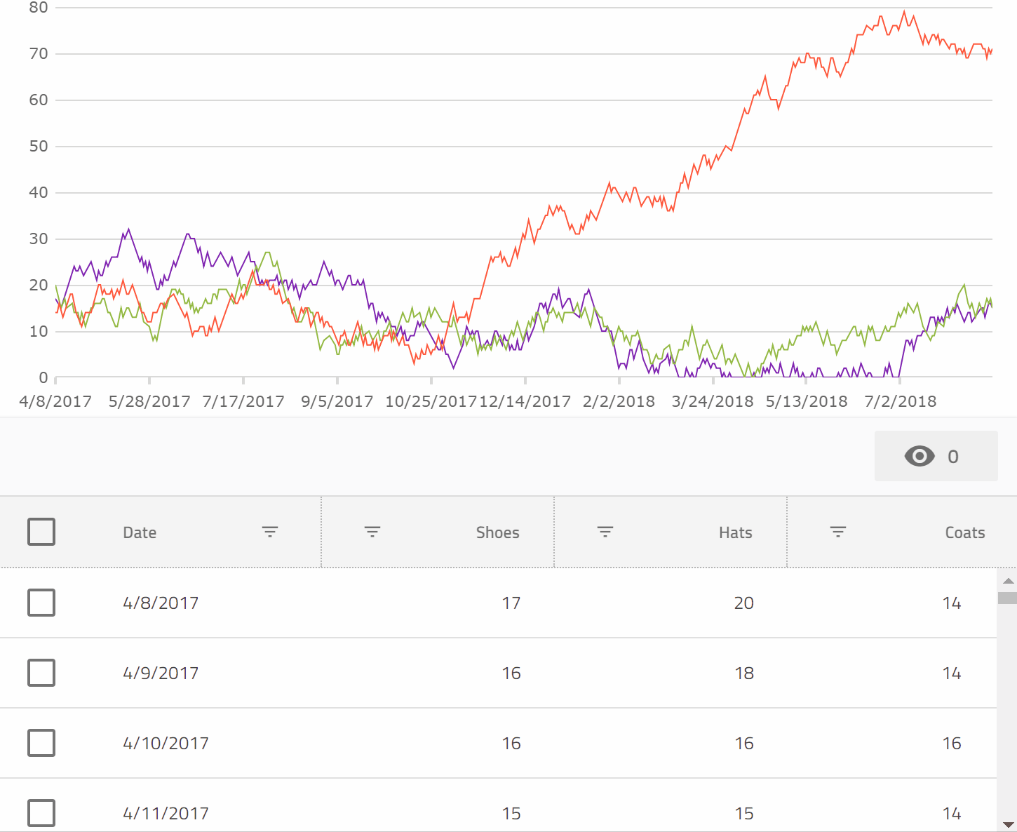
All we had to do in order to plot the data in the igx-category-chart was bind it to the dataSource property. That's it. The chart figured out everything else automatically.

Now we have both the chart and the grid pointing at the same data, but before we move on, we can clean up the visuals a bit with a couple tweaks. First, let's use a shorter date format for the Date column and the x axis, and exclude the index property from being plotted in the igx-category-chart by adding this code to the AppComponent class in app.component.ts:

  public excludedProperties: string[] = ["index"];
  
  public formatDate(val: Date) {
    return val.toLocaleDateString()
  }

  public formatDateItem(val: any) {
    return val.date.toLocaleDateString();
  }

And then, in app.component.html adding these properties to the igx-category-chart element:

  [xAxisFormatLabel]="formatDateItem"
  [excludedProperties]="excludedProperties"

and then amending the igx-column element for the date property to read:

<igx-column
  field="date"
  header="Date"
  [dataType]="'date'"
  sortable="true"
  filterable="true"
  [disableHiding]="true"
  [formatter]="formatDate">
</igx-column>

excludedProperties will tell the igx-category-chart not to consider a set of properties for inclusion in the automatic visualization it performs on the provided data shape. We'll be able to do some even more impressive things with this property next.

Connecting Things Together

Since the igx-grid has some UI gestures to let us show and hide columns, wouldn't it be great if we could have these visibility changes reflect themselves in the chart also? All we need to do is at this code to AppComponent:

onColumnVisibilityChanged(args: { column: any, newValue: boolean }) {
    if (args.newValue) {
      if (this.excludedProperties.indexOf(args.column.field) == -1) {
        let newArr = this.excludedProperties.slice(0);
        newArr.push(args.column.field);
        this.excludedProperties = newArr;
      }
    } else {
      if (this.excludedProperties.indexOf(args.column.field) >= 0) {
        let newArr = this.excludedProperties.slice(0);
        newArr.splice(newArr.indexOf(args.column.field), 1);
        this.excludedProperties = newArr;
      }
    }
  }

And then add this event binding to the igx-grid element:

(onColumnVisibilityChanged)="onColumnVisibilityChanged($event)"

This has the effect of updating the excludedProperties array, which is excluding properties from the igx-category-chart, every time the user shows or hides columns from the grid.

Now, that's cool, but we also made all the columns filterable right? So can we make sure that is reflected in the igx-category-chart also? No problem. While we are at it, we'll also have selecting some rows filter down to just those rows also!

First, let's add a few more event bindings to the igx-grid element in the app.component.html file:

(onRowSelectionChange)="onRowSelectionChange($event)"
(onFilteringDone)="onFilteringDone($event)"

These will fire when the row selection state changes, or the filtering changes are complete in the grid. So we just need to react to those changes by updating the data to which the chart is bound.

All we need is to implement those two event handlers:

  public onRowSelectionChange(args: any) {
    window.setTimeout(
    () => {
    let sel = this.grid1.selectedRows();
    if (sel == null || sel.length == 0) {
      this.chartData = this.data;
    } else {
      this.chartData = sel;
    }
    }, 0);
  }

  public onFilteringDone(args: any) {
    this.grid1.selectRows([], true);
    window.setTimeout(() => {
    this.chartData = this.grid1.filteredData ? this.grid1.filteredData: this.grid1.data;
    });
  }

These just take either the selected rows, or the current filtered view of the data, and assign those to the igx-category-chart. Super simple, but the results are very compelling.

You can see a preview here:

Or check out a running version on StackBlitz, and the code that powers it.

We truly have some very neat Data Visualization capabilities in Ignite UI for Angular now that we are excited for you to check out!

Cloud Creates Tooling Opportunities

$
0
0

By David Rubinstein

It’s no secret that Microsoft is all in on the cloud. From CEO Satya Nadella’s statement in 2014 that Microsoft would take a mobile-first, cloud-first approach to software development, to its reorganization in March to put Azure at the core of its efforts, the company has clearly shifted away from its Windows-centric view of the world.

The impact of that move on developer tools for Microsoft’s cloud platform has been almost as profound. SD Times news editor Christina Cardoza spoke with longtime Microsoft Regional Director Patrick Hynds to better understand what this strategic shift could mean for the Visual Studio ecosystem.

In the article, Hynds states: “I think that it offers some interesting challenges and tons of opportunity. The cloud is fast moving and that cries out with the need for better tooling. There are more niches being exposed every month where a tools provider can really carve out a world of their own.”

Visual Studio Update

Microsoft also released Visual Studio 15.8 last week. Among the new features are faster git branch switching, faster unit test execution, and TypeScript 3.0 support.

After this release, git branch checkout and branch switching for C#, VB, and C++ projects is much faster. This is because reloading is no longer required.

Angular Migration Tools

For AngularJS developers, Angular has created two migration tools to help move those applications to more modern web development standards with Angular. One of the tools assesses the current application to see which migration path is best, while the other creates a community forum in which developers can share their experiences and exchange thoughts and ideas. 

A Push Towards Windows 10

I used to have a Windows Phone, running the Windows 8.1 update, but finally had to give it up because so few apps were available for the phone. Last week, Microsoft announced it would no longer accept Windows 8 apps in its store, encouraging developers to create or update their apps for Windows 10 devices.

As of October 31, 2018, Microsoft will stop accepting new applications for Windows Phone 8.x or earlier and Windows 8/8.1 packages. According to the company, this will not affect existing apps. And, starting in July 2023, the company will no longer produce updates for Windows 8.

The People App

$
0
0

Overview and Walkthrough of the Sketch Design

We hope that you’ve already heard about Indigo.Design and one of the samples we provide with it, the People App. Infragistics’ design system provides unmatched design, usability, and code generation tooling to make collaboration between the different roles in an enterprise more fluent, rapid, and productive. Indigo.Design makes the tedious handoffs obsolete and embraces the true nature of lean product development, which you can experience hands on with the People App. 

People is a simple app that lets you browse through profiles and perform various operations on the People data such as editing their name and birthday among others, as well as adding and deleting a complete profile. With the People App, we exemplify an app creation process with Indigo.Design and have made the following resources available for you to try it yourself: 

This article will discuss the Sketch design containing four artboards. To clarify, the “People Home Drawer Open” is a state of the “People Home” with the navigation drawer opened, rather than a screen layout itself, therefore we will not dive into its details. Also, since “Edit Person” and “Add Person” artboards use a very similar layout, we will pick only one of the two. So, in the rest of the article, we will dive into the details of “People Home” and “Edit Person”. 

People Home 

The home screen of People holds the app navigation, as well as a list of people to the left and a profile layout to the right. The “People List” group results from the insertion, detaching from symbol and configuration of a “Generic List” from the Indigo-Components library. The most notable changes on the “Generic List” are content-related, such as the removal of its header item, and the use of a set of seven one-line list items to show the complete collection of profiles. The “People List” group is wrapped in another group, called “peopleList”, which is required for the List Component to generate code.  

To the right, a “peopleDetails” group is laid out, consisting of a background color, floating action button in the bottom right, and a centered layout of user profile UI elements in a group called “Information”. This group has fixed height and width and is positioned in the center of the “peopleDetails” group, which will instruct our code generation engine to define the necessary layout rules that would preserve this horizontal and vertical centering in the parent container in a responsive environment. Inside the “Information” group there are different elements and layout behaviors defined, which you may explore on your own after downloading the Sketch file for the People App.


Edit Person 

The “Edit Person” artboard shows a screen, through which the details for a selected person can be updated, but the high-level structure of the screen is very similar to “People Home”. Inside the “Content” group, which appears together with a background and a hidden confirmation dialog under “peopleEdit”, a more intricate layout has been designed. It uses a larger variety of Indigo-Components such as an Avatar, Icon and Raised Buttons, Inputs, Slider, Checkbox and Radio Buttons. The arrangement follows a row layout paradigm, therefore, where multiple components overlap on a horizontal row, the row is “wrapped” as a Sketch group. Such is the case of the Text used as the label of the Slider and the Slider itself, or the three Raised Buttons at the bottom. Groups are sometimes automatically established like for the File Upload Pattern, which upon detaching to generate code assets, creates a group “File Upload”. Each group or element that constitutes a row has resizing properties that define the behavior of its width on the horizontal axis and preservation of margins to the neighboring elements on the vertical one. This has been achieved by pinning to the left, top, and right and fixing the height of the elements like the “Name”, “Birthday”, “Gender”, “Ranking Group” and “IsAdmin” that span from the left to the right border of their parent group. 


That wraps up our People App, and to learn the nuts and bolts of the Indigo.Design UI Kits, feel free to download and inspect the file yourself, but why not also design an additional screen or two. If you are completely fresh to design systems and our take of them with Indigo.Design, there is a very good blog that will help you get your head around this awesome new concept and the amazing product we have put together. 

Simplifying Angular Data Binding to .NET Developers

$
0
0

At my job, I get the opportunity to talk to many .NET developers who want to learn Angular. Often, I’ve seen that they bring their .NET skills and work to map that in the learning of Angular. While the effort and drive to learn is there Angular is not .NET.

Since Angular is a pure JavaScript library, I’ll simplify basic but important concepts of Angular to .NET developers in this post series.  

In this article, we’ll learn about Data Bindings in Angular. Luckily, Data Binding in Angular is much simpler than in .NET.  

First, Let’s revise some of data binding techniques in .NET. For example, in ASP.NET MVC, you do data binding using a model. View is bound 

  1. To an object
  2. To a complex object
  3. To a collection of objects

Essentially, in ASP.NET MVC, you do data binding to a model class. On the other hand, in WPF, you have data binding modes available. You can set the mode of data binding in XAML, as follows:

  1. One-way data binding
  2. Two-way data binding
  3. One-time data binding
  4. One-way to source data binding

If you are following MVVM patterns, then you might be using INotifyPropertyChanged interface to achieve two-way data binding. Therefore, there are many ways data bindings are achieved in world of .NET.

 Data binding in Angular, however,  is much simpler.

If you are extremely new in Angular, then let me introduce you to Components. In Angular applications, what you see in the browser (or elsewhere) is a component. A component  consists of the following parts:

  1. A TypeScript class called Component class
  2. A HTML file called Template of the component
  3. An optional CSS file for the styling of the component

In Angular, Data Binding determines how data will flow in between Component class and Component Template.

Angular provides us three types of data bindings. They are as follows:

  1. Interpolation
  2. Property Binding
  3. Event Binding

Let’s see each one by one.

Interpolation

Angular interpolation is one-way data binding. It is used to pass data from component class to the template. The syntax of interpolation is {{propertyname}}.

Let’s say that we have component class as shown below:

export class AppComponent {
 
      product = {
          title: 'Cricket Bat',
          price: 500
      };
 
  }

We need to pass the product from the component class to the template. Keep in mind that to keep example simple, I’m hard coding the value of the product object, however, in a real scenario, data could be fetched from the database using the API.  We can display value of the product object using interpolation, as shown in the listing below:

<h1>Product</h1> <h2>Title : {{product.title}}</h2> <h2>Price : {{product.price}}</h2>

Using interpolation, data is passed from the component class to the template. Ideally, whenever the value of the product object is changed, the template will be updated with the updated value of the product object.

In Angular, there is something called ChangeDetector Service, which makes sure that value of property in the component class and the template are in sync with each other.

Therefore, if you want to display data in Angular, you should use interpolation data binding.

Property Binding

Angular provides you with a second type of binding called “Property Binding”. The syntax of property binding is the square bracket []. It allows to set the property of HTML elements on atemplate with the property from the component class.  

So, let’s say that you have a component class like the one below:

export class AppComponent {
 
       btnHeight = 100;
       btnWidth = 100;
   }

Now, you can set height and width properties of a button on template with the properties of the component class using the property binding.

<button 
  [style.height.px] = 'btnHeight'    [style.width.px] = 'btnWidth' >        Add Product
</button >

Angular Property Binding is used to set the property of HTML Elements with the properties of the component class. You can also set properties of other HTML elements  like image, list, table, etc.  Whenever the property’s value in the component class  changes, the HTML element property will be updated in the property binding.

Event Binding

Angular provides you third type of binding to capture events raised on template in a component class. For instance, there’s a button on the component template and, on click of the button, you want to call a function in component class. You can do this using Event Binding. The syntax behind Event Binding is (eventname).

For this example, you might have a component class like this:

export class AppComponent {
 
     addProduct() {
         console.log('add product');
     }
 
 }


You want to call addProduct function on the click of the button on the template. You can do this using event binding:

 
<h1>Product</h1><button (click)='addProduct()'>    Add Product
</button>

You can do event binding with all events of a HTML elements which is part of Angular ngZone. You can learn more about it here.

Angular provides you these three bindings. In event binding, data flows from template to class and, in property binding and interpolation, data flows from class to template.

Two-Way Data Binding

Angular does not have built-in two-way data binding, however, by combining Property Binding and Event Binding, you can achieve Two-Way Data Binding.

Angular provides us a directive, ngModel, to achieve two-way data binding, and It’s very easy to use. First, import FormsModule and then you can create two-way data binding:

export class AppComponent {
 
     name = 'foo';
 }


We can two-way data bind the name property with an input box:

<input type="text" [(ngModel)]='name' /><h2>{{name}}</h2>

As you see,  we are using [(ngModel)] to create two-way data binding in between input control and name property. Whenever a user changes the value of the input box, the name property will be updated and vice versa.

As a .NET developer, now you might have realized that data binding in Angular is much simpler, and all you need to know is four syntaxes. I hope you find this post useful and, in further posts, we will cover other topics of Angular.  

 If you like this post, please share it. Also, if you have not checked out Infragistics Ignite UI for Angular Components, be sure to do so! They have 30+ material based Angular components to help you code web apps faster.

Using Inedo’s ProGet to Manage Infragistics NuGet Packages

$
0
0
Infragistics' Xamarin and Inedo's ProGet to manage NuGet packages.(read more)

Working with Firebase Firestore and the Ignite UI for Angular Grid

$
0
0

In this article, w’ll learn to use Firebase Firestore and the Ignite UI for Angular Grid. The Firestore is Firebase NoSQL database offering so, before you start, I recommend that you to learn more about both Firestore and Ignite UI for Angular.

In this article, we’ll learn to read data from Firestore and bind that data to the Ignite UI for Angular Grid. In next article for this topic, w’ll move through Create, Delete, and Update operations.

So, let’s begin with setting up Firestore, creating Angular project to work with Ignite UI for Angular, and then fetching data from Firestore.

Setting up Firestore


You’re going to navigate to the Firebase console. When you’re there, click on the “Add project” option.

After clicking on “Add project”, you will get a dialog window to provide project information. Enter into that to create project as shown in the image below. Here, I have given the project name iggridemo.

Once project is created, you need to add an app to the project. We’ll add a web project, as we’re going to use Firestore data collection inside Angular, which is a web project.

As you click on the web option, you’ll get snippet to add to your project. Copy this snippet, since you may need it later to add into an Angular project.  

Note:  We will add the below setting in Angular project environment.prod.ts file.

Next, click on “Database” in the side menu options and create a collection. Keep in mind that Firestore is NoSQL based database. Here we create collections to work with data. To create a database, go to the side menu and click on database, then creating the database. You’ll be asked to select your security rules. Select option “Start in test mode” and click on “Enable”.

After setting up security rules, click on “Add collection” to add a collection to the database.

Give a name to the collection. For this example, I gave the name here “products”.

After creating the collection, add a document. I’m adding a document in the products collection, as shown in the image below:

After adding first document, the database should look like this: 

Now, let’s add a few more documents to the collection. For that action, click on “Add document” in the products collection. 


So, I’ve added five documents to the products collection. We’re going to work with the products collection now in the Ignite UI for Angular Grid. So far, we’ve only created the collection in Firebase Firestore.

Setting up an Angular project with Ignite UI

We have three options for setting up anAngular project with Ignite UI for Angular.

  1. Use Ignite UI CLI to create a new Angular project configured with Ignite UI for Angular.
  2. Use Ignite UI for Angular in an existing Angular project.
  3. Use Ignite UI for Angular Toolbox Extension for Visual Studio Code.

 From this point forward, I’ll assume that you already have an Angular project configured to work with Ignite UI for Angular.  

Setting up AngularFire

We’re going to use the AngularFire library to work with Firebase in an Angular projectTo start, install AngularFire in the Angular project using npm.

 npm install firebase @angular/fire --save 

After installing Angularfire, we need to setup a Firebase environment. To do that, open environment.prod.ts and modify it, as shown below:

export const environment = {
    production: false,
    firebase: {
        apiKey: "yourkey",
        authDomain: "iggriddemo.firebaseapp.com",
        databaseURL: "https://iggriddemo.firebaseio.com",
        projectId: "iggriddemo",
        storageBucket: "iggriddemo.appspot.com",
        messagingSenderId: "1055912852453"    }
};

If you recall from setting up Firestore, we added a web project. We need to copy that setting from there to environment.prod.ts file. If you’re working in a development environment, you may want to add the above entry in the environment.ts file. 

Next, in AppModule, import Firestore and AngularFire modules. Import in app.module.ts, as below:

import { AngularFirestoreModule } from '@angular/fire/firestore';
import { AngularFireModule } from '@angular/fire';
import { environment } from '../environments/environment';

Modify AppModule:

@NgModule({
    declarations: [
        AppComponent
    ],
    imports: [
        BrowserModule,
        BrowserAnimationsModule,
        IgxGridModule.forRoot(),
        AngularFireModule.initializeApp(environment.firebase),
        AngularFirestoreModule
    ],
    providers: [],
    bootstrap: [AppComponent]
})
export class AppModule {
}

Now, we’ve added AngularFireModule and AngularFireStoreModule in imports array.

Read Data from Firestore Collections

We’re going to read data from Firestore collections in AppComponent. First, import AngularFirestore and Observable in AppComponent.

import { AngularFirestore } from '@angular/fire/firestore';
import { Observable } from 'rxjs';

Next, let’s fetch data in the constructor of the component:

items: Observable<any[]>;
constructor(private db: AngularFirestore) {
    
    this.items = db.collection('/products').valueChanges();
 
}

If you remember, we have created a products collection in Firestore. Putting everything together, AppComponent will look like below:

import { Component } from '@angular/core';
import { AngularFirestore } from '@angular/fire/firestore';
import { Observable } from 'rxjs';
 
@Component({
    selector: 'app-root',
    templateUrl: './app.component.html',
    styleUrls: ['./app.component.css']
})
export class AppComponent {
    title = 'Ignite UI for Angular Grid + Firestore';
    items: Observable<any[]>;
    constructor(private db: AngularFirestore) {
 
        this.items = db.collection('/products').valueChanges();
 
    }
}

On the template, let’s add Ignite UI for Angular Grid:

<h1>    Welcome to {{ title }}!
</h1><igx-grid [data]="items | async" [autoGenerate]="false" height="400px">    <igx-column field="Id" [sortable]="true" header="Id" [filterable]="true"></igx-column>    <igx-column field="Title" [sortable]="true" header="Title" [filterable]="true"></igx-column>    <igx-column field="Price" [sortable]="true" header="Price" [filterable]="true"></igx-column>    <igx-column field="Quantity" [sortable]="true" header="Quantity" [filterable]="true"></igx-column>    <igx-column field="inStock" [sortable]="true" header="Stock" [filterable]="true"></igx-column></igx-grid>

So, let’s talk through the code, since we:

  • Added igxGrid
  • Set data through property binding to items. Since it is an observable, we are using async pipe.
  • Set autoGenerate property to false because we are going to add columns manually.
  • Configured columns and bound it to the Firestore collection products columns.

On running the application you will find the Ignite UI for Angular Grid is displaying data from Firestore. For products, collection igxGrid should be rendered, as shown in the image below:

In next post, we will see how we can perform Create, Update, and Delete operations. I hope you find this post useful, and now you should able to work with Firebase Firestore and Ignite UI for Angular Grid with ease.

If you like this post, please share it. Also, if you have not checked out Infragistics Ignite UI for Angular Components, be sure to do so! They have 50+ Material-based Angular components to help you code web apps faster.

Designing a User Profile: How to Use Overrides

$
0
0

By Dainail Marinov

No matter the type of software project UI/UX designers have their hands on – apps for fintech, blockchain, or e-commerce – almost all projects share one screen in common. In this case, we’re talking about the part of an app containing the user’s personal info…his profile.

Yes, on the surface, everything looks like a piece of cake. We should include an image, name, password, and save button, plus various option settings. While all this holds true, this simplicity only applies to run-of-the-mill scenarios. When diving deeper into a concrete business case of a software product, the user profile screen is likely to become a bit more complicated. From inner levels to billing and verification – when it comes to the profile screen – the devil is in the details.

If you have to design a component-rich user profile case,it's time to gear up; you’ll confront a few challenges defining the best UX scenario and picking the optimal components to represent it. Then, after performing UX tests on the initial prototype iteration, it’s time for changes and improvements of the wireframes. And yes, we would need to make the wireframe improvements as soon as possible.

Furthermore, let’s stick to this familiar phrase, “As soon as possible!”, and let me show you how to use the pixel-perfect predefined Sketch Components and Indigo.Design patterns to build up our UX concept.

Let's Begin

With the initial paper sketches already done, we’re in front of the screen and ready to begin with Sketch. Here comes the first neat surprise (let’s stick to using surprise only for positive vibes):

We don’t need to lose time thinking about how to start from the blank artboard when we use Indigo.Design UI Kits, because we can simply insert one of the patterns closest to our design concept.

As a member of the Indigo.Design product team, I’m excited to create more patterns that are going to aid in a variety of use cases. So, if you have a need for a specific use case, don’t hesitate to drop us a line. You can even attach a mock-up to illustrate it better.

The next step is to configure the existing User Profile Pattern according to our specific requirements. I’m going to keep the initial pattern next to the modified one to keep track of changes:

Here is the result after choosing a different profile image representation.

From the option situated under Avatar, we can quickly define the background color of the icon in the bottom-right corner, the icon type, text color, placeholder text, etc.

As you can see, the initial pattern provides several inputs, the first of which is represented in the focus state, while the rest are in the filled state. Of course, if we want to change the state, it can be done easily from State options.

For the current example, I chose idle state, so I receive that result. What’s rather useful when specifying an input is clearly describing its behavior. For example, noting whether a password is incorrectly or successfully typed. That can be set up from State dropdown again. After choosing the state that we want, the inputs are perfectly distributed vertically.

What if we want to change the layout of the input to show boxes instead of lines? No worries, just change it like this…

…and you receive a perfect-pixel boxed input. Needless to say, if you prefer that layout, better to stick to it for all other inputs.

Moving on, what if you wanted to have more complicated inputs including suffixes, prefixes, or icons? Our library provides easily editable templates that cover several cases. Let’s start with the initial condition.

Then, you can see how to get the input with prefix and suffix icons.

It’s likely you’ll just need to edit the icon which you can edit both for prefix and suffix color and icon type.

If we want to go even further and use another Component rather than and Input, we'll have to detach our Profile pattern and edit the smaller components. 


Very often we need a switch option when editing a profile, so let’s add and edit such a component from the Indigo library.

Since the pattern is already detached, I recommend deleting an input after adding another option, to use it as a base point for alignment.

After precise alignment, you can just stretch the switch component to fit between the offset.

Finally, just delete the input or field that you don’t need and edit the switch label.

In case of more complicated profile settings, we may need to add an item that navigates the user to another screen or deeper level. If we face this case, I recommend using a list item.

First, we add it as a component from the library, then we put it wherever we want on the screen and simply adjust its width to fix the screen size. Finally, don’t forget to change the label.

An important note that I would like to add: Don’t add a component from the Overrides menu. I know it is very tempting since it is positioned on the top of the components list, but it’s better first to add the initial form of the component than to configure it from the right option panel.

That’s all! As promised, using our Sketch UI library speeds up your productivity. But that’s just the beginning, as more exciting Indigo.Design capabilities (such as how to code generate your design) will be revealed in upcoming articles.


Coming to the Rescue of Calling All Cats Rescue

$
0
0

Calling All Cats

Soft-spoken but empowered, Sara told us, “My life isn’t mine, but I love it because I see all the good that I do.”  Sara Cameron is part of that small group of people who dedicate their lives to safeguarding the lives of our furry friends.  She runs an organization, Calling All Cats Rescue, located in Toms River, New Jersey. Though her journey started with a small kitten rescue, she now provides a home for over 200 cats. 

Over the years, Calling All Cats has grown into a safe haven for our other favorite four-legged companions. As goats, sheep, rabbits, and more graced the farm, Sara found another kind-hearted volunteer to help her along the way: Lori Richardson. Calling herself a “foster failure,” Lori rarely finds the heart to adopt out the animals she rescues. Both the animals and Lori find a home in each other, for the cats can’t help but clench their claws in Lori’s heart.  

While their hearts were in the right place, Sara and Lori struggled to gain the internet presence they required. Focusing on the farm was a full-time job alone and much of their time was dedicated to hands-on care. Posting on Facebook just wouldn’t cut it.  So, the team at Infragistics decided to lend a hand.  

Calling all Cats Rescue needed a website revamp. Our consulting team sat down, diagnosed the issues, and carried out a much-needed makeover. From pixel-perfect images and simplified navigation items to easy to find donation and volunteer forms, the site is now user-friendly and on trend. To quote Sara, “It’s central, it’s so easy to navigate…[and] it just makes life so much easier.”  

After Infragistics’ guidance, Sara and Lori are feeling extremely positive about the future. The new site will help them gain enthusiastic volunteers, animal-loving donors, and tender-hearted pet parents. And with the site’s fresh look, they hope all will remember, as Lori stated, that “they’re now bigger than just cats.”  

Take a look at the new Calling All Cats Rescue to see what we’ve done, and – if you’re in town – offer to lend a hand. We’re sure Lori and Sara’s sheer compassion will inspire you, as it did us. 

From Design to Code: Announcing Indigo.Design

$
0
0

Back in May, I announced our design to code vision for how visual designers, UX Architects, Product Managers, & Application Developers can participate in a collaborative software design and development process, allowing each stakeholder to use the tools they love the most, including Sketch, Indigo Studio and Visual Studio Code and the frameworks they love the most like Angular & Flutter.

Today I am excited to announce the release of Indigo.Design, a unified, cloud-based platform for visual design, UX prototyping, code generation and app development. 

Indigo.Design Design to Code Sketch & Angular

We believe that you'll get the best outcomes if we participate in the ecosystem of tools that you love the most and that give you the most productivity – we aren’t trying to wrestle you out of Sketch if you are a visual designer, or Indigo Studio if you are a UX Architect, or Visual Studio Code if you are a developer. We know you are most productive in the tools you use every day, all day, we aren’t asking you to change. We'll bring the tooling into your process, not the other way around. We won't force you down an uncomfortable path that will deliver less then amazing results. 

What you get with Indigo.Design

Indigo.Design includes four key components that make up the design to development process of creating amazing experiences, with the goal of ensuring that stakeholders are involved in the design process, and the elimination of the error-prone & tedious hand off of designs from designer to developer - Indigo.Design lets you generate code instead, delivering unparalleled team flow and productivity.

  • Design System - 50+ UI components surfaced as Sketch UI Kits that map to our Ignite UI for Angular UI toolset.  Designs created using these components will generate HTML, CSS & Angular code. We’ve also included 45+ UX/UI patterns and complete applications to jumpstart your design projects, plus a couple completed app designs that you can learn from. Our libraries are designed with extensibility in mind, allowing you to customize components or UX patterns easily for your brand needs.

  • Design Cloud– Is our cloud experience that has a few key features & benefits. An image-based prototyping tool with built-in group collaboration allows you to organize your teams around public and private workspaces. With image-based prototyping, you can Import your Sketch documents or images and then add interactions and transitions to show user flows, then share your prototype with others and view on any device.  Add to that the unmoderated usability studies feature, which lets you create task-based tests for your prototypes, and we’ll record audio & video, so you can watch your users interact with your prototypes all while returning real-time analytics and reports as tasks are completed.

  • Design Code Generation Service: Is surfaced via a Visual Studio Code extension that links your cloud-based designs to your development team. Use the URL generated from your Indigo.Design prototype to access your prototype from the Visual Studio Code extension, select the components or views you want HTML, CSS & code for, and with 1 click, we’ll generate best-practices Angular code and add it to your application.

  • Ignite UI for Angular: 50+ Material-based UI components designed and built on Google's Angular framework, including the fastest Angular data grid and data chart on the market. Each symbol in the Sketch UI kits map to our Angular components, ensuring full-featured, enterprise ready capabilities in your apps.

Who can benefit from using Indigo.Design?

Indigo.Design can help anyone that uses Sketch & Angular bring productivity in their teams and drive amazing experiences to their customers.

  • Development managers can get unparalleled team flow and productivity. Combine UX guidance and Sketch Libraries for the designers with the powerful Indigo Studio for prototyping and user testing and bringing it all together in an Ignite UI for Angular project.
  • UX Architects can share, collaborate, & test the experience with users. With an Indigo.Design prototype, they get user videos and analytics from usability studies to decide on the right design before coding.   
  • Sketch designers can craft best-in-class, functional designs using our components & UX patterns in the expressive Indigo Design System with Sketch UI kits. Extensibility is built in with easy customization to match the brand experience their app needs.
  • Angular developers can skip handoffs - everything a design team crafts in Sketch from the design system matches our Angular components, so there is 100% certainty in the outcome of high-quality HTML, CSS & Angular code from the design.    

What about Flutter? What about React?

My original post around Design to Code was all about Flutter (http://flutter.io), a killer new mobile framework from Google that seems to be taking the world by storm. Flutter is super exciting to us; at Goggle I/O we demoed an early version of our code generator for Flutter from a Sketch design with Indigo.Design. We are working on Flutter now, stay tuned for access to Flutter beta's in Q3.

We are investing in React controls now - by Q4 this year, you'll see new a new React Data Grid, React Chart, React Financial Chart, 100% framework-free - no 3rd party dependencies.  Just like our Angular Grid & Charts, we are focused on high-volume, real-time data scenarios and will bring the fastest React grid and charts to the market.  Following that, we'll ship React code generation as part of Indigo.Design.

For the complete roadmap on Indigo.Design, visit: https://www.infragistics.com/community/blogs/b/infragistics/posts/indigo-design-2018-roadmap

Availability & Pricing

Indigo.Design is available today for immediate trial and purchase. We’re offering 2 pricing models for the Enterprise SKU that includes everything described in this blog post. There is a yearly subscription for $995 or a very attractive $99 per month option. Check out the pricing page here:

https://www.infragistics.com/products/indigo-design/pricing

Wrap Up & Resources

I hope you are as excited as we about Indigo.Design and its potential to help design & development teams build amazing app experiences while reducing time, cost and rework.

We have a lot of guidance – help, videos and samples - to help you get started and successful on day 1, get started here:

Please visit the Forums for help if you need: https://www.infragistics.com/community/forums/f/indigo-design.

If you have any other questions, comments, feedback, shoot me an email at jasonb@infragistic.com. In the mean-time, get started today by going to http://indigo.design and sign up for your trial!

Infragistics Windows Forms Release Notes - September 2018: 17.2, 18.1 Service Release

$
0
0

Release notes reflect the state of resolved bugs and new additions from the previous release. You will find these notes useful to help determine the resolution of existing issues from a past release and as a means of determining where to test your applications when upgrading from one version to the next.

Release notes are available in both PDF and Excel formats. The PDF summarizes the changes to this release along with a listing of each item. The Excel sheet includes each change item and makes it easy for you to sort, filter and otherwise manipulate the data to your liking.

In order to download release notes, use the following links:

Windows Forms 2017 Volume 2 Service Release (Build 17.2.20172.2097)

PDF - Infragistics for Windows Forms 2017 Volume 2
Excel - Infragistics for Windows Forms 2017 Volume 2

Windows Forms 2018 Volume 1 Service Release (Build 18.1.20181.237)

PDF - Infragistics for Windows Forms 2018 Volume 1
Excel - Infragistics for Windows Forms 2018 Volume 1

Windows Forms UI Controls

Infragistics WPF Release Notes - September 2018: 17.2, 18.1 Service Release

$
0
0

Release notes reflect the state of resolved bugs and new additions from the previous release. You will find these notes useful to help determine the resolution of existing issues from a past release and as a means of determining where to test your applications when upgrading from one version to the next.

Release notes are available in both PDF and Excel formats. The PDF summarizes the changes to this release along with a listing of each item. The Excel sheet includes each change item and makes it easy for you to sort, filter and otherwise manipulate the data to your liking.

In order to download release notes, use the following links:

WPF 2017 Volume 2 Service Release (Build 17.2.20172.2188)

PDF - Infragistics for WPF 2017 Volume 2
Excel - Infragistics for WPF 2017 Volume 2

WPF 2018 Volume 1 Service Release (Build 18.1.20181.237)

PDF - Infragistics for WPF 2018 Volume 1
Excel - Infragistics for WPF 2018 Volume 1

WPF UI Controls

Infragistics ASP.NET Release Notes - September 2018: 17.2, 18.1 Service Release

$
0
0

With every release comes a set of release notes that reflects the state of resolved bugs and new additions from the previous release. You’ll find the notes useful to help determine the resolution of existing issues from a past release and as a means of determining where to test your applications when upgrading from one version to the next.

Release notes are available in both PDF and Excel formats. The PDF summarizes the changes to this release along with a listing of each item. The Excel sheet includes each change item and makes it easy for you to sort, filter and otherwise manipulate the data to your liking.

Download the Release Notes

ASP.NET 2017 Volume 2

ASP.NET 2018 Volume 1

Viewing all 2398 articles
Browse latest View live