Quantcast
Channel: Infragistics Community
Viewing all 2398 articles
Browse latest View live

Bind JSON to HTML table using the Ignite UI data source in three simple steps

$
0
0

IgniteUI DataSorce or igDataSource is a component of the Ignite UI framework. It binds various UI components to the data of the various forms like JSON, XML etc.

Step 1: Creating the Data

Let us say you have a JSON data as shown in the listing below:

var populationData = [
    { "CountryName":"China", "1995":1216, "2005":1297, "2015":1361, "2025":1394 },
    { "CountryName":"India", "1995":920, "2005":1090, "2015":1251, "2025":1396 },
    { "CountryName":"United States", "1995":266, "2005":295, "2015":322, "2025":351 },
    { "CountryName":"Indonesia", "1995":197, "2005":229, "2015":256, "2025":277 },
    { "CountryName":"Brazil", "1995":161, "2005":186, "2015":204, "2025":218 }
    ];

Data could be in the following form,

  • Plain JavaScript array
  • JSON object
  • XML

In real projects data will be pulled in the system from the remote services. Remote service could be WCF, REST or Web API.

Step 2: Create the render function

Let us say we have a requirement to render the data in a HTML table. We have created a HTML table as shown in the listing below:

<table id="t1"><thead><tr><th>Name<th><th>1995<th><th>2005<th><th>2015<th><th>2025<th><//tr><thead><tbody><tbody><//table>

Next to render the table we need to,

  • Create template using the jQuery template. In the template we are using the column name from the key of the JSON data.
  • Attach the template to HTML table
  • Create data view on the data source and attach to the HTML table

Render table function can be written as shown in the listing below:

var renderTable =function (success, error) {var template ="${CountryName}${1995}${2005}${2015}${2025}";if (success) {
            $("#t1 tbody").empty();
            $($.ig.tmpl(template, ds.dataView())).appendTo("#t1 tbody");
        } else {
            alert(error);
        }
    } 

Step 3: Create the igDataSource

In the last step we need to create the data source from the JSON data. In Ignite UI, igDataSource connects the data and the view. igDataSource can be created as shown the listing below:

var ds =new $.ig.DataSource({
        type:"json",
        dataSource: populationData,
        callback: renderTable
    });
    ds.dataBind();

We need to set the value for the datasource and the callback properties. Datasource property is set to the JOSN array and callback property is set to the renderTable function. In the renderTable function we are creating the template and rendering the table.

Running the application

On running the application, we will get JSON data rendered in the HTML table using the igDataSource. Rendered table should look as shown in the image below:

I hope you find this post useful. Thanks for reading.


Public Speaking 101

$
0
0

Gearing up to deliver a talk that lasts  Public Speaking

Who hasn’t been to a conference at least once in their lifetime? At the end of the day we usually reflect on the speakers and their performance. Some speakers did well, others not so and yet there are the few, who seem to have been way out of everyone’s league. Of course, we always return to this last group and discuss it the most. Inevitably someone makes the statement “They were born with the talent to speak well in front of an audience”. When I was born nearly thirty years ago I don’t remember myself talking the very next minute, despite the audience of family, unfamiliar to me until that very moment. Correct me if that is not true for 21st century babies, but barring some evolutionary leap in language development and motor skills, we are not likely to meet anyone born with the talent to speak well in front of an audience.

Having delivered a few talks myself, I started noticing trends and wanted to share them with you. I believe that if you build the right habits and create a plan to gear up for your talk, the likelihood that your performance will last in the memories of the audience will significantly increase. So, reflecting on the times when the audience was patiently listening to me… and the times when they counted the seconds to the end… and those one or two occasions when their eyeballs seemed to enlarge and almost pop just before the applause, I will share a few of my public speaking tips hoping that you will put them into action and deliver an outstanding presentation.

Bold beginning, bold end. I’ve seen people make a joke or put on a silly hat to break the ice. These affectations may work but make sure to pick an inoffensive joke and try not to make a fool of yourself. Being a joker is not a good first impression if you want to plant some serious ideas later on. At the end of your presentation, try leaving your audience with a question that will keep them thinking for a day or two.

Short sentences and simple words. Don’t prepare a script and try to learn it by heart. Having a few points on each slide to talk about, expressing them in simple language will put you on the right track. Preparing slides is a beast on its own and I will not cover it here, but make sure that you don’t read from the slides– the audience is there to hear you speak, not to watch you read. And it should go without saying, avoid turning your back toward the audience.

Tailor your talk. Pick images and examples that make most sense for the expected of audience. Missing the target might be bad, but being too general is even worse. Spend a little extra time to research what sort of people are likely to attend the event and who went on its last occasion.

Show actual stuff. People believe their eyes, and when you are telling a story your slides serve as a visual confirmation for your words. But if you really want to impact the audience, you will probably need to get your hands dirty and search your home, garage or ceiling for some unique objects that reinforce your ideas. I remember my talk on emotional design last year when I took out an apple peeler that looked like torture tool from the Inquisition. It served its purpose well and stressed my point about the different aspects that drive user desire when purchasing a product.

11426389_971562072878414_2205054990259075856_o

The author and his Inquisition-like apple peeler. Image attributed to: the UX Sofia 2015 team.

It doesn’t have to be something special. Something that anyone can find in their house is even better! What’s needed, however, is something that reinforces your ideas and arguments in a special way – a function of the object that people did not realize until this very moment.

These four tips are a good beginning, but I have many more observations to share, so expect a second part of this blog in the very near future. However, that does not mean you need to wait for it without taking action. If you have the opportunity, use these four tips now and let me know how it goes.

Is programming similar to composing music?

$
0
0

Over the last couple of decades, computer scientists with an interest in both musical composition and programming have managed to marry the two together. Artificial Intelligence can now compose music that is practically indistinguishable from that which is created by professional musicians.

It’s no secret that many professional developers have a real passion for music, and many musicians dabble in computer programming too. For example, Elvis Costello, the prolific British musician who’s been described as ‘the finest songwriter of his generation’ operated an IBM 360 in the 1970s before his musical career took off.

You can see why people might be drawn in by both concepts; There’s a lot that composing melodies and writing algorithms have in common. On the surface the two may seem quite disparate, but there is a creative side to developing, and a mechanical side to composing. So, just how similar is programming to composing music?

You’ve got the music in you

Let’s first take a look at the similarities between composition and programming.

 1.   They are both about following logical rules.

Composing music, just like programming, requires what the Ancient Greeks called the Trivium. You need:

  1. Grammar: a solid grasp of the fundamentals – be that musical notation and theory or knowledge of programming language rules
  2. Logic: you need to be able to create ‘logical arguments’. When writing music or code you need to follow logical rules to get the ‘moving parts’ to work together correctly.
  3. Rhetoric: as well as following grammar and logic, you need to be able to persuade listeners and users of new approaches to standard practice.

Without following the fundamentals of composition or development, things just don’t work. A haphazardly written program will be full of bugs, in the same sense an ill-formed chord structure will create dissonance.

 2.   They are about making something beautiful from small parts

To be a great pianist, you must first practice and perfect the basics: simple, repetitive scales and arpeggios. To be a great developer, you need to spend a lot of time ensuring even the simplest expressions are elegantly and correctly coded. Once you have the small pieces in place, you’re then able to build something greater, which is equally as important:

 3.   You need to be able to see the bigger picture

Just as a composer must consider all the different sections of the orchestra and how they will gel together, a developer needs to hold an abstract ‘bigger picture’ in their head as they start building their program’s architecture. Both disciplines are about building up towards something bigger and better.

 4.   Self-expression is key

Music and software development both require creativity and self-expression; both are about cultivating your own style and creating something new and inspiring.

 5.   You need to be technically engaged

Musicians and developers need to spend a long time thinking about how their creations will interact with other outputs, and in the hands of ‘end users’. A composer may add accent marks to instruct members of the orchestra the style in which to play. A guitarist may want to think about using external hardware (amps, effect pedals etc.) or how they want their song to be produced in the studio. Developers similarly need to bear in mind how others will use their end-products, on which kind of device and in what context.

 6.   They both include collaborative and individualistic aspects

Mozart might have spent a lot of time alone working out how his next composition would sound, yet his skillset also required working with others – namely the musicians he was conducting. Similarly, the most successful developers can’t be pure introverts; they need to collaborate with end users, managers, UX designers and so on.

I’m no musical dev

While there are a lot of things these disciplines hold in common, it’s worth hearing out the arguments against. Not every developer is set out to be the next Beethoven!

 1.   Is this kind of comparison just a way that we as developers puff up our egos?

As the author of the Coding Horror blog argues, comparisons that developers draw between their craft and painting, music or other art forms could be seen more as self-aggrandizement than a real comparison. Of course, we’d all like to think that the app we’re building is just as wonderful as the best of Gershwin, or that the website we just designed has the same lasting impact as Miles Davis’ Kind of Blue. But let’s be honest, it’s not quite the same thing, is it?

 2.   Programming is about solving a problem

When you’re asked to design an app, for example, it’s usually in order to solve a specific business or consumer problem. Developers excel at solving this kind of issue, yet can this really be compared to music? At its purest, composition should be about representing and inspiring pure feelings and emotion.

 3.   Programming has a very different purpose to music

When you develop any kind of tool, the final goal is for an end user to be able to do something specific with it. Say you’re building a business app – your creation should mean that the end user’s day to day tasks are facilitated. Music, by contrast, doesn’t really serve a specific ‘purpose’, beyond pure enjoyment.

Weighing the balance

The jury is still out on this one; while it’s clear that composition and development definitely hold certain factors in common, there are also a lot of areas where they diverge. What we do know is that both developers and musicians can enrich our lives and give us things we never knew we needed and which we now can’t live without.

Limited Time Offer: Get a Free Custom Mobile SharePoint Workspace in 30 Days or Less and Realize ROI

$
0
0

Your current SharePoint investment is already helping your organization collaborate and become more efficient. But do you realize SharePoint’s ROI when it comes to mobility?

With the latest release of SharePlus, the premier mobileSharePoint and collaboration solution, we’ve empowered enterprise teams to become even more efficient! With Custom Mobile Workspaces to give you a tailored experience, SharePlus enables teams to access content from multiple file sources on premise or in the Cloud from Sharepoint, OneDrive for Business, Dropbox, Google Drive and Network Drives.

Limited Time Offer: Realize ROI in 30 Days or Less

To help companies put themselves on the fast track to enable their modern workforce, Infragistics is offering businesses a free Custom Mobile Workspace that will have your team up and running in 30 days. Find out more about this offer.

What is a Custom Mobile Workspace? Custom Mobile Workspaces provide teams with a focused mobile SharePoint environment tailored to their needs or specific job roles. You can have everything you need from SharePoint, including data visualizations, in one mobile location with personalized and central access online or off.

SharePlus’ Custom Mobile Workspaces help you:

  • Stay connected and securely collaborate anywhere in the world.
  • Adapt SharePlus to your mobile workstyle.
  • Add rich data visualizations for over 20 data sources.
  • Keep content secure on the go with Enterprise security configurations.

Transform the Way You Work  

Take a look at some of our Mobile Workspace Solutions for a deeper dive:

Education

Faculty, students and alumni need to connect with each other and to the information and resources vital to the education process. Providing everyone with focused mobile workspaces available anywhere helps grow and engage a school’s community:

Figure 1 Sample Custom Mobile Workspace for Education

Executive

Leaders can make better informed decisions when they have a single secure portal on their mobile device to share and collaborate with access to all of their data:

Figure 2 Sample Custom Mobile Workspace for Executives

Field Service Operations

Perfection at a job site happens when a team has the full spectrum view of equipment maintenance records, access to related issues, and documentation, like in this example:

Figure 3 Sample Custom Mobile Workspace for Field Services

Professional Services

Service professionals need 24/7 secure access to project specific content on the go. By extending SharePoint to a custom workspace on their mobile devices, they can stay compliant and limit risk when managing projects and client engagements every day, remotely or onsite:

Figure 4 Sample Custom Mobile Workspace for Professional Services

Sales

From prospect-to-lead to a closed deal, mobile sales teams need access to valuable customer data and key resources on the go. Mobile access to SharePoint makes it possible for sales reps to win deals anywhere, anytime:

Figure 5 Sample Custom Mobile Workspace for Sales

Which is the most in-demand use case of your mobile workforce?

Whatever your needs might be, see them come to life with SharePlus. See if you qualify for a  Free Custom Mobile SharePoint Workspace by calling 1.800.231.8588 today or emailing us at 30DayROI@Infragistics.com - we look forward to hearing from you soon!

Create an IRC Bot using Python 2

$
0
0

What is IRC?

If you're unfamiliar with IRC (Internet Relay Chat) it is an application layer protocol used to facilitate chat with users all over the globe and has been around since the late 1980s and is still widely used to this day. There are several different IRC networks, so which one you chose to use comes down to your own personal preference.

Why Create an IRC Bot?

Simply put, IRC bots in general are simple and fun to create. They allow you to extend the functionality of a channel or even create fun interactive games for your channel. Basically, the sky is the limit in terms of possibilities for bot functionality, and when mixed with the ease of Python you can create a complex bot in very few lines of code.

How Do I Connect to the IRC Server?

The process for connecting to an IRC server is straight forward*.

  1. Connect to XXXX server on port XXXX (typically 6667)
  2. Send the USER command
  3. Send the NICK command
  4. Respond to any PING commands

* - It's important to note that some IRC servers differ in how you connect or the format of messages received, be sure to look up the reference information for the host you normally connect to.

Before connecting to the IRC server we'll setup the variables for server, botnick, the channel to join on connect and the boolean flags for sentUser and sentNick. The sentUser and sentNick boolean flags are used to determine whether or not those commands have been previously sent to the server during connection.

server = "ix.undernet.org"
channel = "#usa"
botnick = "uberbot" + str(random.randint(1, 10000))
sentUser = False
sentNick = False

Connect to XXXX server on port XXXX

To connect to a server a simple socket is created and then connected to by calling the connect method.

irc = socket.socket(socket.AF_INET, socket.SOCK_STREAM)
print "\nConnecting to:" + server
irc.connect((server, 6667))

Send the USER command

Next, register (and something authenticate) a user session with a short username and a human-readable realname. The command format looks like this.

USER (username) (hostname) (unused) (realname)

if sentUser == False:
   irc.send("USER " + botnick + " " + botnick + " " + botnick + " :This is a fun bot\n")
   sentUser = True
   continue

Send the NICK command

After the USER command, send the NICK command to specify your chat nickname. The command format looks like this.

NICK (nickname)

if sentUser and sentNick == False:
   irc.send("NICK "+ botnick + "\n")
   sentNick = True
   continue

Respond to any PING commands

IRC servers regularly send the PING command to connected clients to determine if they are still connected. To show you are connected each PING must be answered with a PONG and the supplied PING token. The PING command uses the following format.

PING (token)

if text.find("PING") != -1:
   irc.send("PONG " + text.split()[1] + "\n")

How Does My Bot Accept Commands?

To have your bot accept commands, you'll need to parse the input that comes from the buffer and then respond accordingly. Since IRC is text based the messages coming from the server are all easy to parse using regex or even a simple text find. The snippet below searches the message text from a channel or private message containing "!host". If found, the bot responds with the OS version information. 

if text.find(":!host") != -1:
irc.send("PRIVMSG " + channel + " :" + str(platform.platform()) + "\n")

Can I Just Have the Codez?

The source code below is the full listing of code used for this post.

import platform
import random
import socket
import sys

reload(sys)
sys.setdefaultencoding('utf8')

server = "ix.undernet.org"
channel = "#usa"
botnick = "uberbot" + str(random.randint(1, 10000))
sentUser = False
sentNick = False

irc = socket.socket(socket.AF_INET, socket.SOCK_STREAM)
print "\nConnecting to:" + server
irc.connect((server, 6667))

try:
   while 1:
      text = irc.recv(2048)
      if len(text) > 0:
         print text
      else:
         continue

      if text.find("PING") != -1:
         irc.send("PONG " + text.split()[1] + "\n")

      if sentUser == False:
         irc.send("USER " + botnick + " " + botnick + " " + botnick + " :This is a fun bot\n")
         sentUser = True
         continue

      if sentUser and sentNick == False:
         irc.send("NICK " + botnick + "\n")
         sentNick = True
         continue

      if text.find("255 " + botnick) != -1:
         irc.send("JOIN " + channel + "\n")

      if text.find(":!host") != -1:
         irc.send("PRIVMSG " + channel + " :" + str(platform.platform()) + "\n")

except KeyboardInterrupt:
   irc.send("QUIT :I have to go for now!\n")
   print "\n"
   sys.exit()

Where Can I Learn More?

The links below are great references for learning about IRC, IRC bots and the IRC protocol.

Data Visualization: What Is It and Why Does It Matter?

$
0
0

As the saying goes,“A picture is worth a thousand words”. But exactly how true might that statement be? There is an abundance of research out there regarding how we gather and retain knowledge most effectively, and the general consensus is that we remember pictures and images more readily than we remember words.

This makes a fair amount of sense when you consider that our brain is mainly an image processor, not a word processor. The part of our brain devoted to processing words is considerably smaller in comparison to the part that processes visual images. Words are abstract and altogether harder to retain, versus the more concrete manner of visuals; can you remember the last program you watched on TV? Probably. But trying to remember the last paragraph or sentence of the last thing you were reading (and no, this blog post doesn’t count!) is considerably more challenging.

[source]

While there are a select few that learn best when actively doing something, research shows that the majority of us are visual learners; we use images, pictures, colors and other visual stimuli to organize and learn information. The messages from visual content are transmitted to our brain much, much faster than text – 60,000 times faster, to be exact. Our eyes can register 36,000 visual messages per hour, and the brain can register images that last for just 13 milliseconds. The difference between the two is actually quite astounding. Given the above, in the average time it takes you to read this sentence you could have registered about 40 images… feeling unproductive? Fear not, in this post we’ll explore how you can use the visual power of the brain to express your data in striking and memorable ways.

2, 5 and 17 zeros

Today, we generate 2.5 quintillion bytes of data every day. The fact that we’re now dealing with numbers that we have to research to understand their value (it’s 2.5 Exabytes of data, for those wondering) should provide context that we’re dealing with a lot of data. With the power of the Cloud and mega-data centers, storing all this data isn’t yet an issue. Although as we continue to create more data than ever – and show no signs of ceasing to do so – the prospect of just how much is out there can be quite overwhelming.

Of course, the other way to interpret all this data is that there is now more content for us to understand and work with, and more ways we can express and showcase this data than ever before. Platforms like social media have created an intense desire (and opportunity) to share what we learn and experience with others, and this can be attributed to data visualization. With so much data available to business users, it’s important they have the appropriate tools to allow them to turn data into something they – and anyone they show it to – can visually understand.

Drive your data

In TechTarget’s essential guide to dashboard development and data visualization, the term itself is expressed as follows:

“an effort to help people understand the significance of data by placing it in a visual context… …used effectively, new data visualization tools and well-thought-out dashboard designs help streamline the visual presentation of large, complex sets of data for better decision making.”

Understanding the significance of data is, we think, the most telling part of this definition. Being able to effectively display your findings has always been a point of emphasis in business – whether it’s showing your data to colleagues, presenting it to your team or your boss. Engaging and relating to your audience is much harder if you’re simply speaking your message and pointing at words on a screen. A lack of engagement and interest is going to result in no one remembering your presentation in a week’s time, even if that presentation’s content held some insightful and important messages. Data visualizations, on the other hand, can help to convey messages with considerable weight and leave a real impact on your audience. In the modern working world, the ability to package relevant and meaningful information in a unified manner is invaluable and is why data visualization tools have skyrocketed in popularity over the past few years.

Data visualizations for the enterprise

ReportPlus, from Infragistics, is a dedicated data visualization app that lets users access all their data in a single space – whether it’s On-Premises, in local files, in Cloud storage software from Dropbox and Google Drive or in cloud apps like Salesforce. Dashboard and report access is  available on mobile devices (Android & iOS) and will soon be available on desktop. Real-time dashboards allow teams to make data-driven decisions with no gaps in information and users can share dashboards securely through email, the Cloud or as a presentation in PowerPoint.

ReportPlus really plays into our definition of ‘understanding the significance of data’. Rather than a tool that breaks existing decision making workflows, or requires a dedicated expert or team to setup and master, ReportPlus really can provide ‘Insights in an instant’. From adhoc roundtable discussions, to board presentations, or decision making in the field – ReportPlus pulls out the significance of data right there in the palm of the user’s hand when they need it most.

Once data has been connected, compelling visualizations can be dragged and dropped into place quickly and easily – and then shared. Imagine a typical boardroom scenario:

A presentation of a business case is going well, but a ReportPlus visualization on the big screen really sells the idea. The deal is sealed when you point the board to the hosted version of the data, allowing them to connect to the dashboard right there on the devices in their pockets.

At Infragistics, we understand that the enterprise is a prime destination for data visualizations to take control; ReportPlus offers support for data sources such as Oracle, Analysis Services, SQL Salesforce and Microsoft Dynamics CRM. Combining the power of the enterprise with the flexibility of mobile apps, ReportPlus lets you create and share striking visualizations wherever you may be.

Create Tappable Content Within the IGLabel (Obj-C)

$
0
0

What is the IGLabel?

What is the IGLabel?

The IGLabel is an iOS control for creating rich text labels. It works similarly to the generic UILabel and applies styles to text in a similar fashion that is done when using attributed strings. It is also based on Core Text to boost performance and functionality over the generic UILabel.

What is Tappable Content?

Tappable content is series of characters, words or sentences that allow interaction by tapping them. The IGLabel allows this interaction by setting an attribute over a matching regular expression or specific text location. When tappable content is tapped using the IGLabel, the labelTap:tapText:tapValue IGLabelDelegate method is called. This method provides the label tapped, the text receiving the tap and the value applied to the text through the styling attribute.

How Do I Create Tappable Content?

The first step in creating tappable content is to set the text property on an instance of the IGLabel.

_label.text = @"The IGLabel contains tappable content.";

Next create an NSDictionary containing the tap attribute. Any NSObject can be used for the tap attribute.

NSDictionary *attributes = @{IGTextStyleTapAttributeName : @"Imaginary Value"};

Finally, add the attributes dictionary to the IGLabel.

[_label addAttributes:attributes forRegEx:@"tappable\\scontent" error:nil];

Once the attribute has been added to the IGLabel, the text "tappable content" can be tapped.

[custom] width="400" height="600" src="https://appetize.io/embed/5z44ep6xc5jnvv5anzjbb6v34g" [/custom]

Where Can I Learn More?

The reference links below provide more information about the IGLabel and the styling aspects it supports.

By Torrey Betts

Using the IGOverlayView to Display a Toast Message (ObjC)

$
0
0

What is the IGOverlayView?

The IGOverlayView is a powerful and extremely flexible control for displaying any type of view that will overlay another view, with or without animation, when shown or dismissed. A total of 12 overlay animations are included, with 2 of these animation types allowing for custom animations limited by your imagination.

What is a Toast Message?

A toast message is an brief auto-expiring information dialog. Typically used in mobile devices to show visual feedback when turning the volume up/down or application actions such as notifying the user a file has saved.

What is a Toast Message?

How Do I Create a Toast Message Using the IGOverlayView?

The first step in creating a toast notification is to initialize the IGOverlayView. The IGOverlayView will provide the transparent dark appearance over a view and animate the toast message to and from the screen.

_overlay = [[IGOverlayView alloc] init];
_overlay.backgroundColor = [UIColor colorWithWhite:0.3 alpha:0.5];

Next, initialize a UILabel with a fixed size and a white background to serve as the toast message. The center property is also set to place the toast message directly in the center of the view. After configuring the UILabel is added as a subview of the IGOverlayView.

_toastLabel = [[UILabel alloc] initWithFrame:CGRectMake(0, 0, 200, 100)];
_toastLabel.backgroundColor = [UIColor whiteColor];
_toastLabel.textAlignment = NSTextAlignmentCenter;
_toastLabel.numberOfLines = 0;
_toastLabel.layer.masksToBounds = YES;
_toastLabel.layer.cornerRadius = 8;
_toastLabel.center = CGPointMake(self.view.center.x, self.view.center.y);
[_overlay addSubview:_toastLabel];

How Do I Display the Toast Message?

To display the toast message we need to set the message text and the duration of the message.

int duration = 2;
NSString *message = @"This is a toast message.";
_toastLabel.text = message;

Next the IGOverlayView is animated into view and using the Dispatch API the IGOverlayView will automatically dismiss itself.

[_overlay showInView:self.view withAnimation:IGOverlayAnimationFade];
dispatch_after(dispatch_time(DISPATCH_TIME_NOW, duration * NSEC_PER_SEC), dispatch_get_main_queue(),
^{
        [_overlay dismiss:IGOverlayAnimationFade];
});

[custom] width="400" height="600" src="https://appetize.io/embed/j8gfcuv5uj7razd3ufg83pnpcw" [/custom]

Where Can I Learn More?

The reference links below provide more information about the IGOverlayView.

By Torrey Betts


Access OneDrive for Business through SharePlus

$
0
0

If you’re a SharePoint user, then OneDrive for Business is the cloud storage service for you. It's not to be confused with OneDrive, its sister cloud service. While OneDrive, formerly known as SkyDrive, offers cloud storage, OneDrive for Business offers a perfect and secure collaboration experience, is integrated with both SharePoint and Office 365, and is also accessible within SharePlus. In addition, you now get 1 TB of space in OneDrive for Business if you have an active Office 365 Pro license. Why should you consider accessing OneDrive for Business from within SharePlus?

Just like SharePoint content, you can access OneDrive for Business files offline in SharePlus – both in iOS and Android!

Because of its integration with SharePoint, SharePlus allows you to keep your OneDrive for Business files both online and offline. You can now continue working with your OneDrive content even when you don’t have connectivity, similarly to the way you work offline with SharePoint portals!

The multiple-document previewer in SharePlus iOS lets you work fast and organized

Ever felt the need to review multiple documents to find the one you're looking for? On a mobile device, that's close to impossible. Well, look no further! With SharePlus, you can tap the required documents and see a clean, responsive, in-app preview of several documents at once.

But that’s not all....

For our Enterprise users, that's not all. If you have the SharePlus Social feature enabled, you won't even need to configure OneDrive for Business! Upon going to the Documents tab, you will find your personal OneDrive for Business already configured.

Try this out starting today

Get your Free 30-Day SharePlus Enterprise Demo here!

If you have any questions, would like to give feedback, or schedule a demo, please do not hesitate to contact us. We look forward to hearing from you!

Developer News - What's IN with the Infragistics Community? (3/21-4/3)

The Value of Bringing Self-service Data Visualization & Data Discovery to Your Organization

$
0
0

Microsoft’s internal help desk supports more than 105,000 clients – employees, vendors and contractors – across 5 international call centers. In an attempt to reduce call volumes, the Redmond tech giant deployed a number of self-service tools, including an online support website that offered chat capabilities and access to knowledge-based articles. As a result, calls were reduced by almost 16% at a savings rate of roughly $30 per call.

As the above example shows, there are substantial savings to be found using self-service tools to help users solve their own problems. And yet it’s not merely cost and efficiency savings that come as a by-product of self-service methods. In the realm of data, self-service software and tools offer users a lot of free reign, which is ideal for a line of work that requires imagination and creativity to be fully effective. Data discovery and data visualization are two areas that have seen self-service tools more recently enter the market.

In this post, we’ll explore the benefits that can be found in bringing these self-service tools into your company. To start with, though, let’s look at both data discovery and data visualizations to understand the impact they can have on a company.

Data Visualization

As we mentioned in a previous post (Data visualization: What is it? Why does it matter?), a picture is worth a thousand words. We are visual learners above anything else; interpreting, understanding and relating more strongly to visual stimuli than plain text. Data visualizations take this concept to new heights – providing an array of tools and techniques for users to create visual representations from their gathered data. When done right, the results can be extremely effective.

With the right data discovery and visualization tools, users are able to uncover interesting and unique patterns and relationships from the underlying data, and create striking visualizations to express those patterns through powerful, memorable visuals. But what makes these tools ‘self-service’? Well, as the name suggests, self-service Business Intelligence (BI) allows you to access all these features by yourself, giving you more flexibility and potential for customizations. Gartner predicts that by 2017, most business users and analysts in organizations will have access to self-service tools to prepare for data analysis. We say, why wait until 2017?

Data Discovery

Data discovery involves the process of interacting with your data through different data visualizations and finding business insights. More specifically, however, data discovery breaks down complex data collections into information that users can more readily understand and manage. This means it can turn what would otherwise be incomprehensible quantities of raw data into recognizable groups, sets and relationships. For data analysts, this is one of the first (and most important) steps towards finding meaningful answers in their data. By discovering and observing interesting relationships between data, users are also far more likely to get the imagination or inspiration they need to create the next data visualization.

You can do it now

“Going beyond the obvious impact to the data/information/analysis/insight/action paradigm that has dominated our sales analysis work for decades, I was struck by the potential for how [self-service analytics] will change how we work.”

Tad Travis, Research Director, Gartner.

Gartner aren’t the only experts that are acknowledging the potential of self-service analytics. A Forrester report noted the top enterprise business intelligence vendors are prioritizing investments in self-service, desktop and Cloud products that appeal to business users.

Control and effect

Being in control of a situation can give you an added feeling of confidence and motivation. Giving users the ability to access and control levels of information will get them more familiar with the tool over a shorter period of time, as users interact with the tool on a closer, more frequent level. To refer back to Gartner:

“The ability to rapidly associate disparate data sets without building a multidimensional data model will be quite liberating…they will grasp insights much faster because they are no longer constrained by physical analysis limitations, like dimensionality, aggregations and joins.”

In a lot of companies, technical teams – such as Business Intelligence and IT departments – will have to concentrate on creating the majority of reports themselves and satisfying end user report requests. With self-service tools, however, users are able to make decisions based on their own queries and analysis, which frees up the organization’s technical teams to focus on other IT initiatives and improve overall company efficiency.

Accessible to all

Self-service Business Intelligence allows users to generate their own reports and dashboards, regardless of their technical know-how. To accommodate for this, BI tools must be intuitive and user-friendly in their design, as complex and sophisticated user interfaces (UI) are likely to steer away potential users. Self-service data visualization and discovery tools must provide simple and easy access of users’ customized information without the need for extensive training.

ReportPlus, from Infragistics, takes the self-service aspect of data discovery and data visualizations a step further. With a dedicated mobile app, users can create stunning visual designs on-the-go on their smartphone or tablet. With next to no help from IT, users can combine multiple data sources, access dashboards and reports and connect to on-premises, local and Cloud-based data.

Soon the power of ReportPlus will also be available to desktop users, as we get ready to launch the brand new Windows version.

Desk bound enterprise users will be able to access the same powerful visual tools they are used to on their mobile, via the desktop. Best of all the desktop version comes with all of the enterprise grade benefits of the mobile versions – connect multiple data sources, built in security, the ability to customize and brand reports - and of course visualizations can be shared right across an organization no matter how or on what device they were created.

We are currently putting the finishing touches to ReportPlus for Desktop. Sign up online to be the first to be notified when it’s available.

Meet with Infragistics in Bellevue, WA – April 20

$
0
0

Infragistics,the worldwide leader in providing tools and solutions to accelerate design, development, insights, and collaboration for any organization, will be out visiting Bellevue, Washington later this month. While we’re there, we’d love to invite developers, designers, and marketers in or looking to get into the technology industry to a free happy hour at Tavern Hall on April 20th.

Please consider this your official invite:

  • Who: Infragistics
  • What: Recruiting Event
  • When: Wednesday, April 20th, 4-6 PM
  • Where:Tavern Hall 505 Bellevue Sq., Bellevue, WA 98004

Do you have a passion for:

  • User Experience and Design when it comes to building the latest enterprise and consumer applications?
  • Building software with the latest web and mobile technologies such as Angular2 and HTML5?
  • Designing and executing highly integrated go-to-market campaigns?
  • Defining product roadmaps, being a product/technology champion (evangelist), building technical content?
  • Managing relationships with Fortune 1000 enterprises (sales or technology consulting)?

If so, then Infragistics would love to speak with you. We will be setting up shop at the bar in Tavern Hall in Bellevue, WA on April 20th from 4-6 PM.  Stop by, and have a drink on us.  Let’s informally chat about what you are looking for in your next gig and explore one of the many openings we have across the globe.  

Jason Beres, SVP of Developer Tools (Product Management) and Adam Jaffe, VP of Marketing Communications will be in the Puget Sound area, and they are looking to speak with developers, designers, strategic marketers, product managers, technology sales experts, and enterprise consulting specialists. 

Our team is growing rapidly with offices in NJ (HQ), NY, Bulgaria, UK, India, Uruguay, and Japan, and we are also open to remote/flexible working arrangements. Feel free to simply stop by, or if you would like to reach out in advance, send an email introducing yourself: ajaffe@infragistics.com  & jasonb@infragistics.com.

Hope to speak with you soon!


Top Developer Meetups: Chicago, IL

$
0
0

Next up in the Developer Meetups series is Chicago, Illinois!

With great opportunities like Girl Develop It and Geekfest, whether you're living in or visiting the windy city, don't miss out on these great groups!

Share With The Code Below!

<a http://www.infragistics.com/community/cfs- filesystemfile.ashx/__key/CommunityServer.Blogs.Components.WeblogFiles/d-coding/6866.Top- Developer_5F00_Chicago_5F00_19112015.jpg"/> </a><br /><br /><br />Top Developer Meetups: Chicago, IL <a href="http://www.infragistics.com/products/jquery">Infragistics HTML5 Controls</a>

Webinar Recap: Objects and Inheritance in JavaScript

$
0
0

On March 31st we hosted a webinar titled “Understanding Objects and Inheritance in JavaScript” for the India region, and we’d like to share the presentation and recorded webinar with you now!

In the webinar, we covered everything you need to know to about objects and inheritance in JavaScript, including:

  • Objects literals 
  • The Function constructor 
  • The Value of prototype of function 
  • Inheritance in object literal 
  • Inheritance in the function constructor

You can view the recording of the entire presentation here:

[youtube] width="560" height="315" src="http://www.youtube.com/embed/PMGizuJCQY8" [/youtube]

You can also view the presentation slides here

Once again, thank you so much for your interest in our webinars – and we look forward to seeing you at a future webinar!

UXify 2016 Conference Follow-Up

$
0
0

Infragistics’ 4th annual user experience, UXify, took place this past Saturday, 9 April 2016 at our global headquarters in Cranbury, NJ. It was a fantastic event filled with presentations from thought leaders with unique perspectives on UX, design, and the process that underlies the creation of useful, beautiful experiences.

If you were able to join us, please accept my thanks. If the cold and rain (and in nearby Philadelphia, snow!) kept you home, I hope we’ll get to see you next year. You want to miss such an excellent opportunity to network, share knowledge and experience, and gain new insights in fields ranging from UX Architecture, UX Design, UI Development and more.

We will be publishing videos of almost all the talks in the coming weeks, so stay tuned to the Infragistics UX blog page to make sure you don’t miss them!

In the meantime, take a look at some photos from the event!

IMG_3104IMG_3105IMG_3106IMG_3107IMG_3108IMG_3109IMG_3110IMG_3111IMG_3112


Are mobile UIs as good as they can be?

$
0
0

How did you feel the last time you downloaded a poor-performing mobile app? What was your reaction; how long did you put up with it? Perhaps you found yourself getting lost, maybe you couldn’t find out how to go back or forward, maybe it just wasn’t clear how to navigate through the app itself. We’ll bet good money that you deleted it straight away – or left it sitting somewhere in the background of your phone never to be used again.

80% of apps only ever get opened once, and even the most forgiving users won’t continue to use a poorly designed app:

Source: Digital Trends

Digital Trends report that any issues – such as freezing, crashing, slow launches or simply not living up to expectations - will turn users off even the most useful apps. And, in a world where around 85% of apps are only ever opened once, tools need to be bug free as well as immediately engaging. No one said being a developer was going to be easy!

If these statistics are anything to go by, there are a lot of apps out there that are clearly letting themselves down with a poor UI. And because users are aware there is normally an alternative to your tool out there, you often have just a few select moments to impress with a sleek and smooth User Interface. First impressions really do matter with apps, so if you want to please clients and engage their customers, it’s valuable to spend a little more time learning about UI. Not every development team has a dedicated UI design expert, but with a bit of testing, a bit of observation and a bit of research, anyone can improve their UI skills.

In today’s post, we’ll be drawing on neuroscience (and the work of Dr. Susan Weinschenk) to better understand how the human brain interacts with mobile apps, and reveal some valuable insights into how you can make UI a lot better.

Sexy chocolate kills

The human brain has various levels on which it makes decisions, including the emotional brain and the ‘old brain’ – the most instinctive part of the organ. The old brain is responsible for a huge amount of our unconscious processing, and is interested in two things: survival and propagation – which can be roughly translated to ***, food and danger (hence ‘sexy chocolate kills’). It’s very easy to grab hold of an app user’s attention by appealing to the old brain or the emotional brain (which is particularly affected by pictures of people and by stories).

The lesson here? Grab your user’s attention from the word go with an engaging message which strikes an instinctive or emotional note. Tell a story, show a picture of happy, smiling people, highlight the risks of not using your app; or show how it’s going to make them healthier, happier and better looking.

People are lazy

And you are too! Most developers are just like everyone else; they want to do the bare minimum to get the job done. However, the bare minimum just isn’t enough with UI. People will give up on your app if it forces them to remember things or if they have to do lots of additional work to get something done. Think of some of the most wildly popular apps out there: you can order an Uber cab in just a few taps or find a date on Tinder in a couple of swipes.

The lesson here? Make your app as easy to use as possible. Get rid of any information that isn’t necessary, remove any steps which confuse matters, ask your users to do as little as possible to achieve as much as possible. Use visual cues and stick to usability best practices: give users control, flexibility, consistency, updates, recognition over recall and avoid errors (among others).

LOOK AT ME!

The human brain is programmed to pay attention to anything that is different or novel (and fills gaps when it comes to things which it has come to expect). Something that is different or striking will stand out and users are much more likely to come back to it.

The lesson here? Grab people’s attention by hooking all their senses (…well, as many as you can) from a mobile phone screen. Give them music, beeps, flashing colors, bold and distinctive fonts or unusual tones.

There must be a reason Facebook got so big…

Humans are the most social animal in the history of the planet. We depend on others, we look to learn from our peers and people we regard as influential. When we do things together it bonds us and releases positive chemical reactions in the brain. If we’re asked to do a favor, we’re also reciprocal and unconsciously expect something back. When we’re confused we seek information from others.

The lesson here? Accentuate the social side of your UI. If you’ve developed a game, introduce competition with friends or a leader board. If you’ve provided a restaurant recommendations tool, include reviews from other users. If you’re asking someone to fill in a form, promise to give them something back in return.

There’s a lot that developers can learn from psychology about how to create truly engaging apps. In a world where close to 90% of apps are only ever opened once, there’s a lot of space for improvement, so those who design the best apps can expect the biggest returns.

Build native and cross-platform applications that shine on any mobile device. Download Infragistics UI controls for iOS, Android or Xamarin.Forms today and start creating great mobile experiences!

What’s New in Infragistics WPF 16.1

$
0
0

Wow… is it 2016 already?  It seems just like yesterday I was talking about all the great stuff we did in the last 15.2 release of Infragistics WPF.  Now, it’s time to see all the goodies we have been working on over the last few months since.  Well to be honest, in 16.1, we really out did ourselves.  We added some of the most mind blowing, face melting, eye popping features that will make you want to slap your mama!  In order to prevent your heart from stopping, I’ll start slow and then work my way up to the coolest feature.

Gauge Needle Dragging

First up is a small, but very useful, feature for both the xamLinearGauge and xamRadialGauge controls.  The gauge controls have always been a popular, and simple way, to visualize certain types of data.  If you have used these controls, you know that they even have a nice little needle element that allows you to indicate a value on the scale.  This is really helpful.  The problem is that while they look great and those needles do their job of pointing out the value, your first instinct in interacting with the control is to use your mouse to click and drag the needle position.  You soon realize that YOU CAN’T!  Say what?  You’re kidding right?  I’m serious as a heart attack.  The needles did not have built-in functionality to be dragged and repositioned.  I mean, technically we had a sample in the WPF sample browser that you could copy and paste about 100 lines of code to do it manually, but that’s just crazy.

Thankfully, we has some customers report this to me and we got it fixed.  You can now set the brand new IsNeedleDraggingEnabled property to enable needle dragging by interactively dragging the needles using the mouse to indicate new values.  You can now rest easy knowing that you will no longer have the red mark on your forehead from your palm every time you want to add needle dragging to the WPF gauge controls.

gauge-nedle-dragging

XamTabControl Tab Dragging

Another reason you may have a red mark on your forehead from face palming, is the fact that our xamTabControl doesn’t support the ability to click and drag a TabItem with your mouse to reorder it.  I mean, come on… this is the year 2016 right?  This is standard tab control stuff we’re talking about here.  Why didn’t we have this feature earlier?  Good question!  Heck, even I didn’t even know this.  I just assumed it had it this whole time.  Once again, a customer reported this limitation to me, and we got it fixed!

As of 16.1, if you’re using the xamTabControl, you can now reorder tab items by clicking and dragging a tab item with your mouse to a new position. To enable this feature, simply set the TabDragMode property to the desired behavior.

The TabDragMode has three options:

  • None – dragging is disabled. (this is the default behavior)
  • Deferred – dragging is deferred until the tab is dropped. You’re shown a visual insertion indicator while you are dragging the tab.
  • Immediate – tabs are reordered while the tab is being dragged. Tabs are shifted to the left or right to indicate the new position of the tab being dragged.

tab-dragging

Right about now, your forehead should start feeling much better.


XamDataGrid Improvements

Ahhhhhh… the data grid!  Just about every developer that has ever written an app knows that the data grid is the heart of all line of business applications out there.  It is by far the most widely used control in our industry.  So it should be no surprise that every release of Infragistics WPF will include updates to our xamDataGrid to help make your life easier.  I had some great conversations over the last few months with customers to find your pain points in the xamDataGrid’s editing experience, the limitations you face laying out your fields (columns), and hearing the screams of anguish trying to load even more and more data into your applications.  You let me know where we could help, and that’s exactly what we did.

Auto Edit Mode

Since the first release of the xamDataGrid, its editing behavior has been pretty much remained unchanged.  Select a cell and press F2, or double click, in order to enter edit mode.  While this works, it is not always the most intuitive approach to editing.  A lot of apps require a much richer, some would say easier, editing experience that is closer to how Microsoft Excel works.  Right now, the editing experience is a little annoying.  What you want to do it select a cell, and start typing.  BAM, you’re editing!  No double clicking… no F-keys… no hassles!  Well keep your fingers off those “F’n” keys!  In 16.1, we have added a new property to the xamDataGrid FieldSetting object called IsAutoEditModeEnabled. When IsAutoEditModeEnabled is set to true, you can select a cell and just start typing.  BAM!!!  You’re in edit mode in a blink of an eye!  Editing, tabbing, committing changes all without having to click a mouse button.

xamdatagrid-auto-editing

Field Grouping

So we got our editing in check.  You’re cruising right along.  Now we need to address another issue you guys told me about.  Grouping your fields!  I got an email from a customer asking, “Brian, why can’t I group my fields so that I can make more sense of the data and show how it’s related to the other fields in the xamDataGrid?”.  I’m like, “What do you mean?  Show me!”.  So they did, and it made total sense.  Once I say what they wanted to achieve, I was like “let’s do this!”.

So we did!  In 16.1, we added the ability for you to create field groupings which allow you to group multiple fields together under a single common header. This allows your end user to quickly see which field falls under similar categories.  We actually had to change the way we defined FieldLayouts all together.  Now, don’t worry… we didn’t break you, but we did change the API to support this.  We added a brand new property called FieldItems which now accepts both Field objects (TextField, ComboBoxField, NumericField, etc.) as well as a new FieldGroup object.  If you are using the FieldLayout.Fields property, your app will still work, but going forward you should be using the new FieldItems property to add Fields and FieldGroups to.

image

So what can you do with these FieldGroups besides group your fields together?

  • Nesting - grouped fields can be nested within each other infinitely. Meaning that you can have a parent grouped field which contains other grouped fields.
  • Moving - grouped fields can be moved to a new position as a whole, or you can move individual fields within a group. (Note: by design we don’t support dragging a Field or FieldGroup outside of its parent group or into any other group.
  • Pinning - you can pin a grouped field so that its position does not change as you scroll the xamDataGrid. (Note: By design you can only fix Fields or FieldGroups that are at the root level, i.e. they don’t have a ParentGroup.)

Oh, and one more little feature that is pretty freaking cool.  When we completed this feature, the customer was like “Dang son… this is sick!  Do you know what would be even better?”, and I’m like “what’s that?”, and they said “if we could collapse the field group to hide all the child fields, but have an option to show only select fields”.  I though about it a little and said, “hell yeah, that would be awesome”.  So we did that too!

  • Collapsing – Field groups allow you to display an expansion indicator that will collapse a field group to show less detail. It essentially hides all the fields in the collapsed grouped field. This comes in handy when you have many grouped fields and need to de-clutter the view. You can also control which fields remain visible when collapsing a group.

xamdatagrid-fieldgroup-collapsing

Virtualized Data Source

While those features are cool and all, we have something even better up our sleeve.  I met with a customer one day, and they were having a hard time loading data from their OData service asynchronously, and having the xamDataGrid stay responsive, and continuously load data as they scrolled.  The problem was that they had literally millions of records being served up by this OData feed, but obviously they didn’t want this data loaded all at once in the xamDataGrid.  So we chatted about it for awhile and thought, “hey, why don’t we create a virtualized data source that will let you simply point it at an OData service, set how many records you want to bring down at a time, how many records you want to cache, and just bind that to the xamDataGrid.  Then, the xamDataGrid could do all the work for you and asynchronously load the data as you scroll it?”.  So that’s exactly what we did!

I am really excited to announce that in Infragistics WPF 16.1, we are shipping a brand new data source that will give the xamDataGrid (xamDataPresenter) the ability to asynchronously load data from an OData service. This means that data can now be loaded on a separate thread to keep the UI responsive. The data will appear in the grid as soon as it has been fully loaded regardless of scroll position.  The best part, is all you have to do is point it at an OData feed.  That’s it.  You’re done!  Now, for the initial release, we will only be shipping support for OData services. Simply point the data source to an OData service URI, set the entity set, request your fields, set your page size, and you’re off to the races. The virtual data source and xamDataGrid will do the rest.  I know you want more types of data sources, but we just didn’t have time.

xamdatagrig-virtualized-datasource

but wait…. there’s more!

The best part about this new virtual data source is that it is completely open source and available for download on GitHub.  

https://github.com/Infragistics/DataSource-Reference-Implementations  

Not only is the source code for the OData virtual data source available for download, but we also provide sample applications demonstrating how to use them in your applications. You can use this OSS project to submit improvements, and add support for other data sources and clients that you need, but we don’t currently support.  

Also, I would like to mention that while the default appearance of data that has not been loaded is a simple gray overlay bar, you can customize this and provide any overlay color you would like so that it aligns with your application theme and styles. You also have the ability to respond to the state of the data being loaded to show a custom loading indicator such as the xamBusyIndicator to give the end-user a visual indication that an asynchronous operation is being executed. Simply use the xamDataGrid.IsAsyncDataPending property to check the state of the data loading process.

A New 3D Surface Chart

While I know your brain is still trying to recover from the previous feature announcements and may still have a feeling of numbness, it’s time for sensory overload!  The brand new xamScatterSurface3D chart.  That’s right!  This was the number 1 most highly voted for idea on our Product Ideas website.  Not only was it the most highly voted idea, we had more customers email us about this than any other feature request.

This new xamScatterSurface3D chart is perfect for those scenarios where you need to visualize price volatility plots I the financial services industry, instrument measurement, and equipment testing, process simulation, modeling, and monitoring applications.  Basically anyone building specialized hardware for use in biotech, materials science, component testing would need such a surface plot to visualize multivariate data from testing/measurement.  I mean, this thing is sick!

image

Even though it’s a V1, this control has it all.

  • Surface Area Series Support – this is the single series type available in the control, which allows mapping of any x/y/z value set, such as terrain mapping, price volatility plots, etc.
  • Zooming – uses scaling to enlarge or shrink the surface chart
  • Touch support – the control uses standard touch gestures to initiate operations such as rotation and zooming.
  • Chart Surface Texture customization– allows more control over the material of the surface, from material used to color properties.
  • Tooltips – mouse tracking to show data, related to the currently hovered point.
  • Rotation – allows rotating the surface along all three axes – X, Y and Z.
  • Gridlines– horizontal and vertical gridlines along all sides of the Surface Cube for better usability and pointer tracking, when crosshairs are enabled.
  • Data Pint Markers – enable customizable data point markers for each point in the surface. Each marker is customizable to allow shape and template customization.
  • Crosshairs – allows matching of mouse position over the sides of the Surface Cube.
  • Color Palettes – offers a set of predefined color ranges, which can be modified and applied to the value ranges on the surface.
  • Axis labels – supports an array of features, related to the labels along the axes – step, formatting, customization, styling and templating.

You really have to download the WPF Sample Browser and play with this thing.  It’s an awesome 3D chart control.  Honestly, this is one of the few types of charts where 3D actually makes sense.  Most of the time, 3D charts are a novelty control that add no value to your data.  As you can see, that is not the case with the one.

Let’s Wrap this Baby Up!

I hope you are as excited as I am about these new controls and features.  As you can see, your feedback played a vital role in this 16.1 release of Infragistics WPF.  Every one of these features was because you let us know what you wanted and needed in order to be successful. Everything from fixing annoying things like needle and tab item dragging, to creating an entirely new 3D chart control.  Besides all the new features I mentioned in this post, we are delivering much more that I didn’t get a chance to talk about.  We have tons of other smaller features, and bug fixes that are part of our newest 16.1 release.  

If you have ideas about new features we should bring to our controls, important issues we need to fix, or even brand new controls you’d like us to introduce, please let us know by posting them on our Product Ideas website.  Follow and engage with us on Twitter via @infragistics. You can also follow and contact me directly on Twitter at @brianlagunas.  Also make sure to connect with our various teams via our Community Forums where you can interact with Infragistics engineers and other customers.  

If you are not using our WPF controls yet, remember that a free evaluation download is only a click away.

Lastly, when you do build something cool with our controls, please make sure to let us know.

What's New in Windows Forms 16.1!

$
0
0

With more than 100+ controls, Infragistics Windows Forms is the most mature, fully-featured Windows Forms Product on the market. With features that cover every aspect of enterprise software development including Microsoft Office Style user interfaces, high performance charting, and full modern experiences with touch & gestures. With this release, you will see our continued commitment and investment in Windows Forms, we recognize that it is by far the most widely used .NET platform for enterprise scale apps that target the desktop. Our goals and themes remain the same for the Ultimate toolset, and Windows Forms is a major part of this story:

  • Touch Everywhere, Office Inspired Apps on Every Platform
  • Deliver Outstanding Experiences with Awesome Branding and Styling
  • Developer Productivity Across Every Device, Every Platform

Overall, we had an emphasis on quality for 16.1, which means improving existing features, RTM'ing features that were previously CTP, and polishing your developer experience using the product.

I'll highlight each area of focus for 16.1.

UltraSpreadsheet - RTM


What was previewed as a CTP in 15.2, was perfected in 16.1 with the following additions.
  • Cell Formatting
    • Fonts –double underline and accounting
  • Page Layout
    • Worksheet Background
  • Shapes
  • Touch support
  • Touch Context Menus
  • Mouse and Touch Panning
  • Change Notifications
  • Description/Category Attributes
  • Dialogs => shown through igExcel Showcase sample
The UltraSpreadsheet control allows visualizing and editing of spreadsheet data, represented by the data model supported by the Infragistics Excel Engine. The following screenshot shows the UltraSpreadsheet control displaying some spreadsheet data:
Spreadsheet

DataVisualization


UltraPieChart

The UltraPieChart™ is a specialized control that renders a pie chart, consisting of a circular area divided into sections. Each section has arc length proportional to its underlying data value.
UltraPieChart

UltraDoughnutChart

The UltraDoughnutChart™ control is similar to the UltraPieChart™ –proportionally illustrating the occurrences of a variable or multiple variables in concentric rings. The following screenshot shows the UltraDoughnutChart control displaying some data:
UltraDoughnutChart

UltraRadialGauge

The UltraRadialGauge™ control is a data visualization tool capable of displaying a gauge containing a number of visual elements, such as a scale with tick marks and labels, a needle, and a number of ranges. Create a scale by supplying MinimumValue and MaximumValue values and point the needle to a value by setting the Value property. The gauge also supports ranges providing visual cues for the scale.
UltraRadialGauge

Barcode

Industries have created standards around barcode technology such as creating barcodes that provide capabilities unique to their industries. The vision for the Barcode™ control is to provide you with a control that is capable of rendering on screen barcode images that conform to the various widely adopted barcodes standards; this control abstracts much of the process and detail of barcode creation from you, allowing you to easily embed data in barcode format into your applications. The Barcode™ control provides support for the following barcode symbology:

UltraCode128BarCode

Code128Barcode

UltraQTCodeBarCode

QRCode Barcode

User Voice Requested Features


New features for the UltraGrid

Collapsible Column Groups

The UltraGridGroups collection supports ExpansionIndicators, allowing the user to hide all columns assigned to them. This improves the readability of your grid by allowing users to quickly prioritize information most relevant to them.

Column Header Collapse

ChildBand Rows Expand/Collapse indicators

The UltraGrid supports BandExpansionIndicators at the header of each child band, allowing for collapse/expand funcitonality on each child band. This improves ease of navigation between sibling bands with large data sets and reduces information clutter on the UI.

ChildBand Collapse

AutoEditMode

The AutoEditMode property is used to specify whether typing a displayable character will automatically enter edit mode on the active cell and process that character as though the cell had already been in edit mode. This allows the user to select or activate a cell (which is not in edit mode) and begin typing immediately to edit the contents of the cells, instead of having to explicitly enter edit mode via a separate keyboard action (like pressing F2).

Additional RTL support


UltraTabControl & UltraTabStrip Control

The Right-to-Left mode in the UltraTabControl & UltraTabStripControl applies to the tabs and their corresponding position at the top of the control.

Summary

I hope you are as excited as we are about these new controls and features. As usual, your feedback played a vital role in the 16.1 release. If you have ideas about new features we should bring to our controls, important issues we need to fix, or even brand new controls you’d like us to introduce, please let us know by posting them on our Product Ideas website. Follow and engage with us on Twitter via @infragistics. Also make sure to connect with our various teams via our Community Forums where you can interact with Infragistics engineers and other customers. And as usual, shoot me an email at jasonb@infragistics.com if you have any questions, comments or feedback.

Infragistics Android 16.1

$
0
0

It’s no secret that mobile development is all the rage right now.  Every conference, user group, pod cast, blog post, and chats by the water cooler involve some form of mobile topics.   In the beginning, HTML5 was the technology that got all the attention.  It was often talked about as if it were the tech that ruled them all.  While trying to target all device types with HTML5 sounded like an easy win, it has been proven that HTML5 is not the silver bullet everyone was hoping it would be.  Instead, native mobile development has been given an adrenalin boost as companies move away from their HTML5 mobile apps, and instead replace them with full blown native implementations to take full advantage of the device the apps are running on.  While Infragistics has always supported our web devs with our award winning web products, we recognize that HTML isn’t always the answer.  This is why Infragistics is committed to bringing you our industry leading UI controls from desktop and web, to native mobile for Android and iOS.  Now you can get the performance of the desktop and the reach of the web in the palm of your hands.

What exactly do you get with Infragistics Android 16.1?  Well, let’s take a look shall we…
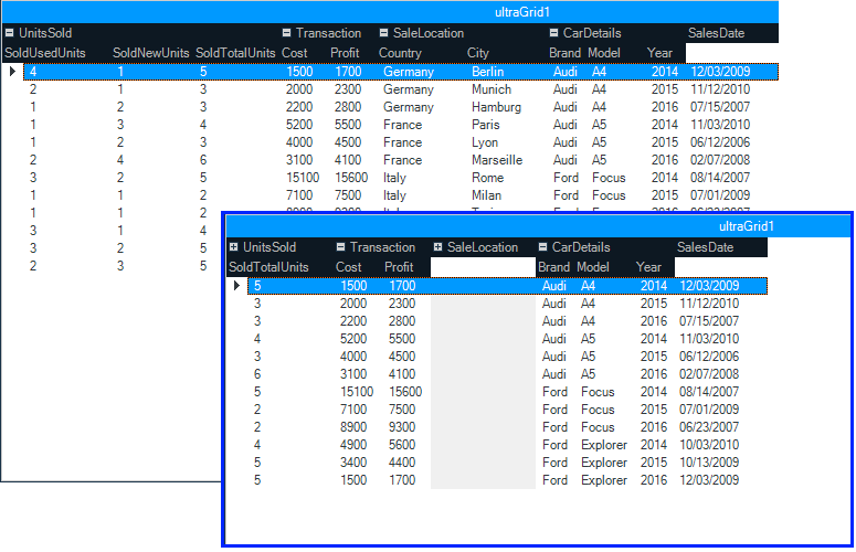
Data Grid

First up, is our brand new Android data grid written from the ground up to allow us to take advantage of everything that native mobile has to offer.  Even though this is a v1 release of our data grid, it has a ton of features that you can start taking advantage of right now.  Everything form the basics of column definitions, to sorting, filtering, responsiveness, and even async data loading.  This data grid has  some great features that will take your Android apps to the next level.

Columns

Every data grid has to have columns, and the Infragistics Android data grid is no different.  Create a grid with auto-generated columns or define the specific column types from our built-in columns: Text, Numeric, Image, DateTime, and Template.  All columns’ cells and headers can be configured by setting text properties like text color, font size, background color, alignment, and width just to name a few.  Of course, each column type has it’s own properties specific to its intended function, such as options for decimal places for the Numeric column, date/time formats for the DateTime column, and customizations for the Template column and many more.   I would like to mention that in this initial version of the data grid, all columns are read-only for now.  Editing is not supported just yet, but we’ll get it in there soon.

android data grid auto-generated columns

Sorting

The next no brainer is sorting.  You can’t have a grid and not have the ability to sort the data within that grid.  The Infragistics Android grid provides a powerful sorting API to give you full control of all your sorting needs.  You can provide single column sorts, or complex multi-column sorting.  You can provide a UI for your end-users, or choose to hard-code your sort.  You can choose a two-state sort or a three-state sort.  The choice is yours, and we give you everything you need to support your sorting requirements.  Besides you standard sorting of local data, you know… your data stored in memory on the device.  You can also sort data remotely on the server.  That’s right!  Put your server to work, not your app.  More on this later.

android data grid sorting

Filtering

Filtering is another one of those features that every grid just has to have.  Without filtering, a data grid is essentially use-less.  You have to have the ability to find the data you care about.  Otherwise, you might as well be looking through notes you wrote down on a napkin at lunch.  As with sorting, not only can you filter the data you have loaded in memory, but you can also filter your data on your server.  That’s right!  More work for the server to do, and less impact on your app performance and memory foot print.  All good things when creating an app for a mobile device.
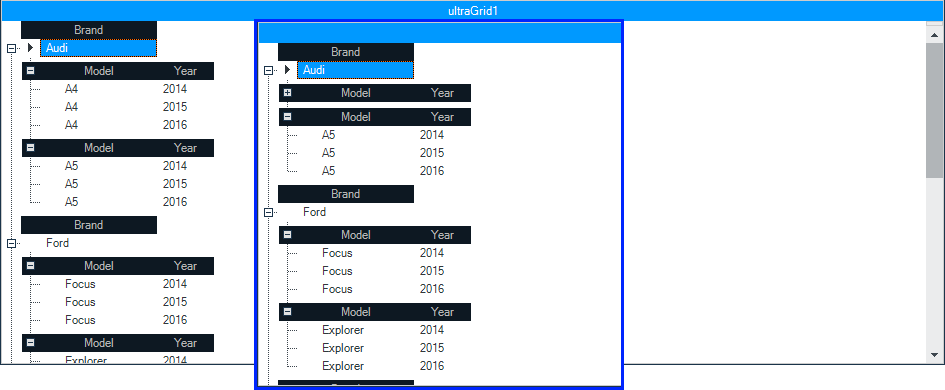
android data grid filtering

Responsive

One of the most unique, and awesome features of the Infragistics Android data grid is it’s ability to respond to the size of the device.  This is known in the web world as being “responsive”.  Responsive Layouts allow you to react to scenarios in your application where horizontal screen real estate is significantly reduced, such as when a device is rotated from a horizontal to a vertical orientation.  In such cases retaining all of the columns in a visible state may impair both readability of data as well as reduce the aesthetics of your application (that means make it look like crap). Therefore, columns which display less critical information may be removed from view, while still displaying columns which contain the most relevant data.  This concept is popular among web developers and is their primary tool used for getting their HTML sites to play nice with mobile devices.

There are two general scenarios that the responsive grid layout is intended to be implemented with:

  • Purposely reducing the width of the current layout that contains the data grid control
  • Reduction of the width of the layout due to changes in orientation of the device as the result of its rotation, for example by rotating from a horizontal to a vertical position

The best part is, you have complete control of what columns show and when.  You can even combine this with the awesome built-in animation framework to create some really great and eye-catching visual experiences for your end-users.  Your imagination really is the limit to what you can do.

android data grid responsive layout

Virtual Data Source

I am personally really excited about this particular feature.  In Infragistics Android 16.1, we are shipping a brand new data source that will give the Android data grid the ability to asynchronously load data from an OData service. This means that data can now be loaded, sorted, and filtered on the server, and then loaded on a separate thread in your app to keep the UI responsive, without you having to do anything. The data will appear in the grid as soon as it has been fully loaded regardless of scroll position.  The best part, is all you have to do is point it at an OData feed.  That’s it.  You’re done!  Now, for the initial release, we will only be shipping support for OData services. Simply point the data source to an OData service URI, set the entity set, request your fields, set your page size, and you’re off to the races. The virtual data source and Android data grid will do the rest.  I know you want more types of data sources, but we just didn’t have time.

android-datagrid-virtual-datasource

but wait…. there’s more!

The best part about this new virtual data source is that it is completely open source and available for download on GitHub.  

https://github.com/Infragistics/DataSource-Reference-Implementations

Not only is the source code for the OData virtual data source available for download, but we also provide sample applications demonstrating how to use them in your applications. You can use this OSS project to submit improvements, and add support for other data sources and clients that you need, but we don’t currently support.   Heck, feel free to submit your PR so everyone can benefit from your newly created data source.

Data Chart

Next up is our Android Data Chart.  This control has been the power house of Infragistics for many years on other platforms.  Now, you can take advantage of the power and massive feature set provided by the Android data chart.  There are literally too many features to even fathom talking about all of them in this post.  So I will simply sum them up and you can go play with the data chart yourself.  Make sure you set aside a year or so to really dive in.  That’s just how many features we pack into this native mobile data chart.  The Android data chart comes with over 50 chart types including bar, column, line, area, spline, waterfall, point, OHLC, polar, radial, and many many more.  Besides a crazy number of supported chart types, there are an even larger number of features with each chart.  Crosshairs, legends, markers, panning, zooming, and much more.  Basically, the Infragistics Android data chart is the Chuck Norris of charts.  Nothing else needs to be said.

android data chart

Pie Chart

Who doesn’t like pie?  The main features of the Pie Chart include label configurations, like position and extent, label font properties, controlling pie radius, start angle, sweep direction, exploded slices and distance from center for exploded slices, selected slices, and legend. The ability to prevent the labels from colliding with each other or the slices.

android pie chart

Funnel Chart

A single series chart that displays data in a funnel shape with a variable number of sections each representing the data as different portions of 100% or to weight the height of the slices based on value. The Funnel Chart can be configured to be inverted, to use Bezier Curve for its shape or weighted slices.

android funnel chart

Gauges

Radial

The Radial Gauge contains a number of visual elements, such as a scale with tick marks and labels, a needle, and a number of ranges. The Radial Gauge has different label configurations, like color, extent, and interval. Radial Gauge has different range properties, like color, start and end value. The needle of the Radial Gauge can be configured by setting its color, needle and pivot shapes and outlines. The transitions between different sets of settings can be animated.

android radial gauge

Linear

The Linear Gauge is useful for showing a single measure on a linear range. It has different label configurations, like color, extent, interval, and position of the first and last labels. The needle of the Linear Gauge can be configured by setting its color, outline, shape, size. The transitions between different sets of settings can be animated.

android linear gauge

BulletGraph

The Bullet Graph displays a single primary measure and compares it to one or more other measures to create a concise data visualization. It supports a variety of configurations, e.g. orientation, scale, tick marks, ranges and colors along with animated transitions between different sets of settings.

android bullet graph

Barcode

If your app needs a barcode, well look no further.  Code 128 and QR codes are the most common barcodes for mobile apps.  So we figured these would be the first set of barcodes we deliver.  Don’t worry, we’ll have more in a future release, but these should get you going.

Code 128 Barcode

Code 128 Barcode can be used in inventory, shipping and distribution applications. The Code 128 Barcode has different configurations, like label’s color and font, background color, and stretch.

android code 128 barcode

QR Barcode

QR (Quick Response) Code Barcode can be used in commercial tracking, entertainment and transport ticketing, product marketing applications.

android QR barcode


What about iOS?

Right about now you are probably saying to yourself, “Wow Brian, your Android product melted my face off with awesomeness, but what about iOS?  I want to bring my Android app to iOS, but I need the exact same controls and features.  Do you ship the same controls on iOS?”  Well, I’m glad you asked!  One of our main goals in delivering high performing, feature rich, and drop-dead gorgeous native mobile controls to you is consistency.  Consistency in available controls.  Consistency in API’s.  Consistency in features.  Consistency in end-user experience.  Consistency in your satisfaction no matter what platform you are developing for.  We want to make sure that if you are using Infragistics Android, and then want to bring your app to iOS, you will have the exact same controls, features, and development experience across both platforms.  When we write a control for Android, we make sure to bring that control to iOS.  This is core to our mobile strategy.  We want to make sure that you are never limited when bringing your native mobile apps to all available platforms.  We even provide Xamarin bindings for all of our native Android and iOS controls so that you can write cross platform native mobile apps using C# and Xamarin.  You really have no excuse not to write awesome cross platform native mobile apps with Infragistics Android and iOS controls.

Let’s Wrap this Baby Up!

I hope you are as excited as I am about the Infragistics Android 16.1 release.  I know there is a lot in this post, and thanks for hanging in there with me.

If you have ideas about new features we should bring to our controls, important issues we need to fix, or even brand new controls you’d like us to introduce, please let us know by posting them on our Product Ideas website.  Follow and engage with us on Twitter via @infragistics. You can also follow and contact me directly on Twitter at @brianlagunas.  Also make sure to connect with our various teams via our Community Forums where you can interact with Infragistics engineers and other customers.  

If you are not using our Android controls yet, remember that a free evaluation download is only a click away.

Lastly, when you do build something cool with our controls, please make sure to let us know.

What's New in Ignite UI 16.1!

$
0
0

We are pleased to announce the release of Ignite UI 16.1! This release continues our investment in modern app development for HTML on mobile, tablet & desktop browsers. In 16.1, we’ve added support for Angular 2 Beta, Bootstrap 4, we’ve done a ton of work in Typescript enhancements across controls and we’ve invested in updates across the board in major controls. Let’s go through what’s new in 16.1!

Angular 2 Components

Arguably the biggest feature in 16.1 is support for Angular 2 components for Ignite UI controls. Like our Angular 1 directives, we’ve made our Angular 2 components available on Github for immediate availability. With the Angular 2 components come full TypeScript support. You can grab the Angular 2 components here and start using them today. Once Angular 2 comes out of beta, we’ll update Github to ensure everything works as expected. Keep in mind though Angular 2 is still beta, we fully support our components and will update them along the way as Angular 2 nears release. As with anything new as big as this, make sure to keep the feedback and commentary flowing back to us, we are committed to have the best Angular 2 components on the market.

igGrid

the grid continues to see investment. It is the most widely used control in the toolset, and your feature requests continue to drive the backlog. In 16.1, we’ve made improvements in key areas.

  • New column option - mapper - For columns with dataType="object" we now allow setting a mapper function, which can be used for complex data extraction from complex objects, whose return value will be used for all data operations executed on the specific column.
  • The ColumnFixing feature now works with grid width set in percentage.
  • Multi-Row Layout - enables you to create complex grid record layouts, that contain multiple rows with cells in them spanning multiple columns and rows. Such structure allows for greater rendering flexibility for grids with many columns that would otherwise require a horizontal scrollbar or when the data shown is better presented in a non-tabular fashion. Initializing the Multi-Row Layout is done entirely through the igGrid's column collection. Four new properties are added to the column definition that specify the position and size of the column - rowIndex, columnIndex, rowSpan and colSpan.

    • Checkbox Appearance - Checkbox column visual appearance have changed and it's square box is not going to be rendered when the grid is in display mode. What would be provided is only a plain checkmark. This change is due to refinement of the experience for the end-users, who naturally perceived that this was an interactive element, which they can click to toggle.

      • Paste from Excel sample - A new sample is added that demonstrates pasting Excel clipboard data into igGrid

      igTreeGrid

      When you have hierarchical data that needs column headers for each child level aligned with the parent columns. In 16.1, we improved the updating feature - the "Add new row" user interface is now enabled and along with it TreeGrid Updating supports adding new records not only directly to the root level, but also adding a child records to a specified level as through the UI, as well through the API. The "Add child row" button is available next to the "Delete row" button when a row is hovered with the mouse or swiped left or right when on

      The add new row UI is rendered inline next to its parent

      igTileManager

      splitterOptions now replaces the showSplitter option. Besides showing and hiding, additional functionalities are added. You can configure the splitter to be collapsible as well as attach to its collapsed/expanded events. SinceshowSplitter option will no longer be available

      igDataSource

      Related to the same feature on the grid column, a new field option –mapper - for field with dataType="object" we now allow setting a mapper function, which can be used for complex data extraction from complex objects, whose return value will be used for all data operations executed on the specific field

      TypeScript Support

      • Support for union types - widget members now support union types which greatly improves type checking. Union types introduced in TypeScript 1.4 allows for a variable or a member to have one of a set of several types. Previously members that were declared as type any now use union types to declare a more specific type.

      • Intellisense improvements - Intellisense is improved for options and methods to suggest all widget`s overloads.
      • Member descriptions - All members now have a description.

      Summary

      I hope you are as excited as we are about these new controls and features. As usual, your feedback played a vital role in the 16.1 release. If you have ideas about new features we should bring to our controls, important issues we need to fix, or even brand new controls you’d like us to introduce, please let us know by posting them on our Product Ideas website. Follow and engage with us on Twitter via @infragistics. Also make sure to connect with our various teams via our Community Forums where you can interact with Infragistics engineers and other customers. And as usual, shoot me an email at jasonb@infragistics.com if you have any questions, comments or feedback.

      Viewing all 2398 articles
      Browse latest View live