Quantcast
Channel: Infragistics Community
Viewing all 2398 articles
Browse latest View live

How to share data between controllers in AngularJS

$
0
0

In my AngularJS classes, I often get asked, “How do I share data between the controllers in AngularJS?” On the Internet, there are many solutions suggested. However, I prefer to share data using the Shared Data Service method, and that’s what we’re going to explore in this post.

To start with, let’s suppose that we want to share a Product object between the controllers. Here I have created an AngularJS service named SharedDataService as shown in the snippet below:

myApp.service('SharedDataService', function () {

     var Product = {

        name: '',

        price: ''

    };

    return Product;

});

Next let’s go ahead and create two different controllers using SharedDataService. In the controllers, we are using the service created in the previous step. Controllers can be created as shown below:

var myApp = angular.module("myApp", ['CalService']);


myApp.controller("DataController1", ['$scope', 'SharedDataService',

    function ($scope, SharedDataService) {

    $scope.Product = SharedDataService;


    }]);


myApp.controller("DataController2", ['$scope', 'SharedDataService',

    function ($scope, SharedDataService) {

    $scope.Product = SharedDataService;


}]);

On the view we can simply use the controllers as shown in the listing below:

<divng-controller="DataController1">

            <h2>In Controller 1h2>

            <inputtype="text"ng-model="Product.name"/><br/>

            <inputtype="text"ng-model="Product.price"/>

            <h3>Product {{Product.name}} costs {{Product.price}}  h3>

        div>

        <hr/>

        <divng-controller="DataController2">

            <h2>In Controller 2h2>

            <h3>Product {{Product.name}} costs {{Product.price}}  h3>

        div>

Now we can share the data between the controllers. As you can see, the name and price of the product is being set in the DataController1, and we are fetching the data in the DataController2.

Do you have any better options that you use to share data? Or perhaps you have a complex scenario which may be not be solved by the above approach. If so, let me know! Tell me about it in the comments below.


Developer News - What's IN with the Infragistics Community? (4/28-5/3)

$
0
0

After a great week at Build, I'm back here with your Developer News for the last few days of April and the start of May! There's a great assortment here, but I think I would say my own personal top pick is The Agile Testing Manifesto. Check out all 5 and see for yourself!

5. How Microsoft should woo Android and iOS developers to build Windows 10 apps  (Venture Beat)

4. The Agile Testing Manifesto (GrowingAgile)

3. 10 Highest Paying Programming Languages in 2015 - Infographic (Perception Web)

2. Using AngularJS in your ASP.NET MVC Projects (DotNetCurry)

1. Designing for Simplicity (davidwalshblog)

Prototyping to manage changes in your application (Webinar recap)

$
0
0

Whether you are migrating your application from desktop to web or creating a native mobile app for an existing desktop application, there is going to be change.  One obvious change is that the technology stack used for the newer implementation. But there are other changes that are not readily apparent:

  • Your business has evolved: From the time the application was first built, the business/service has evolved, and newer requirements have emerged based on usage. This may demand tweaks to existing business workflows or newer workflows targeting user goals that did not previously exist.

  • Your users have evolved: Your users are constantly learning and on a look-out for software experiences that are more usable and delightful. Furthermore, your business may be trying to bring new users into the fold who don’t have prior experience with your application, but have used your competitor’s products.

  • UI patterns have evolved: We are constantly discovering new interaction paradigms that may change how users interact with software. Touch being one such paradigms. On top of that, we are learning about newer UI patterns which may not have existed when the app was first built. 

So, yes-- change is inevitable. We should acknowledge that porting an existing application to a new technology is not just about the technology. Getting the experience wrong can be very expensive, as failure exposes the business to undue risk.

Prototyping is one way to manage this risk by experimenting newer ideas with both your existing users and users you like to have. Prototyping is as much about trying out new things as much it is about failing early. And above all, prototyping is about extracting maximum learning from minimum effort invested. Don’t spend valuable days to prototype something in code which could have taken you hours to do in Indigo Studio. 

Webinar Video & Summary

[youtube] width="650" height="488" src="http://www.youtube.com/embed/tYik5oBbWB8" [/youtube]

Youtube Video

  • Why Prototype?
    To evaluate an idea quickly with participation from intended users

  • How to Prototype?
    Goal-driven task/user flows; relevant content; consistent style for interactive UI elements

  • Prototyping with Indigo Studio (basics)
    Draw the starting UI for user flow; add interaction to create a new state; make necessary UI changes 

  • Prototyping for large apps with Custom UI libraries
    Standardize UI components by styling and converting them to screenparts, and reuse

  • Indigodesigned.com and community
    Learn from others; browse and download prototypes and re-usable UI libraries
     

View and download presentation


About Indigo Studio for Interaction Prototyping

Don’t have Indigo Studio? Download a free 30-day trial which will let you try all of the prototyping goodness!

Download Indigo Studio

Looking to suggest improvements and new ideas for Indigo Studio?

Submit a new idea

If for some reason you are having trouble with Indigo Studio, check out our help topics, forums or contact support.

Get Support

Follow us on Twitter @indigodesigned

View Release Notes


What's New on the Office 365 Roadmap?

$
0
0

For years, consumers and enterprises alike were forced to wait long periods for Microsoft’s next updates, yet with the upcoming release of Windows 10 this model will gradually disappear. In theory, the question “which version are you running on?” will become obsolete. It’s common knowledge that under Satya Nadella Microsoft are emphasizing a ‘mobile first, cloud first’ approach and for end users the advantage of this is that updates will be more rapid, regular and relevant.

The Redmond WA. firm are currently pushing Office 365 as the future of enterprise IT, and the stack is built for total cloud integration in mind (although it’s still possible to customize your own hybrid cloud/local server solutions). Office 365 is a bold move to re-establish Microsoft’s dominance in the industry and, just like Windows 10 promises to do in future, Office 365 already offers regular updates which end users can pick and choose as and when they’re released.

Open up

Another major change in Microsoft’s long term strategy is their increasing openness, not only with consumers but also by making their services available on devices built by competitors, often free of charge. As part of this move, the Office 365 RoadMap was introduced in mid-2014 to the pleasure of app developers, Office 365 professionals, IT managers and almost anyone who uses the platforms.

Office 365 is an enormous stack, so while it’s great we can now see what’s to be expected over the coming months, finding the time to keep up to date with these changes isn’t always easy. At Infragistics we’re all about finding ways of improving enterprise UX and streamlining workflows across platforms and so we like to follow how Microsoft are making this easier. The RoadMap of recent, current and upcoming updates is extensive, to put it lightly, but Office 365 really does let you pick and choose, and so as cross platform app developers, we’re really excited about many of these releases.

1. Yammer on mobile devices. 

Recent weeks have seen numerous updates for Yammer on different devices. The latest developments allow amazingly simple integration with Mac OS X Yosemite and iOS 8 so you can simply switch between your desktop or iPhone/iPad and continue collaborating on the social network.

For Android on the other hand (or more literally, on the other wrist), Yammer has recently become available with Android wear. It’ll be possible to read and ‘like’ messages and even dictate your responses directly to your watch. Yes, the future is here already.

2. OneDrive for Business on Mac and iOS

While you could already use OneDrive for Business from Apple devices, January 2015 saw the release of an update which made the whole process of using Microsoft’s online storage a whole lot easier. This will take the form of a standalone app that facilitates sync and share between the cloud and the user’s Apple devices, thus making productivity on the go easier than before.

3. Outlook for iOS and Android

In addition to the email management solutions natively found on iOS and Android devices, the app stores abound with email management tools. Despite these challenges, Microsoft are convinced that their touch friendly version of Outlook for these operating systems will create traction. The new version of Outlook is a great little tool - it’s optimized for users on the go, people who need to triage their emails quickly and see what’s most important to them. Machine learning means the app gradually works out what kinds of emails, and which contacts you want to see while out and about. Its real draw is its integration with Office 365 and business users in particular will wonder how they lived without it.

4. Office 365 video

The moving image is one of the greatest means of mass communication and so it’s more than a little bit exciting to see that it is currently being rolled out on Office 365. You can read Microsoft's official announcement here. The use applications of video on your company’s IT platform are as diverse and creative as your company is, so whether it’s a message from the CEO, a recording from a conference, ideas to share with colleagues on Yammer or just about anything else, video on Office 365 could really shake up how you communicate with colleagues.

5. Lync Web App support for Mac and Chrome browsers

It’s currently a pain to use the Lync Web App when not using Internet Explorer and it requires numerous steps before users can simply get on with chatting. Fortunately, Microsoft have been listening to their users and in the coming months the Lync web App will be universally accessible, regardless of the browser you use.

From A to B

Microsoft are constantly updating Office 365 and keeping an eye on the latest and upcoming releases gives you an overview of what to prepare for. We’re impressed to see just how wholeheartedly Microsoft have embraced their new, open and transparent model. The cross platform offerings in particular are exciting and in a world of mobile working, this approach is really appreciated. We can’t wait to see what else is around the corner.

Looking for a comprehensive and secure mobile Office 365 and SharePoint solution, which you can customize to your preferences? Look no further. Download our SharePlus free trial now and see the wonders it can do for your team's productivity!

SharePlus for SharePoint - Download for Android

The ‘Art’ of User Experience

$
0
0

There are many ongoing discussions about User Experience, Usability, Design, Development, Agile, etc.  I’m hearing – more and more - a theme of ‘Design, Build, Test’ or ‘Design, Test, Build’.   The theory is that as long as you test your design with users, you are doing User Experience.  Something about this just seems to miss the mark.  It excludes the ‘Art’ of User Experience.

analytical_vs_creative

It’s the classic ‘Art vs. Science’ argument.   Visual Arts and Liberal Arts fields can give you a broader, softer set of skills that focus on creativity, intuition and empathy.  STEM (Science, Technology, Engineering and Math) fields may rely more on the analytical mind and scientific method to determine facts and prove theories.  User Experience/Design is a field – like many - that employs both.  In fact, we can already start to see some movement toward this concept with Rhode Island School of Design’s STEM to STEAM effort. 

Research, Design, Test

In UX, you really should have some user research – which is different than ‘testing’ your users.  At some point (hopefully, on a continuous basis), you should gather some data and information about who your users are.  This research often uses a scientific method of gathering data and analyzing it.  However, once information is gathered we can start to develop an understanding of those users.  Then, intuition and empathy kick in to help create solutions for those users and their needs based on what you know of the users and what you’re creativity and problem-solving skills tell you might be a good solution.  Once that solution is designed, we go back to a more scientific method of testing designs with users.

Build the Right Thing

If you don’t have a good understanding of your users to begin with, you could very easily go down the wrong path.  Think of your list of ‘things to do’, whether it’s a project plan, roadmap, backlog or whatever.  Where did these items come from?  Did someone who truly understands the user compile it or is it just a list of requests from executives, customers or sales?  If you simply take items off that list and start designing and usability testing, you may build something ‘usable’ that doesn’t actually meet the users’ needs.  Even in LeanUX, you still need to start with a good understanding of who your users are and what they need -  you need to ‘build the right thing’ not JUST ‘build the thing right’.  If you can do this, you’ll get closer to a good solution sooner.

The Art of Understanding

This understanding is the Art of UX .  Whether you’re doing waterfall or LeanUX, being able to empathize with the user and anticipate his or her needs isn’t something that can be scientifically done.  The creativity of the solution isn’t in whether it works or not or whether it’s  usable.  It’s all about whether it solves an actual problem the user is having and/or whether it does so with delight.  The better you are at understanding the problems the user is having, the better your solutions will solve them.

UXify North America - Conference Videos

$
0
0

This year, instead of hosting the World IA day like we did over the last couple of years, we brought our own UX conference UXify that we've been running very successfully in Sofia (Bulgaria) to North America. 


 UXify logo


UXify was hosted on April 11 at the Infragistics world headquarters in Cranbury, NJ. Our theme was "The Future of UX Design". We had an impressive line-up of speakers who shared their experiences and inspired great discussions. For anybody who could not attend the event or who wants to watch the presentations again, here are the videos.


Kent Eisenhuth, Interaction Designer, Google
Living at the Intersection of Art and Science: The Future Skills of a Designer

[youtube] width="560" height="315" src="http://www.youtube.com/embed/g8P-v1fNgjc" [/youtube]


Justin Fraser, Sr. Project Manager, Infragistics
Managing Design Projects: A PM View

[youtube] width="560" height="315" src="http://www.youtube.com/embed/IDKlqhLRa1Q" [/youtube]


Sunita Vaswani, Director UX, Deutsche Bank
UX Competencies in Capital Markets

[youtube] width="560" height="315" src="http://www.youtube.com/embed/w1V0s-SIbSY" [/youtube]


John Chin, Experience Strategist, Verizon Wireless
Universal Design: One for all, All for one!

[youtube] width="560" height="315" src="http://www.youtube.com/embed/M3xYmeJQXpU" [/youtube]


Clare Cotugno, Director of Content Strategy, EPAM Empathy Lab
Content Strategy and the Project Lifecycle

[youtube] width="560" height="315" src="http://www.youtube.com/embed/Leau_mhtXnk" [/youtube]


Ronnie Battista, Practice Lead, Experience Strategy + Design, Slalom Consulting
Getting High on Journey Mapping

 [youtube] width="560" height="315" src="http://www.youtube.com/embed/VoKdbLLNsk8" [/youtube]


Lisa Woodley, VP Experience Design, NTT DATA
Surviving the Demise of Architecture: Get Strategic, Get Coding, or Get out of the Way

[youtube] width="560" height="315" src="http://www.youtube.com/embed/pVX09b8j50g" [/youtube]


All speakers, thank you again for the great presentations!

Next up, on June 19th and 20th we host the European version of UXify. It's a 2-day format with one day of presentations in parallel tracks and one day of workshops. For more information, see here: http://uxify.net/

Infragistics Racing 2015

$
0
0

As I’ve written in the past, there are a lot of parallels to be drawn between motorcycle racing and User Experience Design. And now, as Spring finally arrives here in NJ, it’s that time when all the physical and mechanical preparation, like user experience research prior to starting the design phase of a consulting project, is finished and it’s time to take the motorcycle back to the track.

The first outing for Infragistics Racing in 2015 was a practice day at Summit Point Raceway in West Virginia. Don’t let the southern-sounding state fool you – getting to full-throttle at over 120mph on the short straight when the air temperature is 46 F (8 C) is chilly!

46 degree track temperature

Weather notwithstanding, it was a good first outing for the team as it prepares for the upcoming 9 race season. If you find yourself in the area, come by and say hi – I’m sure you’ll recognize the Infragistics race bike!

Infragistics Racing at Summit Point 1

Infragistics Racing at Summit Point 2


2015 Infragistics Racing Schedule
May 11New Jersey Motorsports ParkMillville, NJ
June 12Virginia International RacewayAlton, VA
June 29Summit Point RacewaySummit Point, WV
July 20New Jersey Motorsports ParkMillville, NJ
August 3Virginia International RacewayAlton, VA
August 24Summit Point RacewaySummit Point, WV
September 10New Jersey Motorsports ParkMillville, NJ
September 27Dominion RacewayWoodford, VA
October 11New Jersey Motorsports ParkMillville, NJ

See you at the track!

---------------------------------

Kevin Richardson has been working in the area of user experience for almost 25 years. With an advanced degree in Cognitive Psychology, he has experience across business verticals in the fields of research, evaluation, design and management of innovative, user-centered solutions.

Kevin’s experience includes web sites, portals and dashboards, enterprise software and custom business applications for medical, pharmaceutical, communications, entertainment, energy, transportation and government users.

On the weekends, you can find Kevin on his motorcycle, riding for Infragistics Racing at a number of different racetracks on the East coast.

Bugtrackers.io and Infragistics' Rani Angel!

$
0
0

In case you missed it, Infragistics' own Rani Angel was recently featured on bugtrackers.io! Bugtrackers.io is a project by usersnap which endeavors to share stories from on-the-ground developers working in companies across the globe who are involved in bug tracking and web development. Rani was interviewed a few weeks ago, and her piece went live just about a week ago. If you'd like to support her, feel free to check it out, and show her some love by sharing it to your social channels! Congratulations, Rani!!!

(If you or someone you know would like to be featured on bugtrackers.io, fill out their form today!)


How Tech is Going to Change Our Lives Over the Next Ten Years

$
0
0


iotBeing only twenty-one years old, I’ve pretty much grown up with technology. While I do remember the brutal days of dial up, when texting didn’t exist and I had to actually remember a phone number, I have been pretty thoroughly connected with technology since I was young. I received my first cell phone for my eleventh birthday a little over ten years ago—a Nokia with a tiny, blue screen, with the most advanced features on this little phone being the games ‘Snake’ and ‘Doodle’. I remember the popularity of Napster and Limewire, both being controversial yet game changing methods of exchanging content and information. I remember using AOL Instant Messenger as a way to stay connected with my friends. I remember playing PlayStation with my dad and thinking about how cool it would be to be able to somehow play against my friends even though they were not with me.

This past October for my twenty first birthday, I received what is probably my tenth cell phone—an iPhone 6 with a touchscreen and a multi-pixel digital camera that keeps me constantly connected with the rest of the world and allows me to access any information I want in just a few seconds. I am now using iTunes to buy the latest music, videos, books, games, and applications, as well as using Spotify to stream unlimited music directly to my phone and MacBook Pro. I have a social presence on LinkedIn, Twitter, Facebook, Instagram, Snapchat, and Pinterest, where I can connect with just about anyone, anywhere, anytime. I can now watch my friends play people from the other side of the world in real-time, online video games while I’m video chatting with my best friend who is stationed outside of the United States. In ten short years of my life, this is how much technology has evolved in front of my own eyes. Plus, this does not even take into account the emergence and growth of other technologies and sources of information that have changed our lives. In just ten years, the world has seen an exponential increase in the complexity, sophistication, integration, and importance of, as well as the reliance on, technology. This leads me to ask the question, what will technology be like in ten years and how is it going to change our lives?

Time Magazine recently just published an article called “This Is How Tech Will Totally Change Our Lives by 2025”, which was based off a report recently released by the Institution for the Future which listed five predictions for the ways tech is going to change our lives in the next ten years. The driving force behind how technology is going to change our lives isthe “ever-increasing hunger for data” which will “fundamentally change the way we live our lives over the next decade.” According to the Times article, “in the future, people might be able to personally sell info about their shopping habits, or health activities to retailers or pharmaceutical companies,” which means that we might possibly see an economical shift in which personal data will be able to be shared, bought, or sold with more benefits to the consumer. With the introduction of the first directional shift, the information economy, individuals will be able to choose what they do with their information, therefore possibly leading to more opportunities for both individual, and widespread, financial or social gain.

Stemming from the increased dependence on data and the shift to an information economy, we will definitely see networked ecosystems, such as the Internet of Things continue to expand. The Internet of Things is described as a network of physical objects, from basic household items to cars, which are embedded with technologies that enable an exchange of data via the internet. Could you imagine waking up one morning to your alarm clock which is connected to your smart phone, which then sends a message to your shower to turn on? Then after you turn off the shower, a message is sent to your coffee pot to start brewing a cup, which then signals to turn on the kitchen lights and flip the television to the morning news? Or how about having your refrigerator identify when you are low on milk so that it can send you a reminder on your way home from work to pick some up after you pick the kids up from school? All of these instances seem a bit foreign right now; however, we’re already seeing and experiencing the beginning of the Internet of Things. The cross compatibility of all of these inanimate “things” promises to make our lives easier, more efficient, and possibly even safer. We’ve already began to see self-driving cars start to become a reality and these will likely revolutionize not only the automobile industry, but how we get from place to place, the numbers of accidents on the roadways, insurance costs, and many other facets of our lives.  

While the Internet of Things may gather information about our daily decisions, the third shift caused by the information generation is the continued creation of increasingly sophisticated algorithms which may end up actually aiding our daily decisions at work. In the article “2025 Tech Predictions Both Thrilling and Scary”, it is stated that “tech leaders increasingly are saying that we’re moving to a world where employees will have smart decision-support systems.” These smart decision-support systems operate under what is known as augmented decision-making. Augmented decision-making is referred to by Daniel J. Power as, “when a computer serves as a companion, advisor and more on an ongoing, context aware, networked basis.” So while data analytics have given us information to base future decisions off of, what augmented decision-making and its systems do is offer real-time information, basically in the form of suggestions in order to help individuals make important decisions. Having these support systems will be like having a second opinion for everything; however, the algorithm produced information given will be optimal and will likely be more accurate than another human being would. This however, causes me to raise one important question; how long can these systems assist in decision making before they eventually replace the workers outright? While I think there are certainly fields that can benefit from this, such as the medical field where a doctor could use these tools to determine a more accurate prognosis, there are some jobs that could completely be replaced by these systems and this could have a profound effect not only on people’s lives, but also on our economy.

The fourth predicted shift is known as “multi-sensory communication.” In this shift, information will be able to be communicated and received through multiple human senses. We can see an example of this in the recently released Apple Watch. Instead of ringing or vibrating, the watch will actually “tap” an individual on their wrist to let them know when they have a text or a notification. In the Institute for the Future’s report, it expands on multi-sensory communication by stating, “in a world saturated with competing notifications, multi-sensory communication of information will cut through the noise to subtly and intuitively communicate in novel ways that stimulate our senses.” The addition of senses such as touch, smell and taste, as well as new experiences with sight and sound, will not only change the way we communicate socially, but it will also change how developers, retailers, and marketers create products and appeal to customers. What this change will ultimately mean is that we will begin to stray away from the screens we hold and physically interact with, and transition to what the Institution for the Future describes as “screenless communication tools that allow people to blend the digital and physical in more fluid, intuitive ways.” The idea of blending the digital and physical can be seen in the immersive marketing tactic that the Marriott Hotels launched in late 2014 called ‘The Teleporter.’ The Teleporter is a virtual reality experience that was programmed to allow users to “experience” and virtually transport to Hawaii or London. The technology featured a virtual headset and wireless headphones, along with several sensory triggering features such as producing heat, wind and mist, all working in sync to give the user a realistic experience of what it is like to be on the beaches of Hawaii or strolling through London. While this marketing strategy seems to be a bit over the top right now, we will definitely be seeing similar tactics being used in the next ten years both inside and outside of our homes.

After all of this talk about sharing data and personal information and how it is going to transform life as we know it, I’ll introduce the fifth, and in my opinion, the most important shift: privacy enhancing technology. With the vast amount of data that will be produced and received, there will be a demand for better tools for privacy and security. There must be a common ground found between the individual users who are concerned about their privacy and the companies leveraging their data in order to make sure that people’s information is protected and innovation does not cease because of personal exposure. There are predictions of “cryptographic breakthroughs” which will hopefully help in minimizing the number of hacks and breaches on companies and individuals, as well as continuous changes and updates to policy that will ensure protection to both the producers and consumers. It is a must that privacy is continuously advancing while the amount of data being shared concurrently increases, because if not then all of our lives will essentially become openly available to anyone, and that is terrifying.

The information generation is upon us. We have already began aggregating, analyzing and using data and information to enhance our lives. With the digital and physical worlds beginning to come together in other places besides computers and cellphones, we are in for an innovative, exciting, and possibly even scary next ten years where the only things that are certain are uncertainty and data. I’m curious to see where I am at in 2025. I’m interested in what my cellphone, if they even exist anymore, will look like and what it can do. I’m a bit nervous about the fact that policy tends to not be able to keep up with the speed of technological innovation. I am excited to see how companies will incorporate all of our senses into technology and how this might enhance and change our lives. How am I going to be using technology at home, at work, in social settings? It is going to be unlike anything that any of us have ever experienced before, but I am very interested in seeing how much technology is going to change in front of my eyes over the next ten years.

Installing Infragistics Ultimate Without an Internet Connection

$
0
0

The Infragistics Platform Installer was created to help make it easier for users to install our various products.  It achieves this by downloading the installers and updates which have been selected by the user through the UI.  In some instances, the Platform Installer may have difficulties connecting to our servers. This is caused by very strict firewall rules on the network used to run the installer. These instances may result in the following errors:

  • System.Net.WebException: The operation has timed out
           at System.Net.WebClient.DownloadFile(Uri address, String fileName)
           at System.Net.WebClient.DownloadFile(String address, String fileName)
           at Infragistics.Wrapper.Interface.Utilities.AutoUpdatesUtility.UpdateRTMDownloadUrls()
  • An error occurred while downloading . No URI for this file has been set. Please verify that there is an active internet connection and try again.
  • System.Net.WebException: Unable to connect to the remote server --->
       System.Net.Sockets.SocketException: No connection could be made because the target
          machine actively refused it

Unfortunately, in these cases, there is not much we can do.  The network would need to allow access for the installer to download files from our server, which may not be possible under certain networks. Under these circumstances, we provide an offline installer which contain the individual product installers. This enables the Platform Installer to complete the installation of our various products without the need to connect to our servers.

You can access the offline installer in two ways.  The first only applies if you’ve registered a product key to your account.  Simply access your account page to view a list of registered product keys.  Clicking a product key will display a list of “Product Downloads” associated with the product key you’ve selected.  For example, the list includes options such as, “Infragistics 2015 Vol. 1 Product and Samples” and “Infragistics 2015 Vol. 1 Complete Bundle”.  Choosing one of these options will allow you to download an “offline” version of our Platform Installer.

The second way to access the offline Platform Installer is by navigating to our Products Help & Download page, or clicking here, and click on the “Offline” link under the Package installer section.  This link will provide you with an offline Platform Installer for the latest version of our Infragistics products.
 
Note, the “offline” download includes the Platform Installer. However, some options are still available which require a connection to our server. One of these options would be to check and download the latest service release. An example of how our 15.1 installer looks is shown below:

By default, the option to download the latest service release is checked; so you will want to uncheck it.  Once complete, click the next button and complete the installation without the need to download anything extra.

If you need the service release you can download it by navigating to the My Keys & Downloads page, or by clicking here.  Simply click on the product key for the version you want and then select the Service Releases tab.

Here is a list of all the service releases for 15.1 which are available at the time of writing this post.  Simply download the one you require and install them after you have the main product installed.  That’s all there is to it!

Line Charts: Where to Start?

$
0
0

I've previously explained that it is essential that the bars of bar charts start at 0. The reasoning is simple: we use relative lengths of bars to compare values, so starting a bar somewhere else leads to false judgements. But what about line charts?

Below is a line chart with three datasets: A, B and C. We can see that:

  1. all lines are well above zero across all the years;
  2. A is roughly flat;
  3. B trends downward with a jump in the mid 1980's;
  4. C trends upwards.

Only point 1 above is enhanced by starting the y axis at 0. If we care more for trends, gradients, and the size of noise then focusing our chart around the area that actually contains data (as below) will help us to see these aspects at an improved resolution. That's true whether we're looking at different sections of one line or comparing across multiple lines.

With this improved resolution we can now see just how big the jump in the mid 1980's is for B - it's a change of 3 or 4 in Value in a single year. We can see that the upward trend in C isn't present in the early years. There might even be a hint that A trends ever so slightly upwards too. Further, while a table is the best option for displaying very precise information, this second chart is still an improvement on the first when it comes to accurately estimating values for a given year.

I've tried to make the case that it isn't generally necessary to include 0 on the vertical axis of a line chart and that there are frequently advantages to not doing so. Nevertheless, it can be useful to guide your audience away from making the assumption that the y axis does start at 0. The chart below illustrates a potential issue.

The problem with this chart is the visual metaphor of line D crashing to the bottom. Of course if the y axis started at 0 this wouldn't be a problem. But we don't need to extend our axis that far to reduce the salience of the misleading metaphor; even a little extension helps.

However, D is still fast approaching the dark(er) horizontal axis at the bottom. While the axis lines provide convenient separators between chart area and labels, they're not strictly necessary. So we can remove the x-axis line and tick marks without any loss in meaning.

Still, the labels themselves could be seen as an indicator of line D's fast approach to the bottom. Why not move them to the top?

We could probably stop there. But I like experimenting. The final change I'm going to make to this chart is more of a novel, but subtle, experiment. Rather than simply suppress one visual metaphor - the line crashing in to the axis at the bottom - we'll attempts to replace it with another. By fading away the bottom of the chart area we'll try to convey the idea that the vertical scale actually continues on downwards into the distance.

Is this last change helpful, a hindrance or neither? I'm not sure. I don't think it's particularly straightforward to implement in most charting software. Hence, one of Colin Ware's guideline for information visualization (Colin Ware, Information Visualization, Third Edition, page 24) seems relevant: "Consider adopting novel design solutions only when the estimated payoff is substantially greater than the cost of learning to use them."

So far the discussion has been centered entirely around modifying the vertical scale. The horizontal extent of the datasets has been ignored or it has been implicitly assumed that what's been visible is all there is. Frequently time series are cropped in the horizontal direction. This may seem like a dubious activity but is frequently just used as a means of increasing resolution over a specific period of interest. In the latter case this is exactly the same benefit that we saw above from reducing the vertical axis. There is, however, a notable difference. Reducing the vertical extent of a line chart will generally only reduce the whitespace. Cropping the horizontal axis reduces whitespace and removes data from view. For that reason, when you first see a line chart you have reason to distrust, perhaps the first question to ask is "Why does the x axis start there?" and not "Why doesn't the y axis start at/include 0"? Of course, when you're making your own charts you should ask yourself both of these questions.

What's New in IG TestAutomation 2015.1

$
0
0

The primary focus for Infragistics Test Automation is to offer you peace of mind. Such that when you develop with our controls, your teams can seamlessly implement automated testing of the user interface (UI) to confidently produce higher-quality releases. IG Test Automation, currently supports our Windows Forms controls via HP’s Unified Functional Testing (UFT) and IBM’s Rational Functional Tester (RFT).  We also support our WPF controls via HP’s UFT.

As IG Test Automation’s purpose is to automate tests of the UI of applications using IG controls, this what’s new will start off with the new controls. I will follow with changes in existing controls that had changes that would affect how the UI behaved, lastly I’ll list any bug fixes that were implemented this cycle.

New Infragistics Controls


IG WPF’s XamTreeGrid

The xamTreeGrid control is the latest addition to the Data Presenter family of controls. It arranges data in a tree grid layout. Essentially the control is a xamDataPresenter that implements a single view (a tree view) which cannot by dynamically switched.

 XamTreeGrid Example


IG Controls with UI-Altering Improvements


More Right to Left Support in Windows Forms

We started in 14.1 introducing Right to Left support in our of our editor controls. In 15.1 we expanded our right to left support to our UltraExplorerBar.

IG Windows Forms' User Voice Requested Features

We regularly turn feedback and requests from our customers, and turn it into features. This release was no different. There were a number of features from our user voice implemented in our controls this release. Below are those features that had IG TestAutomation had to specifically implement for. Have an idea for one of our products, submit it through User Voice here

  • Print Preview Dialog, Select Printer button
  • UltraGrid ColumnChooser, Select multiple columns at once

IG WPF's XamSpreadsheet Improvements

While there were several improvement’s to the XamSpreadsheet, including modifying the user functionality when workbook and worksheet protection is enabled. It was the addition of underline and hyperlink support that affected the UI. Via key commands of changing the underline format of the cell, or clicking on and activating the hyperlink of a cell.

New Bug Fixes in 2015.1

TA Product

Control

Description

Win Forms for HP

All

Trial Period Expires occurs during record or replay against CLR 2 assemblies with UFT, Windows 7 64-bit

Win Forms for IBM

UltraExplorerBar

RFT does not record properly against deeply nested ExplorerBar

WPF for HP

XamDockMananger

Controls added directly to the XamDockManager, instead of via a ContentPane were not recognized.

WPF for HP

XamDataGrid

Accessing the second filtered record throws out of index runtime error

WPF for HP

XamDataGrid

The filtering window is not recognized when Excel Style Record Filtering of th XamDataGrid is activated

WPF for HP

XamPivotGrid

The field chooser of the XamPivoGrid is not recognized


Download the free trial of IG TestAutomation for HP 15.1
http://www.infragistics.com/products/windows-forms-test-automation-for-hp/download

Download the free trial of IG TestAutomation WPF for HP 15.1
http://www.infragistics.com/products/wpf-test-automation-for-hp/download

Download the free trial of IG TestAutomation for IBM RFT 15.1
http://www.infragistics.com/products/windows-forms-test-automation-for-ibm/download

Voice your suggestions today, for the products of tomorrow 
http://ideas.infragistics.com/

Setting up an Application in Azure AD for Office 365 API Access

$
0
0

Introduction

To understand how the Office 365 API works, it might be good to explore the underlying REST API and see what happens “under the hood” to get a clear idea of the interactions between Azure AD, authentication and authorization, as well how to incorporate interaction with the Office 365 data.

In this blog post, we will look in to the configuration and setup of the Application in Microsoft Azure AD. The same will be used in the part 2 when trying out the fiddler to test the REST API.

It’s important to note that we will be working with the REST API in this blog post and NOT using the Office 365 Tools for Visual Studio client SDK.

Getting Started

The first step to get started is to login to your Microsoft Azure account and register and configure the application in the Azure Active Directory within your tenant. You will also need to set the permissions that are required for your app.

Login to Microsoft Azure with your login credentials (Office 365 login credentials), browse to the Azure AD Portal and navigate to your Azure AD account. Then click on the applications and then click "Add button" from the bottom bar in the "What do you want to do?" wizard, select "Add an application my organization is developing" and provide a name for the application.

For the example I’ll create in this post, let’s use the name "InfragisticsDemo". From here, let’s select "Web Application and/or Web API".

Click the Next button, then enter your Sign-On URL and Application ID URL.

Your application is now created and registered in your Azure AD. Within a few minutes you will be redirected to the application's page in the Azure AD, where you can edit the application-related configurations for connecting from your Mobile or Web application.

Click on the Configure tab in the application, which will display the configuration-related details of the application.

You’ll see here that there are some configuration items that are very important and interesting for the application to connect, including:

  • Client ID
  • Client Secret
  • Reply URL

The Client ID is a unique identifier for your application. You will need to use this if your application needs to access data.

The Client Secret is a key that your app will need if your app reads or writes data in Windows Azure AD, such as data that is made available through the Graph API. You can create multiple keys to address key rollover scenarios, and you can delete keys that are expired, compromised, or no longer in use. To generate these keys, select the duration. Once you save the settings, the key will be displayed only once.

The Reply URL is the physical address for your app to which Windows Azure AD will send SAML authentication tokens for authenticated users. In this scenario, we need not worry about what happens after the authentication; we only need to get the Token in Fiddler.

Below are the details of our demo application:

Client ID: ae2bae60-fc94-411e-bba0-43083e42ab1a

Reply URL: http://Infragistics.com

Client Secret Key: E/g1v+Eryn1d2cAEWsRTeb/SIajLPYv8CjQCDCr7HmY=

Now you should copy the values in your favorite text editor, because we’ll need these when we test the REST API when using Fiddler.

Configure the Office 365 Application Permissions

The next step will be to setup the application permission to enable the application access to the Office 365 data.

  1. In the bottom of the Configure screen, click the “Add application” button.
  2. In the Permissions to Other Applications dialog, select Office 365 Exchange Online and Office 365 SharePoint Online and click ok.

      3. From here, you can select the permissions that are needed for your App. The list of possible permissions include:


Exchange Online permissions

  • Read users' calendars
  • Have full access via EWS to users' mailboxes
  • Read users' mail
  • Read and write access to users' mail
  • Send mail as a user
  • Have full access to users' calendars
  • Read users' contacts
  • Have full access to users' contacts


Office 365 SharePoint Online permissions

  • Run file search queries as a user
  • Read items in all site collections
  • Edit or delete items in all site collections
  • Create or delete items and lists in all site collections
  • Have full control of all site collections
  • Read users' files
  • Edit or delete users' files

For the demo, let’s select all the permissions which we will be using in the upcoming articles as well, then click the save button which is found in the bottom bar.

This step completes the setup of the application in the Azure AD. In this blog post, we saw how to add your application to Azure AD, configure the permissions and identify the necessary properties like Client ID, Client Secret, etc. And in the next blog post, we will see how to use Fiddler to work with the raw data and work with the Office 365 Data for the above application. Stay tuned!

Webinar Recap: The Top 3 Must-Haves for a Successful Enterprise Mobility Solution

$
0
0

Today’s workforce is global and mobile. The “Bring Your Own Device” (BYOD) trend is a fairly new paradigm which has created a fast moving train coming right at IT professionals, urging them to react fast.

In our recent webinar “The Top 3 Must-Haves for a Successful Enterprise Mobility Solution”, Anand Raja, Global Solutions Consulting Manager at Infragistics and Technical Evangelist, gives out the 3 secrets that will arm you with the critical criteria to follow when choosing the most optimal EM solution to your users.

[youtube] width="560" height="315" src="http://www.youtube.com/embed/OqDy4vagaQ8" [/youtube]

Here is a sneak peak of some of the pressing enterprise mobility challenges Anand is sharing his insights on:

User Focus and UX

Since the introduction of smartphones and tablets, the way we perform everyday personal and work activities has changed substantially. The consumerization of IT, or the influence of technology, which is designed first and foremost for consumers, has left employees expecting the same fluid and connected experience across private and enterprise applications. This is why user needs are now one at the center of mobility decisions.

Security

With so many mobile devices in the field, it is no surprise that enterprise IT departments relate BYOD policies with privacy concerns and company data leakage nightmares. The challenge in front of enterprise IT is how to keep up with constant device upgrades and at the same time provide for the secure management of all connected devices (IoT), enterprise applications, content, and data, using MDM (Mobile Device Management), MAM (Mobile Application Management), and MCM (Mobile Content Management) solutions.

Webinar: The Top 3 Must-Haves for a Successful Enterprise Mobility Solution

Mobile Development & Deployment

Enterprises already have long backlogs with mobile apps waiting to be developed. CIOs are searching for ways to shorten development cycles with the help of high-productivity platforms, where little to no coding is needed. Nowadays, it is crucial to be able to innovate fast in order to stay competitive. This is where low-coding platforms, such as Infragistics’ mobile SharePoint platform come in handy in enabling enterprise innovation.

Another long-standing debate is where to deploy enterprise mobile apps – should enterprises trust external cloud providers, such as Amazon and Microsoft, or keep apps in-house? The cloud model is compelling with its benefits of flexibility and operational cost savings, but is it the right decision for every enterprise?

Big Data on the Go

Employees, LOB managers and executives need to access data and make critical decisions day-today no matter where they are. Mobile business intelligence solutions can deliver real-time business information to user devices exactly when they need it, online or offline. The possibility of always having the data you need, personalized to your way of work, and to even be able to collaborate on it with colleagues on the go, has empowered a shift in productivity we never imagined!

Mobile opportunities in front of enterprises are vast – the question is, how to decide which ones to pick? Watch Anand Raja’s webinar to learn the top 3 must-haves for a successful enterprise mobility solution here.

Looking for a comprehensive and secure mobile Office 365 and SharePoint solution, which you can customize to your preferences? Look no further. Download our SharePlus Enterprise for iOS free demo now and see the wonders it can do for your team's productivity!

SharePlus for SharePoint - Download for Android

uxcamp Copenhagen - the topics

$
0
0

Pitching your talk and listening to other amazing people

clip_image003

The #uxcampcph logo. Image attributed to: http://uxcampcph.org/Uploads/UXCampCPH_HVID_transparant.png

This is a continuation of an earlier blog about my experiences at UX Camp CPH 2015 with a focus on the topics presented there.

In a blog last week I tried to explain what lean stands for in a broader sense and to relate the concept to an event that I recently attended. UX Camp Copenhagen is a forum organized in a lean fashion and had Jeff Gothelf, the father of “Lean UX”, as its keynote speaker. In this blog I would like to share a bit more about the conference, the topics I attended and the one that I offered to the other attendants there. I will start with the Friday night to set the mood, continue with a break-the-ice session Saturday morning, followed by the attendant-generated content and end up with Jeff’s closing keynote on Lean UX.

Setting the mood

Friday night began with three invited speakers, who offered very different topics. First, Jonas Priesum from theeyetribe talked about eye-tracking, the science behind it and its related problems, such as how users might visually select items on-screen. Of course, the inevitable discussion of “blink to select” and “dwell to select” spiced up the discussion but it all ended up with a nice overview of the empowering potential of the technology for the hospitalized and the disabled.

Next it was time for Johan Knattrup to talk about the interactive movie experience that his team created using Oculus Rift, called Skammekrogen. They basically directed a 20-minute immersive movie experience that could be lived through the eyes of one of the actors through the use of a virtual reality headset. What was particularly interesting was how their initial screening of the film seemed to doom the whole concept. Movie viewers failed to feel very “immersed” in one particular character. They actually felt alienated throughout the movie when in the shoes of that particular actor. Initially the team’s understanding was that they failed to achieve immersion and all their shooting and directing efforts were in vain. But after more in-depth analysis of their script, they realized that it was actually written such that that this particular character was distant to everyone else. This, it turns out, immersed movie viewers beyond everyone’s initial expectations.

The final speaker of the night was Thomas Madsen-Mygdal, ex-chairman of podio, who spoke about belief. According to Madsen-Mygdal, belief in something is a choice and belief in the power of the Internet 20 years ago was what drove humanity forward. He also suggested that those who ultimately succeed in life are those who believe in seemingly unattainable long-term goals – particularly when the odds are against them. Perhaps the most important thing that got stuck in my mind was the notion of belief as “the most important design tool in life”.

clip_image006clip_image008

Johan Knattrup to the left and Thomas Madsen-Mygdal to the right setting the mood on Friday night. Image attributed to the author.

My take on the whole of Friday night was that I was in the right place. No matter if I were more of a researcher, or an artist, or a philosophical type of person, this was the place and the time for anyone to share anything they were passionate about, regardless of how crazy it might seem.

Breaking the ice

Saturday morning brought to us a hidden gem with Ida Aalen’s talk about The Core Model. I particularly loved the way she “killed” the homepage-first design approach by showing that most of the time we end up on a child page from a Google search or by following a link shared in social media. And if we think about it for a second she is absolutely correct; we rarely see the homepage even if we explored some of the IA of a given website. The framework that she extensively uses and promotes, called The Core Model, is definitely one of the things that I cannot wait to put into practice in my upcoming design challenges.

Talks from the people and for the people

Luckily, all who pitched talks managed to find a slot on the schedule. This highlighted the impressive efforts of the organizers because 27 of us each had thirty seconds, one after another. Once the schedule was ready, I decided to spend my first slot with Nanna and the rest of Think! Digital in a discussion about designing with and for the actual content. We spoke about the importance of getting actual content as early as possible and prototype with it instead of the “Lorem ipsum…” that is so familiar to the design world. Having content early means we decrease the probability that a piece of content will ruin our layout later in the project. Rather, the content becomes a design constraint known from the very beginning.

My second slot was spent with Pascal from ustwo in London. It was probably the most anticipated talk of the day after an amazing pitch and he definitely kept his promise. Pascal spoke about the digital identity that we create through all our gadgets, how they quantify us and the implications of this journal of our life (e.g., ownership, privacy and longevity) as these journals are very likely to outlive us.

The third session on my list was with Steven from Channel 4, another speaker from the UK. He talked about their design process, involving experience maps and user journeys, taking as a case study the launch of his company’s “On Demand” product.

Doing my part

At the end of the day it was time for the talk that I had prepared: “Designing Usable Dashboards”. I picked that topic for two reasons. Firstly, we at Infragistics know how to design usable dashboards. We have demonstrated that on a number of occasions such as the Xamarin Auto Sales Dashboard, Marketing Dashboard, Finance Stocks App, and CashFlow Dashboard to note just some of our latest work. Secondly, I was really inspired by the webinar, How To Design Effective Dashboards, recently presented by Infragistics Director of Design, Tobias Komischke. Despite the fact that my slides had a researcher’s approach to data visualization, the lengthy discussion at the end of the talk left me with the feeling that it quenched the thirst of the crowd for the topic.

clip_image013

Designing Usable Dashboards presentation by the author. Image attributed to the author.

The icing on the cake

There was only one thing standing between us and the beer in the bar, signifying the end of such community-driven forums. It was what turned out to be inarguably the best talk of the whole event – Jeff Gothelf and Lean UX. Originally from New Jersey, where Infragistics’ headquarters are located, he shared his struggle to create a design team in a NYC startup. A team that had to work with the agile software development already established in the company. Jeff shared the ups and downs along the way, and the birth of what he eventually coined “the Lean UX approach”. He spoke about continuous feedback loops, conversations as a core communication medium and the importance of learning and change. He also spoke about how it is crucial to learn whether your assumptions are valid by testing a hypothesis with minimal effort, as quickly as possible. And that once you are better informed, you have to be willing to change and iterate to progress your product forward.

clip_image015

Jeff Gothelf talking about lean UX. Image attributed to the author.

UX Camp Copenhagen, thank you once again for the great event and it was really a pleasure to be part of it. Hope to see you again next year.


Bar Charts versus Dot Plots

$
0
0

Bar charts have a distinctadvantage over chart forms that require area or angle judgements. That's because the simple perceptual tasks we require for decoding a bar chart - judging lengths and/or position along a scale - are tasks we're good at. But we also decode dot plots through judging position along a scale. Is there a reason to choose one over the other?

To explore this question I'm going to create several bar charts and dot plots from a real-world dataset. Specifically we'll be looking at the World Health Organization (WHO) table of life expectancy by country. It covers three different years: 1990, 2000, and 2012 and we'll just look at the life expectancy at birth across both sexes combined. Data is rounded to the nearest whole year.

Let's start by looking at the increase in life expectancy between 1990 and 2012 for 12 of the G-20 nations.

Which chart is better? With the bar chart you can compare lengths as well as position, but if you're an ardent disciple of Edward Tufte then the dot plot has the better data-ink ratio. In addition, one could always change the lines in the dot plot so that they only go from 0 to the position of the dot if one wanted to judge based on length. In the end, I think in this simple case it's probably just a matter of personal preference.

What if, instead of looking at the difference between 2012 and 1990 for each country, we just wanted to show the two corresponding values? In the bar chart case we create a grouped bar chart, in the dot plot case we string two different symbols on each line.

It's easy to compare the two bars from the same country, but if we want to compare across countries for the same year we must ignore the presence of half the bars. Because these bars provide quite a dense concentration of color, this isn't all that easy a task. With the dot plot, comparison for the same country is even easier - we just scan along the same horizontal line. I think comparison between countries for the same year is also simpler, there's no large blocks of color to distract us when we want to compare blue circles to other blue circles or red squares to other red squares.

That covers the most obvious decoding tasks, but can we extract any other insights? I think it's immediately apparent from the dot plot that Turkey has seen the biggest increase in life expectancy (as was obvious when directly plotted in the first example). With the grouped bar chart, that information is there but it is somewhat concealed. Similarly, I think that the fact that the life expectancy in India in 2012 was lower than for most of the listed countries in 1990 is more obvious in the dot plot.

Let's add the middle year of measurement to the chart and see what difference that makes.

Now things look a bit cramped. In the case of the dot plot, for example, there is an overlap between the marker for the year 2000 and one of the other two years in eight of the twelve cases. But we can change things with the dot plot more than we can the bar chart. Assuming we're restricted to the same horizontal and vertical space as above, about the only thing we can do with the bar chart is change the horizontal scale so its maximum coincides with the maximum in the data. But with the dot plot, because line length does not encode anything, we can expand our scale in both horizontal directions to whatever is convenient.

Things are much clearer now in the dot plot while the bar chart is barely any different.

The above discussion gives several reasons for favoring a dot plot over a bar chart. The dataset used is, however, quite well-behaved. Specifically, for each country the life expectancy increased from 1990 to 2000 to 2012. This was not universally the case across the globe. In fact if I'd picked a different sample of twelve countries from the G-20, like the one below, our dataset would not have been so well-behaved.

In the case of South Africa and Russia we have overplotting in the dot plot. That's a problem we can probably deal with. We could use semi-transparent points, for example. The bars of a grouped bar chart do not lie on the same line and so overplotting will never be an issue.

Software Design & Development Conference

$
0
0

I'm heading out tomorrow night to attend and speak at Software Design & Development which is a yearly conference in London, UK. My talk is on May 14th and is called "Assessing UX" and provides a 360-degree view on what the different dimensions of user experience are, and what concrete things you want to look for when assessing these dimensions. Free tools are presented that help to check concepts and products for their UX quality. I involve the audience in a live usability test demonstration as well as a 5-minute Q&A period right at the end of the presentation. Should be fun!

UXify Animating Name Badges

$
0
0

In case you missed out on UXify 2015 last month, check out the recent Infragistics blog UXify North America – Conference Videos for all 8 presentations covering “The Future of UX Design”.

UXifyNameBadge

In addition to an afternoon of free lectures, conference goers also received interactive animating name badges. At first glance, the name badge appears to be the attendee’s name printed on a card along with an abstract design. But with the addition of a second transparent card overlaying the image, the design comes to life.

The name badge uses a method of animation known as “scanimation”. A six frame animation is combined into a single abstract image. By moving a striped acetate overlay across the image, the viewer is only able to see one frame at a time. As the frames are quickly strung together, the once static image creates the illusion of movement.

Try the animation for yourself using this interactive prototype:http://indigodesigned.com/share/7qn4datqwwqu

Interested in sharing your own prototypes? Check out the all new platform for sharing Indigo Studio prototypes: IndigoDesigned.com

NucliOS Release Notes - May: 14.2.331, 15.1.70 Service Release

$
0
0

Introduction

With every release comes a set of release notes that reflects the state of resolved bugs and new additions from the previous release. You’ll find the notes useful to help determine the resolution of existing issues from a past release and as a means of determining where to test your applications when upgrading from one version to the next.

Release Notes: NucliOS 2014 Volume 2 Build 331 and NucliOS 2015 Volume 1 Build 70

ComponentProduct ImpactDescriptionService Release
IGChartViewBug Fix

The first and last points are cropped in the OHLC and Candlestick series.

Note: Added useClusteringMode to category axis. Setting this property to true will stop cutting off half of the first and last data points in financial price series.

14.2.331, 15.1.70
IGSparklineViewBug Fix

Sparkline as a line is closing its geometry path.

Note: Fixed line-type sparkline rendering a filled polygon instead of a polyline.

14.2.331, 15.1.70

By Torrey Betts

How to use AngularJS in ASP.NET MVC and Entity Framework

$
0
0

These days, it seems like everyone is talking about AngularJS and ASP.NET MVC. So in this post we will learn how to combine the best of both worlds and use the goodness of AngularJS in ASP.NET MVC by demonstrating how to use AngularJS in an ASP.NET MVC application. Later in the post, we will see how to access data using the Entity Framework database as a first approach, then we’ll explore how to access the data in AngularJS and then pass to the view using the controller. In short, this post will touch upon:

·         adding an AngularJS library in ASP.NET MVC;

·         reference of AngularJS, bundling and minification;

·         fetching data using the Entity Framework database;

·         returning JSON data from an ASP.NET controller;

·         consuming JSON data in an AngularJS service;

·         using AngularJS service in AngularJS controller to pass data to the view; and

·         rendering data on an AngularJS View

To start, let’s create ASP.NET MVC application and right click on the MVC project. From the context menu, click on Manage Nuget Package. Search for the AngularJS package and install into the project.


After successfully adding the AnngularJS library, you can find those files inside the Scripts folders.

Reference of AngularJS library

You have two options to add an AngularJS library reference in the project: MVC minification and bundling or by adding AngularJS in the Script section of an individual view. If you use bundling, then AngularJS will be available in the whole project. However you have the option to use AngularJS on a particular view as well.

Let’s say you want to use AngularJS on a particular view (Index.cshtml) of the Home controller. First you need to refer to the AngularJS library inside the scripts section as shown below:

@section scripts{

    <scriptsrc="~/Scripts/angular.js">script>

}


Next, apply the ng-app directive and any other required directives on the HTML element as shown below:

<divng-app=""class="row">

     <inputtype="text"ng-model="name"/>

     {{name}}

div>


When you run the application you will find AngularJS is up and running in the Index view. In this approach you will not be able to use AngularJS on the other views because the AngularJS library is only referenced in the Index view.

You may have a requirement to use AngularJS in the whole MVC application. In this case, it’s better to use bundling and minification of MVC and all the AngularJS libraries at the layout level. To do this, open BundleConfig.cs from the App_Start folder and add a bundle for the AngularJS library as shown below:


  publicstaticvoid RegisterBundles(BundleCollection bundles)

        {

            bundles.Add(newScriptBundle("~/bundles/angular").Include(

                        "~/Scripts/angular.js"));


After adding the bundle in the BundleConfig file, next you need to add the AngularJS bundle in the _Layout.cshtml as listed below:

<head>

    <metacharset="utf-8"/>

    <metaname="viewport"content="width=device-width, initial-scale=1.0">

    <title>@ViewBag.Title - My ASP.NET Applicationtitle>

    @Styles.Render("~/Content/css")

    @Scripts.Render("~/bundles/modernizr")

    @Scripts.Render("~/bundles/angular")

    @Scripts.Render("~/bundles/jquery")

    @Scripts.Render("~/bundles/bootstrap")

    @RenderSection("scripts", required: false)

head>


After creating an AngularJS bundle and referring to it in _Layout.cshtml, you should be able to use AngularJS in the entire application.


Data from Database and in the AngularJS

So far we have seen how to set up AngularJS at a particular view level and the entire application level. Now let’s go ahead and create an end to end MVC application in which we will do the following tasks:

1.       Fetch data from the database using the EF database first approach

2.       Return JSON from the MVC controller

3.       Create an AngularJS service to fetch data using the $http

4.       Create an AngularJS controller

5.       Create an AngularJS view on the MVC view to display data in the table

Connect to a database using the EF database first approach

To connect to a database with the EF database-first approach, right click on the MVC application and select a new item. From the data tab, you need to select the option ADO.NET Entity Model as shown in the image below:


From the next screen, select the “EF Designer from database” option.


On the next screen, click on the New Connection option. To create a new connection to the database:

1.       Provide the database server name

2.       Choose the database from the drop down. Here we are working with the “School” database, so we’ve selected that from the drop down.


On the next screen, leave the default name of the connection string and click next.


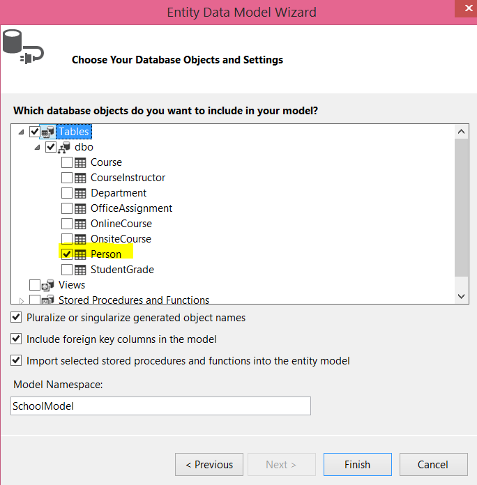
On the next screen, select the tables and other entities you want to keep as the part of the model. To keep it simple I am using only the “Person” table in the model.


As of now we have created the connection with the database and a model has been added to the project. You should see an edmx file has been added as part of the project.


Return JSON from the MVC controller

To return the Person data as JSON, let us go ahead and add an action in the controller with the return type JsonResult. Keep in mind that you can easily write a Web API to return JSON data; however the purpose of this post is to show you how to work with AngularJS, so I’ll stick with the simplest option, which is creating an action which returns JSON data:

publicJsonResult GetPesrons()

        {

            SchoolEntities e = newSchoolEntities();

            var result = e.People.ToList();

            return Json(result, JsonRequestBehavior.AllowGet);


        }


Create an AngularJS service to fetch data using the $http

Here I assume that you already have some knowledge about these AngularJS terms, but here’s a quick review/intro of the key concepts:

Controller

A controller is the JavaScript constructor function which contains data and business logic. The controller and the view talk to each other using the $scope object. Each time a controller is used on the view, an instance gets created. So if we use it 10 times, 10 instances of the constructor will get created. 

Service

A service is the JavaScript function by which an instance gets created once per application life cycle. Anything shared across the controller should be part of the service. A service can be created in five different ways. The most popular way is by using the service method or the factory method. AngularJS provides many built in services also: for example, the $http service can be used to call a HTTP based service from an Angular app, but a service must be injected before it is used.

Modules

Modules are the JavaScript functions which contain other functions like a service or a controller. There should be at least one module per Angular app.

Note: These are the simplest definitions of these AngularJS concepts. You can find more in depth information on the web.

Now let’s start creating the module! First, right-click on the project and add a JavaScript file. You can call it anything you’d like, but in this example, let’s call it StudentClient.js.

In the StudentClient.js we have created a module and a simple controller. Later we will modify the controller to fetch the data from the MVC action.

var StudentApp = angular.module('StudentApp', [])


StudentApp.controller('StudentController', function ($scope) {


    $scope.message = "Infrgistics";


});


To use the module and the controller on the view, first you need to add the reference of the StudentClient.js and then set the value of ng-app directive to the module name StudentApp. Here’s how you do that:

@section scripts{


     <scriptsrc="~/StudentClient.js">script>

}

<divng-app="StudentApp"class="row">

    <divng-controller="StudentController">

        {{message}}

    div>

div>


At this point if you run the application, you will find Infragistics rendered on the view. Let’s start with creating the service. We will create the custom service using the factory method. In the service, using the $http in-built service will call the action method of the controller.  Here we’re putting the service in the same StudentService.js file.

StudentApp.factory('StudentService', ['$http', function ($http) {


    var StudentService = {};

    StudentService.getStudents = function () {

        return $http.get('/Home/GetPersons');

    };

    return StudentService;


}]); 


Once the service is created, next you need to create the controller. In the controller we will use the custom service and assign returned data to the $scope object. Let’s see how to create the controller in the code below:

StudentApp.controller('StudentController', function ($scope, StudentService) {


    getStudents();

    function getStudents() {

        StudentService.getStudents()

            .success(function (studs) {

                $scope.students = studs;

                console.log($scope.students);

            })

            .error(function (error) {

                $scope.status = 'Unable to load customer data: ' + error.message;

                console.log($scope.status);

            });

    }

});


Here we’ve created the controller, service, and module. Putting everything together, the StudentClient.js file should look like this:

var StudentApp = angular.module('StudentApp', []);

StudentApp.controller('StudentController', function ($scope, StudentService) {


    getStudents();

    function getStudents() {

        StudentService.getStudents()

            .success(function (studs) {

                $scope.students = studs;

                console.log($scope.students);

            })

            .error(function (error) {

                $scope.status = 'Unable to load customer data: ' + error.message;

                console.log($scope.status);

            });

    }

});


StudentApp.factory('StudentService', ['$http', function ($http) {


    var StudentService = {};

    StudentService.getStudents = function () {

        return $http.get('/Home/GetPersons');

    };

    return StudentService;


}]);


On the view, we can use the controller as shown below, but keep in mind that we are creating an AngularJS view on the Index.cshtml. The view can be created as shown below:


@section scripts{


     <scriptsrc="~/StudentClient.js">script>

}

<divng-app="StudentApp"class="container">

    <br/>

    <br/>

    <inputtype="text"placeholder="Search Student"ng-model="searchStudent"/>

    <br/>

    <divng-controller="StudentController">

        <tableclass="table">

            <trng-repeat="r in students | filter : searchStudent">

                <td>{{r.PersonID}}td>

                <td>{{r.FirstName}}td>

                <td>{{r.LastName}}td>

            tr>

        table>

    div>

div>


On the view, we are using ng-app, ng-controller, ng-repeat, and ng-model directives, along with “filter” to filter the table on the input entered in the textbox. Essentially these are the steps required to work with AngularJS in ASP.NET MVC application.


Conclusion

In this post we focused on a few simple but important steps to work with AngularJS and ASP.NET MVC together. We also touched upon the basic definitions of some key AngularJS components, the EF database-first approach, and MVC. In further posts we will go into more depth on these topics, but I hope this post will help you in getting started with AngularJS in ASP.NET MVC. Thanks for reading!

Viewing all 2398 articles
Browse latest View live


Latest Images