Quantcast
Channel: Infragistics Community
Viewing all 2372 articles
Browse latest View live

How to create constants in JavaScript?

$
0
0

Constants are immutable variables which value cannot be changed. Once, you have created a constant, its value cannot be changed.

While coding in JavaScript, many times you may have come across a requirement to create constants. Before ECMA Script 6, it was not very easy to create constants in JavaScript. In this post, I will show you to create constants in both ECMA Script 5 and ECMA Script 6.

Constants in ECMA 5

We can create a constant in ECMA Script 5 using Object.defineProperty().  First we need to find out, whether variable would be a global variable or part of the window object.  Once that is determined, create variable by setting writable to false.

Object.defineProperty(typeof global ==="object"? global :window,"foo",
	{
	    value:10000,
	    enumerable:true,
	    configurable:true,
	    writable:false
	});

 Object.defineProperty() function takes three parameters,

  1. Object for which variable should be created
  2. Name of the variable to be created
  3. Object to configure behavior of the variable.

 To create a constant,

  1. As first parameter, we are passing either window object or global object
  2. As second parameter, we are passing name of the variable to be created, which is foo in this case.
  3. As third parameter, we are passing object to configure the variable behavior. Keep in mind to make the writable property to false.

We have created a constant foo. If we try to reassign value of foo, JavaScript will ignore it. However, if we run, JavaScript in strict mode, then JavaScript will throw exception.  Let us see this in action, We are running JavaScript in strict mode and trying to reassign value of foo.

"use strict"Object.defineProperty(typeof global ==="object"? global :window,"foo",
        {
            value:10000,
            enumerable:true,
            configurable:true,
            writable:false
        });

    console.log(foo);
    foo =90;
    console.log(foo);

Due to strict mode, JavaScript will throw exception as shown in the image below:

In this way using the Object.defineProperty() and making writable to false, we can create a constant in ECMA Script 5.

Constants in ECMA 6

As you might have noticed that, creating constants in ECMA Script 5 was not very simple. In ECMA Script 6, new feature const has been introduced. It enables us to create constants or immutable variable.

const foo =10000;
    console.log(foo);

If we try to reassign value of foo, JavaScript will complain about it in ECMA Script 6.  Let us try to reassign value of foo as shown in the listing below:

const foo =10000; 
    console.log(foo);
    foo=90; 
    console.log(foo);

JavaScript will complain about this as shown in the image below:

These are two ways constants can be created in JavaScript. I hope you find this post useful. Thanks for reading.


Infragistics Nominated for Prestigious IxDA Award

$
0
0

As Infragistics’ user experience consulting group, the UX work that we do for our external clients doesn’t always get the recognition it deserves. While our efforts positively effect the working lives of thousands of individuals across all industry verticals, our proudest achievements are often celebrated only by the project teams and the other UX folks here in the office.

From a more personal perspective, my opportunities to be hands-on have become much less frequent given my role as as Director of User Experience. Luckily, when Keysight Technologies contacted us about reimagining the complex, scientific software that controlled their Atomic Force Microscopes (AFM), I was able to collaborate with my friend and colleague Kent Eisenhuth to design an application that far exceeded their expectations (and made us proud).

 003_screen_home_experiment_selected

003a_overview

019_measure_live-update_view

Sample screen shots from our design.

Interaction Design Association (IxDA) Awards

Fast forward to December 1, 2016. That morning, the Interaction Design Association (IxDA), a global network of over 80,000 members worldwide dedicated to the professional practice of interaction design, announced the finalists for its 2017 international awards competition. In the category of “Disrupting: Re-imagining completely an existing product or service by creating new behaviors, usages or markets”, we were honored to be one of the final four! Our complete entry is available for view on the site, but for convenience, I’ve included our video submission below.

[youtube] width="719" height="381" src="http://www.youtube.com/embed/3FvNREcZVVU" [/youtube]

We won’t know if we were selected as the winner of our category until the awards ceremony in NYC on February 8, 2017. In the meantime, we couldn’t be happier to have been included in such prestigious company. Keep your fingers crossed for us!

Introducing Ignite UI Scroll

$
0
0

Introduction

In today’s blog we would like to introduce the new igScroll. This control was previously used only internally in the Ignite UI controls. In this release we rewrote the control to take advantage of the latest browser features and decided to officially release it as part of the toolset. The control allows our customers to create custom scroll solution than the default scrolling the browser provides. The control is available both in the Ignite UI 16.2 Volume Release and on GitHub in our Open Source repository.

igScroll Features

Its goal is to provide a unified and consistent scrolling experience across different platforms and devices. While achieving that it also aims to preserve the most widely used and friendly features and interactions that the browsers provide which the users perform on a daily basis. That way the users will be already familiar with these features.

The main features that the igScroll implements while on desktop or mixed environment are scrolling through mouse wheel, through the provided scrollbars or through keyboard interactions as well.

On touch environments the main focus is user friendliness without distancing itself too much from the default browser experience. That is why it will react on swipes and taps, while providing inertia as well depending on the swipe both vertically and horizontally. To enhance the user experience, the igScroll also implements horizontal swipe tolerance, which means that there will be some dead zone on the horizontal axis initially when starting a swipe. This is to provide the user of small error margin when swiping fast vertically which may result in horizontal movement as well that will lead to unwanted scrolling left or right.

The igScroll provides a more customizable solution for all described features in the previous paragraphs, compared to the default browser and can easily be changed through its options. It also gives the ability for the scrollbars to be styled in any way while providing even more events when interacting with them. That could help in distinguishing if the user has scrolled by using the thumb drag of the scrollbar, by using the arrows or the track area where the thumb drag moves.

Since it was designed to help with the scrolling of the igGrid in many different scenarios it supports syncing between multiple igScroll instances or syncing between an igScroll instance and simple container. This can be used in different scenarios where for example a difference between two texts needs to be previewed or having a content that is spread across two separate elements needs to be synced when scrolling. It also supports detaching of the igScroll’s scrollbars so they can be positioned everywhere and still be interactable or even passing custom scrollbars that have custom implemented logic for scrolling behind them.

Configuring a simple scrollable content

Now let’s look into making content scrollable with the igScroll. It can be achieved easily by initializing the igScroll widget on that element that contains the content. For example, let’s say we have some text paragraphs that we want them put in a container, which could be scrolled by either mouse wheel, scrollbars or touch interactions (when on touch device). To do that we only need to initialize the igScroll onto that container and all these features will be available by default.

If we have the following configuration for body of our page:

Initializing the igScroll on it would look like:

The final looks that we have for our content, with some styling for the #scrContainer would look similar to the screenshot bellow:

Fig. 1: Default igScroll look

Customizing the overall look of the igScroll

As we said earlier the scrollbars that come with the igScroll are fully customizable. This is done through the classes that are applied to them. Since the igScroll is designed for customization, each element has its own set of specific classes that are applied to it.

Two examples of customized scrollbars can be seen in the images bellow:

Fig. 2: Customized igScroll scrollbars

Fig. 3: Customized igScroll scrollbars

The both examples that are displayed above can be seen on our GitHub page. The first example can be seen here, and the second one here.

Syncing containers

Finally, we will look into a more advanced feature that the igScroll is introducing – syncing between multiple igScroll instances. In the following example we will look into connecting two containers that aim to display a difference between two texts. In this case the experience will be greatly enhanced by the ability for both containers to have same scroll position so the differences between each text can be viewed more clearly.


<iframe width="100%" height="400" src="http://jsfiddle.net/cb1c81n9/1/embedded/" allowfullscreen="allowfullscreen" frameborder="0"></iframe>


In the example above you can see that igScroll is initialized on both containers that we want to scroll just like the example we gave in the “Configuring a simple scrollable content” part. The options respectively used are the syncedElemsV/syncedElemsH so they can specify the other element that will be linked on the desired direction.

Using System.JS with Ignite UI controls

$
0
0


AMD signatures

Ignite UI controls can be loaded using standard module loaders. Each module now contains an AMD signature and references dependency modules. System.JS is a popular module loader which is used by the JSPM package manager. This topic describes how to setup System.JS to use Ignite UI controls.

All examples below are executed in Windows PowerShell. Similar commands can be performed in terminal on MacOS. Using Visual Studio Code is recommended, but not required.

Initialize application with JSPM

Install JSPM:

npm install -g jspm

Create a folder for the new application and make it the current folder.

mkdir igsample

cd igsample

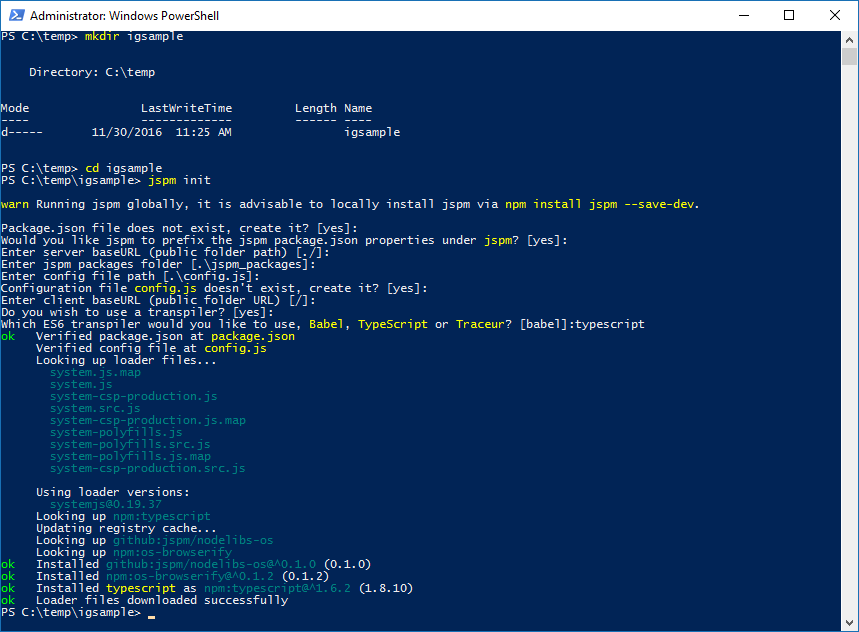
Initialize the application using JSPM:

jspm init

After answering a series of questions (choosing the default answer is OK, although using TypeScript as the transpiler is recommended), you should have everything that is needed to use JSPM and System.JS loader in the application.

Install jquery, jquery-ui, and css loader packages:

jspm install jquery

jspm install jquery-ui

jspm install css

Add Ignite UI package from NPM registry

Ignite UI package can be added through NPM registry. Open source version of the control suite is freely available on NPM.

Full paid version of Ignite UI that includes all Ignite UI controls can also be loaded from NPM. However, to do that one should have a license from Infragistics and a few configuration steps need to be performed to gain access to Infragistics’ private NPM repository. Please refer to this blog post for more information about licensed NPM feed from Infragistics.

If your organization has a private NPM registry setup, you can download the Ignite UI package from igniteui.com and publish it there.


Regardless of the NPM setup, in the end you can bring it to your application by using this command:

jspm install npm:ignite-ui

Reference controls as ES6 modules

Create index.html and js/bootstrap.js, js/igsample.js files using Visual Studio Code (or your favorite text editor). Type

code.

to open the editor in the current folder.

index.html content:

<doctype html>

<head>

    <title>IG Sample</title>

</head>

<html>

    <span id="rating"></span>


    <script src="jspm_packages/system.js"></script>

    <script src="config.js"></script>

    <script>

        SystemJS.import('js/igsample.js');

    </script>

</html>

js/bootstrap.js content:

import 'ignite-ui/src/css/themes/infragistics/infragistics.theme.css!';

import 'ignite-ui/src/css/structure/modules/infragistics.ui.rating.css!';

import 'ignite-ui/src/js/modules/infragistics.util';

import 'ignite-ui/src/js/modules/infragistics.ui.rating';


export function bootstrap(){

    // init code here

}

The exclamation sign at the end of css modules indicates that the module loader should not assume that it is a js module and that the css loader should handle these modules.

js/igsample.js content:

import $ from 'jquery';

import 'jquery-ui';

import {bootstrap} from './bootstrap';


// execute initialization procedure

bootstrap();


$(function(){

    $("#rating").igRating();

})

Run it

The example above can be hosted on your web server. Or if you prefer just quickly run it, use the http-server:

npm install -g http-server

http-server

Open the browser and navigate to http://localhost:8080 to see the application running.

Bundle JavaScript and CSS

The example above instructs the System.JS loader to load all modules that are required for the requested control. The dependency tree is analyzed and necessary files are loaded in the order of dependency.

JSPM can also conveniently bundle all referenced modules along with their dependencies and css files into one js file. This helps to reduce time that is required by the browsers to request multiple individual files from the server.

To bundle all modules, execute the following command:

jspm bundle js/igsample.js --inject

Return to the browser window and open dev tools by hitting F12. Switch to the Network tab then refresh the page. Note that you now have a lot fewer files requested by the browser without changing a single line of code in your application.

To return to separate files execute the following command:

jspm unbundle

This was a quick demonstration of how Ignite UI controls can be used along with JSPM and System.JS loader.

Happy coding!

Geographical Heat Maps and How to Use Them with ReportPlus

$
0
0

Our recent ReportPlus release welcomed a new interactive real-time data visualization to our family — the Heat Map — available for you in ReportPlus Desktop for Windows & ReportPlus Mobile for iOS and Android. Let’s see what a heat map is and how you can use this view to improve your data-driven decision making.

What is a Heat Map?

Heat maps display the density of data points on a geographical map and help you see the intensity of phenomena visualized through a color scale. Normally, red is used to show the highest data density in an area, while blue is used to point to the ‘coldest’ areas, i.e. the areas with the fewest data points. Heat maps are especially handy if you need to analyze bigger geographical datasets.

Creating these maps is easy; you will be able to identify areas of interest on the map with just a few clicks.

What Type of Data do You Need to Create Heat Maps With ReportPlus?

As with the ReportPlus Map View, each row in your data set will need to be bound to a location in the world map. Geocoding is not yet supported in the Heat Map visualization, so be sure to include the geo coordinates (latitude and longitude) in each of your data points. Regardless of whether you have latitude and longitude information in one or in separate columns, ReportPlus will automatically try to recognize your data and visualize it.

Figure 1. Creating a Heat Map from Airport Location Data with ReportPlus Desktop. All Data Visualizations Can Also be Created with ReportPlus Mobile for iOS.

When it comes to map design, you can choose between a political map, a satellite picture or a hybrid between the two.

If you still need to see the exact location of your data, you can add an additional layer to your Heat Map visualization by tapping the Pins and HeatMap option under Layersin ReportPlus. The pins will show the location while retaining the color gradients of the Heat Map.

Assigning Weight to Your Heat Map

Sometimes, there are points in your data which have higher weight than others. For example, displaying earthquake locations on a map would tell us a better story if we include their magnitude on the Richter scale. To achieve this with ReportPlus, simply use the Heat Map’s Weight feature to get a better global understanding of your data.

Looking at Your Geo Data From a New Perspective: Examples

Still wondering how to take advantage of this new data visualization in ReportPlus? To give you a head start, see the below examples:

1. Real Estate

If you are in the real estate industry, mapping out all your current properties for sale/rent in real time can give you a global idea of your portfolio. You might notice, for example, that you offer very few estates in one of the highest-profile neighborhoods. As a result, you might decide to channel more of your sales efforts in this direction. Or, why not add Weight to your data points to display the dollar value of your portfolio across the ReportPlus Heat Map?

Figure 2. Real Estate Heat Map built with ReportPlus Desktop

2. Competitor Analysis

You can use heat maps when collecting market intelligence. Suppose you are founding a fast food chain in the USA. In which states would you establish your first restaurants? Judging from the market penetration of one of your competitors below, why not start with some of the states with lower competitor restaurant density?

Figure 3. Fast Food Chain Locations Heat Map built with ReportPlus Desktop

3. Airline Industry

Need to analyze the economic performance of the airline industry for your academic thesis? It might be useful to map the airport distribution and current population potential of airports in the country:

Figure 4. Airport Locations Heat Map built with ReportPlus Desktop

The above use cases are just the start. You could visualize population data, or metrics such as unemployment rate or crime rate. You could even track your GPS-based personal sports activities geographically by simply connecting to your smartwatch data with ReportPlus.

Having a bird’s-eye view over your geographic data will help you gain new insights and make smarter decisions faster. And with ReportPlus Desktop & Mobile you can take your data visualizations and dashboards with you anywhere, including mobile devices.

Try this geographical data visualization type, and share you findings with your team.

Simplifying Custom Two-Way Data Binding in Angular 2

$
0
0

There are three types of data bindings in Angular 2, they are as follows:

  1. Interpolation
  2. Event Binding
  3. Property Binding

If you are coming from Angular 1.X background, you might be wondering that where is the two-way data binding? Remember, when first time you saw AngularJS 1.X demo, and was just blown away by power of ng-model? Yes, like you, I was also very impressed by power of two-way data binding in AngularJS 1. Even though, AngularJS 1 two-way data binding was beautiful, it came with the baggage of digest cycle and $watch.

To simplify the things, Angular 2 does not have any built in Two-Way data binding. It does not mean; you cannot have two-way data binding in Angular 2 application. Come on, we cannot think of creating a modern web application without having power of two-way data binding. So, in this post, we are going to learn, how to work with two-way data binding in Angular 2.

Two-way data binding with ngModel

Angular 2 provides us a directive ngModel to achieve two-way data binding. It is very simple and straight forward to use ngModel directive as shown in the listing below:

import {Component} from '@angular/core';@Component({moduleId:module.id,
    selector:'my-app',
    template:`<div class="container"><input [(ngModel)]='name'/><br/><h1>Hello {{name}}</h1></div>`
})exportclass AppComponent{


}

To use ngModel directive, we need to import FormsModule in the application. For your reference, below I am listing app.module.ts  which is importing FormsModule besides other required modules.

import { NgModule }      from '@angular/core';import { BrowserModule } from '@angular/platform-browser';import { FormsModule }   from '@angular/forms';import { AppComponent }  from './app.component';@NgModule({
    imports:      [ BrowserModule,FormsModule ],
    declarations: [ AppComponent],
    bootstrap:    [ AppComponent ]
})exportclass AppModule { }

In above demo, when typing into the input element, the input’s value will be assigned to name variable and also it would be displayed back to the view. So we are implementing two-way data binding using ngModel as shown in the below image:

Two-way data binding without ngModel

To understand ngModel directive working, let us see how we can achieve two-way data binding without using ngModel directive. To do that, we need to use

  1. Property binding to bind expression to value property of the input element. In this demo, we are binding name variable expression to value property.  
  2. Event binding to emit input event on the input element. Yes, there is an input event which will be fired whenever user will input to the input element. Using event binding, input event would be bind to an expression.

So, using the property binding and the event binding, two-way data binding can be achieved as shown in the listing below:

import {Component} from '@angular/core';@Component({moduleId:module.id,
    selector:'my-app',
    template:`<div class="container"><input [value]="name" (input)="name=$event.target.value"/><br/><h1>Hello {{name}}</h1></div>`
})exportclass AppComponent{

        name : string="";
    }

Same like ngModel directive demo in this demo also, when typing into the input element, the input element’s value will be assigned to name variable and also it would be displayed back to the view.

So we are implementing two-way data binding without using ngModel using the code shown in the below image:

 Let us understand few important things here:

  1. [value]=”name” is the property binding. We are binding value property of the input element with variable (or expression) name.
  2. (input)= “expression” is event binding. Whenever input event will be fired expression will be executed.
  3. “name=$event.target.value” is an expression which assigns entered value to name variable.
  4. Name variable can be accessed inside AppComponent class.

 So far we have seen two-way data binding using ngModel and without ngModel. We can conclude that the directive ngModel is nothing but combination of property binding and event binding. Event binding is denoted using small bracket and property binding is denoted using square [] bracket, and if you notice syntax of ngModel is [(ngModel)], which is like a banana put into a box suggests it is combination of both event and property binding.

Custom two-way data binding

We should be very careful whether to create a custom two-way data binding or rely on ngModel directive. We really don’t have to create custom two-way data binding always. However, it is good to know steps to create a custom two-way data binding. Let us create a customcounter component with two-way data binding enabled. Let us follow the steps:

 Step 1

Create a component with two buttons and methods to increment and decrement.  

@Component({moduleId:module.id,
    selector:'countercomponent',
    template:`<button (click)='increnent()'>Increment</button>
    {{count}}<button (click)='decrement()'>Decrement</button>`
})exportclass  AppChildComponent {

        count : number=0;      
        increment(){this.count =this.count+1; 
        }

        decrement(){
            this.count =this.count -1; 
        }
    }

Above we have created a very simple component to increment and decrement the count. Now very much we can use this component inside another component, however two-way data binding is not enabled on this component.  To enable that, we need to use @Input and @Output properties.

 Step 2

Let us create a getter with @Input() property. This getter will return the count. Since it is attributed with @Input() decorator, consumer of this component can bind this value using the property binding.

@Input() 
    get counter(){returnthis.count; 
    }


Step 3

To create two-way data binding, we need to create an event of the type EventEmitter. This event is attributed with @Output() decorator such that it can be emitted to the consumer component. We are creating event object in the constructor of the component.

@Output() counterChange :  EventEmitter<number>;constructor(){this.counterChange =new EventEmitter();
    }


Step 4

As last step, increment and decrement functions should emit counterChange event. So, we need to modify increment and decrement function as shown in the listing below:

   increment(){this.count =this.count+1; this.counterChange.emit(this.count);
    }

    decrement(){
        this.count =this.count -1; this.counterChange.emit(this.count);
    }

Both functions are emitting counterChange event. Putting every pieces together, a component with custom two-way data binding will look like code listed below:

import {Component,Input,Output,EventEmitter} from '@angular/core';@Component({moduleId:module.id,
    selector:'countercomponent',
    template:`<button (click)='increment()'>Increment</button>
    {{count}}<button (click)='decrement()'>Decrement</button>`
})exportclass  AppChildComponent {

        count : number=0;   @Output() counterChange :  EventEmitter<number>;constructor(){this.counterChange =new EventEmitter();
        }@Input() 
        get counter(){returnthis.count; 
        }

        increment(){

            this.count =this.count+1; this.counterChange.emit(this.count);
        }

        decrement(){
            this.count =this.count -1; this.counterChange.emit(this.count);
        }
    }


Step 5

Like any simple component, a component with two-way data binding can be used inside another component.

import {Component} from '@angular/core';@Component({moduleId:module.id,
    selector:'my-app',
    template:`<div class="container"><br/><countercomponent [(counter)]="c"></countercomponent><br/><h2>count = {{c}}</h2> </div>`
})exportclass AppComponent{

        c : number=1; 
    }

The main thing you may want to notice the way value of counter property is set inside AppComponent. Like ngModel directive, counter property is also set using the banana in box syntax [(counter)]

Conclusion

Two-way data binding in Angular 2 is supported using the event and the property binding. There is no in-built two-way data binding. We can use ngModel directive to use two-way data binding. Also, if required custom two-way data bindings can be created. Custom two-way data binding us useful in form controls.

In this post, we learnt about ngModel and creating custom two-way data binding. I hope you find this post useful. Thanks for reading.

Communication Between Components Using @Input() in Angular 2

$
0
0

In Angular 2 a component can share data and information with another component by passing data or events. A component can be used inside another component, thus creating a component hierarchy. The component being used inside another component is known as the child component and the enclosing component is known as the parent component.  Components can communicate to each other in various ways, including:

  1. Using @Input()
  2. Using @Output()
  3. Using Services
  4. Parent component calling ViewChild
  5. Parent interacting with child using a local variable

In this article, we will focus on how a child component can interact with a parent component using the @Input() property. We’ll also look into intercepting the input message and logging changes in the input message.


Let us consider the components created in the listing below. We have created a component called AppChildComponent, which will be used inside another component.

import { Component } from '@angular/core';@Component({
    selector:'appchild',
    template:`<h2>Hi {{greetMessage}}</h2>`
})exportclass AppChildComponent {

        greetMessage: string="I am Child";

    }

We have also created another component called AppComponent. Inside AppComponent, we are using AppChildComponent:

import {Component } from '@angular/core';import {AppChildComponent} from './appchild.component';@Component({
    selector:'my-app',
    template:`<h1>Hello {{message}}</h1> <br/><appchild></appchild>`,
})exportclass AppComponent  { 
        message : string="I am Parent";

    }

In the above listings, AppComonent is using AppChildComponent, hence AppComponent is the parent component and AppChildComponent is the child component.


Passing data from parent component to child component

Let us start with passing data from the parent component to the child component. This can be done using the input property. @Input decorator or input properties are used to pass data from parent to child component. To do this, we’ll need to modify child AppChildComponent as shown in the listing below:

import { Component,Input,OnInit } from '@angular/core';@Component({
    selector:'appchild',
    template:`<h2>Hi {{greetMessage}}</h2>`
})exportclass AppChildComponent  implements OnInit{@Input() greetMessage: string ;constructor(){

        }   
        ngOnInit(){

        }
    }

As you notice, we have modified the greetMessage property with the @Input() decorator. Also, we have implemented onInit, which will be used in demos later.  So essentially, in the child component, we have decorated the greetMessage property with the @Input() decorator so that value of greetMessage property can be set from the parent component.

Next, let us modify the parent component AppComponent to pass data to the child component.

import {Component } from '@angular/core';import {AppChildComponent} from './appchild.component';@Component({
    selector:'my-app',
    template:`<h1>Hello {{message}}</h1> <br/><appchild [greetMessage]="childmessage"></appchild>`,
})exportclass AppComponent  { 
        message : string="I am Parent";
        childmessage : string="I am passed from Parent to child component"

    }

From the parent component, we are setting the value of the child component’s property greetMessage. To pass a value to the child component, we need to pass the child component property inside a square bracket and set its value to any property of parent component. We are passing the value of childmessage property from the parent component to the greetMessage property of the child component.

Intercept input from parent component in child component

We may have a requirement to intercept data passed from the parent component inside the child component. This can be done using getter and setter on the input property.

Let us say we wish to intercept an incoming message in the child component, and combine it with some string.  To achieve this, we created a property called _greetmessage and using @Input() decorator creating getter and setter for _greetmessage property. In the getter, we’re intercepting the input from the parent component and combining it with the string. This can be done as shown in the next listing:

import { Component,Input,OnInit } from '@angular/core';@Component({
    selector:'appchild',
    template:`<h2>Hi {{_greetMessage}}</h2>`
})exportclass AppChildComponent  implements OnInit{


        _greetMessage : string; constructor(){

        }   
        ngOnInit(){

        }

    @Input()
        set greetMessage(message : string ){this._greetMessage = message+" manipulated at child component"; 
        }
        get greetmessage(){returnthis._greetMessage;
        }

    }

In the setter, we are manipulating incoming data from the parent component and appending some text to that. Keep in mind that the behavior of the parent component would not change whether we are intercepting the message or not. To explore it further, let us take another example and create a child component, which will display names passed from the parent. If the parent passes empty name value, then the child component will display some default name. To do this, we have modified the setter in the child component. In the setter, we are checking whether the name value is passed or not. If it is not passed or it is an empty string, the value of name would be assigned to a default value. The child component can be created as shown in the listing below:

import { Component,Input,OnInit } from '@angular/core';@Component({
    selector:'appchild',
    template:`<h2>{{_name}}</h2>`
})exportclass AppChildComponent  implements OnInit{


        _name: string; constructor(){

        }   
        ngOnInit(){

        }

    @Input()
        set Name(name : string ){this._name = (name && name.trim()) ||"I am default name"; 
        }
        get Name(){returnthis._name;
        }

    }

As you notice in the @Input() setter, we are intercepting the value pass from the parent, and checking whether it is an empty string. If it is an empty string, we are assigning the default value for the name in the child component.

We can use AppChildComponent inside parent component AppComponent as shown in the listing below:

import {Component } from '@angular/core';@Component({
    selector:'my-app',
    template:`<h1>Hello {{message}}</h1> <br/><appchild *ngFor="let n of childNameArray"
    [Name]="n"></appchild>`,
})exportclass AppComponent  { 
        message : string="I am Parent";
        childmessage : string="I am passed from Parent to child component"
        childNameArray = ['foo','koo',' ','moo','too','hoo',''];

    }

Inside parent component, we are looping the child component through all items of childNameArray property. A few items of the childNameArray are empty strings, these empty strings would be intercepted by the child component setter and set to the default value. The child component will render the values passed from the parent component as shown in the image below:

ngOnChanges and @Input() decorator

We can intercept any input property changes with OnChanges lifecycle hook of the component. There could be various reasons that Input property can be changed in the parent component and needed to be intercepted in the child component. This can be done on the OnChanges life cycle hook.

Let’s imagine we need to log changes on an Input variable called counter. The value of counter is set by the parent component, and can be changed in the parent component. Whenever the value of counter is changing in the parent component, we need to log the changes in the child component. We created a child component as shown in listing below:

import { Component,Input,OnChanges,SimpleChange } from '@angular/core';@Component({
    selector:'appchild',
    template:`<h2>{{counter}}</h2><h2>Value  Changed</h2><ul><li *ngFor="let c of changeLog">{{c}}</li></ul> `
})exportclass AppChildComponent  implements OnChanges{@Input() counter =0 ; 
        changeLog : string[] = []; constructor(){

        }   

    
        ngOnChanges(changes : {[propKey:string]: SimpleChange}){let  log : string [] =[];for(let p in changes){let c = changes[p];
            console.log(c);let from = JSON.stringify(c.previousValue);let to = JSON.stringify(c.currentValue);
            log.push(`${p} changed from ${from} to ${to}`);

        }

        this.changeLog.push(log.join(', '));

    }

    }

Essentially we are doing the following:

  1. Implementing OnChanges life cycle hook
  2. In ngOnChanges method, passing array of type SimpleChange
  3. Iterating through all the changes and pushing it to a string array

Whenever the value of counter will be changed, the child component will log the previous value and current value. The reading of the previous value and current value for each input properties is done in the ngOnChnages method as shown in the image below.   

At the parent component, we are assigning a new random number to count the property on click of the button, and also setting the count property as the value of the child component’s input property counter.

import {Component } from '@angular/core';@Component({
    selector:'my-app',
    template:`<h1>Hello {{message}}</h1> <br/><button (click)="nextCount()">change count</button> <br/><appchild [counter]="count"></appchild> `,
})exportclass AppComponent  { 
        count : number=0; 

        nextCount(){
            console.log("hahahah");this.count =this.getRandomIntInclusive(this.count,this.count+1000);
        }

        getRandomIntInclusive(min :number, max: number) {
            min =Math.ceil(min);
            max =Math.floor(max);returnMath.floor(Math.random() * (max - min +1)) + min;
        }

    }

Essentially in the parent component, we are setting the value of the child component’s input property counter with the parent component’s count property, and also changing its value on each click of the button.  Whenever the count property value changes at the parent component, the value of the counter input property will be changed in the child component and the changed value would be logged.

On running the application, we may get the expected output with a change log as shown in the image below:

Conclusion

In this article, we learned how to pass data from a parent component to a child component. We also learned how to intercept the input message and log changes. In further posts, we will explore more aspects of component communication. I hope you found this post useful, thanks for reading!

Infragistics Windows Forms Release Notes – December 2016: 16.1, 16.2 Service Release

$
0
0

With every release comes a set of release notes that reflects the state of resolved bugs and new additions from the previous release. You’ll find these notes useful to help determine the resolution of existing issues from a past release and as a means of determining where to test your applications when upgrading from one version to the next.

Release notes are available in both PDF and Excel formats. The PDF summarizes the changes to this release along with a listing of each item. The Excel sheet includes each change item and makes it easy for you to sort, filter and otherwise manipulate the data to your liking.

Windows Forms 2016 Volume 1 Service Release (Build 16.1.20161.2118)

Windows Forms 2016 Volume 2 Service Release (Build 16.2.20162.2040)

How to get the latest service release?


Infragistics WPF Release Notes – December 2016: 16.1, 16.2 Service Release

$
0
0

Release notes reflect the state of resolved bugs and new additions from the previous release. You will find these notes useful to help determine the resolution of existing issues from a past release and as a means of determining where to test your applications when upgrading from one version to the next.

Release notes are available in PDF, Excel and Word formats. The PDF summarizes the changes to this release along with a listing of each item. The Excel sheet includes each change item and makes it easy for you to sort, filter and otherwise manipulate the data to your liking.

In order to download release notes, use the following links:

WPF 2016 Volume 1 Service Release (Build 16.1.20161.2174)

WPF 2016 Volume 2 Service Release (Build 16.2.20162.2045)

Ignite UI Release Notes - December 2016: 16.1, 16.2 Service Release

$
0
0

With every release comes a set of release notes that reflects the state of resolved bugs and new additions from the previous release. You’ll find the notes useful to help determine the resolution of existing issues from a past release and as a means of determining where to test your applications when upgrading from one version to the next.

Release notes are available in both PDF and Excel formats. The PDF summarizes the changes to this release along with a listing of each item. The Excel sheet includes each change item and makes it easy for you to sort, filter and otherwise manipulate the data to your liking.

Download the Release Notes

Ignite UI 2016 Volume 1

Ignite UI 2016 Volume 2

Infragistics ASP.NET Release Notes - December 2016: 16.1, 16.2 Service Release

$
0
0

With every release comes a set of release notes that reflects the state of resolved bugs and new additions from the previous release. You’ll find the notes useful to help determine the resolution of existing issues from a past release and as a means of determining where to test your applications when upgrading from one version to the next.

Release notes are available in both PDF and Excel formats. The PDF summarizes the changes to this release along with a listing of each item. The Excel sheet includes each change item and makes it easy for you to sort, filter and otherwise manipulate the data to your liking.

Download the Release Notes

ASP.NET 2016 Volume 1

ASP.NET 2016 Volume 2

Infragistics Silverlight Release Notes – December 2016: 16.1 Service Release

$
0
0

Release notes reflect the state of resolved bugs and new additions from the previous release. You will find these notes useful to help determine the resolution of existing issues from a past release and as a means of determining where to test your applications when upgrading from one version to the next.

Release notes are available in PDF, Excel and Word formats. The PDF summarizes the changes to this release along with a listing of each item. The Excel sheet includes each change item and makes it easy for you to sort, filter and otherwise manipulate the data to your liking.

In order to download release notes, use the following links:

Silverlight 2016 Volume 1 Service Release (Build 16.1.20161.2143)

How to integrate IgniteUI with Aurelia

$
0
0

This blog post will demonstrate the usage of IgGrid in Aurelia application, but the steps are applicable for all of the Ignite UI widgets.

Aurelia made a great effort to deliver to its users several ways for building Aurelia applications. This will be a walkthrough of the most popular one - Creating a project using Aurelia CLI.

Prerequisites

This is the list with the requirements:

  • Install NodeJS version 4.x or above. You can download it here.
  • Install the Aurelia CLI - npm install aurelia-cli -g
  • Download and install the Ignite UI product itself

Once the prerequisites are available, Creating a new Aurelia Project could take place.

  • Type au new
  • Select the defaults(hit enter several times)
  • To run the project type au run, but before running it, let's create our IgGrid component.

Aurelia provides writing applications in ESNext or in TypeScript, this blog post is using the default one - ESNext. Also note that you could type au run --watch if you don't want to re-run the project on every single change.

Build the IgGrid Component

Let's build the ViewModel. Go to the src folder and create a file ig-grid.js with the following content:

 import {bindable, inject} from 'aurelia-framework';
 import '../igniteui/js/infragistics.lob';
 @inject(Element)
 export class IgGrid {
     @bindable options;
     @bindable id;
     constructor (element) {
         this.element = element;
     }
     attached() {
         var grid = $(this.element).find('table');
         //set id of the grid
         grid.attr("id", this.id);
         //initilize the widget
         grid.igGrid(this.options);
     }
 }

There are two Bindable properties to the ViewModel, which will be populated as attributes. To achieve the binding between an attribute and a property of the class, the property should be decorated with @bindable decorator. The First property options is used for specifying the grid configuration and the second one is the id attribute of the HTML element on which the widget is going to be initialized.

The Aurelia dependency injection gives the opportunity to refer to the template from the view(the table HTML element). This element is injected in the constructor and stored.

Afterwards in order to make sure the component is attached to the DOM for the initialization, the attached lifecycle callback is used.

The view is used to specify the HTML element on which the igGrid is initialized.

Create ig-grid.html file with the following content:

Invoke IgGrid Component

In order to use the component we've already built, go to the application template - app.html; and inside it require and initialize the component:

Now opts and id should be defined in app.js file:

 export class App {
     constructor() {
         this.message = 'Ignite UI igGrid with Aurelia';
         this.id = "grid1";
         this.opts = {
             caption: "Angular2",
             primaryKey: "Id",
             dataSource: [
                 { "Id": 1, "Name": "John Smith", "Age": 45 },
                 { "Id": 2, "Name": "Mary Johnson", "Age": 32 },
                 { "Id": 3, "Name": "Bob Ferguson", "Age": 27 }
             ],
             columns: [
                 { headerText: "Id", key: "Id", dataType: "number", hidden: true },<
                 { headerText: "Name", key: "Name", dataType: "string" },
                 { headerText: "Age", key: "Age", dataType: "number" }
             ],
         };
     }
 }

Ignite UI references

And finally Ignite UI scripts should be included. Download them from here and include them into the project. For this demo we've created 'igniteui' folder, where the Ignite UI product is located and have imported the infragistics.lob.js file in the ViewModel, this file has dependencies to:

  • jquery
  • jquery-ui
  • infragistics.core.js

What we need to resolve is jQuery and jQuery UI packages.

Include as devDependencies into the package.json:

"jquery": "1.12.4",
"jquery-ui-dist": "1.12.1"

And in order to bundle all of them put them as dependencies in aurelia.json file which is aurelia_project folder:

"jquery",
 {
"name": "jquery-ui",
"path": "../node_modules/jquery-ui-dist",
"main": "jquery-ui.min"
 }

The same rules apply to any Ignite UI widget and all of them can be integrated in an Aurelia application.

Now you’re ready to run the application and see the igGrid, type au runin the console.

Download the demo.

Steps to run the demo:

  1. Make sure Aurelia CLI is installed
  2. Type npm install
  3. Type au run

Link to the live demo.

Why Storytelling through Data Is a Required Skill in 2017

$
0
0

Business Intelligence, data visualization and dashboards made a huge impact in 2016. In fact, 89% of business leaders believe big data will revolutionize business operations in the same way the Internet did. The exponential growth of business data - and the numerous choices a user has when it comes to visualization solutions available - make it hard for users to make sense of data effectively. Data visualizations are key to telling an impactful story in a business environment. As such, choosing what data to visualize and how to present it has become a vital skill in today’s business world.

To those unacquainted with the world of data and Business Intelligence, its rows of unintelligible numbers and confusing jargon can feel intimidating. Nevertheless, you do not need a statistics PhD to begin creating effective data visualizations and dashboards.

There is a substantial amount of research that shows that visual learning is key. It takes the brain roughly 13 milliseconds to process an image; in comparison, it takes around 60,000 times as long to process basic text. 65% of visual information gets retained in memory for more than 3 days, compared to 10-15% learning recall for spoken or written information.

Adapted from: Dale 1969

As the above table demonstrates, the brain is able to preserve information much more effectively when provided with visuals compared to written and spoken information. This can be proven by simply comparing the table with its visualization shown with the chart below:

Of course, most people are already very aware of the benefits that data visualizations can offer; the problem is actually creating them. Given the sheer quantity of available data and methods of visualizing it, it can seem rather intimidating.

Know your story

The explosion of data now makes it easier than ever to back your business story with proof points. Being able to effectively justify your idea has always been emphasized in businesses – whether it’s showing a new concept to your boss or presenting a project in front of your team. With new data visualization solutions available, like ReportPlus, you can now connect, explore and turn your data into a powerful visual story to drive influence in your organization.

It’s easy to get lost in this ever-expanding ocean of data – so it is vital that you understand where your data sits and what the purpose of your data visualization is from the beginning. The role of visualization solutions like ReportPlus is to simplify connecting data streams, help you uncover your strongest proof points and expedite visual story telling. A valuable approach is also to take on a storytelling mindset. Giving your visualization a narrative offers it a spine, and makes it far less likely to end up trailing off (along with your audience’s attention).

Once you think you have the basis for your data visualization, ask yourself the following questions:

• Who is your audience?

• What are the key messages you want to convey?

• What questions might your visualization spur?

• Do you have the answers to those questions?

• What conversations may result?

The notion of questions and conversations is very important, as that should be one of your main aims for your visualization. You want your viewers to come away with something after they’ve spent time with it, so that they’re more likely to remember the information you’ve shown them.

Find the right pattern

When analyzing data, searching for patterns or interesting insights is a great starting place for creating the base of your story. The three common patterns conveyed through data are trends, correlations, and outliers.

Trends

You can use data to express a variety of different things, but one of (if not the) most common theme for data visualizations is displaying trends. Tracking trends over time is a frequent favorite, used for its simplicity and clarity. These are most often displayed in the form of bar, area and line charts.

Correlations

The perfect pattern for comparing and contrasting, correlations help put your data into perspective. You may have found an interesting parallel between two data sets, or an alarming difference between two others. There is a certain attraction to seeing two elements juxtaposed, and correlation patterns are extremely popular. By highlighting the two side-by-side, your results become far clearer and more striking.

Outliers

Outliers may seem like a burden when analyzing data, and are recognized by some as ‘faulty data’. While this is sometimes the case, they can actually form the starting point for creating your data story. Outliers are defined as data that lies a considerable distance away from the mean or median average, and so are good ways of identifying any dissimilarities or unusual instances in your findings.


Having a good base for your data story is one of the prerequisites for making your presentation understandable and memorable for your audience. In the free whitepaper ‘The Beginner’s Guide to Effective Business Storytelling with Data Visualizations’ we discuss what else you need to know to get started with visualizing your data, and unlocking its large-scale potential: how to work out your story, how to understand your data, which type of chart to choose and how to present your data and how to create a dashboard from your data and make it shine.

Keen to explore the power of data storytelling in your job? Try ReportPlus today to discover and present new solutions for your business.

Put User Research Knowledge Where It Belongs

$
0
0

Imagine conducting extensive user research. You reveal extremely interesting information and present it to your client and the project team. They seem intrigued and appreciate learning about the users and their needs. You feel that you’ve done a good job and that this knowledge is going to make a big difference in their project. However, you find months later that your report sits on a shelf, your presentation sits in a project folder on the server, the personas lie under a pile of other documents on people’s shelves, and the information you conveyed has faded from the minds of the meeting attendees.

How did this happen? Why does user research information sometimes go unused, and how can we prevent this from happening? Of course, the easy answer may be that the research was poorly planned, poorly conducted, or the findings were poorly presented. But why does even good research get forgotten? Let’s look at the answers to that question.

Knowledge inscribed on building 
Image courtesy of Marcin Wichary by Creative Commons license

User Research Provides Knowledge and Understanding

User research provides valuable information about the users, their tasks, the tools they use, and their environment, but that information doesn’t always translate directly into concrete recommendations or requirements. Unlike usability testing, which finds problems and provides specific recommendations, user research provides knowledge and understanding, which is important, but doesn’t always point to immediate design directions.

This understanding of the users and their needs becomes valuable when making design decisions. As you decide how a particular feature or interaction should work, you pull upon the information that you learned during user research to make the right decisions.

Research Knowledge Is Needed to Make Design Decisions

For user research to be successful, the knowledge and understanding of the users has to reside in the minds of the people who need that information the most – the designers. Yes, it’s good for everyone to hear about the user research findings, but the people who most need to absorb the information are those who need to make direct design decisions based on that information.

Reading a report or attending a presentation provides information, but it doesn’t always stick in people’s minds. The findings are distilled down to a summary, which is fine for most of the audience, but it’s not enough to deeply internalize the information. To truly understand the users and their needs, designers need to attend or to conduct the research themselves. Either the designer should be a generalist researcher and designer, or the designers should attend and observe the research sessions, led by a researcher specialist.

Two silos 
Image courtesy of Rutkowski Photography by Creative Commons license

Siloed Research and Design Isn’t User-Centered

Perhaps the worst arrangement is when research and design are siloed activities performed by different specialists. A researcher conducts the user research alone and presents the findings to the project team. The designer then conducts the design alone, using whatever is remembered from the user research presentation. In this model, the person with the deepest understanding of the users, the researcher, is not involved in the design.

Where Does User Research Knowledge Belong?

User research knowledge belongs in the minds of everyone involved in a project, but it’s most important for that information to be deeply engrained in the minds of those making decisions. That’s primarily the designer. Involve designers to get the best value out of user research.


Custom Data Visualizations using D3.js with ReportPlus

$
0
0

Introduction

Introduction

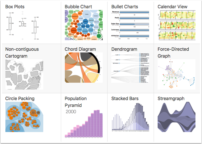
One of the most powerful data visualization frameworks on the web is D3.js. The visualizations can be simple or really complex. If you're curious for more examples, the D3.js visualizaiton gallery has some real amazing work. With such a powerful and flexible framework comes the tradeoff of being familiar with HTML, CSS, JavaScript, SVG, etc. Despite needing a basic knowledge of all those topics, there's quite the plethora of tutorials online for using this framework.

This exploratory blog post will dive into creating a D3.js visualization using data from ReportPlus in a dashboard.

Data

Data
When using the DIY Visualization in ReportPlus, that's the icon that looks like </> in the visualization gallery when editing a widget, data will be passed to the web page to allow for custom rendering. To facilitate the receiving of widget data the inclusion of rplus_bridge_utils.js file is required to be included with the reference scripts on your visualization page.

[custom] width="600" height="80" src="https://pastebin.com/embed_iframe/KBptpFYw" [/custom]

With the rplus_bridge_utils.js file reference in place a new SCRIPT tag is created to house the RPBridgeListener as well as the notifyExtensionIsReady method call to signify that the extension is ready when the page loads.

[custom] width="600" height="350" src="https://pastebin.com/embed_iframe/tQxLsEaT" [/custom]

The tabularData parameter object has many properties that can be used with custom visualizations. A few include:

  • tabularData.data.length - Returns how many rows of data
  • tabularData.data[index] - Returns a row data array
  • tabularData.metadata.columns.length - Returns total columns
  • tabularData.metadata.columns[index] - Returns column object (this returned object has .name and .type properties)

Using these properties a generic visualization could be made to display the row data on a web page.

[custom] width="600" height="1025" src="https://pastebin.com/embed_iframe/Ciav8gTc" [/custom]

When the above web page is added to the DIY Visualization the widget will look similar to the example below.

2effa8db-45c9-43a3-94a8-12cf35a79097.png

Integration

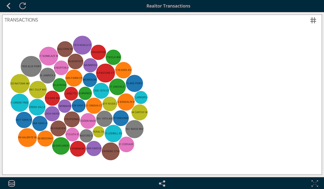
The visualization that this blog post will create is a bubble chart based off an example found on the D3.js gallery page. Instead of using a CSV for data, ReportPlus will supply the data through the previously mentioned RPBridgeListener. Once the data is received all that's necessary is to iterate through and add each data item to an array. Afterwards, a method is called to draw the visualization.

[custom] width="600" height="480" src="https://pastebin.com/embed_iframe/gmxWRfMA" [/custom]

If you're confused on where the rowData index numbers came from, take a look at the previous image. Each line is a row of data that is comma separated; the address corresponds with index 0 and the value with index 1.

Next, when the drawBubbleChart method is called the visualization is setup in similiar fashion to the example from the D3.js gallery page. This includes the diameter, color palette, circle shapes, clip path and text.

[custom] width="600" height="980" src="https://pastebin.com/embed_iframe/RFNSq8E4" [/custom]

The current visualization is nearly complete, with the exception of automatically resizing when the window changes size. To achieve this, a listener is added for resize when the page loads.

[custom] width="600" height="75" src="https://pastebin.com/embed_iframe/xXERY7CU" [/custom]

The listener will call the redraw method any time there's a size change to the webpage.

[custom] width="600" height="130" src="https://pastebin.com/embed_iframe/csHgjXtN" [/custom]

With the webpage complete, you'll need to host it on a webserver. The URL from this will be added to the DIY Visualization. The following is a link to the HTML we've built from this post.

http://bit.ly/2ieqEWj

Visualization

Visualization

Once you've added the visualization page URL to the DIY Visualization you'll see something similiar to the image above. If you'd like to experiment with the same data source I used, feel free to download or directly use this link as a web resource within ReportPlus.

https://dl.dropbox.com/s/nrc1lv1n9xuz20n/Sacramentorealestatetransactions.csv?dl=0

Infragistics – IxDA 2017 Peoples Choice Award

$
0
0

As Infragistics’ user experience consulting group here in Cranbury, the UX work that we do for our clients doesn’t always get the recognition it deserves. While our efforts positively affect the working lives of thousands of individuals across all industry verticals, our proudest achievements are often celebrated only by client project teams and the other UX folks here in the office.

Infragistics UX Finalist

That changed for us this past December 1, when the Interaction Design Association (IxDA), a global network of over 80,000 members worldwide dedicated to the professional practice of interaction design, announced that we were one of four finalists for its 2017 international awards competition (Disrupting: Re-imagining completely an existing product or service)!

Here’s Where You Can Help

In addition to the award for “Disruptive Design”, we are also in the running for the “Peoples’ Choice” award. Basically, the public is invited to review all the award submissions and vote for the one they like best. Our entry is here: http://awards.ixda.org/entry/2017/re-imagining-atomic-force-microscopy/.

As a loyal IG blog reader, I respectfully ask two favors:

  1. Visit the link to our entry and vote for us (by February 7, 2017). All you need to do is select the big “Vote for this Project” button. Only one vote per person will count ;-)
  2. Post our project link across your social media to let your friends know about us.

I appreciate your help and look forward to my next blog, when I hope to tell you what it’s like to ride NJ Transit sitting next to a trophy (or two) ;-)

Thanks very much,

Kevin

Director of User Experience, Infragistics

What's New in IG TestAutomation 2016.2

$
0
0

The primary focus for Infragistics Test Automation is to offer you peace of mind. Such that when you develop with our controls, your teams can seamlessly implement automated testing of the user interface (UI) to confidently produce higher-quality releases. IG Test Automation, currently supports our Windows Forms controls via HP’s Unified Functional Testing (UFT) and IBM’s Rational Functional Tester (RFT).  We also support our WPF controls via HP’s UFT.

As IG Test Automation’s purpose is to automate tests of the UI of applications using IG controls, this what’s new will start off with the new controls that you will want to explore and test with and I will follow with changes in existing controls that had changes that would affect how the UI behaved. 

New Controls supported by IG TestAutomation

UltraOfficeNavBar

First up on our list is a new control for Windows Forms, inspired by the Outlook Navigation bar, the Ultra Office Nav Bar provides a simple way to navigate between different views of the same data. This enables you to provide your users with several different presentations and allows them to choose the one that works best for them at any time. This control also enables users to quickly access a subset of their detailed data in a popup “Peek Window” when a user hovers over any item in the control. The Peek Window can contain text or a picture (or a mixture of both) and enables users to see a summary of data for an item without having to open the it. There are many ways to customize the layout and information, and we invite you to explore all the creative ways you can present data to your users with it.

UltraZoomPanel

Helping to blur the lines between Windows Forms and WPF, this next control for Windows Forms, added in release 16.2 is the Ultra Zoom Panel. This new control is actually a container that can contain other controls, and it allows the user to zoom in and scroll through the contents of the contained controls. For example; if you were to place one of our Ultra Grid controls inside of an Ultra Zoom Panel, you would have the ability to zoom in on the grid data as shown in this image:

Zoom Panel - zoomed 100%

(Zoom set to 100%)

(Zoom set to 175%)

UltraColorPicker

We’ve redesigned the color-selecting experience to provide a modern UI, allowing you to customize the palette any way you like. The centerpiece of the new color selection experience is the Ultra Color Palette. The Ultra Color Palette is a standalone control and is ready to be added to your Windows form for a direct access color-selecting experience. We support RGB, HSL, or CMYK format as well as five different view styles to choose from.

xamCategoryChart

On the WPF front, the xamCategoryChart is a brand new charting control that makes visualizing category data a breeze. Built on top of the market’s highest performing and feature rich xamDataChart, the xamCategoryChart simplifies the complexities of the data visualization domain into an easy-to-use API. Simply data bind a collection of data, or a collection of collections, to the ItemsSource property and watch the magic happen. The xamCategoryChart will analyze the data and automatically choose the best series to represent your data. You can easily decide for yourself which type of chart to use by setting the xamDataChart.ChartType property. Choose from the following chart types:

  • Line
  • Area
  • Column
  • Point
  • Spline
  • Spline Area
  • Step Areas
  • Step Line
  • Waterfall

IG Controls with UI-Altering Improvements

xamDataGrid

Our WPF control suite already has one of the best grids available, but in 16.2 we’ve made it even better. We’ve added a “Select All” option to the Field Chooser. This makes it easier for users who have Field Layouts with a lot of fields to select them all without having to check every one.

A great feature of the xamDataGrid is its flexible and rich filtering capabilities. We’ve made a great improvement to filtering by adding a Cross Field Filtering feature. The current xamDataGrid filtering behavior is set to a single field at a time. Users can create as complex a filter as they want, but it can only be applied to a single field. For each field that needs a filter, a new filter must be added to that field.

With Cross Field Filtering, a user can create a single filter and apply to as many fields in a single Field Layout as they want. This means that users can now create filters that include values from many different fields that are in the same Field Layout.

New menu options have been added to the xamDataGrid’s Header Prefix Area that exposes this new cross field filtering feature.

The new cross field filtering dialog looks similar to the existing field filtering dialog, but with the difference in that it provides a ComboBox that allows the end-user to choose which Field to include in the filter.


Download the free trial of IG TestAutomation for HP 16.2
http://www.infragistics.com/products/windows-forms-test-automation-for-hp/download

Download the free trial of IG TestAutomation WPF for HP 16.2
http://www.infragistics.com/products/wpf-test-automation-for-hp/download

Download the free trial of IG TestAutomation for IBM RFT 16.2
http://www.infragistics.com/products/windows-forms-test-automation-for-ibm/download

Voice your suggestions today, for the products of tomorrow 
http://ideas.infragistics.com/

Introduction to Localization and Internationalization

$
0
0

Localization and Internationalization: What do these terms mean?

Internationalization means making your product flexible enough to be localized to other languages. This includes, but isn't limited to, externalization of string and image resources, applying correct number, date, time, and currency formats based on region, text input considerations, and right to left support. This is effectively the "prep work" that must be done before localization can be applied. The term globalization is also used for the same purpose.

Localization is the process of translating (and otherwise tweaking) your product to be accepted in a specific locale. Often this starts with translation of text and possibly images. Layouts may have to be modified to fit the new content. Certain content may have to be changed to be more applicable to the target culture. Testing is also very important, especially by a native speaker, to make sure everything makes sense and that the expected tasks can be accomplished.

You may see "i18n" and "l10n". These are abbreviations for the previously discussed terms, created from the first and last letters of the words, and the number of letters between them.

What's in it for me?

Code may be a universal language, but if a UI (user interface) is only in one language, the market potential is limited. Would you want to use software with a non-English UI if you only speak English? Of course not! And neither would non-English speakers want to use an English UI! This is where Localization and Internationalization come in - expanding the market and making your users happy.

Non-Software Examples

How would you read this advertisement for a soft drink?

  1. A man is exhausted in the desert.
  2. He drinks the soda.
  3. He is full of energy!

Seems like a great advertisement, right? Well... what if you market this in a country where they read right to left?

  1. A man is full of energy!
  2. He drinks the soda.
  3. Dead in the desert?

Don't quite want that soda anymore, do you?

The Chevy Nova didn't sell very well in Spanish speaking countries. After all, why would you want to buy a car that doesn't go ("no va")?

This movie is called "Laputa: Castle in the Sky" in Japanese. But for western audiences it was changed to just "Castle in the Sky" to avoid being potentially offensive in Spanish.

Software Examples

My next blog will be about best practices for software internationalization and localization, so I will cover the software part in more detail then. Here are some quick examples.

Text Input - Make sure your users can enter non-English characters (like letters with accents or even Chinese, Japanese, Korean, Arabic, etc.) in your text boxes and combo boxes. If they can't, your application won't be usable.

Layout - Be sure to allow extra space for translations. Some languages, like German, tend to have longer text length than English. Positioning labels above inputs can also help resolve layout issues.

Number, Date, Time, and Currency Formats - These can often be formatted automatically based on a regional setting. Libraries like .NET provide this functionality with methods like "DateTime.ToShortDateString()".

For further information about internationalization and localization, here are some useful reference links:

L10N and I18N Best Practices

$
0
0

This post will focus on localization and internationalization in software. It will provide some guidance on best practices, as well as what to avoid. If you haven't read my previous blog post introducing Localization and Internationalization, you can read it here.

Best Practices

Get Started Early

Don't write your application and then rewrite it to be internationalized. Save yourself some time and plan this from the beginning. Get the project manager on board with this and make sure the specification research is done for all target locales. If you need to get stakeholders to approve, explain the benefits of internationalization with regards to market expansion and user experience. This means more sales because there are more potential customers. If that doesn't do it, write a sample app or make a prototype that's in another language, and tell them to use it.

Flexible Layout

As mentioned in the previous post, text length varies between languages. There are 2 major options here:

  1. Adjust the layout for each locale where necessary.
  2. Allow enough space to fit all target languages. You can place labels above entry fields to provide more space, and right-align text in front of inputs if they need to be on the same line.

Support For Non-English Input

Not all languages use the A-Z alphabet. Make sure that your application supports non-English characters. For example, there are characters with accents above letters, and there are also languages that require multiple keystrokes to input one character (IME input). Make sure that support for the target languages is a development requirement and test it early.

Unicode Encoding

Ever see a message show up as all "?" or blocks ([])? Chances are that the page is incorrectly encoded. It's recommended to use Unicode (UTF-8) encoding in your files. In some applications the default is ANSI or other encodings based on your region, so be sure to check!

Culture-Specific Formatting

Numbers, dates, times, currencies, and even calendars can have different formats. For example, some cultures use "." to separate thousands from hundreds in numbers. Many will use different currency symbols. Most cultures use military (24-hour) time instead of 12-hour with "AM" and "PM". Dates vary widely. The common format in Europe is day/month/year, where in Japan it is year/month/day. There are even different types of calendars, like the imperial calendar in Japan and a Hebrew calendar in Israel which are both used in government.

Allow for Right to Left

If one of your target locales uses right-to-left layout, make sure that your UI accounts for that.

Native Speaker Review

Have a native speaker review the localized application. This will help to catch any internationalization or localization issues that were missed, and check that the localized product makes sense and is usable. If you have any concerns about the localization, this is the time to raise them and get feedback.

What to Avoid

Hardcoded Text

To make sure the application is properly internationalized, you can substitute all text and applicable images with placeholders (like Lorem Ipsum for text and sample images), then provide it for testing at an early state. If they find something that's not placeholder, or something that doesn't work correctly with the placeholder content, then you're not fully internationalized. This is easy to do if your strings (and other resources where necessary) are externalized to separate files (like .resx in .NET). Then you can simply create a copy of the file with the placeholder content and test with that locale applied. This way you don't lose any of your real content, and when it has passed testing, you can localize it in-house or outsource it to a language vendor. For example, you might have a string equality check in your code-behind that will only work for the default locale. It's best to catch those things early.

Offensive Content

Different cultures will interpret things differently. Colors and symbols have different meanings. There are also cultural sensitivities, like war history and territory disputes. You can customize content to fit the target culture.

Text in Images

If possible, don't put text in images. This way there is a higher chance that the image can be reused. If you need text, you can overlay it with the image so that the image doesn't have to be changed.

Concatenated Strings

Word order is different between languages. Don't count on it being the same, or else you'll get unintelligible translations. For example, given a string variable called "favoriteColor", a sentence like ["My favorite color is " + favoriteColor] won't work in all languages. The color word won't always come at the end of the sentence. String interpolation can be used here as an alternative, so that the placeholder can be moved in the translation, and it's clear that something is appended. This would instead become ["My favorite color is {0}"], so the {0} could be moved wherever in the sentence it is needed.

Spaces For Layout

Never use additional spaces in labels to adjust where text appears. Use text alignment properties instead. The reason why spaces won't achieve the desired result is that the text length is different between languages, and it will be frustrating to figure out how many spaces are needed in each language based on trial and error. This may also differ based on OS or browser default font settings.

Confusing Content

Make your content easy to understand. If you use a language vendor, you want to make their job easy so that the final product is high quality. Using slang or abbreviations in content increases the risk of misunderstanding, and can result in poor localization. If there are space limitations that require abbreviation, the design could be modified, or there should be a comment left in the externalized content to explain the restriction. Additionally, if there are ambiguous words, leave a comment to explain the usage. For example, the word "last" could be a verb ("to remain"), an adjective meaning "final", or an adjective meaning "previous". If there is a label in your application with only this word, it would be good to either clarify it in the label, or leave a comment in the resource file.

Viewing all 2372 articles
Browse latest View live


Latest Images