Quantcast
Channel: Infragistics Community
Viewing all 2372 articles
Browse latest View live

Top Five Usability Sweeteners in Indigo Studio

$
0
0

I doubt any of you may have used Indigo Studio as much as I have, but that can change. Here are my five usability sweeteners/addictions that make time spent building prototypes…sweet! Some are more obvious than others, but you will eventually run into them if you end up using Indigo like we do here at Infragistics. Think of these features as workflow accelerators.

#1 Alt+Click or Alt+Drag to add elements

This has become, by far, my favorite feature because it helps me hide away the toolbox, which leaves me with an uncluttered interface. As it's with any tool, once you have spent enough time working with it, you develop a certain workflow that keeps you efficient. Also, you develop a kind of affinity with some controls or design elements that you tend to use more than others.

Following are five design elements I keep reaching for:

If you are wondering why not a "recently used" section in the toolbox, ALT+CLICK allows me to collapse the toolbox altogether! With this feature, I get a quick in-context search box into which I can type the control/element name, and place it exactly where I clicked. Gone are the days of locating something in the toolbox, dragging it out, and positioning it. To make it sweeter, if I ALT+DRAG, I get to add a control/element that matches my drag dimensions exactly.

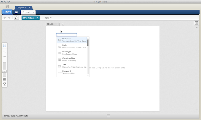
Fig1. Using ALT+CLICK shows an in-context search box for adding controls and elements

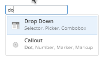
We did not stop there. An under-advertised feature of the ALT+CLICK search box is that you can type in a string of text and add this as a text/label element, provided it does not match on a toolbox item. But if for some reason it does match a toolbox item, you can force it to add it as a text label by typing an extra space. For instance, if you wanted to add text label called "DO" and it matches on "drop-DOwn," you can add it as a text label by typing SPACE and hitting ENTER. You may find this handy. I'm so addicted that I find myself doing Alt+Click on other tools like Omnigraffle and Powerpoint!

#2 What's Below the Cursor

This is another one of the features that I find useful for changing properties of design elements hiding behind a stack of elements; without having to re-arrange anything. You can invoke this by right-clicking on the design surface.


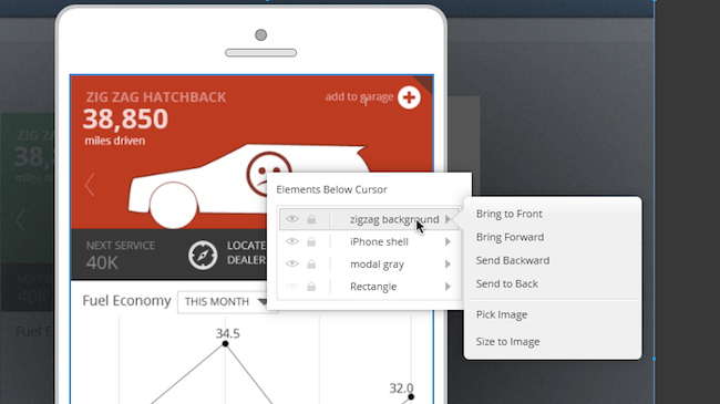
Fig 2. Right-Click to reveal "elements below cursor" context menu

In the list shown in the image, hovering over element names will highlight it on the design surface. As shown in the image, I am hovering on the background image called "zigzag background." Doing so also reveals a fly-out showing me z-order options and specific actions relevant to the image element. With this feature, I can pick a new image and replace the current one without nudging a single pixel. Left-clicking on the item in the list will reveal the contextual property panel for the image control, which will allow you to tweak any of the properties available for the image (e.g., add interaction).

#3 Hide Elements temporarily

The ability to hide elements on the design surface feels like an obvious thing to do till you realize that not many tools offer it. At least I haven't found it in tools like OmniGraffle or Powerpoint. If you know different, feel free to point it out to me in comments section of this blog article. I conceded that there are tools that let you show/hide layers and lock elements, but they don't let you temporarily hide the element.


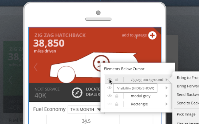
Fig 3. Use the "elements below cursor" to temporarily hide something

The HIDE functionality in Indigo Studio works differently than making design elements fully transparent. When fully transparent, you can still select it and move it around. In fact, I use this transparency feature quite often when I want to do a slick in-place appear kind of transition.

Using HIDE, however, it's as if the element never existed. What this let's you do is, as the feature suggests, HIDE unwanted elements till you need them again. You can hide elements both from the properties panel or the right-click menu. To show an element previously hidden, position your mouse cursor over where it originally was present and use the "What's below the cursor" feature. Or you can pull up the ELEMENTS and LAYERS panel located at the base of the toolbox and hide/show from there. The right-click option is quicker.


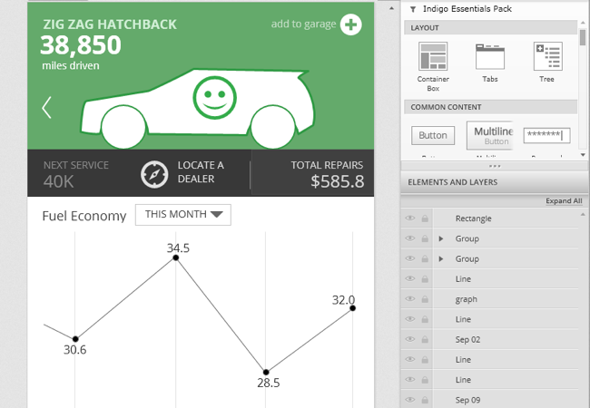
Fig 4. Showing elements and layers panel located at the base of the toolbox

In a nutshell, hiding elements directly releases you from worrying about showing or hiding layers, something you might use on other tools to control visibility.

#4 Edit/Move Interaction Flows

If you have already read our previous post on "Revisiting prototyping with Indigo Studio," you have some idea about how we approach interaction flows. For the uninitiated, Indigo studio places a spotlight on designing changes based on user interactions. To support this, Indigo not only offers the "traditional" screens, but also introduces screen states in a novel and useful manner. Each state/screen is connected to another via interactions, and when viewed together represents a flow. But sometimes, as part of design iteration, you will need to change how the user "flows" through the prototype. Editing or moving interaction flows via the interactions explorer will allows you to do that quickly

The following image shows an interaction flow for an e-commerce shopping cart experience.


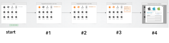
Fig 5.  A linear flow example for an e-commerce shopping cart experience

In this example, the user adds a couple of products to the shopping cart (marked in orange color) before proceeding to checkout. The user then wants to view product details for the "mac" product. To enable this, you design a DOUBLE-CLICK interaction on the "mac" product (in state #3), which reveals the product details (shown in state #4). The following list of actions/screens states will make it clearer if the image is not self-explanatory:

  1. User arrives at on the shopping page (start state), and clicks on add the "mac" product to shopping cart
  2. Shopping cart now shows one item, and the ADD TO CART option is replaced with the text ADDED, and colors changed to orange to indicate that it's in the cart; user then adds the "win" product to shopping cart
  3. Shopping cart shows two items. User then clicks on shopping cart
  4. Shopping cart is expanded to show contents; user DOUBLE-CLICKs "mac" product
  5. User views the ITEM DETAILS for "mac" product

The linear flow implies that DOUBLE-CLICK interaction is ONLY available from state #3 onwards, which is OK for a usability prototype. In fact, linear prototypes are good thing as we do not need to concern ourselves with what_if_the_user_clicks situation. The study moderator will take care of this. But what if you want a different flow to begin with? That is, the user wants to view the "mac" product details before adding it to cart. In this situation, you want the interaction (changes) you designed for ITEM DETAILS to be available earlier (in the start state).

One way would be to add an interaction in the start state, and target the interaction to an existing state (state #4). But a quicker approach would be to do the following:

  1. Expand the interactions explorer
  2. Select the state showing item details (state #4)
  3. Drag and drop this on top of the start state. That's all!

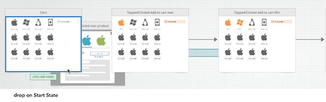
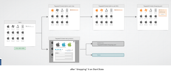
Fig 6. Showing how you can drag and drop states to edit the interaction, and edit the flow.

If you like, you can add an interaction on the ITEM DETAILS page such that clicking on ADD TO CART will take the user to an existing state where there is a one item added to the cart.

#5 Selectively Undo Changes (UNDO)

We are all familiar with what undoing the most recent action in an application implies. This is commonly achieved using the CNTRL+Z short cut key or some visible button to undo/redo an operation. Indigo Studio takes this a step further by letting you selectively undo some of your changes without forcing a sequential undo operation.

When you add an interaction on an element (e.g., button), and choose to create a new state, Indigo creates a copy of the previous state for you. At this point, the previous state and the current state are identical until you make some changes. As in, make design changes to the current state based on what you want the user to see. And any change you make is recorded in the timeline. Consider the following e-commerce flow once again:

  1. User arrives at on the shopping page (start state), and clicks on add the "mac" product to shopping cart
  2. Shopping cart now shows one item, and the ADD TO CART option is replaced with the text ADDED, and colors changed to orange to indicate that it's in the cart; user then adds the "win" product to shopping cart
  3. Shopping cart shows two items. User then clicks on shopping cart

In this example, six changes were recorded in the timeline that visually differentiate the START state from STATE #1 (one item added to cart).

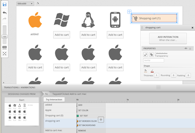
Fig 7. Showing a list of changes made to the current state. Shopping cart is selected in the designer.

At this point, if you start undoing changes using the short cut key CNTRL+Z, Indigo will start undoing changes in a sequential manner, starting with the last change first. In this particular instance, UNDO will bring back the ADD TO CART button which was removed (most recent change). But what if you want to keep the last change but revert some earlier change made. For example, you want want to revert the color of the shopping cart from Orange back to Gray. With Indigo Studio timeline, simply select that change/action, SET COLOR and hit the delete key on your keyboard. That's it. You have now selectively reverted some of the changes.

Anyway, that's my list for now. Of course there are more, but that's for you to find ;).

About Indigo Studio

Version 1.x of Indigo Studio is free forever, and yours to keep. Check out some of the highlighted features here or download it now

If you need help with Indigo Studio or prototyping in general, email us at indigo AT infragistics.com or follow us on twitter @indigodesigned.


Experiencing Mobile Application User Experience

$
0
0

The key to designing a mobile application is not how good it looks or how cool it’s state transitions are (think deleting an email and watching it crumple up into a ball and arc into the trash can icon). It’s important to look professional and feel current but these serve primarily to entice users to download your application from amongst the thousands of others. The degree to which your application is useful and usable is what ensures your application won’t be deleted after the first few minutes. When an application meets a need, takes advantage of the native strengths afforded by a mobile form factor, and designs for the mobile context of use, your audience will say about your application, “Why can’t all apps be this good?”

Here are a few applications that I personally use on my iPhone because their UX teams spent the time, upfront, to understand what folks like me are doing and designed something to help us do those things quickly and easily.


clip_image002Clear

Clear is a beautiful little app that helps you create lists. Big deal, you say? It is. First, there are no buttons. The application was built using native gestures – pinch, swipe, tap, shake. Second, the creation and deletion of new lists and items takes advantage of existing interaction models – no need to learn unique gestures or interaction models.


clip_image004Zite

News aggregator applications are neither new nor scarce but Zite rises above the rest. Why? A clean interface allows me to quickly select news categories of interest and then provides an easy to scan list of recent articles. At the level of an individual item, I am shown only the detail I need (title, author, image, text) unless I ask for more (original web source). It also allows me to vote (thumbs-up/down) to bias the selection of future articles as well as share articles with friends.


clip_image006Amazon

On my mobile device, I use the Amazon application to price check items while I’m walking around a store. I admit it. Sorry brick and mortar stores. If a product of interest is meaningfully cheaper on Amazon, I’ll add it to my cart for later consideration. Amazon knows shoppers do this and make it exceedingly simple. No need to enter a product name in the search bar – just scan the bar code. Like it? Save it for later. After opening the application it takes exactly 3 taps. They could drop it down to 1 but hey, no one’s perfect.


clip_image008 Starbucks

I like coffee and I make no excuses for buying my cappuccino from Starbucks. Want my business? Make consistently good, strong coffee. Starbucks makes this easier for me (and them) because using their application means I don’t need to take out my wallet. I always have my phone, I don’t always have cash and it just bugs me to use a credit card to buy a cup of coffee. A simple application at its core, it is a reloadable debit card that keeps track of my purchases and every dozen drinks or so, gives me a free drink. Open the application, flip the display from “current balance” to barcode and scan. Done.


Kevin Richardson has been working in the area of user experience for over 20 years. With an advanced degree in Cognitive Psychology, he has experience across business verticals in the fields of research, evaluation, design and management of innovative, user-centered solutions.

Kevin’s experience includes web sites, portals and dashboards, enterprise software and custom business applications for medical, pharmaceutical, communications, entertainment, energy, transportation and government users.

On the weekends, you can find Kevin on his motorcycle, riding for Infragistics Racing at a number of different racetracks on the East coast.

IG Racing

Simple trick to silently fallback when CDN’s unreachable

$
0
0

Using content delivery network provides increased performance – since files are copied and replicated, end users accessing content from far off, remote areas do not download content from your web server, but instead from a closer CDN server. Since CDN hosted content is cached; it is a good idea to have JavaScript, Image, and CSS files hosted there as they will be downloaded to the client PC and reused until the client’s browser cache is discarded. This eliminates the bandwidth expense of having to download the same files repeatedly. Google and Microsoft provide their own Ajax Content delivery network which provide JavaScript libraries like jQuery, Knockout, Angular etc..

Since these services come to you free of cost, why wouldn’t you be using it? As a web developer you don’t have to maintain third party JavaScript libraries at all. 

What if they fail?

“Our CDNs are 99.9% uptime guarantee” You would have run into similar statements a number of times with cloud hosting providers. But what if your customer were just unlucky that day(it happens)? Don’t you want to silently fallback to your local servers when that happens? Fortunately there’s a simple trick.

<script src="//ajax.googleapis.com/ajax/libs/jquery/1.8.3/jquery.min.js"></script><script>window.jQuery || document.write('<script src="../common/jquery-1.8.3.min.js"><\/script>')</script>

Add the above piece of code to your web page, change the CDN URL, update the local path of jQuery, and see the magic happen.

This post has been inspired by HTML5Boilerplate’s implementation of effectively falling back when the jQuery load from a CDN fails.

Don’t forget to check out Infragistics Content Delivery network for Ignite UI 

Have a feedback? Find me on twitter @nishanil

Getting Started using NucliOS with Xamarin.iOS Part 2: IGGridView

$
0
0

NucliOS is an Infragistics toolset that allows you to create high performance iOS applications that feature the wonderful data visualization you have come to expect from our developer tools. If you are a Xamarin.iOS developer that wants to add some flair to the data presentation in your app, we have you covered with the Xamarin.iOS bindings for NucliOS. This post focuses on using the IGGridView control to add a basic data grid to your application.  As a bonus, I’ll also show you how to use the Xamarin.Mobile Contacts API to access the Address Book with this cross-platform API.

[If you’re looking for help with IGChartView, check out part one of this series.]

nuclios-xamarin-ii

Using IGGridView with Xamarin.iOS

IGGridView is an iOS layout control that is very flexible and will allow you to create a wide variety of grid-based layouts.  The most common use case for the control is as a standard data grid.  This post will help you get started using the IGGridView in that context.  The app that will be built loads the contacts in the iOS device’s address book and displays the first name, last name, and email address for each of them.  The app looks like this:

app_screenshot_th

Step 1: Creating the project

Start by creating a Single View iPad application by clicking on “New…” under Solution and configure the project as shown in the following screenshot:

create_ipad_single_view_application

This will set up a project that uses a single view (i.e. no navigation) which is all we need for this simple sample. A ViewController with a XIB file will be created to represent the view.  Unlike the first post in the series, we won’t need to customize the XIB file.  Since we only need the IGGridView, we will add our user interface from code.

Step 2: Adding and configuring the IGGridView

The first thing we need to do is add a reference to the IG.dll which is found in /Developer/Infragistics/NucliOS 2012/MonoTouch on your machine. To do this, right-click on References and chose "Edit references…". Go to the .NET Assembly tab and navigate to the IG.dll as shown here:

add_ig_dll

Now open up the NucliOSGridViewAddressBookViewController.cs file and add the following using statement:

using Infragistics;

Next, add fields for an IGGridView and a IGGridViewDataSourceHelper. 

IGGridView _gridView;
IGGridViewDataSourceHelper _dsh;

The IGGridView is our data grid and the IGGridViewDataSourceHelper will help manage the data that is displayed within the grid.  The data source helper is capable of auto-generating columns based on the properties on the objects contained in its Data property.  Using an IGGridViewDataSourceHelper or one of its derivatives also shields you from having to write a lot of boilerplate code.  Your time is too valuable for that so use the helpers when you can!

Add the following code to the ViewDidLoad method in the view controller to set the background color, create an autoresizing IGGridView, and add it to the view controller’s view:

_gridView = new this.View.BackgroundColor = UIColor.White;

IGGridView(this.View.Bounds, IGGridViewStyle.IGGridViewStyleDefault);
_gridView.AutoresizingMask = UIViewAutoresizing.All;

this.View.Add(_gridView);

We will further customize the data grid once we have our data, but first we need to get that set up.

Step 3: Setting up the address book data

The data grid in the sample application will display the contents of the device’s address book.  So, we need to get access to that data.  The easiest (and most cross-platform) way to do this in a Xamarin.iOS project is by using the Xamarin.Mobile Contacts API.  The Component Store within Xamarin Studio is the easiest way to get started with this.  Right-click on the “Components” node under your project and click “Edit Components…” and then click the “Get More Components” button.  Find the Xamarin.Mobile component which should look like this:

xamarin_mobile_component_th

Add the component to your app.  The “Getting Started” section for the component contains the code we need to use the API for what we need to do.  Instead of adding the Contact objects from Xamarin.Mobile, we’ll create a lightweight wrapper object that contains only the properties we actually need to display.  Add the following class after the closing brace of the view controller:

public class AddressBookItem : NSObject
{
	[Export("FirstName")]
	public String FirstName {get; set;}

	[Export("LastName")]
	public String LastName {get; set;}

	[Export("Email")]
	public String Email {get; set;}

	[Export("LastInitial")]
	public String LastInitial {get; set;}
}

Now that we have our wrapper object we can access the address book and build up our list of AddressBookItem objects.  The following code sets up a list of contacts and then iterates over the address book to populate it. 

Add the following code after the fields for the grid view and data source helper at the top of the class:

List<NSObject> _contacts;

Add this code to the ViewDidLoad method:

// Our list of AddressBookItem objects for the data source
_contacts = new List<NSObject> _contacts();

var book = new AddressBook ();
book.RequestPermission().ContinueWith (t => {
	if (!t.Result) {
		// In a shipping application, you'll want to do something to handle
		// the fact that your user did not give you permission to access the 
		// Address Book.
		Console.WriteLine ("Permission denied by user or manifest");
		return;
	}
	// Using Xamarin.Mobile, we can perform Linq operations over
	// the Address Book entries.  Here we order by Contact.LastName
	foreach (Contact contact in book.OrderBy (c => c.LastName)) {
		// Create an AddressBookItem (defined below) for each contact
		// to expose only what we need for the grid...
		AddressBookItem bookItem = new AddressBookItem();
		bookItem.FirstName = contact.FirstName;
		bookItem.LastName = contact.LastName;
		if(contact.Emails.Count () > 0)
			bookItem.Email = contact.Emails.FirstOrDefault().Address;
		else
			bookItem.Email = "";
		bookItem.LastInitial = contact.LastName.Substring(0, 1);
		_contacts.Add(bookItem);
	}
	SetupGrid();
}, TaskScheduler.FromCurrentSynchronizationContext());

The SetupGrid() method will take this data and set it up to be displayed in the data grid.

Step 4: Configure the data grid

Now that we have a list of contacts, we are ready to display them in our IGGridView.  Although the data source helper we are using is capable of auto-generating the columns for us, we will create our column definitions manually.  This is so that we can customize the header text that will appear in the header for each column.  The SetupGrid() method will create column definitions and add them to the data source helper.  The data will be grouped by the first initial of the last name which will automatically create sections for us.  Add the following code to the view controller class:

// We'll manually create the column definitions so that we can customize
// the header text for each.  The string passed into the constructor is the
// property name on the object to use for the column.
IGGridViewColumnDefinition FirstNameColumn = new IGGridViewColumnDefinition("FirstName");
FirstNameColumn.HeaderText = "First";
IGGridViewColumnDefinition LastNameColumn = new IGGridViewColumnDefinition("LastName");
LastNameColumn.HeaderText = "Last";
IGGridViewColumnDefinition EmailColumn = new IGGridViewColumnDefinition("Email");
EmailColumn.HeaderText = "Email";

// We're using the basic IGGridViewDataSourceHelper
// since our data will be displayed in a standard datagrid
_dsh = new IGGridViewDataSourceHelper();

// Since we are manually creating columns, turn off auto-generation
_dsh.AutoGenerateColumns = false;
_dsh.Data = _contacts.ToArray();

// Add the ColumnDefinitions to the DataSource
_dsh.ColumnDefinitions.Add(FirstNameColumn);
_dsh.ColumnDefinitions.Add(LastNameColumn);
_dsh.ColumnDefinitions.Add(EmailColumn);

// We'll group on the first initial of the LastName
_dsh.GroupingKey = "LastInitial";

// Set the DataSource
_gridView.DataSource = _dsh;

// Turn off empty rows
_gridView.EmptyRows = false;

// Update the data!
_gridView.UpdateData();

And that’s it.  The application is ready to go.  Run it and you should see your contacts in an IGGridView grouped into sections.

Summary

This post showed you how to set up a basic data grid to display contacts from the address book on the device.  In future posts I’ll show you how to customize the grid and also interact with the contents.

You can download the solution here: NucliOSGridViewAddressBook.zip

Contact

If you have any questions or comments please feel free to email me at bschooley@infragistics.com or find me on Twitter@brentschooley.

Improved Exporting and Sharing

$
0
0

Hi y'all! Just wanted to let you know that we released a pretty useful update (Build 1.0.113) that includes:

  • Added Ability to Generate Prototype to Local Folder for Sharing on Internal Servers, Public Folders, etc.
  • Improved Share and Export Experience
  • Added Export of Screens with any Referenced Image Assets (Including Optional Zipping)
  • Share/Export from Project & Design Tabs Right-Click
  • Hit Enter on Image and Icon Control to Pick Image/Icon
  • And of course lots of bug fixes. :)

So here's a bit more explaining these updates.

Generate Prototypes to Local Folder


Generate Prototype to Local Folder.jpg

Now in addition to the simple one-click sharing on our servers, you can choose instead to generate the prototype to a local folder and then share it on your own servers (which is useful for those designs that need to stay behind firewalls). With this capability, you can also opt to share your prototype in some cloud services like Dropbox and Google Drive. And of course it gives you total control over the prototype, so you can overwrite, remove, etc. at will.

Improved Share and Export

We give you more control now on Exports--you can pick screens, states, folders.


Select for Export.jpg

When you select one or more screens, you can optionally choose to export only selected states within those screens. We also added optional zipping, so if you want export a bunch of PNG and zip in one step, you can do that.

Coming Friday: Quick Snapshot!

Although it didn't make it into this update, we'll be delivering a new special update on Friday that builds on this enhanced export capability--Quick Snapshot.


Quick Snapshot.jpg

This is one of those no-brainer things that just didn't make the initial cut, much to my own personal dismay. But it'll be there tomorrow! In any screen or storyboard, you can click the little camera icon in the global tool bar to take a snapshot. For storyboards, it will create a PNG of the whole storyboard in the same folder that the storyboard is in (or Desktop if not saved yet). For screens, it is the same, except that it will take a shot of the current state and the current animation segment (if you have more than one)--in short, whatever you are currently looking at will be exported to PNG.

You can also use CMD+R on Mac and CTRL+R on Win to execute this same capability. Note that we will never overwrite prior shots, so you can go crazy shooting with it if you want and not worry about that.

Export of Screens with any Referenced Assets

This is one of those things you don't know you need until you need you know it. If you have ever tried to just send someone a screen you are working on, and they get it, and it is missing images, you need this feature.


Export Screens.jpg

If you're going to work on a project regularly together, probably GitHub, TFS, Dropbox, or whatever is a better choice. But if you need to just send someone a screen for temporary/one-off purposes, this is very helpful. Select the screen(s) and then click Export Selected. Then you pick the Indigo File & Assets option. If you don't opt into the free ZIP, it will just put the selected in a folder, but it's more useful, IMO, to use ZIP. Then it's easier to ship that off to someone. What we put in there are:

  • the .screen files you picked
  • any images used by those screens (these are kept in the /assets folder of your project)
  • the project file

This way, when someone gets your stuff and opens it, they won't be missing your images.

Bonus: This could also be a way to fork the project if you wanted to, e.g., create a new alternative starting with a few select screens from the current project. In that case, not zipping is probably better.

Share/Export from Project & Design Tabs Right-Click

Now it is easier to just share or export the current screen--just right-click the tab and pick Share or Export. In OS X, you can also pick this from the application menu (that's been there since launch).

Hit Enter on Image and Icon Control to Pick Image/Icon

Now you don't have to switch from keyboard to mouse when you add an image or icon using the quick add options (Alt+Click/Drag). After picking to add one, just hit enter, and you can launch the appropriate picker.

That's it for this one! To get this update, you should be notified when you open Indigo Studio the next time (if you don't already have it or if you haven't turned off automatic checking). If you don't see it, go to Help and About and check for updates there.

Enjoy! And of course, if you have more suggestions, feel free to vote for and suggest them!

What is MonoTouch?

$
0
0

MonoTouch allows developers to create iPhone applications using C# and the .NET framework, instead of Apple’s official development environment and the Objective C language. It is based on the Mono framework, which is an open source project now lead by Xamarin (an Infragistics partner). Mono was first released in 2004 with the initial aim of providing C# development tools for Linux machines. This quickly turned into a larger ambition of providing a cross-platform runtime for .NET applications.

One crucial difference between MonoTouch and Mono is that applications created using
the former are compiled down to machine code. Mono is different; it is a Just-in-time (JIT) compiler. This means that code is only compiled into native code just before it runs. Apple does not allow that kind of execution on the iPhone, so MonoTouch apps are “proper” iPhone apps.

Even though it produces native iPhone apps, the future of MonoTouch looked bleak a few years back. Apple decreed that apps had to be developed in a pure Apple development environment, with no layers of abstraction or third party tool sets allowed. Only a pretty fierce public backlash caused Apple to rethink this policy, and since then MonoTouch has risen in popularity.

Now renamed Xamarin.iOS, the platform allows developers to easily share code between iOS, Android, and Windows devices. On the iPhone it supports all the APIs of the latest iOS (version 6) and has an impressive client base.

Here at Infragistics we have an iOS toolset that works brilliantly with Xamarin.iOS to help you create state of the art, totally native, iPhone applications. NucliOS provides powerful controls for data visualization and analysis, including 20 different chart types.

NucliOS also comes with the great support you’d expect from an Infragistics product. Our support staff is available 24 hours a day, 5 days a week, via phone, email, or chat. On top of that we also give you access to our community of developers, currently standing at over 850,000 members. Get started here, and see how easy it is to create powerful beautiful iOS applications. 

NetAdvantage for ASP.NET Release Notes - April: 12.1, 12.2 Service Releases

$
0
0

With every release comes a set of release notes that reflects the state of resolved bugs and new additions from the previous release. You’ll find the notes useful to help determine the resolution of existing issues from a past release and as a means of determining where to test your applications when upgrading from one version to the next.

Release notes are available in both PDF and Excel formats. The PDF summarizes the changes to this release along with a listing of each item. The Excel sheet includes each change item and makes it easy for you to sort, filter and otherwise manipulate the data to your liking.

Download the Release Notes

ASP.NET 2012 Volume 1

ASP.NET 2012 Volume 2

NetAdvantage for WPF Release Notes – April: 12.1, 12.2 Service Releases

$
0
0

Release notes reflect the state of resolved bugs and new additions from the previous release. You will find these notes useful to help determine the resolution of existing issues from a past release and as a means of determining where to test your applications when upgrading from one version to the next.

Release notes are available in both PDF and Excel formats. The PDF summarizes the changes to this release along with a listing of each item. The Excel sheet includes each change item and makes it easy for you to sort, filter and otherwise manipulate the data to your liking.

In order to download release notes, use the following links:

WPF 2012 Volume 1 Service Release

PDF - NetAdvantage for WPF 2012 Volume 1 (Build 12.1.20121.2286)
Excel - NetAdvantage for WPF 2012 Volume 1 (Build 12.1.20121.2286)

WPF 2012 Volume 2 Service Release

PDF - NetAdvantage for WPF 2012 Volume 2 (Build 12.2.20122.2151)
Excel - NetAdvantage for WPF 2012 Volume 2 (Build 12.2.20122.2151)


NetAdvantage for Silverlight Release Notes – April: 12.1, 12.2 Service Releases

$
0
0

Release notes reflect the state of resolved bugs and new additions from the previous release. You will find these notes useful to help determine the resolution of existing issues from a past release and as a means of determining where to test your applications when upgrading from one version to the next.

Release notes are available in both PDF and Excel formats. The PDF summarizes the changes to this release along with a listing of each item. The Excel sheet includes each change item and makes it easy for you to sort, filter and otherwise manipulate the data to your liking.

In order to download release notes, use the following links:

Silverlight 2012 Volume 1 Service Release

PDF - NetAdvantage for Silverlight 2012 Volume 1 (Build 12.1.20121.2271)
Excel - NetAdvantage for Silverlight 2012 Volume 1 (Build 12.1.20121.2271)

Silverlight 2012 Volume 2 Service Release

PDF - NetAdvantage for Silverlight 2012 Volume 2 (Build 12.2.20122.2147)
Excel - NetAdvantage for Silverlight 2012 Volume 2 (Build 12.2.20122.2147)

NetAdvantage for Windows Phone Release Notes – April: 12.1, 12.2 Service Releases

$
0
0

Release notes reflect the state of resolved bugs and new additions from the previous release. You will find these notes useful to help determine the resolution of existing issues from a past release and as a means of determining where to test your applications when upgrading from one version to the next.

Release notes are available in both PDF and Excel formats. The PDF summarizes the changes to this release along with a listing of each item. The Excel sheet includes each change item and makes it easy for you to sort, filter and otherwise manipulate the data to your liking.

In order to download release notes, use the following links:

Windows Phone 2012 Volume 1 Service Release

PDF - NetAdvantage for Windows Phone 2012 Volume 1 (Build 12.1.20121.2172)
Excel - NetAdvantage for Windows Phone 2012 Volume 1 (Build 12.1.20121.2172)

Windows Phone 2012 Volume 2 Service Release

PDF - NetAdvantage for Windows Phone 2012 Volume 2 (Build 12.2.20122.2147)
Excel - NetAdvantage for Windows Phone 2012 Volume 2 (Build 12.2.20122.2147)

NetAdvantage for Lightswitch Release Notes – April: 12.1, 12.2 Service Releases

$
0
0

Release notes reflect the state of resolved bugs and new additions from the previous release. You will find these notes useful to help determine the resolution of existing issues from a past release and as a means of determining where to test your applications when upgrading from one version to the next.

Release notes are available in both PDF and Excel formats. The PDF summarizes the changes to this release along with a listing of each item. The Excel sheet includes each change item and makes it easy for you to sort, filter and otherwise manipulate the data to your liking.

In order to download release notes, use the following links:

Lightswitch 2012 Volume 1 Service Release

PDF - NetAdvantage for Lightswitch 2012 Volume 1 (Build 12.1.20121.2000)
Excel - NetAdvantage for Lightswitch 2012 Volume 1 (Build 12.1.20121.2000)

Lightswitch 2012 Volume 2 Service Release

PDF - NetAdvantage for Lightswitch 2012 Volume 2 (Build 12.2.20122.2002)
Excel - NetAdvantage for Lightswitch 2012 Volume 2 (Build 12.2.20122.2002)

Ignite UI and NetAdvantage for ASP.NET DOCTYPE Support

$
0
0

Web browsers determine how to render the markup of a web document using the Document Type (DOCTYPE) Declaration. The DOCTYPE must be placed at the top of the document and should appear as specified by the W3C. The following are the supported DOCTYPE declarations for Ignite UI® and NetAdvantage® for ASP.NET as well as further DOCTYPE considerations.

Ignite UI

Ignite UI is a set of components based on modern web technologies and specifications. The components are fully tested to work with an HTML5 DOCTYPE.

<!—- HTML5 --><!DOCTYPE html>

NetAdvantage for ASP.NET

The NetAdvantage for ASP.NET product has a rich history and began when the .NET Framework CLR 1.0 was still in use. During the years following, developers used various recommended DOCTYPE declarations in their applications.

Currently to ensure the highest compatibility for NetAdvantage for ASP.NET components, use either an HTML5 or an XHTML 1.0 transitional DOCTYPE.

<!—- HTML5 --><!DOCTYPE html><!—- XHTML 1.0 Transitional --><!DOCTYPE html PUBLIC "-//W3C//DTD XHTML 1.0 Transitional//EN" "http://www.w3.org/TR/xhtml1/DTD/xhtml1-transitional.dtd">

Quirks Mode

Quirks mode rendering is the browser default when there is a missing or malformed DOCTYPE declaration. Modern browsers support this for legacy purposes but it is not recommended for modern web applications nor supported with Infragistics® controls.

Other DOCTYPE Declarations

Using a different DOCTYPE than listed above does not guarantee the controls perform incorrectly and you should decide carefully how to use DOCTYPE declarations in your application. Furthermore because support for all variations of DOCTYPES is not possible, it is recommended to use the declarations listed above.

NetAdvantage for Windows Forms Release Notes - April: 12.1, 12.2 Service Releases

$
0
0

With every release comes a set of release notes that reflects the state of resolved bugs and new additions from the previous release. You’ll find these notes useful to help determine the resolution of existing issues from a past release and as a means of determining where to test your applications when upgrading from one version to the next.

Release notes are available in both PDF and Excel formats. The PDF summarizes the changes to this release along with a listing of each item. The Excel sheet includes each change item and makes it easy for you to sort, filter and otherwise manipulate the data to your liking.

In order to download release notes, use the following links:

WinForms 2012 Volume 2 Service Release (Build 12.2.20122.2061)

PDF - NetAdvantage for WinForms 2012 Volume 2
Excel - NetAdvantage for WinForms 2012 Volume 2

WinForms 2012 Volume 1 Service Release (Build 12.1.20121.2126)

PDF - NetAdvantage for WinForms 2012 Volume 1
Excel - NetAdvantage for WinForms 2012 Volume 1

Infragistics Parsing Framework - Syntax Tree Pruning

$
0
0

This post is part of a series on the parsing framework provided by Infragistics starting in version 12.2. The previous post in the series can be found here.

Last time we saw how ambiguities can be removed from grammar rules for binary operator expressions, but the resulting syntax tree was relatively dense and contained a lot of nodes which can be ignored by code consuming the syntax tree in most cases. To fix this problem, you have the ability to prune unimportant nodes out of the syntax tree. This can be done automatically for the operator precedence rules we saw in the last post and/or manually by naming specific nodes which should never appear in the syntax tree.

Note: Before I get into the specifics of tree pruning, I want to briefly talk about the upcoming 13.1 release. During this release, there was a lot of work put into the parsing framework (i.e. syntax parsing engine) to bring it from CTP quality to release quality. As part of that effort, decisions were made which required changes to the API as well as the EBNF format recognized by the framework. From now on the EBNF snippets in my posts will use the new format instead of the older 12.2 format. The changes to the EBNF format were in the special sequences containing XML. The normal EBNF grammar rule syntax did not change. Also, I plan on creating a utility soon which will read in a 12.2 EBNF file and write out an equivalent 13.1 EBNF file. When that utility is finished, I will post it here. Going forward, whenever I discuss the parsing framework API I will refer to the 13.1 object model.

As I mentioned above, there are two ways of pruning the syntax tree to remove superfluous nodes, both of which are enabled by default. They are known as “based on children” and “based on name” pruning and they can be specified with the Grammar.SyntaxTreePruningMode property.

Pruning Based on Children

The first pruning mode I’ll discuss is the “based on children” mode. This is necessitated by the problem we saw in the previous post. The operator precedence rules do a good job of disambiguating operator expressions, but they produce a relatively dense syntax tree. This could complicate or slowdown logic which needs to walk over the tree. But when the “based on children” pruning mode is being used, most of that clutter will be cleared up automatically. This pruning mode will remove any non-terminal symbol node which is the parent of a single node which is also a non-terminal symbol node. So, as an example, let’s look at this tree from the previous post:

This tree represents the expression x + y * z using the proper operator precedence, but there is a lot of clutter. If the “based on children” pruning mode were used, the following nodes would automatically be removed because they are non-terminal nodes which own a single other non-terminal node:

So what you actually end up with is this tree:

This is much better than what we started with, but it is not quite as good as it can be. Those P1 nodes represent the mechanics of the operator precedence rules, but they don’t really represent anything meaningful in the document’s grammatical structure. We’d like to remove those as well, and we’ll see how that can be done with the other pruning mode.

Pruning Based on Name

The other pruning mode supported by our parsing engine is “based on name” pruning and it allows you to decide which nodes to exclude from the syntax tree by naming them in a certain way. Specifically, any node with an underscore as the first character of its name will be hidden automatically. For example, if I wanted to re-write the addition and multiplication grammar from the previous post to prevent the “P…” nodes from ever appearing in the syntax tree, I could have prefaced their names with an underscore, like so:

Expression =

_p3;

_p3 =

_p2

| AdditionExpression;

AdditionExpression =

_p3, '+', _p2;

_p2 =

_p1

| MultiplicationExpression;

MultiplicationExpression =

_p2, '*', _p1;

_p1 = id;

Now the syntax tree for the expression x + y * z will look like this when both pruning modes are used:

And this is as sparse as a concrete syntax tree can get while still representing the original expression. So the “based on name” pruning mode allows you to create non-terminal symbols to represent the mechanics of parsing your grammar without exposing them in the final syntax tree.

When we first added the “based on children” pruning mode, I’ll admit there was a natural tendency to want to create “helper” non-terminal symbols to represent sequences which are repeated over and over again. This is ok to do in most cases, but be careful, because it can cause two problems. This first is not a huge problem most of the time, but it is still something to keep in mind: performance. Even though these hidden non-terminal symbols are never seen in the syntax tree, the parser still needs to perform a reduce operation, which would normally create a non-terminal node to be the parent of the reduced child nodes. That reduce operation takes time. If common expressions are made to be children of these helper non-terminal symbols, those extra reduce operations could add up and might cause a noticeable slowdown for large documents. However, the parser has been highly optimized, so these reduce operations are done very quickly and in most cases you shouldn’t see a slowdown. And just to clarify: the reduce operation for a helper non-terminal symbol is not any slower than that of a normal non-terminal symbol's reduce operation, so if the common expression was already the child of a non-terminal symbol, making that symbol hidden by using the underscore will not add any overhead.

The second potential issue with these helper non-terminal symbols is much more important: they could lead to more local ambiguities occurring during a parse, which could easily lead to a noticeable performance impact. An example will probably help illustrate this potential problem. Let’s say we have the following grammar rules:

X =

a, b, c;

Y =

a, b, d;

Z =

[a], b, c, d;

There are common sequences there, highlighted in bold, which are repeated. It would probably make more sense to define the sequence once using a helper non-terminal symbol and then just reference it in each place needing that sequence:

X =

_commonPrefix, c;

Y =

_commonPrefix, d;

Z =

[a], b, c, d;

_commonPrefix =

a, b;

This cleans up the grammar a bit and it will still produce the exact same syntax tree as the previous grammar when parsing the same document. However, this grammar will produce local ambiguities that the previous grammar will not. We have added a shift/reduce conflict here. Let’s suppose the parser has already seen tokens for symbols ‘a’ and ‘b’. Then if it sees a token for symbol ‘c’, it doesn’t know whether to shift to the next position in the Z non-terminal symbol or reduce the _commonPrefix non-terminal symbol, so it does both. This is essentially the opposite of the substitution strategy we used to remove ambiguities a few posts back. The main problem with this helper non-terminal symbol is that the sequence “a b” could have been part of another non-terminal symbol, but that sequence could not be replaced by the _commonPrefix because the “a” was optional. So if you are going to use helper non-terminal symbols to organize the grammar and remove duplicated patterns, make sure the helpers do not introduce new conflicts/ambiguities into the grammar.

There is another use for these helper non-terminal symbols in addition to EBNF cleanliness. They can help to lower the complexity of non-terminal symbols (measured by the number of productions with the non-terminal symbol as their head). EBNF allows you to define optional and repetition sequences pretty concisely, but it can also hide the complexity generated by those sequences. The parsing engine always needs to process grammars in terms of their productions, each of which specifies a single sequence of symbols that a non-terminal symbol can represent. So a simple EBNF rule like S = A, B; has a single production for the parsing engine to consider: S → A B. However, if the A is optional, as in S = [A], B;, there are now two productions because the A can either be present or omitted:

  1. S → B
  2. S → A B

If both the A and B are optional, as in S = [A], [B];, there are four productions:

  1. S
  2. S → A
  3. S → B
  4. S → A B

This is an exponentially growing problem. A grammar rule with N optional sequences concatenated together will have 2N productions created. Our parsing engine only allows for 65,536 productions per grammar, so all it would take is a grammar rule with 16 optional symbols concatenated together to hit the maximum number of productions. So how can helper non-terminals…umm…help here? Well, let’s take a look at this extreme example:

S =

[A], [B], [C], [D], [E], [F], [G], [H],

[I], [J], [K], [L], [M], [N], [O], [P];

This single grammar rule has 16 optional sequences concatenated together, and so it produces 216, or 65,536 productions. The problem here is that each option compounds on the complexity of the other options before it. So if we split up the options to be in separate non-terminal symbols, they won’t compound on each other as much. We can do this and still produce an identical syntax tree by using a pruned non-terminal symbol:

S =

[A], [B], [C], [D], [E], [F], [G], [H], _theRest;

_theRest =

[I], [J], [K], [L], [M], [N], [O], [P];

And now the S non-terminal only has 8 optional sequences so it produces 28, or 256 productions. But so does _theRest. So together, this grammar produces 512 productions, which is much less than the 65,536 we started with. What we essentially did was take something like this:

2 * 2 * 2 * 2 * 2 * 2 * 2 * 2 * 2 * 2 * 2 * 2 * 2 * 2 * 2 * 2 = 65536

And we replaced one of the multiplications with an addition:

2 * 2 * 2 * 2 * 2 * 2 * 2 * 2 + 2 * 2 * 2 * 2 * 2 * 2 * 2 * 2 = 512

This problem of complexity, and the assistance that helper non-terminal symbols can offer to reduce it, is not limited to optional rules. Alternation rules have the same problem. So, for example, this rule has 3 choices concatenated with 4 choices, which creates 3 * 4, or 12 productions:

S = (A | B | C), (D | E | F | G);

And when the choices are in optional brackets, another choice is added to the group, because one choice is to exclude all of them:

S = (A | B | C), [D | E | F | G];

Now the second group in this rule has 5 choices (D, E, F, G, or nothing). This combined with the 3 choices in the first group results in 15 total productions. Helper non-terminal symbols can reduce complexity here as well if they are used to take the place of some of the more complex groupings:

S = (A | B | C), _secondGroup;

_secondGroup = [D | E | F | G];

Now there are 3 productions for S and 5 productions for _secondGroup resulting in 8 productions in the grammar instead of 15. We took 3 * 5 and changed it to 3 + 5.

In 13.1, we’ve added a Grammar.Analyze() method which, among other things, will warn about non-terminal symbols being too complex. By default, it will warn about non-terminal symbols which create over 100 productions, but that threshold can be specified via options to the method. This method also helps detect shift/reduce and reduce/reduce conflicts, but I’ll go more into detail on that in a future post.

Preventing Nodes from Being Pruned

These pruning modes can help in most cases, but sometimes they aren’t always helpful. You may have certain non-terminal symbols which do have meaning in the grammatical structure of the document, but which own a single non-terminal symbol, or which have an underscore at the start of their name. For example, in a grammar to describe the Visual Basic .NET language, these might be some of the rules that describe method arguments:

Argument =

SimpleArgument

| OmittedArgument

| NamedArgument;

SimpleArgument =

Expression;

OmittedArgument =

;

NamedArgument =

IdentifierToken, ColonEqualsToken, Expression;

Based on this definition, Argument and SimpleArgument will never have nodes in the syntax tree if “based on children” pruning is used because they can only be formed by being the parent of another non-terminal node. This may be acceptable, or it may be the case that your logic needs to know when it is processing an argument expression and so you need the SimpleArgument, OmittedArgument, or NamedArgument to be included in the syntax tree. To make sure that SimpleArgument never gets pruned from the syntax tree, you can set the NonTerminalSymbol.PreventPruning property to true on the SimpleArgument symbol. This can also be done in EBNF like so:

?<NonTerminalSymbolOptions PreventPruning="true" />?

SimpleArgument =

Expression;

Note the new special sequence syntax for specifying NonTerminalSymbol properties in 13.1

Now the SimpleArgument nodes will always appear in the syntax tree when they are parsed.

Next time we’ll get back to ambiguities and talk about the dangling else ambiguity and how letting it be ambiguous might be the best solution to produce a better syntax tree structure.

By Mike Dour

The information contained herein is provided for reference purposes only.

Copyright © 2013 Infragistics, Inc., All Rights Reserved.

jQuery Grids and Responsive Web Design

$
0
0

Responsive Web Design and jQuery GridsResponsive Web Design has been abuzz for some time now. In case you just now clash with the term, it’s a web design approach aimed at crafting sites to provide an optimal viewing experience across a wide range of devices. Basically, a CSS3 / JavaScript / jQuery powered  site that adjusts itself to better suit the screen it’s on, with the added bonus of keeping a single code base. What’s not to like? Well besides it’s often abbreviated ‘RWD’ which outside of the IT fields stands for Rear-wheel drive, so slightly confusing for people into both.. but that’s a minor issue. Other than that, it’s pretty awesome, but also sometimes hard to implement – some elements of a Web app simply don’t handle well squishing into smaller spaces. Complicated enterprise applications might even require quite a bit of extra work – and as you know with Ignite UI we want to help you get the extra work out of the way! And what do heavy business apps use? Grids, of course!

Now, how do you imagine a big table with a few columns and at least a few hundred rows is to fit in portrait mode on tablets and event more so on phones? The limited space calls for some changes and I’m quite excited to tell you your jQuery Grids will soon (and I mean soon – 13.1 is right around the corner) be equipped with the Responsive feature, ready to fit right into your RWD site! Do I hear clapping? Yeah, that’s not some simple data table we are talking about here – a full-fledged,feature-packed jQuery Data Grid and its Hierarchical version– they can do so much you might as well just make a whole app out of them. A responsive app!

Lastly, if you are in for a quick start with the whole toolset and related concepts you can Get Started Learning Ignite UI Today! The more you know, the more exciting this will be.

What can it do for you and what can you do with Responsive!

The main star of the Responsive feature is allowing you to know in what ‘state’ the app is running and define separate grid and column settings for each to make the best of whatever space you have. For example only do a few major columns for a phone view, some more for a tablet:

The Ignite UI Grid with 3 columns visible in phone modeThe Ignite UI Grid in tablet mode

And the all the extra stuff when you have the space:

The Ignite UI Grid with all columns visible in desktop mode

The feature allows you to trigger column visibility based on CSS classes – with a slight nod towards those familiar with or already using popular responsive UI frameworks like Twitter Bootstrap. The RWD Grid comes with 3 modes (mode recognizers if you will, we can work on the naming), that are used to match predefined or custom states ( such as ‘phone’, ‘tablet’ and desktop). Mode Recognizers if you will, but we can work on the naming:

  • Responsive mode – the base
  • Infragistics mode
  • Bootstrap mode

The base implementation looks at the window width, but the Infragistics and Bootstrap profiles rely on CSS3 media classes through a set of classes. Actually here is where Bootstrap comes with their set of media queries and specific classes, that many of you should find familiar. It’s not as simple as putting CSS classes on table cells, though! The igGrid is way too complex for that, but the Responsive feature does the next best thing – hiding columns thought the API methods and detecting when to do that using the class on a test element. I actually love this technique, because that’s how you do a ‘matchMedia’ polyfill (because most mobile browsers support media queries, but not 'matchMedia') and I always thought it was super clever workaround. But anyways, the point is that though CSS you can define when columns will be visible and the grid will do the rest for you. I’ll actually just include a shot of the Twitter Bootstrap description that should be clear enough:

Twitter Bootstrap's Responsive utility classes

Basically what you do is have you classes in CSS - the ones that come with Bootstrap as above, or the ones from Ignite UI CSS that are pretty much the same, but with out usual “ui-“ prefix, so it’s “ui-visible-phone” and so on. Basically, you need the classes in there – if you are using Bootstrap – great, you can reuse, otherwise we will provide you with them. Those classes are assigned in the column settings on the feature (remember, they are for the test element only) and it really is as simple as adding the Responsive feature to your grid with settings similar to this:

features : [{
name : 'Responsive',
columnSettings : [{
columnKey : 'name',
classes: "ui-visible-phone"
}]
//....

Or you can even configure visibility though simple properties that match the mode’s profiles:

// ...
features : [{
name : 'Responsive',
{
columnKey : 'BusinessEntityID',
configuration: {
phone: {
hidden: true
}
}
}
// ...

A Template for every occasion

So hiding columns is not enough? Well the Responsive feature kindly offers additional configuration options by providing templates for separate modes. You heard me right – you can swap the entire grid template on every mode and in the same configuration as above, where you define state for modes, you can also add column template specific to each mode! So that’s quite something – with templates you can change the look and feel of the entire grid between modes – shift controls templated into cells back to data or the other way around, merge columns and more! Just keep in mind the row templates are final and will override column ones if mixed.

Customizable, we need it to be customizable!

And so we hear – there’s a whole bunch of settings you can change for way the feature works. The sheer fact that the responsive modes can be quite a few – you can use the classes and have the designer decide thought media queries when exactly should the modes be triggered! That in itself sounds like a good foundation to keep design consideration out of the code.

Then you also have the option to create your own modes… for example have one specially targeted at “phablets” or something like this or any custom width and CSS media query you can think of. You can also extend and define your own mode recognizers (profiles) where you can not only define custom modes, but also use custom logic to say when they are active. That means you responsive grid doesn’t need to depend on CSS or not even on window width..it can be anything you see fit!

Eventful

Well, it’s not just automatic column hiding and template switching.. There’s a whole lot more! The numerous events you can react to are simply a powerhouse of a customization point – you can react to mode changes or even to separate columns going away or coming into view – either way at any point you can perform additional work to improve you app’s experience! You can reduce page sizes, group records, filter, sort or anything you deem helpful. You can even use the Responsive feature events as hooks for script-related modifications of your entire page/app – after all it’s already monitoring the state of the device, you might as well make full use of that! As you can imagine there are great many possibilities of what you can do.

Settings

Besides the elaborate per-column configuration and per-mode settings already mentioned, the Responsive feature doesn’t have that much:

  • A general setting that will ensure the grid will stretch the full 100% of its parent, overriding other settings.
  • A sensitivity setting defining just how much of a change there should be before the feature would react to changes in window width. Performance implications here obviously.
  • And finally the option to disable monitoring container resizes as a whole – again some performance gains and pretty much the difference between a responsive and fluid behavior. If you are interested in that sort of stuff check out the info for our conference below.

Power to the user

Trust me when I say I appreciate every effort a developer has made to improve my experience using a site and I get annoyed when I have to scroll left and right to read a single sentence. But then again, I’m also a user who doesn’t like his capabilities being taken away unconditionally. Yes, responsiveness can bring better experience, but only if you don’t take away from important content and functionality without the option to get them back. Basically, I hate when something gets hidden permanently on some mobile device and I can’t find it. It’s infuriating, even more so with RWD where I can’t just skip to the desktop version and make do.

In the case of the Ignite UI Grid that would mean using the Responsive feature to hide columns that might contain required information. There’s usually a reason for that data to be there and simply removing it from the picture just cuts of functionality from the app! Best part is that the Column Hiding feature will provide the UI when Responsive kicks in for free:

Column Hiding UI with Responsive feature

This is something I personally can’t see such a feature without. So, in case you are hiding columns, please consider giving the user the option to control what he’s seeing.

Resources

This has been more a general overview of the Ignite UI jQuery Grids’ Responsive feature aimed at Responsive Web Design (RWD) and a kind of a teaser for the upcoming 13.1 goodness. I’ll be making some more blogs with more code, demos and tricks very soon, so stay tuned!


  • Just in case you are joining us tomorrow for a day filled with JavaScript related talks at JS Saturday and the topic of Responsive Web Design and Fluid design interest you – make sure to visit the session by our very own Konstantin Dinev!
    JavaScript Saturday: Sofia, Bulgaria.

I’d love to hear some thoughts, so leave a comment down below or @DamyanPetev.

And as always, you can follow us on Twitter @Infragistics and stay in touch on Facebook, Google+ and LinkedIn!


The Best TED Talks for Developers

$
0
0

TED, which stands for “Technology, Entertainment, Design,” is a set of conferences with the stated aim of showcasing “ideas worth spreading.” The conferences were founded in 1984 by graphic designer Richard Saul Wurman, and from those very early days the emphasis was on technology and its related topics.

It wasn’t until 2006 that the talks took a real hold on the public conscious, when they began to be streamed for free online (via TED.com). As of November 2012 TED talks have been viewed over 1 billion times online. Some notable names who have given talks since they moved online are: Bill Gates (founded Microsoft), Stephen Wolfram (created Mathmatica), and J. J. Abrams (the film director).

There are TED talks for almost everyone, we bring you 5 TED talks every developer should watch:

  • Kevin Kelly on the next 5,000 days of the web. Kevin Kelly founded Wire magazine, and in this video he speculates about the future of the web. His ideas and thoughts will have huge ramifications for every developer. Well worth a watch.
  • John Underkoffler on gesture-based computing. This talk might be 3 years old now, but John Underkoffler’s ideas on gesture interfaces (he created everything you see in the Minority Report film) are still valid today, and will make all developers think about how people can interact with their creations.
  • Jeff Hawkins: How brain science will change computing. Jeff explains how the more we understand the human brain, the more we need to rethink the future of computing. Will change your ideas of what computing can be.
  • Kevin Slavin: How algorithms shape our world. This talk looks at algorithms, and explains that they aren’t just something programmers need to know to write code, but actually are all around us in everyday life.
  • Mitch Resnick: Lets teach kids to code. This is a fascinating look at how children of the future could actually be better off learning to code, rather than learning French, Spanish, or other foreign languages.  This talk is given by the director of the Lifelong Kindergarten group at MIT Media Lab.

Ignite UI Release Notes - April: 12.1, 12.2 Service Releases

$
0
0

NetAdvantage® for jQuery is now named Ignite UI™. Please see this blog post for more details. With every release comes a set of release notes that reflects the state of resolved bugs and new additions from the previous release. You’ll find the notes useful to help determine the resolution of existing issues from a past release and as a means of determining where to test your applications when upgrading from one version to the next.

Release notes are available in both PDF and Excel formats. The PDF summarizes the changes to this release along with a listing of each item. The Excel sheet includes each change item and makes it easy for you to sort, filter and otherwise manipulate the data to your liking.

Download the Release Notes

Ignite UI 2012 Volume 1

Ignite UI 2012 Volume 2

jQuery UK Conference - Oxford 2013

$
0
0

The jQuery UK conference starts April 19th. Infragistics is proud to be a key sponsor, and we’re thrilled to show off our HTML5/jQuery toolset, Ignite UI. It is not too late to come along too if you’re just hearing about it.
                                                                                                                                  
In fact, we’ve got a discount code that will give £99 off the standard conference ticket, but be quick! They are limited to the first 10 customers. Use the code “infragistics” to claim the discount.

jQuery UK opens with the creator of JavaScript and Mozilla CTO Brendan Eich. We are really excited to be sharing the spotlight with Brendan; it is an interesting time for JavaScript and Mozilla so surely he’ll have plenty to say.

The rest of the day is packed with world class speakers covering not only jQuery but the latest tips and tools from the wider JavaScript world and beyond, including a 45 minute walk through of Chrome DevTools from the world’s leading DevTools expert Ilya Grigorik from Google.

jQuery UK’s going to be a busy and exciting event with great presentations in the day, rising stars presenting in a smaller second track of 15 minutes each over lunch and into the afternoon, and Code Club demos. But why stop there, when you can combine happy hour with a play on words – join us for the jBeery festival where Infragistics will debut our Ignite UI craft brew.

The day after jQuery UK, we're taking our JavaScript skills to the races at Hack Day! The cars can be controlled over WiFi and we’ll experience video from an on-board webcam. See you at the finish line.

Build beautiful Android apps with our Iguana UI controls

$
0
0

It is easy to think that Apple has the monopoly on beautiful mobile apps, but that just isn’t true. The Android platform is home to some stunning products, and here at Infragistics we are doing our bit to help. We have a large number of tools and products that can help you build great looking, new, and innovative Android applications. These products include:

  • IndigoStudio - A rapid prototyping tool for creating animated user interface mockups. Indigo Studio is an extremely powerful tool that can help you get the UX of your Android app just right. And best of all, version 1 of the tool is totally free, and always will be (future versions will be paid).
  • IgniteUI - Ignite UI offers standards compliant ASP.NET wrappers and pure client side jQuery controls. It can be used to turbo charge the performance and capabilities of your Android apps, by providing rocket-fast performance and stellar data visualization.
  • IguanaUI - The Iguana UI pack is our dedicated Android set of controls. A true community effort, these controls have been developed with the help of Android developers themselves. With this closed source library of high end controls we have taken a “release early, release often” approach to give you the best possible tools.

The Iguana UI pack currently consists of a powerful Data Chart control, capable of displaying hundreds of thousands of data points on numerous types of charts. Built-in support is provided for multi-touch gestures, offering intuitive ways to pan, zoom, and drill down into the data.

The possibilities for “data rich” Android apps are limited only by the imaginations of developers, and we are excited to see what the community can come up with. Here are a few ideas for apps to provide some inspiration:

  • Sleep and health monitoring apps are very popular this year. Why not build an app to help users monitor how many steps they take a day? The app could then provide beautiful charts showing how active the user is over days, weeks, and months.
  • Lots of people in the web development community make huge use of Google Analytics and other web stat services. Why not build a rich data app to put these numbers in people’s pockets?
  • In these turbulent financial times many people are trying to carefully control their money. Why not create an Android app to help people monitor their budgets or weekly spend? The Iguana UI Chart control can help you build easy to read charts summarizing the data.

Important Developer Resources for a JavaScript Newbie

$
0
0

JavaScript is client side scripting language used in almost all modern websites and Web applications. JavaScript can enhance User Experience of a website and provide rich interactive features. With latest HTML specs, more and more developers are inclining towards JavaScript development. Here are few tools that will help you get started.


Tools to help JavaScript Development:

Visual Studio 2012 (Windows): Visual studio is one of the popular IDE's and as a .NET developer you would love coding JavaScript on this IDE. It supports JavaScript as a first-class language. You can use most of the standard editing aids (code snippets, Intellisense, etc.) in Visual Studio.

Here is a video by Scott Hanselman showcasing VS2012 JavaScript Editor.

clip_image001

Webstorm 6 IDE (Windows/ Mac OS X/ Linux): Intelligent JavaScript IDE with refactoring, code completion and on-the-fly code analysis support. It’s light-weight and sports a JS code editor, debugger (support for putting breakpoints, conditional breakpoints, step-in, step-over etc.)
One of the highly rated JavaScript IDE!

clip_image002

Komodo IDE (Windows, Mac OS X, Linux): Besides the basic IDE features you can integrate any source control with this IDE. Komodo Edit is the free version of Komodo IDE minus the integrated debugger and a few features less. It is free and open-source unlike the Komodo IDE. You still get a code editor, Intellisense and it also integrates nicely with Firefox+Firebug.

I like the tabbed browsing feature, where I can see the reflection of the code changes in real time inside the tabbed browser!

clip_image003

Parsley.js: It provides you with DOM API that lets you validate your forms without even writing a single JavaScript. You can write it in English with Parsley DOM-API using jQuery data API. Your HTML will be cleaner than ever!

JS Regex Generator: It helps JavaScript developers write Regular Expressions for matching strings of text. This is commonly done for text-format validation, such as when checking if inputted text has the correct date and email format.

Browserhacks: It is an extensive list of browser specific CSS and JavaScript hacks from all over the interwebs. If you face any rendering bug in a particular browser, you may use browserhack to find one of the proposed hacks and use it in your CSS. The source code is available on GitHub.


Tools to help identify problems in JS:

JSLint: Let's you verify the JavaScript code errors. You can customize verification algorithms as per your need. It is a code quality tool.

JSHint: Similar to JSLint. A community driven tool.

JSCheck: It is a specification driven testing tool. Also provides some level of self-documentation.

JsUnit: It provides you with a Framework to write repeatable tests in JavaScript.

Blackbird: It offers a simple way to log messages in JavaScript and an attractive console to view and filter them. You might never use alert() again.


Tools to share, collaborate web snippets:

Plunker: It is an online community for creating, collaborating and sharing HTML+JavaScript snippets. Let's you do a real-time code collaboration. I use this quiet often for sharing samples on my blog!

jsFiddle: It is playground for web developers, an online editor for web snippets. jsFiddle is Similar to Plunker and supports various frameworks. Since Plunker came in later, it has few additional features.


JavaScript Code Minification tools:

JS Minifier: It is a web based tool for shrinking JavaScript code to reduce the overall size of the JS file.

YUI Compressor: It is a JavaScript/CSS compressor. It removes comments and white spaces, and obfuscates local variables using the smallest possible variable name.


In this blog I have covered few of the must have JavaScript developer tools.

Looking for JavaScript MV* frameworks? Have a look at this blog series for details.


If you have any questions or suggestions regarding this blog post, please feel free to mail me at anarain@infragistics.com.


Cheers
Abhishek
Twitter: @narainabhishek
http://about.me/narainabhishek

Viewing all 2372 articles
Browse latest View live


Latest Images