When writing an app, you sometimes comes across situations where you need to adjust the position and size of a label based on the size of the text. And that size could be different based on a particular font you're using. So, today i'm going to show you how you can quickly grab the size of a string with a specified font. Prior to iOS 7 you could use: CGSize size = [@“Infragistics" sizeWithFont:[UIFont fontWithName:@"Avenir-Book" size:20]]; However, in iOS 7 that method was...(read more)![]()
↧
iOS Quick Tip: Find the Size of a NSString
↧
WEBINAR Q&A : How to Build Office-Inspired Apps
The following are the answers to the questions that were submitted to the Q&A box during the webinar on 6/19/2014. Thanks again for attending.
Q: Is the new control (xamDiagram) available to WinForm application?
A: The control is currently built in XAML – however you could use this WPF control within your Windows Forms application through the use of Element Host.
Here is a Microsoft article walk-through that shows how you can do this. You can use any WPF control that you like: http://msdn.microsoft.com/en-us/library/ms742215(v=vs.110).aspx
Q: For WPF Excel component, is it possible to hide the header and left most column (ie. the A,B,C and 1,2,3) so a user wouldnt realize its a spreadsheet?
A: Yes, this is possible – the Worksheet object has this property: http://help.infragistics.com/doc/WPF/2014.1/CLR4.0/?page=InfragisticsWPF4.Documents.Excel.v14.1~Infragistics.Documents.Excel.DisplayOptions~ShowRowAndColumnHeaders.html
So, you would do something like this: MyWorkSheet.DisplayOptions.ShowRowAndColumnHeaders = false;
Just get a reference to the Worksheet in the Worksheet collection or whenever you create and add a worksheet, keep track of the reference to that worksheet.
Worksheet Class http://help.infragistics.com/doc/WPF/2014.1/CLR4.0/?page=InfragisticsWPF4.Documents.Excel.v14.1~Infragistics.Documents.Excel.Worksheet_members.html
WorksheetDisplayOptions class: http://help.infragistics.com/doc/WPF/2014.1/CLR4.0/?page=InfragisticsWPF4.Documents.Excel.v14.1~Infragistics.Documents.Excel.WorksheetDisplayOptions_members.html
Q: Will you have any more in depth webinars on the WPF IG Outlook sample...?
A: We currently do not have any scheduled at the moment, however, we will give your suggestion to the product / marketing team for future webinar possibilities. And, as you know, you can always get in touch with our Developer Support if you ever had any questions on how to go about building this, or if you run into any problems, questions, or not sure which direction to go when putting this together.
Submit Support Request:
https://www.infragistics.com/login.aspx?ReturnUrl=%2fmy-account%2fsubmit-support-request%2f
↧
↧
Five interesting web development trends so far this year
We have hit the half way point of the year, so it seemed a good time to take a look at some interesting trends we have seen so far in 2014. Hopefully you will recognise the majority of these, and will have touched them in your work at some point. Add a comment below with your thoughts.
 1. Flat Design
Our first trend affects designers, UX/UI professionals, and developers alike. All of these people will have struggled to escape the launch of iOS 7 late last year, and the focus it brought to ‘flat design’ (and the end of the principles of Skeuomorphic design). 2014 has seen flat design go nuclear, with websites large and small looking to redesign themselves to fall inline. Even Google got in on the act.
As demonstrated by: iOS 7 and nearly every website launch and mobile app of 2014.
2. The continuing popularity of CSS frameworks
Tools like LESS and SASS are continuing to find favour with web developers. Such frameworks offer well-defined programming constructs (such as code blocks and variables) in the traditionally fast and loose world of CSS. The old school development community might see this as a fuss about nothing, but those who have struggled to tame CSS over the last few years see such CSS extensions as really useful innovations.
As demonstrated by: Google’s unwavering support for pre-processors being matched by Microsoft (The recent Visual Studio 2013 Update 2 added much improved support for SASS editing).
3. Single page apps
Chiefly a response to the need for better HTML5 mobile apps (less round tripping/data requests and slicker user experiences), the single page app is just that - a website consisting of just a single page. Such apps - where the data and presentation layers are totally separated - are designed to look and behave like native phone or tablet apps, with background data refreshes and rich UI interactions. The term ‘single page app’ was actually coined in 2005, but 2014 has seen huge growth in interest and adoption..
As demonstrated by: Google’s much loved (by most) AngularJS framework.
4. The rise and rise of JavaScript frameworks
In 2014 the JavaScript framework is, in itself, nothing new. But this year we have seen some very impressive innovations. Take Famo.us for example, an open source framework designed to help developers build complex user interfaces. More than that though Famo.us is the first framework to offer its own rendering engine (separate to the browser it is running in), which it can do by taking advantage of client GPU acceleration. This allows for some impressive effects like 3D processing and physics simulations. Truly a step forward for JavaScript.
As demonstrated by: Famo.us has just opened its beta program to all developers.
5. Web based development environments
The web development community is used to pushing the power of the browser. In 2014 we saw it able to harness that power for its own means. A number of browser based Integrated Development Environments (IDEs) have surfaced which give developers a realistic alternative to traditional desktop tools. Google has its own effort called Spark, and Pario attempts to give less technical users something they can use to create code.
As demonstrated by: Google Spark, Codio, and countless others.
↧
Infragistics Web Design Council
Hey, do you know about the Infragistics Web Design Council? If not, read on!
What is the Infragistics Web Design Council?
It’s a select group of Infragistics customers who want to have early access to what we are working on to provide early feedback and help shape the Web products to better suit your needs.
Why join?
In this program, you will have access to exclusive information, early-preview software, and avenues of feedback. Under a mutual Non-Disclosure Agreement, we can more freely share information that is not released publicly yet and thereby better integrate you into our design and development process, which means you know what is coming and, more importantly, you get to help shape the future of Infragistics Web tools to maximize your productivity and effectiveness.
How does it work?
The primary mode of involvement is through a private mailing list. Once you are a member, you will be able to send to and receive from that list. When we are ready to share new software builds, we’ll email the list to let you know about it and how to get it, as well as the timeframe for feedback.
If you are interested, you can grab it, try it out, and let us know how you think it could be tweaked to help you and your company more.
We may also just ping you with general questions, maybe even share some prototypes, design docs, etc. Our goal is to get you involved more and earlier so that what we make is as close as it can be to what you need.
How much time does it take?
That’s pretty much up to you. It’s not going to be a high volume list most of the time. Traffic will come in spurts around when we send out questions/things for review. It’s totally up to you if you respond and participate at any given time.
Okay! How do I apply?
Send an email to igniteui [at] infragistics [dot] com with your customer information and asking to join our private Web Design Council. We will then pass along our mutual NDA form that we’ll need you to sign for your company and either scan and email or fax back to us. After that, we will add you to the email list, and you’re in!
(If you think you already are under an NDA with us, let us know who your account rep is so that we can verify.)
That’s it. We hope you will join—we want our customers to feel empowered to shape the future of Infragistics Web tools.
Oh, and by the way, another great way to contribute to the future of our products is by suggesting and voting on product ideas—we use that to help us prioritize what we do for you! Drop by any time—we want to hear from you!
↧
Android L Developer Preview
During the Google I/O conference yesterday, Google revealed their brand new Android L Developer Preview. This is actually the FIRST time Google is releasing a developer preview, so it’s a pretty big deal. Not only does Android L have a new enhanced look, but it also has deeper ties to the web making it more user friendly.
For More In-Depth Info about Android L from Industry Pros, Check Out:
- Full List of Features: http://android-developers.blogspot.com/2014/06/developer-preview-and-play-services-5.html (Jamal Eason, Product Manager of Android)
- Hands-On Review of Dev Preview:http://www.engadget.com/2014/06/25/Android-L/ (Brad Molen, Engadget)
- Android L Announcement Details:http://liliputing.com/2014/06/google-announces-android-l-developer-preview.html (Brad Linder, Liliputing)
- Android L Overview:http://mashable.com/2014/06/25/google-android-l/ (Christina Warren, Mashable)
↧
↧
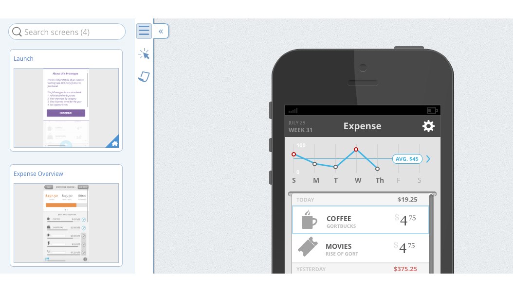
Releasing Update 1 for Indigo Studio (v3)
In version 3, we added the capability to create custom UI libraries using screenparts. If you haven't tried this yet, you are missing out :D.This was one of the top requested ideas. And with that, it's time to move on to even bigger and better things. Keep the ideas rolling in!
To kick off the "update" season for Version 3, we added the following new features in update 1:
- Image thumbnails in the prototype viewer
- New fonts for offline/online use in your prototypes
- Minor UI improvements
Image thumbnails in Prototype Viewer
When we have shipped the Table of Contents in the prototype viewer, it showed the names of the screens. We figured viewing the screen thumbnails makes it a more recognizable experience. So now when you pull out the table of contents, you see screen names + thumbs. I know, not earth shattering, but it's a nicer experience.
New Fonts for Designing Prototypes
Quite of few of you have been requesting more fonts for Indigo. It's not because we aspire to be stingy about this, but given the focus on rapid prototyping, we felt a smaller font list will be quicker to help you pick a reasonable one, and move on the bigger things :D. But we understand that sometimes fonts can set the mood, and may be important. With this update, we added support for Source Sans Pro, Roboto and Roboto Condensed.
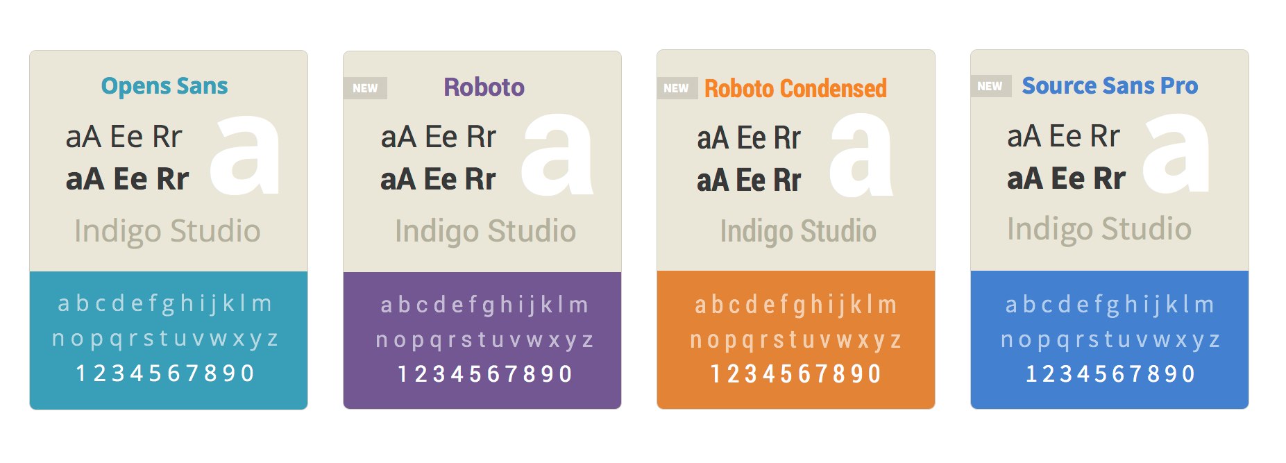
There are a few reasons why we are adding fonts (and font weights in the future) carefully. A primary driver has been the need to embed fonts in the prototype so that we can support both offline and online uses. The last thing we want is you being unable to render the prototype correctly when offline. The other aspect we considered is that viewers of the prototype may not have the prototype font, and license restrictions may prevent us from embedding it. In either case, we are exploring ways to incorporate more open fonts and use it seamlessly whether online or offline. For now, your viewers will see exactly the same font you designed with.
Minor UI Improvements
- The lock and visibility icons were tweaked to better communicate its current state.
- The IX explorer is now visually integrated with the state name.
How to Get This update?
Here's how to update the version of Indigo Studio installed on your machine:
- If you have the option to automatically check for updates on startup checked, you should see a dialog box pop up when you launch Indigo. Simply click update, and Indigo Studio will do the rest. This is the easier approach.
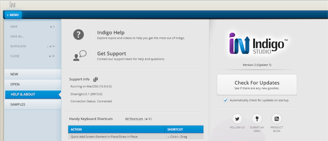
- If for some reason you chose not to automatically check for updates, go to MENU > HELP & ABOUT and use the "CHECK FOR UPDATES" option.
![Checking for Updates]()
About Indigo Studio for Interaction Prototyping
Don't have Indigo Studio? Download a free 30-day trial which will let you try all of the prototyping goodness.
Looking to suggest improvements and new ideas for Indigo Studio?
If for some reason you are having trouble with Indigo Studio, check out our help topics, forums or contact support.
Follow us on Twitter @indigodesigned
↧
Releasing Update 2 for Indigo Studio (v3)
In this update, we added several visual improvements to the look and feel of Indigo Studio in addition to adding some requested features. These include the following:
- Tweaks to project home
- Clipboard paste for images
- Color picker improvements - recent colors and eye-dropper
- Improvements to setting fonts
- Changed ordering of elements in Elements & Layers (most recent on top)
Project Home UI Tweaks
We finally got around to making some UI improvements to the project home. This involved making some of the toolbar actions more obvious.
The RUN button has a more consistent position in the app overall. We made the search feature more prominent and also unified the look of the design thumbnails and titles. Let us know how it's working our for you.
AFTER Update 2, your project home should look like this: 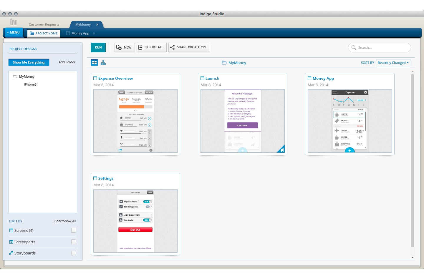
This is how it looked BEFORE: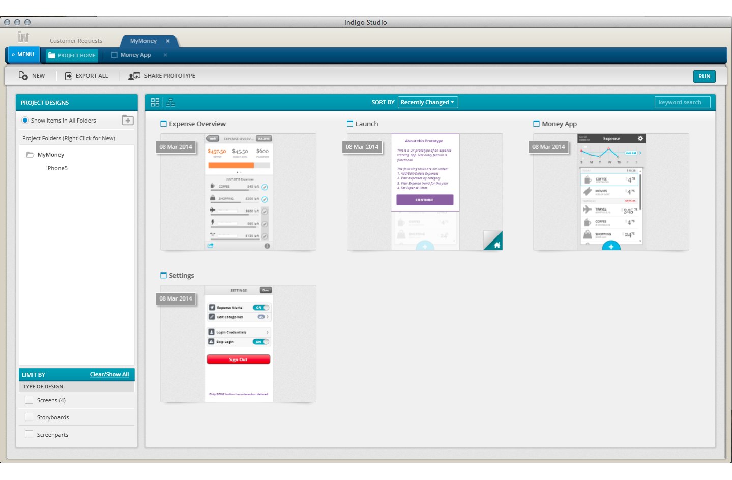
And by the way, the project home will remember the sort order when you relaunch the app (i.e., by name, recently changed).
Clipboard Paste for Images
Quite a few of have been using tools like snagit to capture screenshots. A lot such tools copy the image captured to the clipboard. So we have now made it easier for you to quickly paste it inside Indigo Studio without have to explicitly save this image first.
This works with other image editing tools as well (e.g., Preview on OSX, GIMP, MS Paint). When editing an image, you can select a region, copy it and paste it on the Indigo Studio design surface.
Recently Used Colors and Eye-Dropper
This feature does not need much explanation :D. It would suffice to say that with addition of recent colors (row), you don't have to look up the color values ;).
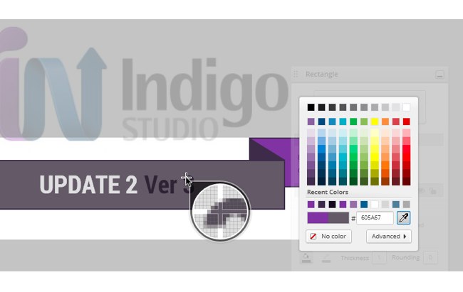
The eye-dropper, like in other tools, will let you sample and match colors from other images or colors on the design surface.
Recently Used Fonts and Font Picker
In update 1 (for v3), we introduced three new fonts. With update 2, once you pick a font, Indigo will remember it for the project. So if you started with Roboto, you can continue to create new text based elements without having to set it again.
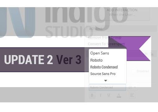
On a related note, we minimized the font list when you initially load it up. This way you don't have to hunt for the new fonts we added. The open fonts we have selected to include for now are pretty resilient and should serve you well. You can, of course, expand to view all the supported fonts. Indigo warns you about unsupported system fonts (on OS X).
How to Get This update?
Here's how to update the version of Indigo Studio installed on your machine:
- If you have the option to automatically check for updates on startup checked, you should see a dialog box pop up when you launch Indigo. Simply click update, and Indigo Studio will do the rest. This is the easier approach.
- If for some reason you chose not to automatically check for updates, go to MENU > HELP & ABOUT and use the "CHECK FOR UPDATES" option.
About Indigo Studio for Interaction Prototyping
Don't have Indigo Studio? Download a free 30-day trial which will let you try all of the prototyping goodness.
Looking to suggest improvements and new ideas for Indigo Studio?
If for some reason you are having trouble with Indigo Studio, check out our help topics, forums or contact support.
Follow us on Twitter @indigodesigned
↧
SQLSaturday #313 Rheinland, Germany – Event Recap
Infragistics Inc. was a sponsor of SQLSaturday #313 Rheinland, Germanu. Company provided licenses for the event raffle. 
Infragistics also was presented at SQLSaturday Rheinland by me by me as a speaker.
The event was held on Saturday, June 28th at Hochschule Bonn-Rhein-Sieg Campus Sankt Augustin ( an university in Sankt Augustin, near Bonn, Germany).
There also was a big data hackathon, organized during the previous day – 27th of June.
Administrators of the conference were Olivel Engels , Tillmann Eitelberg and Kostja Klein .
They organized an amazing team of volunteers who did an awesome event.
This was the first Microsoft Data Platform event with Infragistics in Germany. Infragistics Inc. was the only one component vendor with a speaker at the conference. Participants gave a good feedback about the company presentation. There was also an interest in the Infragistics solutions, related to Development Tools, Data Visualization and Business Solutions. Infragistics presentation samples for Node.js and SQL Server included solutions implemented with the company products like Ignite UI. Hope in the near feature to have more closer contacts with professionals, community members and companies from this region.
Summary:
- There was 31 presentations in 5 tracks.
- More than 250 attendees
- 28 Speakers from 10 countries: Austria, Denmark, UK, USA, Slovenia, Bulgaria, Russia, Portugal, France and Germany
A Big Data Hackathon before SQLSaturday Rheinland


SQLSaturday Rheinland sessions…


During the breaks…

and more…

Infragistics participation in the event:
- Infragistics Inc. was a swag sponsor
- There was 1 technical presentation from Infragistics Inc.:
Node.js for Microsoft SQLServer Nerds : Mihail Mateev
Follow news from Infragistics for more information about new Infragistics events.
As always, you can follow us on Twitter @mihailmateev and @Infragistics and stay in touch on Facebook, Google+ andLinkedIn!

↧
VIDEO: Exploring the WPF Ribbon Control
In this video, we're going to take a look at the new XAM ribbon and XAM ribbon window features that have been added in Infragistics Ultimate 14.1 to help give your applications a Microsoft Office 2013 look and feel.
[youtube] width="640" height="360" src="http://www.youtube.com/embed/e_fhsVAEkM8" [/youtube]
TRANSCRIPT:
Here we have an existing WPF application that uses a ribbon and a XAM ribbon window. As you can see, we have a home tab with a few buttons, as well as, the Office 2010 blue theme applied.
If we run the application, we'll notice that we have our XAM ribbon window, and we also have a Backstage, which mimics the Office 2010 backstage.
In order to give this application a new Office 2013 look and feel, the easiest way to do that is to simply set the theme property of the XAM ribbon to Office 2013. Immediately, you're going to see the designer reflect a clean, modern Office 2013 look and feel.
Now when we run the application, you’ll notice that the application now has the Office 2013 look and feel. It also has the new Office 2013 backstage. (You can see with the back arrows how you would now escape the backstage. ) But pay specific attention to the window chrome. The chrome also has the new Office 2013 window look- that clean, modern, thin border around the window chrome.
But that's not all we can do with this. Let's say that we want to change the accent color of our ribbon and window chrome. We can change the accent color application by setting the “application accent color” property to a value of our choice. For example, let's look at what red looks like. By setting that single property, we've now changed the color of the border of our chrome of the window, as well as the backstage and file/menu options.
Another feature that's been added in 14.1 is what's called a “tap item tool bar”. Due to time constraints, I'm going to go paste in some pre-existing code. As you can see, I've created a new tab item area tool bar object: a “stack panel”, which contains a toggle button that has a control template. Basically what we're doing is mimicking that login functionality that you’ll find in current Microsoft Office products.
So now when I run this application, we’ll see that we now have this tab item area tool bar available to our end users. Notice that when I show the backstage, it stays in view just like the current Office products behave.
You could put any control you want in this area. You're not limited to specific object types here. You’ll also notice that this tab item area tool bar has an overflow. So when you minimize or resize your window, you have an overflow icon that allows you to access those items that you have placed in your tab item area tool bar.
Now, all these features are great for the main window of your application, but what about all the other dialogs and windows that show throughout your application? Luckily, you can easily apply the same window chrome to all the other windows by simply removing the ribbon.
Let's remove all that work we just did - we'll remove the ribbon and now we're going to set the theme property on the ribbon content host of the XAM ribbon. We'll set it to Office 2013 and run the application.
Even though we're not using the ribbon, we can still use the XAM ribbon window without a ribbon in order to give the rest of the windows, dialogs and pop-ups within our application a similar Office 2013 look and feel. This keeps your application consistent, and looks great.
You can also modify the application accent color by setting the application accent color property. But in this case, we have to use an attached property. We're going to say “ribbon window content host dot application accent color” and we'll just choose red again. We'll run the application again, and as you can see, we now have our XAM ribbon with no ribbon, but we're still able to leverage our accent color to keep our application consistent with the main window of our application!

↧
↧
How to Create a Quick Access Toolbar
In our latest how-to video, we show you how to create an Office-inspired Windows Forms application, complete with a Quick Access Toolbar! Check it out:
[youtube] width="640" height="360" src="http://www.youtube.com/embed/CYQ7dR_gijE" [/youtube]
TRANSCRIPT:
First, we’ll open up Visual Studio, and go to "File," "New," "New Project," and start with the Windows Forms application. First let's make it larger. To start, we’re going to go to the Toolbox to add the UltraToolbarsManager. When we add that to the form, we're going to get prompted: do we want to add a Panel control? Let’s say yes and add a Panel control to the form, which is going to hold our control. We'll pick the middle option which is the lighter-weight Panel control.
So now what we’ll do is click "Show Ribbon" and right here at the top is a Quick Access Toolbar. To add a new tool here, simply click "Insert New Tool" and it's going to be type “button”, and let’s select “Cut”. At this point, let’s go ahead and add a little Cut button, like Cut and Paste. We’ll hit "Add" and "Close," and now you'll see that the button was added here but it has no image. So let's go ahead and add an image! We’ll right click on that, and under Images, I'm going to say "Set Small Image". I’ll navigate to an image - for a small button, you're going to want to use the image of size 24 x 24. So I’ll select the image called Cut. Click "OK," and click "OK" again, and there you have it. Now, you can see we have a Quick Access Tool right here: Cut. We’ll hit F5 to see what it looks like – and great! It looks good to me!
Now, the only thing we need to do is to handle the click event, and there’s a really easy way to do that. Click on the UltraToolbarsManager, open up the properties, and at the bottom right you'll notice “Generate Tool Click Code”. Let’s click that. Right now, I only have one command but just imagine if you had around 10 or 20 commands here. You're going to hit "Select All" and on the right, you'll see that the code is generated to handle that click event. So we’ll say Select All, Copy To Clipboard, close this, and now we need to get inside that click event of the toolbar. So let's double click to get to the UltraToolbarsManager_ToolClick event. Here we'll paste in our code that was generated for us.
Basically, here's what's happening: in this event, you get a ToolClickEventArg and you're basically just interrogating that object and looking at the key property and doing a case statement, so you might have a case for a copy, case for paste, etc. In this example, we're just going to have a cut, so let's just throw up a quick message - that looks good to me! Now let's hit F5, and there we go! I've gotten a Quick Access Tool here. I'll click it, and there we go. You can see that we've successfully invoked our code and that's all there is to it. To add more, you simply click on that new icon right next to it and just continue adding.
↧
How to Create an Office-Inspired Ribbon
In this video, we walk through the steps you'll need to take to create a Windows Forms application with a Microsoft-Office-inspired ribbon. Check it out below:
[youtube] width="640" height="360" src="http://www.youtube.com/embed/nu15-C43Fgg" [/youtube]
TRANSCRIPT:
Before we get started, I’m just going to pull up Microsoft Word to point out some of the pieces of the ribbon and talk about the object hierarchy.
At the top here you have the quick access toolbar, which is used to hold tools and commands that are available to your end user regardless of whatever tab they’re on, and regardless of whatever context they’re in. Below that you have the ribbon itself, which is composed of tabs. Each tab has one or more groups, such as clipboard, font, paragraph, et cetera, and each group has one or more tools, such as paste, cut and copy.
Now, let’s go ahead and open up Visual Studio and start building this app. We’re going to start by creating a new Windows Forms project. I’m just going to go ahead and use the defaults, so I’ll hit okay. The first thing that we’re going to do is make the form a little bit bigger to hold our toolbar. To achieve that ribbon, the first thing that you should do is go to the toolbox and search for the UltraToolbarsManager and double click it.
Now that that’s added to the project, the first thing that happens is that you’re going to be prompted to add a panel. We’ll choose the middle option, which adds a lightweight panel control.
To start building the ribbon, let’s click show ribbon, and to create a new tab, click this button right here. Right away, you have your first tab. Again, in this video, we’re trying to build something very similar to Word, so let’s go ahead and just start building it out.
Here you have our first tab. I’m going to hit F4 to bring the properties up, then I’ll choose select object, and we’ll see that the caption is “ribbon one” – let’s change that to “home”. Under home, you’ll see one group called ribbon group one. Again, we’re just going to click this, hit F4, and change the caption. We’ll call this clipboard.
Next we’re going to add the tools “paste, cut and copy” to this clipboard group of the tab called home. We’re going to click insert new tool, and create three buttons. The first one will be called paste. The next one will be called cut. Finally we’ll do copy. Now that we have our tools established, which are going to be “button”, let’s go ahead and configure that.
For the paste button, we want that to be large, and we want cut and copy to be small. To do that, we right click on paste, choose preferred size, select large, and then we’re going to set its image by right clicking on it and clicking set large image. We can import an image for a large tool button, so we’re going to want to use an image that’s 32 by 32. Once we find that, we’ll use that as “paste” and it’s large, just like we wanted.
Now, let’s quickly do the same thing for cut and copy, but in this case we’re going to leave them at default size, a small image. We’ll do the same thing and import, look for “cut”, and again we’re going to use 24 by 24 because it’s going to be the smaller version. Now we have cut. Let’s just quickly do the same for copy. Set small image, import, and let’s find copy. And there we go! Now we have paste, cut and copy.
Let’s just hit F5 and run this to see what it looks like so far. Here we have our ribbon and we have paste, cut and copy. It looks perfect. Now all we have to do is figure out how to get to the click event to actually wire up our logic. There’s a very easy way to do this. I’m going to click on UltraToolbarsManager, hit F4 to bring up properties, and right over here, at the bottom, you’ll see generate tool click code. I’m going to click that. Here you can see I’ve got a list of all of my commands. I’m going to click select all, and you’ll see that there’s going to be some code generated for me.
I’ll select all, copy to clipboard, hit close, and now just simply do a quick double click on the ribbon, and you’ll see the click event, with the UltraToolbarsManager. We’ll go ahead and paste in the code, and do a quick test here. That looks good to me!
Basically, what’s passed in is this ToolClickEventArgs, and you’re just interrogating the key. Based on the key, you’re going to write some code to handle it. In this case we’re just handling paste. Let’s hit F5, and there we go. That’s all there is to it!
↧
Infragistics Windows Forms Release Notes – July 2014: 13.2, 14.1 Service Releases
With every release comes a set of release notes that reflects the state of resolved bugs and new additions from the previous release. You’ll find these notes useful to help determine the resolution of existing issues from a past release and as a means of determining where to test your applications when upgrading from one version to the next.
Release notes are available in both PDF and Excel formats. The PDF summarizes the changes to this release along with a listing of each item. The Excel sheet includes each change item and makes it easy for you to sort, filter and otherwise manipulate the data to your liking.
In order to download release notes, use the following links:
WinForms 2014 Volume 1 Service Release (Build 14.1.20141.2059)
• PDF - Infragistics WinForms 2014 Volume 1
• Excel - Infragistics WinForms 2014 Volume 1
WinForms 2013 Volume 2 Service Release (Build 13.2.20132.2075)
• PDF - Infragistics WinForms 2013 Volume 2
• Excel - Infragistics WinForms 2013 Volume 2
↧
Native vs. Hybrid: Which Side Are You On?

Have you heard? An epic battle is going down here at Infragistics! Below, our own Ambrose Little and Steve Zaharuk go head to head over which is better: native or hybrid? And we want to hear your side of things too! Read on to see how they stack up against each other and then weigh in with your vote in the comments below. Ready? FIGHT!
How do Native and Hybrid development compare in terms of...
Time to develop?
NATIVE
HYBRID
Depending on your level of competency with a particular platform, you could probably get approval and get to market faster with native because each platform has their UI patterns, styles, and conventions baked in. BUT - if you're targeting more than one mobile platform (who isn't?), a hybrid approach allows you to essentially develop one app to run on all platforms. It's never that easy, of course, but there's a good chance you'd see a big time, effort, and cost savings with hybrid or web.
I don't think there is a clear cut answer to the question of Native vs Hybrid or Web. It's all about how much time and money you're able or willing to spend. Having said that, I think that hybrid web apps might be best here! If you need something for an internal application, building a web app is really a great choice. You can generally build something quickly and easily deploy internally, no matter what devices your employees are using.

Operational/maintenance costs?
NATIVE
HYBRID
The same factors are at play here as they are in the development time. Each new feature has to be developed X times individually if you are native, as opposed to, essentially, one time if you are Web/hybrid. But where you see fewer savings is in testing and potential bugs. No matter what you will want to test on your key target platforms, and hybrid/Web can introduce some issues that you won't see with native, most notably with performance and app store approval challenges.
If you're creating applications that work on multiple mobile platforms, you have to re-write at least the UI portion of the application on each platform, which takes time, which costs money. In creating a native experience, you get a lot for free. The API's that each of the platforms provide really guide you into the best practices. On top of that the tooling for all of these platforms keeps getting better and better, including IDEs, Interface designers, Automated Testing and even Performance Testing.

USER EXPERIENCE/QUALITY?
NATIVE
HYBRID
As a rule, native apps almost always win in the UX category, thanks to their performance-you just can't get the level of smoothness in Web/hybrid that you can get in native. I would go as far as to say that this is more or less THE determining consideration as to whether or not to go native. If you really need that extra polish, you should build native. But for many apps that's not necessarily crucial, and the benefit of having the same design and interactions for your app across platforms can be a winning factor.
This is where Native shines. You shouldn't be creating a single application that has the exact same user experience on all platforms. Users have come to expect a certain level of experience when they use an application on their platform, and if you fail to deliver that, they may just stop using your application. With native, you can really create a high-quality application that feels like it truly belongs on the platform. You simply just can't capture that native experience with a hybrid or web solution.

HOW DOES INFRAGISTICS HELP YOU DEVELOP FOR BOTH?
Steve and Ambrose both agree: Infragistics Ultimate offers native and hybrid/web tools, so you can experiment to find the right balance of quality and cost. With Ultimate, you get high quality, advanced line-of-business and data visualization components for iOS and Android, which work in Objective-C, Swift and Java. And these controls all have wrappers that allow them to work 100% in C# with Xamarin. You also get great applications samples that show you how to take both approaches, and the best interaction prototyping tool on the market-Indigo Studio-that you can use to discover the best designs regardless of which implementation platform you choose. The best part is you can purchase without regret. If you decide to go web and can't get the design/usability you want, you can easily switch to native and have the same great tooling experience. To experience the best of both worlds, download your free trial of Infragistics Ultimate today!
WINNER: BOTH NATIVE AND HYBRID DEVELOPERS
WHICH SIDE DO YOU CHOOSE?
We want to hear it! Join the debate in the comments below – let’s get it started!
↧
↧
Infragistics Friends Group Presentation: T-SQL Performance Tips – Event Recap
Infragistics Friends group, BI & .NET Geeks (Bulgarian PASS Chapter) with the help of Infragistics Inc. organized a presentation on “T-SQL Performance Tips” . Infragistics Friends group is an official PASS Chapter in Bulgaria under the name BI &. NET Geeks and we try to provide more BI and data platform related content.
The event was held on Wednesday, July 9th, 2014 at Infragistics Bulgaria Office, 110B, Simeonovsko Shosse Bul., Sofia, Bulgaria.
This presentation was a practical session about T-SQL queries optimization. .
SQL Server optimizer doesn't use and index seek for execution of your query although the quer is high selective? What is better, when and why: LIKE vs: SUBSTRING, IN vs. EXISTS, SUBQUERY vs. JOIN. Why you should not use the UPPER or LOWER functions? How to avoid non-SARG-able WHERE clauses? Which query takes about 3 minutes in SQL Server 2008 and only one second in SQL Server 2012? In this session we will answer these questions and show how bad designed queries lead to poor execution plans. We will offer recommendations and tips how to avoid performance problems caused by poor query design (functions in WHERE clause, data type conversions…) and explain how local variables and parameters affect the generation of execution plan.
Speaker was Milos Radivojevic

Milos Radivojevic is a database developer and consultant, speaker, and trainer and is located in Vienna, Austria. He has been working with SQL Server over 10 years. He is MCT and MCITP for SQL Server 2008 and specializes in SQL Server for application developers and performance and query tuning.In March 2013 he joined bwin.party's database development team.
This session was very useful for:
· Developers / QE / who test products using optimized queries and to receive the best results. They also can provide better samples, which demonstrate better performance just because of the query optimization.
· Consultants who want to help customers to improve the performance of their solutions without any additional work, related to the specific product .
· Web developers who want to use SQL Server with web applications more effectively.
- All kind of SQL Server specialists
Summary:
- There was more than 90 registrations.
- 65 attendees in place
- Slides are available here :
Milos Redivojevic in action!


As always, you can follow us on Twitter @mihailmateev and @Infragistics and stay in touch onFacebook,Google+andLinkedIn!
↧
Developer News - What's IN with the Infragistics Community? (6/30-7/6)
Heeeeere's your news roundup for the past week!
5. Top 10 Programmers in World History (Fuzzy Programs)
4. What Makes a Good Programmer? (Henrik Warne)
3. 9 Things I Learned as a Software Engineer (Medium.com)
2. Writing C# Code Using SOLID Principles (Thoughts on .NET and Coding)
1. Basic Comparison of C# and Apple Swift Programming Language Syntax (Chris Pietschmann)
There you have it!!!
↧
Varna Conf 2014–Event Recap
 The event was held on Saturday, July 12th at Cherno More Hotel, Varna , Bulgaria. Varna Conf is a community event, a part of the it-tour.bg project of the Bulgarian independent IT communities from different locations. This conference includes sessions, related to different technologies: .NET, OSS, Java, iOS, JS, Cloud Computing etc.
The main organizers and administrators of Varna Conf were Dimitar Georgiev and Radoslav Stankov.
Infragistics was presented by me as a speaker - Node.js and Open Source Software Development on Microsoft Azure
Summary:
- There was 7 presentations from 9 speakers
- 7 lightning talks from more than 10 speakers
- Around 140 attendees .
- Varna Conf was the biggest IT event in Varna
- The conference was the biggest community event in Bulgaria outside Sofia.
Varna Conf sessions:


The lightning talks:

Infragistics participation in the event:
- There was 1 technical presentation from Infragistics Inc.:
Node.js and Open Source Software Development on Microsoft Azure : Mihail Mateev
Follow news from Infragistics for more information about new Infragistics events.
As always, you can follow us on Twitter @mihailmateev and @Infragistics and stay in touch on Facebook, Google+ andLinkedIn!
↧
Developer News - What's IN with the Infragistics Community? (7/7-7/13)
Don't fall out of the loop! Check out this week's most active articles from Infragistics' social media portals:
5. Step By Step Path to Becoming a Great Software Developer (Simple Programmer)
4. How to Test an Information Architecture (UX Mastery)
3. Google is About to Take Over Your Whole Life, and You Won't Even Notice (Co.Design)
2. Adapting Scrum to a UX Model (UXmatters)
1. iOS Developers Need to Know Objective-C (Big Nerd Ranch)
↧
↧
Expert Reviews, Usability Testing, and User Research – What’s the Difference?
As a user experience professional, I often take it for granted that everyone knows the difference between user research, usability testing, and expert reviews. It’s true that more people than ever are aware of user experience these days, but I still find there are a lot of misunderstandings about the difference between these methods. So let’s explore each of these methods, the types of findings they produce, and when you would use one over the other.
Expert Review
What It Is
Expert reviews involve a user experience expert evaluating an existing user interface, such as software or a website, by applying his or her knowledge of human factors, usability guidelines, heuristics, design principles, information architecture best practices, and accessibility standards. The result is a prioritized list of problems and recommended solutions.
Results
Expert reviews typically find very tactical problems that can be immediately addressed to improve the user interface. It’s useful in finding violations of design and usability best practices, but since it doesn’t involve users, it can’t find the types of problems that only can be found by people using the system. For example, without involving users, it can’t determine whether the terminology will be understandable or whether the work flow matches the way they perform tasks.
Advantages
- Only requires one or two experts
- Quickest and shortest method
- Least expensive
- No users are involved, so you avoid the cost, effort, and time involved in recruiting, scheduling, and running sessions
Disadvantages
- The quality and reliability of the findings and recommendations depends on the quality, knowledge, and experience of the expert
- Doesn’t involve users, so it can’t find problems that are only found by the end users of the system
When to use it
Expert reviews are a good first step to clean up an interface. They’re not a substitute for testing an application with users, but they are good at finding and eliminating the basic problems.
Usability Testing
What it Is
Usability testing involves asking people to perform typical tasks using the application in question, and record a combination of objective and subjective measures such as completion rate, time to complete, errors, and how users feel about the experience. Testing the application with a number of participants in individual sessions reveals common problems with the interface.
Results
Like an expert review, usability testing provides a list of very specific problems and recommended solutions with regard to an existing interface. The primary advantage of usability testing is that instead of an expert evaluating the interface; it’s tested by actual users. While most of the findings are very tactical, testing can also reveal more strategic problems with the interface.
Advantages
- The interface is evaluated by actual users, which makes the findings more relevant to improving the experience of end users
- Finds problems that only the end users of the application can find
Disadvantages
- Requires the time, cost, and effort to recruit, schedule, and run sessions with participants
- Only finds problems based on the tasks you test, which might not cover the full spectrum of how people would actually use the application
- It doesn’t provide in-depth information about the users and the context in which they perform their tasks
When to use it
Usability testing can be used to evaluate an early design concept, a prototype, or a completed interface. Ideally, usability testing should be used throughout a design process to evaluate a design and make changes based on the problems found.
User Research
What it Is
There are many different methods, but typical user research involves interviewing participants and observing them perform typical tasks. The goal is to understand the users’ context of use, which includes the users’ characteristics, their tasks, tools and technology, and the environment in which they perform those tasks with the purpose of understanding the requirements of a yet-to-be-built application.
Results
User research provides higher-level, strategic information about users and their needs. It generates user requirements that are then used to design an effective user experience.
Advantages
- Provides the most realistic understanding of the users, their context of use, and their needs
- No designs or prototypes are needed as it is typically conducted at the beginning of a project
- Knowledge of the users and their tasks makes it easier to design an effective solution that fits their needs
Disadvantages
- Requires the time, cost, and effort to recruit, schedule, and run sessions with participants
When to use it
User research is best performed at the beginning of a project to understand the users and their tasks in order to use that information to design an effective solution that meets their needs.
As a summary, the following table shows the differences between these methods:
| Results | Advantages | Disadvantages | When to Use | |
| Expert Review | Identifies specific, tactical usability and design problems and recommends solutions | Only requires one or two experts Quick Least expensive No time, cost, and effort to recruit participants | Quality and reliability depends on the experience of the expert Does not provide feedback from actual users | To find and eliminate basic design and usability issues. |
| Usability Testing | Identifies usability and design problems and recommends solutions | Involves actual users Finds problems that can only be found by the users | Requires the time, cost, and effort of recruiting participants Only finds problems related to the tasks you test Does not provide information about the users and their context of use | To evaluate design concepts, prototypes, and completed interfaces in an iterative design process |
| User Research | Provides strategic information about users, their context of use, and their requirements | Provides the most realistic understanding of the users, their context of use, and their needs This knowledge makes it easier to design an effective solution | Requires the time, cost, and effort to recruit, schedule, and run sessions with participants | At the beginning of a project to start with an understanding of the users and their needs |
How to Best Combine These Methods
In the ideal design process, user research is conducted at the beginning of a project, to understand the users and their context of use. Based on that understanding, the interface is designed and usability testing is conducted throughout the design process; with early concepts, with early designs, and with prototypes in an iterative process of testing and design changes based on the findings.
To evaluate an existing interface, an expert review can be conducted first to find and correct the basic problems. Then it can be tested with users in usability testing to evaluate the types of issues that only users can find.
These three methods, used together at the right times, are powerful ways to ensure a good user experience.
Image courtesy of Alexander Henning Drachmann on Flickr
↧
Using IgniteUI to create your own data visualizations in ReportPlus
ReportPlus allows you to connect to enterprise data sources, from your mobile device and visualize data. It provides more than 20 different options for visualizing data. Among them: grid view, text view, map view and several data charts, such as: column, pie, scatter, bubble, candlestick, etc. But there are times when may need another option, not available in the out of the box selection. It’s with these scenarios in mind that we’ve introduced a new option for you to create your own data visualizations in ReportPlus.
Do It Yourself Visualizations
ReportPlus v3.0 introduced the DIY Visualization option in the visualization panel, along with a Javascript API. The DIY Visualization option allows you to configure the url where you host an html webpage. This page is able to interface with ReportPlus by using the new javascript API to get the data ReportPlus has retrieved from the data source, and render it any way you want. This allows you to extend the set of visualization options that come out of the box with ReportPlus with any custom html5 data visualization. It also saves you from the hassle of connecting to the data source and getting the data one specific user is authorized to obtain, while allowing you to reuse any visualization you may have come up with, across different data sets.
The DIY option is displayed in the visualization's menu of the widget editor, with an icon enclosed by the "less than", and "greater than" symbols: </>.

For instance in this picture the state of a business process is displayed. The data is visualized with a flow that’s conditionally formatted. States in red have more pending tasks than what’s considered desirable, while states in green are ok.
ReportPlus Javascript Bridge API
Getting started with displaying data retrieved by ReportPlus from html code is straight forward. You must invoke one method to signal the container, and then process the data in a dataReady handler. The code looks like the following:
        window.RPBridgeListener = {
        	dataReady: function (tabularData) {
				for (var i = 0; i < tabularData.data.length; i++) {
					//iterate and display data
				}
        	}
        };
	$(function () {
		RPBridgeUtils.notifyExtensionIsReady(true);
	});
For a more complete reference of the DIY API check this section of the ReportPlus User Guide (http://dl.infragistics.com/reportplus/help/ReportPlus-v3.0-UserGuide.html#DIYVisualization).
IgniteUI and getting the best from both worlds
Infragistics is a world class provider of building blocks for software developers. Among the suite of products it provides is IgniteUI, a complete toolset for jquery & html based responsive web development. Among the data visualization controls it ships are: bullet graphs, funnel charts and sparklines.
A basic sample with IgniteUI bullet graphs
In this section we are going to show how to display data retrieved by ReportPlus using a set of IgniteUI's bullet graphs
Assuming we are retrieving a data set with revenue by region information, like the following (available as .csv):
| Region | Actual Revenue | Target Revenue |
|---|---|---|
| Northeast | 10 | 14 |
| Midwest | 19 | 17 |
| South | 23 | 20 |
| West | 25 | 28 |
We are able to create a visualization like the following:

By using IgniteUI bullet graphs with the following piece of javascript code:
window.RPBridgeListener = {
	dataReady: function (tabularData) {
		$("#myDataVis").empty();
		for (var i = 0; i < tabularData.data.length; i++) {
			var divName =  "bulletgraph"+i;
			var rowData = tabularData.data[i];
			var rowDiv = $("<div id='"+divName+"'></div>");
			$("#myDataVis").append("<h1>"+ rowData[0]+"</h1>");
			$("#myDataVis").append(rowDiv);

			rowDiv.igBulletGraph({
				height: "80px",
				width: "100%",
				minimumValue: 0, // default is 0
				maximumValue: rowData[2]*1.3, // default is 100
				interval: 5,
				rangeBrushes: ["#FF0000", "#CC9900", "green"],
				value: rowData[1],
				targetValue: rowData[2],
				ranges: [
					{
						name: 'bad',
						startValue: 0,
						endValue: rowData[2]*0.5
					},
					{
						name: 'acceptable',
						startValue: rowData[2]*0.5,
						endValue: rowData[2]*0.85
					},
					{
						name: 'good',
						startValue: rowData[2]*0.85,
						endValue: rowData[2]*1.3
					}],
				formatLabel: function (evt, ui) {
						ui.label = ui.label+"K";
					}
			});
		}
  }
};
In a nutshell this code iterates over the set of rows retrieved by ReportPlus, assuming that the contents of the first column are the name of the region, while the contents of the second and third columns are the actual and target revenues respectively. For each row it creates a bullet graph igniteUI component.
You can check the source code for the whole webpage in this link.
Best Practices for DIY Visualizations Development
When developing a new custom html visualization it’s often handy to mock the integration with ReportPlus with a static data set. In this way you are able to develop and test your custom visualization in the browser, without switching environments, speeding up the development process. You can mock it in the following way:
		$(function () {
			//RPBridgeUtils.notifyExtensionIsReady(true);
			var tabData = {
			   data:[["East",18,19],["West",13,11]]
			};
			window.RPBridgeListener.dataReady(tabData);
		});
Also when trying it from ReportPlus to force the refresh of the webpage to test modifications while tweaking the html it works to switch the selected visualization, back and forth, forcing a reload of the webpage.
To infinity and beyond
The expressive power introduced with the DIY option in ReportPlus is limitless. It opens the door to all kinds of data visualizations and integrations. It’s now possible to have widgets in dashboards become actionable, not only presenting data but also allowing integrations with enterprise resource planning platforms that expose a Web Services API. For instance a ReportPlus dashboard can display a widget with buttons allowing the user to approve, or reject a specific expense, in the light of all required information to make an informed decision.
↧
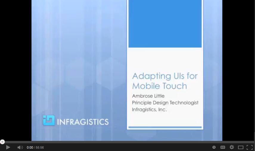
Adapting UI's for Mobile Touch
Forget "Write once, run everywhere". Rethink your mobile development strategy in this exclusive E-Learning Session presented by Infragistics Principal Design Technologist, Ambrose Little.
TRANSCRIPT:
Hello and welcome to this talk on Adapting UIs for Mobile Touch. My name is Ambrose Little. I'm a principal design technologist here at Infragistics. We make lots of UI design and developer tools as well as some enterprise mobility solutions. Today we'll be talking about this topic [Adapting UI’s for Mobile Touch].
This first picture you're seeing here is the dream. It's the one ring. That's what all developers want. They want to write the ultimate program that will solve all possible cases and usages and contexts and things like that but the reality is even for mobile this can't be the case. The problem with mobile in particular especially if you're starting from a desktop and you want to move to a mobile solution is you often run into this problem. That's from Tommy Boy. That's him saying saying "I'm a fat guy in a little coat." That's the reality is that you're trying to stuff something that just doesn't fit into the mobile if you start from a desktop and just try to squish it in there.
What you have to think about is not only the literal the size of the screens but also the contexts. Now contexts may or may not differ very much in terms of what people actually want to achieve but the contexts in which apps are being used is greatly different for mobile devices than it is for your average desktop or laptop. There are going to be some exceptions but by and large that's a truism.
This is a nice quote from a Senior Research Scientist, Rachel Hinman. "Applying PC context assumptions to mobile experiences all too often results in a marginalized experience for users." That's going to be true if you take this approach of trying to fit your standard desktop design approach into the mobile environment. Today we want to talk about some of the important design considerations. Talking about reducing, in and out, eye on the ball, touchy feely, and Moore's Law. This is what we're going to cover at a higher level in this talk.
First of all reduce, so here you're seeing a screenshot of AT&T's wireless account overview page and then you see something similar here in their wireless app. Now these they were taken before you watch this so they could definitely have changed in the meantime but it introduces you to the concept. You can see on the left side there is a ton of things. You see one, two, three at least, four possibly, levels of navigation all within this one page and then you see tons and tons of links and you see sidebars and you see other stuff. That probably was never really a great idea from a user perspective to take this approach to begin with but it's even more crazy if you start trying to do something similar on the mobile situation. Now you can see on the mobile case it's pretty straightforward and simple. It gives you an overview of where you stand and a few top level tasks or context oriented navigations. It's very flat.
Now in terms of in and out this is important to keep in mind for mobile apps because unlike a lot of desktop contexts you don't have the luxury of assuming that you have their complete attention. You don't have the luxury of assuming they're going to want to spend a lot of time or that they even will spend a lot of time with your interface. You have to think much more about how can you get the people to what they want as quickly as possible and not require them to dig through, like you saw on the last screen, a ton of navigation potentially in order to find what they need. You really have to go back and reexamine your basic assumptions in terms of what you want to enable people to do on mobile.
Now glanceability is actually a specialized version of this which is when you want to be able to get them the information they need at a glance and we'll see a little bit more on that soon. Now, this example you see here is from Foursquare and the reason I call it out here is it's a subtle but it's an effective way to bring to the front what you want people to do. Not so much what you want them to do but what they would want to do with your app. You got to think about there's a pattern, clear entry points. What are the few things that people are definitely going to want to do and even of those what is maybe the most common or the most primary and you make that the most obvious thing. Here the subtle thing is to just make that button stand out a little bit from the task bar and put it in the center so it's easily tappable whether you're holding it with your left or your right hand.
Glanceability is a related thing and that's pretty straightforward in terms of the word itself. You just have to think about what information should I surface that someone could literally just glance at the screen and know what they need to know. That doesn't work obviously for all usage scenarios but there are quite a few especially in the mobile context because you end up being one of many apps on someone's device and you want to be able to get them that quick in and out view of probably the most common thing they're going to want so that they don't even really have to do any extra navigation. They just open it. It's there and they can move on with life. Of course on some platforms you can take it to another level by leveraging the integration with notification centers and overview centers like that. It's definitely something to think about if your target platform supports it.
Here's another great example of glanceability where Microsoft really nailed it in bringing that information up onto the tiles themselves. You can see it's more than just a badge that has a number which could be interpreted in any number of ways. You have a lot more flexibility and it's even grown over the years in terms of what you can do with the live tiles and the fact that they're live so that you can push more than one interesting message or image to people and really not even require them to go into the app to begin with maybe to get the information that they need. It's really a home run that they came up with there.
Flat nav is another interesting concept. You won't see that multilayered navigation in mobile apps usually. If you do maybe it's not so great but the point is that you really want to try to keep it within maybe two layers. If you think of it you have your main navigation or activities at the top level. In this case on the iPhone you have that little bar at the bottom, the up bar. I think on the Android it's at the top but point is that you have that layer and then maybe one more layer within your app to get people to doing something useful. You really don't want to go beyond that or it just gets a lot of friction from a user perspective. You definitely cannot usually take a desktop navigation and just use the built in nav in a mobile platform. You have to really rethink that and try to break it down a little bit more.
Keeping your eye on the ball, this is just from a design perspective. You have to think about the fact that again you're not in the PC context. Someone is not going to be sitting in the office. Maybe they are but you don't know. They could be anywhere and then also the fact that they could be moving. They might be driving down the road even though they're not supposed to be. Think about that. Your app could be involved in an accident so if you don't make it glanceable and you could of who knows maybe you're causing an accident.
It's a totally different environment that you get into when you're thinking about mobile versus your stereotypical desktop design. You really have to start thinking about the user context and what people need and getting them to that as fast as they can because it really can even if your app itself is not life or death because they could be using it anywhere. It could turn into a life or death situation so keep that in mind. It's pretty important.
The other thing about mobility is that you're switching from device to device. Maybe you start out on your phone and then you say hey, I'd rather read this on my tablet and then maybe you're like well, I really need to do a lot of writing or something. You don't really want to sit there and tap on your device and you have the option then you could go to a desktop. The reason that's helpful is if you're thinking about those from a design perspective you can help facilitate those transitions. In fact the upcoming iOS 8 at least they've really come up with a slick story for that in terms of being able to start writing something like an email on your iPhone and then literally you go to your desktop and it recognizes that you're working on that and you can pick up right where you left off. That again is another one of those home runs from a user perspective.
The more that platform vendors and applications take advantage of these capabilities that they're coming up with the smoother it is going to be for everyone in terms of the story of moving from device to device. If you can do that I would highly recommend it. Of course it also depends on your uses, contexts, so if maybe you have a status update on a task that someone's working on and then you want to be able to have them pick up that task right away on their desktop because they need to do some work in a desktop app for instance. That's a great story of someone walking down the hall. They get a notification. It's too much of a pain or whatever to do it from the mobile so if you can figure out a way to easily bring that up like you tap a button. Say work on this on my desktop and then as soon as they log in or open their desktop app you bring that case or whatever it is, that task up for them. That's pretty slick so think about opportunities like that.
This is related to those designing for interruptions. You don't want to assume again, that people are just sitting there focused. You've done it yourself. I'm sure you have. You're sitting there. You could be anywhere. In a coffee shop. Someone walks up to you starts talking while you're working on something. You're at home one of your kids comes up and starts talking to you or maybe your significant other. It's just the way things are now that devices are everywhere and it's only going to keep being more and more like this.
The reason this is important is you've got to think about things like you can't just have sessions time out because of inactivity. That's not real great so you've got to think about ways to get beyond that problem. If someone closes the app on their phone by hitting home or whatever you need to save whatever current state was there and most of the platforms provide ways to do that but you need to take advantage of it and actually do it. Make sure you're doing those things because there's nothing more frustrating to be in the middle of something on your phone or your tablet and it goes to sleep or you switch over to something else and the app doesn't properly handle that and you go back and you lost whatever you were working on. You definitely need to be thinking about that and design for interruptions.
Now, this is a given here for most of us. It's definitely the most obvious that's why I say duh on here. A change that came along with mobile devices and especially phones is a built in GPS and location services. If in any way possible that is relevant for your app by all means be thinking about how you can take advantage of that and use it. Don't forget about this but of course there are lots of other different possible new sensor type things that you can think about which I'll get to some of those here in a minute.
Touchy feely: this is by far another most obvious and crucial difference between desktop and mobile. The most common differences in terms of events I list some of those here. There's going to be more once you get into it. You get usage and you use some usability studies you're going to figure out which ones matter more for your particular context. Just be thinking about the fact that just like you can't bring the navigation in, you can't necessarily just bring in your existing interaction especially hover. That's the most common one that people seem to struggle with so you just have to think about new ways to design your interface so that it doesn't rely on hovering or maybe if you absolutely need that extra on demand interface then you can have that go by pressing and holding or some other means. Maybe there's a swipe and a more or something like that.
Then of course keyboarding, you don't want to be requiring typically a lot of keyboard interactions. If your app involves that and that's core to your domain, fine there's not any way around that. If you can come up with other ways to input information, smarter pickers. If you can do more domain specific pickers to get people to where they have to type as few things as possible that's great. Autocomplete, if they're doing any entry that does require that where you can help them to complete what they're typing. Another huge win so just be thinking about the fact and all the implications of the touch interfaces.
This is definitely something you have to keep in mind. You know as well as I do that your fingers are not as pointy as a mouse cursor. You have to keep that in your head when you're moving to touch interfaces and most mobile devices are touch interfaces of course. Here are some general guidelines. It's always best to actually do testing and make sure that you see where and if people are messing up and hitting things incorrectly but these are pretty good rules of thumb. You can translate these into pixels depending on the mobile device pixel densities. The reason these are in millimeters is because in human factors it's actually more relevant to talk about the actual physical measurements as opposed to pixel measurements because they are so very variable so that's why these are this way.
Now, 9mm square that's rather large quite honestly. If you're used to designing for desktop and you start putting things in the equivalent pixel space of 9mm square it's a big touch target. The thing with that is that it's optimal so when that's really important is when you really don't want people to miss it. That's going to also relate to the particular task that you're asking them to do and how important it is that they don't mess up. Some other suggestions here like 7mm high is okay. You can make it wider if that's the case. That has an interesting proportion that if things are wider then that's good.
Then if you do want to have a smaller visual size like 4.2mm as the minimum then what you can do is actually put invisible buffers. You would put an invisible triangle overlay or something like that. Not triangle. Rectangle overlay around your visual target and that means that when people get near it even if it's smaller visually they'll still be able to touch it and that's perfectly fine. There's some guidelines there in terms of spacing.
Spacing is important especially on not just smaller but when you have things with multiple choices that are next to each other. If you have a menu bar or something like that you need to be thinking not only about the size but also about spacing and you want to do that and make sure that's there. If you go smaller for instance than 9mm square then you might want to start thinking about a little bit more spacing so think about that and as I said before target size is proportional to the consequences of missing. Obviously, you don't want to frustrate people in general so it's good to not make it harder.
If you want an experience of what's not a good way to do it is, is try to load up a standard desktop interface on a device that supports touch like a service tablet or something like that and try to actually use it. You see this today with a lot of the desktop software. I mention Surface specifically because you can still run desktop software easily on it if you've got the non-RT version. Definitely you'll want to test it first of all but these are good rules of thumb.
Now here are some common gestures, the most common gestures. They come from this nifty little resource on Luke Wroblewski's site slash touch, lukew.com/touch. It's out of date but it's still mostly relevant especially for these generic ones like the ones listed here. You're going to want to depending on what your target is consult this specific guidelines for that target platform. If it's web then you can look for some of these more cross platform commonalities or maybe you know that some higher percentage of your users use Android or iOS or whatever in which case you can tilt your interface towards those platforms. Then there are some tools out there that let you do adaptive. Any time you do stuff like that it creates a complexity so you really have to think about if it's worth that trade off.
Often times especially if your app is going to be used across multiple devices, potentially even by the same person, then it's better even across multiple platforms. Let's say they have an iPad but they also have an Android phone. It would actually be better in that case to have a consistent interface for your application across the different platforms than to try to totally customize it for an individual platform but there's a balance there and especially if you're going to be publishing in an app store. You are going to have to follow. Well, I should say if it's a controlled app store like the Windows or iOS you're going to have to follow and get your stuff approved through them so keep that in mind. Just in general I would err toward consistency across the board even to an extent on your actual desktop apps if you end up re-factoring them and making them more touch friendly let's say.
Now another interesting thing that those of us who've been in the industry for a while have gotten spoiled in the last few years is thinking about these things. Obviously, most of us didn't even really have to think about battery for the most part but these other ones we can remember back to the earlier days when these were actually a bigger concern and then they gradually became less and less of a concern thanks to Moore's Law but hey, guess what? It's all back again because now we've got these nice new small devices that have limited all of this stuff. You have to actually start thinking about it again and you have to consider the impact that your apps will have on people's devices because if your app hogs a lot of any of these especially battery you're going to be in trouble with your users. Bandwidth, I would say is probably the next most important because the other two have a little bit more built in management in terms of platform stuff.
Some things to think about in terms of performance. Maybe you're used to doing a lot of talky kind of chatty interfaces between your client and your server if you are doing those kinds of apps or maybe you're used to doing web apps that are still more on the server side where they generate and send down basically a whole page of new content for every interaction. Those are really no no's in the brave new world here. It's more of a given actually if you're doing native that you're not going to have that problem. If you are doing web it's something you definitely need to think about and be thinking about first of all how you can reduce the size of your payloads. That's just the total amount of stuff that you send over the wire and the number of the requests that you do. That's especially important if you're on mobile networks because of the latency that's involved in negotiating the back and forth.
There's a great presentation out there I got from Google. I will provide that in the notes that goes into a lot of detail actually about the specifics around this especially with cellular networks. If you are targeting to optimize for those there's some key things you can do and you really do have to get the initial response down to a really rather small size. I can't remember off the top of my head. I think it's 14 kilobytes and that's total. You don't want to have external requests for scripts and other things like that if possible. If you want that really more immediate responsiveness on the initial load for a website then you have to think about stuff like that and then you can piecemeal load in other stuff later. There's all kind of techniques for that and there's a nifty tool called Google Page Speed that you can use to analyze the different factors that can affect this performance.
Thankfully for the web and of course for the native platforms there are more tools these days than there used to be to help you debug problems along these lines. Chrome dev tools, Firefox, IE, they all tend to have pretty decent support for figuring out where your problems are whether it's network requests, whether it's size. Make sure you have things zip enabled. Use zip on your server as a general rule. Minimizing your scripts. Making sure you're not sending out stuff that you don't need. All that stuff is important far more so than it is when you have someone sitting on a LAN in an office. You got to be thinking about this stuff.
The interesting note there at the end, the Dark Themes. Windows Phone 7 came out of the box with that sort of thing. The point there is that mobile devices actually, depends on the technology, but some of them use more energy if they are using lighter colors. The Dark Themes were actually designed specifically to conserve some of the battery usage and it's an interesting consideration. I wouldn't put that at the top of my optimization list but it's something to think about.
Here we're talking about the pixel densities versus the physical measurements for touch screens. Obviously, there's more to it than just touch. You've got to think about images too. That was a big thing when the iPhone came out with their retina display for the first time and you get these high density. Since then more and more devices have high density displays. You need to be thinking about this aspect both in terms of the touch but also images if you have bitmaps. Anything that's not a vector that will not be scaled proportionally you'll want to consider substituting images and stuff. I think I have a little bit more about that later on.
I highly recommend that you search online and find these lists of devices and their relative pixels per inch, but don't get obsessed with specific screen sizes especially if you're doing any web design. Again, I'll touch on that a little bit later. Here just to further illustrate the point the problem with pixels. You can see here that you've got the effects I guess you could say of scaling based on pixel density and it's something to keep in mind. Think about if you do have specific devices and what those densities are. On the web it's a little bit more interesting shall we say.
Orientation that's one of the key factors that changes especially for the native environments but obviously none of that applies to the web but web has again, more potential issues because of the proliferation of screens that it can be run on. If you're dealing with a native platform, I guess now that I think about it it's true more so maybe for Androids then it is for iOS in terms of the potential for varying screen layout issues even on native but anyways so orientation is one thing to keep in mind. It can change somethings pretty significantly.
The example here you see is showing the impact of the onscreen keyboard on this particular device and you can see it takes up a whole lot more. That actually is something that you tend not to think about if you're not used to designing for mobile. That these touch screen keyboards will take over a lot and they can get a little bit wonky if you don't take that into account with stuff being off the screen. I'm sure you've probably experienced that a few times in your use of mobile apps where you're typing and it's actually under the keyboard or something and then you're trying to move the screen and then it wants to recenter it. It gets a little annoying so you definitely want to take that aspect into consideration as well. It's just the general change in dimensions.
Just another example here. This particular sample app that we did at Infragistics we actually did a different view. This is a little less common I would say but it's not unheard of and it's certainly not a no no in my book but you can see that there's a different layout here. You can even do a different chart if you wanted to. In our case we actually hid the top part of it and spread out the chart so that you can see more. You can do interesting variations on that theme as well.
Now I mentioned earlier that location was the obvious one that everyone thinks about. Here's some of the other device capabilities that you might want to hook into. It depends on your targets and things like that and what you can get access to based on platform that it's running on. I do want to provide a little bit of a caveat, a warning here. Don't get crazy. The interesting thing about Android I'll mention is they have such openness that people can come up with all sorts of interesting variations on theme like tilt to scroll and things like that and eye tracking. It's just a little wonky at least in my experience in trying to use those and the other people I've talked to. It's you think it's going to be cool but then it doesn't really work so I would not go into it thinking that you're going to do something like that unless that’s core or critical. I would definitely deprioritize doing stuff like that.
Now mapping in general is a pretty interesting thing to take advantage of and it really depends. You have to think about if it adds value to your particular situation and your contacts and your domain. A lot of people think it's hard. There's plenty of tools like Infragistics tools out there that have really rich mapping capabilities and they make it relatively easy for you to add rich mapping information into your apps so you can do things like overlay to charts and other information on top of maps in addition to the bare bones out of the box stuff that you can get with a Google mapping widget. Be thinking about those sorts of things.
Proximity, ambient light, these tend to be more specialized. I think of this list probably the most commonly used one would be the push notifications. Another common one that is merged in with some of the other ones is the ability to take audio and/or video or picture I guess would be the more common case. If your app can take advantage of that and benefit from that it's pretty slick to be able to do that and you all probably have the experience of for instance depositing a check even with your mobile phone. I think that's one of the coolest and rather straightforward-est advances that the mobile banking has made in recent years. I certainly use it a lot and find it useful so if you're doing an expense app or something like that it's definitely an obvious win to be able to leverage that.
Maybe your platform offers voice to text so that's again another way to make people safer when they're using their mobile devices but also maybe just to help them out. For instance my mom, she has not the best eyesight so for her using these small devices she actually uses the dictation stuff quite a lot. More than most people I expect and it's a very useful thing to have. If you can take advantage of that maybe your platform has it built in but if you can work that in that can be definitely useful.
Now push notifications again they can be very useful. They can also be very annoying so you have to make sure you're only using them for useful information. Don't use it just because you can. If you're using a platform that supports it you can definitely push stuff to the tile or icon I guess would be the word. To do a badge say on iOS or you can do the live tile on Windows. Things like that. Android of course also has the I forget what they call them off the top of my head but the widgets I think they might be called but you can do and actually embed into people's screens. You can do all kinds of interesting stuff there in terms of sending information.
There's a lot we covered so far but the question might be boiling in your head. Well, yeah it sounds like basically I have to start over and to an extent you need to think about that because of the whole concept of mobile first in terms of reexamining what's actually really important versus what's ancillary and how you surface that in your navigation and things like that. Here's some obvious things that you can adapt without a lot of rethinking. The core activities if you have those primary activities and you do identify them there's probably a chance at least that you can reuse some of that. If nothing else you can reuse your logic, your services, your models. Maybe if it depends on the state of your desktop UI but maybe if it's a web UI and it's contained enough you could try to get it to reflow in a responsive manner. That's really going to depend on your particular circumstances because it can get hairy really quickly if you try to do that.
Now controls that's for us. We do a lot of controls and a lot of them actually do work fairly well because they don't really require the desktop size. We are just a piece of your UI. It's not true for all of them. Our big fancy pants grids that we do that have so much amazing functionality and people find really useful. Those are a little bit more of a challenge and believe me we've worked on that problem to adapt those to mobile devices. You end up having to define for instance different column layouts depending on widths and things like that so that you can have a responsive adaptive interface using something like a data bound grid like we have. It depends but think about that. Maybe there are some controls that we'll just pour it over real nice and we can reuse those.
I just wanted to drill in a little bit more on the things to think about as you're adapting. First and most obvious is form factor adaptation. I've already probably beat this drum a little bit but reduce is key. Reduce, reduce, reduce. Eliminate stuff. Be really really tough about that. You need to work with the people who define your requirements essentially and help them to understand this stuff. It's definitely not a matter of just squishing it in. You have to reduce and reexamine what actually is really important and at least start from there. You can think about maybe later we'll add in other stuff or maybe you can split things into different apps.
That's another interesting approach for these devices especially say on Windows platform where you can use your live tiles. If you had a tile for different concerns in your enterprise apps that would launch into those areas you can actually segment the functionality across the apps instead of trying to do that all in one app with lots of menus and things like that. The benefit there would be that you could also create a dashboard actually on the actual start menu so you can see that high level information and let people drill in from there. It's an interesting pattern to think about and it's a hub and spoke pattern.
Then of course there's the fluidity aspect. I'll talk a little bit more about that next and touch obviously. Events especially the hover. There's other things you can do there. You can layout if that information is important and again this is back to reduce. If you've got something that only shows on hover is it really that important. You're going to have to ask yourself that. If it is that important maybe it shouldn't be in hover. Maybe you should re-layout that part of your UI so that you can supply that information or maybe it can be under a little plus so you can expand and show extra information. That's a key thing if you are relying on hover. That's a key way to adapt is to maybe have a more or a plus or an 'i'. I as in the letter 'i' for info so that you prompt people because they can't hover to know that there's possibly more information to get.
There's the drill in on iOS. Often they'll have that little right arrow to get more information about things in a list. You have to think about those and do those as appropriate and of course the touch target. Don't forget you need to optimize especially for web because it does on every loading I guess you might say of the app. It will send down the UI potentially every page depending on how you designed it which you need to rethink as I mentioned before.
Then the data itself sometimes it's easy to think. I'll just load in everything that they could possibly want and select from that. Again, you have to think about the balance between the number of requests versus the amount of stuff in one request and maybe your initial load is just the minimum to show that first bit of information. Then the next one or maybe in the background you can go ahead and download more information but also don't forget that people pay for bandwidth still in most parts of the world. You don't want to be just sucking up unnecessary bandwidth especially over cellular and even in some areas it's metered on land line so keep that in mind.
Responsive web design, so anyone who's familiar with trends in the last several years will have heard this term in the web areas. It sounds really fancy but it's really just a straightforward concept and it's an extension of the fluid layout pattern. It uses a particular technique. In fact it's less really about design so much because the design pattern is just fluid layout. You adapt based on the container that you're in but the specific sauce that's in responsive web design is this concept of using CSS media queries to adapt your layout and your styling and things like that. Basically anything that you can do with CSS this technique would work with that.
Most queries for these media queries the most common ones are these breakpoints and don't blame me. I did not choose that term. It's overloaded for those who are developers but it's a sensical term you might say because you're just saying once it gets to this variable, whatever that variable is, you have a new set of styles that you're going to apply. Mostly that's based on widths. By far that's the number one thing that people create breakpoints for but another fairly common one is pixel density.
Now there's a new picture element. In fact I think I just read today that the WHAT Working Group is adding picture to their official specifications. What that does among other things is enable you to supply different sources based on these common breakpoints like pixel density so you can load in a higher pixel density image for those devices that have those. Of course that means more bandwidth, etcetera but you want that quality probably instead of having a blurry image.
Whereas on the devices that don't have that you can have the lower pixel density and then also there's the I'm on a desktop which is probably connected to a decent pipe in terms of the bandwidth. Maybe it's okay to have a nice huge beautiful full bleed image on your page but then on the phone if you try to just switch using conventional CSS media queries it will still load that big image even if you specify some other image in that breakpoint. That's the problem that the picture element is being designed to solve is so that you don't have this issue of your still loading in the huge image even though you're not even using it on particular devices.
You don't have to worry about using sprites to select a smaller part of a larger image and things like that if that was something you were doing. Although sprites by far are still a good technique to use in terms of minimizing the number of requests. I don't want to give the wrong impression there. I'm just talking about big images that you might have previously just selected some to show like through cropping as opposed to using smaller images or something like that.
Now I think I touched on this before but it's early on in the trends here where responsive web design is very common and even today because it's easy to think about quite honestly you'll see breakpoints like tablet and phone. In some ways those are okay because those are definitely the most common devices or classes if you will but the challenge there is that if you're thinking about specific pixels like what does that actually map to, it's pretty fluid. Then you also have portrait layout versus landscape layout.
If you're dealing with those ways of thinking about it and creating your breakpoints based on that you're still going to have to pick and think about okay, is this for an iPad. You'll just go crazy especially on Android when you start looking at the ridiculous number of sizes and stuff that they have. It just doesn't work if you're really trying to address that particular problem.
The solution is to find your natural breakpoints in the content. Now that may not sound sensical initially but let me try to explain it with my hand waving since I can't draw it really. Basically the idea is that your content itself, let's say you can start with either a mobile or a tablet or whatever. Whatever you think your primary target is. I'm not super you have to always start from phone kind of thing because maybe phone isn't even something you want people or expect them to use it on and maybe you have no intention of supporting that. In my opinion that's fine if that's your environment. If you're totally open on the web that's not a safe assumption but if you're doing an enterprise app and you know that everyone who is going to be hitting this is using a company issued iPad or Android or something like that. It's totally fine in my opinion to go ahead say yeah, we're going to start with that particular form factor or class of device and then you can optionally add scaling up or down from there.
Now, I mention that because whatever you start with you are going to get to a point like let's say you're looking in your web browser and you start re-sizing it. Either you're making it smaller or you're making it bigger. You're going to start seeing once it gets to a certain point it freaks out and it doesn't look right and it doesn't look broken. That's your natural breakpoint. That's where you go okay, obviously right here we need to change the layout or we need to change the font size or use a different image size or whatever. That's where this approach really is targeted at.
You need to look for those and just define them based on that. Don't even worry about the fact that it may be on a tablet in portrait mode versus landscape or it may be on desktop that has been shrunk down because they only wanted to use half their screen. Who knows. The point is that if you're doing it based on content you're going to hit all the important cases without having to worry about the fact that it may be viewed on 300 different actual devices. It's a much better way to do it and I highly recommend it especially if you don't mandate essentially what devices your content is viewed on.
Now, the last point here and I don't know if you can see it very well in the background but that one ring has started to bleed through again here. That's because that's what responsive web design is to some extent. It's back to this idea of hey, I just want to create it once and have it magically run everywhere. Unfortunately as we said at the beginning and as you probably well know that is a pipe dream. It's not going to work even with responsive web design.
The place that this particular technique was born out of was more out of those people who mostly do content oriented websites where you're mostly dealing with text and images and just breaking down how those flow a little differently. Probably the most complex thing that they have to deal with is changing the menu structure and then of course you get into things like the thing like on Facebook for instance where they came up with where it slides over and you tap the hamburger icon and the little three lines. That's great and fine but that level of complexity it's manageable. It's doable with responsive web design. Even that can get a little hairy depending on the number of page templates you have and the different content and images and things like that but if you have a more complex line of business application that has more complex controls it starts getting hairy pretty quick. You really have to do an analysis of is this actually worth it. Are the layouts and the interactions similar enough that you can take an approach like this where you have one app that literally adapts?
There are people out there and some of them I very much respect because they've done a lot of work in the web world. They're huge advocates of responsive web design. It is the one ring. It solves all things and of course then they get into it and they'll talk about all the problems with it and of course there are ways to address those problems but ultimately you're just shifting where your complexity is. You can't get away from the complexity. The fact that it exists so it does boil down to the way I look at and I've written a couple blog posts about it which I will try to supply in the notes.
You can start thinking about it in terms of classes especially from a prototyping point of view and when you're trying to figure out the right thing. You can start from that idea of we're just going to figure out what works best with someone who's using a tablet in whatever your target context are. You know they're going to be used outside of those but at least you have a goal and a target and you create the optimal design for that and then if you do want to target phone you do the same thing. You create an optimized version for a phone interface and then maybe who knows Google apps, whatever. Whatever your targets are. Whatever classes of devices that you're thinking about. Maybe it's a TV. Probably at some point you're going to have desktop/laptop on there.
You do what makes the most sense from a user interaction point of view and then after you've done that work from a design perspective then you go okay, are these similar enough that we can manage having one app that serves all of them. That's the ideal way to approach it in my opinion. You can just start from assuming a responsive web design. I think that's sub-optimal but maybe you already know you don't have the design time. You don’t have the design resources and you just need to get something out quick. Hey, this is good if you're going to start from some basic approach by all means start from responsive web design if that's your situation that you find yourself in but just know going into it that it's not going to be simple. You're going to have things that are challenging and you're probably going to end up having to do some blend of responsive and what they call adaptive.
The difference there is that you have to augment the CSS media query approach with some amount of detection maybe on the server side and serving up for instance maybe different images or completely different shells for instance. If you want to have a totally different navigation shell or maybe you're trying to target a different look and feel. Caveat, you've been warned. Responsive web design is very useful especially in simpler contexts, especially when it's similar enough but that's something you have to figure out.
Briefly I wanted to mention here this case study that we did. We had customers come in as we do every once in a while for a little summit. The problem we gave them here was hey, here's this desktop app and it was a stereotypical line of business thing where you have your two pane navigation and then there's a detailed view and you dig into maybe even a hierarchical grid for instance. How would you take this and adapt it to a mobile phone? I think that's the target that we started from.
Interestingly enough and I don't mean this disparagingly at all but even though they were developers and not designers. They were architects like most of our customers are. They immediately did the right thing in my opinion. They went to optimizing it for that particular target and this is what I was just talking about. They didn't start from how can I switch this hierarchical grid into a phone. They said how can I reimagine this that makes sense for a phone and that again is the better way to do it. It doesn't mean it always the most practical way to do it. If you can take that approach it's probably going to get you to a better end.
I just wanted to illustrate that we all know this I think to an extent intuitively. It's not the right thing but sometimes we're quick to make compromises because it's easier as developers. We think it's going to be less work or whatever. It's just you're asking for trouble if you take the approach of squishing things in because you're probably not going to make your users happy. You'll probably have to do something new in the end or maybe you'll have more bugs because of that. Who knows. There's all kinds of consequences. I hope I have sufficiently scared you away from doing that but anyways.
If you want to think about reuse, you got to think about it in the terms of context. This goes back to some extent that classes of devices because those are part of the context whether or not they're moving about freely versus sitting in an office. Things like that. The lines of reuse are going to be along those lines from a user's perspective. If you start from there you're going to win better than if you start from hey, how can I reuse this technology that I already have. Just reiterating some of that and I'd say at the end, forget about it. Forget about this write once, run everywhere. It is largely a pipe dream. Again, there are some contexts where you can get away with that but it's not the ideal way to do it.
Mobile First is a thing that this guy, I mentioned him earlier [Luke Wroblewski] came up with years ago and it's a good approach especially if you know you're going to have to start your phone because the phone imposes the most restrictions on you from all these different aspects that we've talked about. If you are going to tackle this problem again, reimagine starting from Mobile First and then you can expand out from there but also as I mentioned before Mobile First doesn't necessarily mean phone. It could be a tablet if that's what your target it so do what's right for you.
Thank you again for listening to this talk. I will supply the information that I mentioned. A couple links and stuff that aren't in this particular deck and you can always reach out to me. I'm on Twitter. I'm on LinkedIn and you can get to me through the Infragistics.com website if you want to do that. I'm also ambrose@infragistics.com so it's kind of a tricky thing there. The trickiest part being Infragistics as a long word to write in but anyways. Hopefully you can remember that if you do want to email me and have a great day and I hope you found this useful. Thanks.
↧