Quantcast
Channel: Infragistics Community
Viewing all 2372 articles
Browse latest View live

Conveying the Right Message

$
0
0

We communicate data and the conclusions we've drawn from our datasets in numerous ways: conversations, presentations, reports, charts shared on Twitter... Frequently, the results will be compressed. After all, we can't write a 200-page thesis on every bit of research. Instead we might publish a short article with a headline. And busy people may only read the headline. The end result can be something like a game of telephone, where the message received is a much distorted (or plain wrong) version of what the underlying data is actually telling us.

Take the recent announcement from the World Health Organization's (WHO) "specialized cancer agency", the International Agency for the Research on Cancer (IARC), regarding consumption of processed and red meats. The UK press came out with headlines like "Processed meats rank alongside smoking as cancer causes – WHO" (Guardian), and "Drop the bacon roll - processed meats including sausages 'as bad for you as SMOKING'" (Daily Express). Is this really what the data tells us? Should we be worried? The article "Processed meat and cancer – what you need to know" by Casey Dunlop of Cancer Research UK avoids the sensationalist, attention-grabbing, headlines. The result is something much more informative.

The IARC did conclude that there is sufficient evidence to say that processed meats do cause cancer, and placed it in the same group as smoking (group 1). Red meats were placed in group 2A. That doesn't mean a lot without group definitions, so here are the five groups alongside bars illustrating the number of entities in each group (taken from the IARC website on 4th November 2015).

It seems the headline writers in the newspapers didn't take the time to understand IARC's classification system. As Dunlop explains, the group placements show "how confident IARC is that red and processed meat cause cancer, not how much cancer they cause". Moreover, the IARC are explicit about this in the Q&A document that accompanied the press release: "processed meat has been classified in the same category as causes of cancer such as tobacco smoking and asbestos (IARC Group 1, carcinogenic to humans), but this does NOT mean that they are all equally dangerous".

It's easy to blame the confusion on newspapers going for eye-catching headlines. Perhaps IARC should take some responsibility too? From the chart above we can see that most things that have either been classified as "Possibly carcinogenic to humans" or as not classifiable(!?). But do such classifications even make sense? And why not include in the press release the clear statement that the classification of processed meat doesn't mean it's as dangerous as smoking?

So how do we make sure we convey results accurately? There's a number of steps we could take, here's four I think are particularly important.

Be clear as to who collected the data and how

I'm more inclined to trust research results from a multinational group of scientists who are experts in their field than a group of politicians with an agenda. That doesn't mean we should give scientists a free pass though; we all make mistakes from time to time. Full disclosure of the method by which data was collected is vital for the assessment of the reliability of results. It's not unreasonable to expert that of others so expect others to expect that of you.

State how much data your conclusions are based on

"Seven out of ten people preferred product A to product B". There's a massive difference in the strength of that last statement depending on whether that was the result of asking 10,000 people, with 7,000 preferring product A, or if that's literally the result of asking ten people. Also, if you asked 10,000 people, seven preferred product A, three preferred product B and 9,990 had no preference then don't forget to mention the latter group! It probably says more about your products or the formulation of your survey than the other numbers do.

Express numbers in a format that is easy to understand

It's important to consider how we express critical numbers that pop up. As with chart design there may be effective and ineffective ways of doing so. For example, saying that action X (like eating processed meat) increases our chances of getting disease Y (eg cancer) by Z% makes for a dramatic headline but tells us nothing about our chances of actually getting the disease, which is what we probably want to know. To calculate that we need to know what the chance was in the absence of taking action X and then do some math. There's a strong case for using natural frequencies instead. For example, you could state the expected number of people getting disease Y in a group of 1,000 processed-meat eaters and the expected number from a group of 1,000 people who don't eat processed meat. From that kind of information most people should be able to make an informed choice about whether the increased risk is worth it. This is something the IARC failed to do in their press release, stating only that there was an 18% increase in risk of colorectal cancer for each "50 gram portion of processed meat eaten daily". This probably sounds scarier than it actually is.

Check with other people

If you can, take the time to check how your presentation of results comes across with at least one person not directly involved with your work. If they find your terminology confusing or misinterpret what you say, there's a good chance other people will too.

Let your data tell a compelling story with over 75 with over 75 HTML5 charts, gauges, financial charts, statistical and technical indicators, trend lines and more. Download Ignite UI now and experience the power of Infragistics jQuery controls.


Developer News - What's IN with the Infragistics Community? (1/25-2/7)

$
0
0

Check out the top content from this week in the Infragistics community! If you're a blogger and you've got something you'd like us to socialize for you, don't hesitate to drop a comment here and either myself or one of my teammates will reach out to you directly!

4. Useful Apps o Learn Design and Coding on Your Smartphone (Forbes)

3. Functional Programmers Are Better Programmers (Functional Works)

2. 8 Web Design Trends that will Dominate This Year (Tech.Co)

1. Learn Any of These 16 Programming Languages and You'll Always Have a Job (AOL)

Matching Design Patterns to Cognitive Processes

$
0
0

What happens when your brain is trying to process conflicting streams of information? Let’s find out.

Read this list of colors to yourself:

Red

Green

Blue

Purple

Black

Brown

Yellow

Red

Blue

Pink

Orange

Piece of cake right? You are only concentrating on doing a single task and an easy one at that. Let’s try this a different way; say the names of the colors that you see here:

clip_image002


That wasn’t too difficult either. Your brain had to work a little harder to recall the name for each color but it’s still a fairly simple task.

Now try this: Say the COLOR that the words are printed in below.

Yellow

Red

Blue

Pink

Orange

Red

Green

Blue

Purple

Black

Brown

That was pretty challenging wasn’t it? When you give your brain two conflicting problems to solve at once, things can get confusing very quickly. This phenomenon known as the Stroop effect was first described in 1935 by experimental psychologist John Ridley Stroop. The Stroop effect shows that when a color word is printed in the same color as the word, people can name the ink color more quickly compared with when a color word is printed with an ink color that is different from the word.

One explanation for this is interference. From preschool on, reading is a task that people practice every day. We become so good at it that we read words automatically. When we are asked to name the color of the word instead of reading the word, the automatic reading of the word interferes with naming the color of the word. Sure, you can still do it, but reaction time is significantly slower when you have to purposefully ignore signals from your brain.

Implications in UX Design

So what does this mean for UX design you ask? Well it’s simple – don’t interfere with the user’s natural thought process. If you want someone to navigate through your interface with ease, you need to design things in such a way as to take advantage of naturally occurring human cognitive processes…and keep mixed messages to a minimum.

Take for example the very commonly mishandled ‘OK – Cancel’ paradigm.

okcancel

This interface is confusing to users in two different ways:

1. Both buttons look exactly the same

2. The ‘reset’ button is to the right of the ‘submit’ button

Not only is it difficult to differentiate between the two actions because of their identical appearance, but their placement is also misleading. Submit is a forward moving action and reset equates with going back.

Would you ever present your users with this?

clip_image003

Of course not. It’s just as tricky to mentally process as this:

RED       BLUE


What can we change about these action buttons to make them intuitive? First of all let’s put them in positions that make sense.


clip_image004

We can see how this applies to our ‘Cancel – OK’ example.

forwardback3

We are getting there, but there are still a few more improvements we can make. One of the keys to clear differentiation of actions is to use a set of primary and secondary button styles. These can utilize differences in color, shadow and/or text treatment.

By making the ‘primary’ or in this case the ‘submit’ button more dominant, we safeguard users from accidentally selecting ‘reset’. There is always one action that is more commonly taken (or more intensely desired by the designer) at a given point in an interaction and that is the one that assumes the ‘primary’ role.

forwardback4

This design assures that all but the most absent minded (or contrary) user will select the action that they intend to perform.

Don’t Stroop to Their Level

So while it may be fun to name your Great Dane ‘Tiny’, UX design is not an ironic art form. Your users will always prefer a transparent and intuitive experience. You don’t want to make things harder than they need to be and you certainly don’t want to be misleading.

clip_image009


If you are looking for something fun to do this weekend, try the Stroop test on your friends and family online: http://s3.mirror.co.uk/click-the-colour-and-not-the-word/index.html.

A guide to modal windows and mobile design

$
0
0


Who do you design for? Is your end user a mobile centric startup, a desktop heavy corporation, a regular consumer or a store clerk? How old is your typical user, what do they do with your app and when do they need to access it?

If developers want their app, tool or website to be a success, their target audience should always be their first consideration. From the wireframe to the finished product, it’s absolutely essential to keep your end user in mind throughout the process. Keep asking “under what circumstances will they use the app?”; “from what type of device?” “what do they need from it?”.

Certain UI elements are great in certain situations, but can be less than helpful in others. Modal windows are a good example here. They offer a perfect solution to specific design situations, yet in other contexts can be a real failure. So, how and when should you use them? We’ll look at this issue in more detail below, but the most important thing to consider when using modal windows are your users.

Double glazing

A modal window is a little like double glazing - quite simply, it’s one window that sits on top of another, without getting rid of the first. Technically speaking it’s a little more complicated than that. Modal windows are typically boxes which contain information relevant to the current page but which don’t require the user to leave the page they’re on to view that information.

Modal windows usually appear in the center of the user’s screen and disable the functionality of the rest of the page. They grab the reader’s attention to inform them of an issue relating to the page. To ensure the reader notices the window, web designers generally blur out the page behind the modal box. Users can get rid of the notification by either clicking outside the window, pressing the enter key or closing the window using a ‘close’ icon which normally appears in the top right hand corner.

Why would you use one? There’s a variety of reasons you’d introduce a modal box to your design:

  • Images and videos - so the user doesn’t have to go to a new page to see the photo or film you’re discussing.
  • Contact forms - meaning visitors to your website don’t have to leave the page they’re on.
  • Sign up/login pages - allowing faster access from the page the user is viewing.
  • Alerts or notices - for example, to let them know a download has begun.
  • Tips, help elements and search boxes to make site navigation faster.
  • PDFs - so users can avoid downloading the document or leaving the main page.

Modal win-do, modal win-don’t

As we’ve just seen, using a modal window has a lot of benefits. They save users from the hassle of loading new pages when they want to find out more information. They also offer improvements to the general usability of a page and they save you space - if you want to avoid filling a window with large heavy elements, you can contain it within modal windows.

However, modal windows aren't always appropriate. If overused, modal windows interrupt the user from what they’re doing and are likely to cause annoyance - especially if they pop up automatically. It’s also important to remember that most people dismiss dialog boxes without reading them - it’s become an almost instinctive reaction to anything which is perceived as a pop up, meaning the information you want to convey may well not be read. Finally, modal windows tend to pose major UX problems on mobile devices.

Modal windows in a mobile first world

Put bluntly, modal windows on a mobile screen are not great UI features. Given the physical dimensions of most pocket-sized devices, modal windows rarely display well.

  • Because a modal window sits on top another window, the information displayed is already smaller in size - on a 3 inch mobile screen this just doesn’t work
  • The modal window will have to take up almost all the space available on the device’s screen, meaning users may confusedly think they’ve been taken to a new page
  • You might have to include unwieldy elements such as scroll boxes on the side of the modal window which don’t feel natural on a touchscreen

Now, as we pointed out above, as a developer you should know your audience. If they’re most likely to view your design from a desktop or laptop, modal windows can be a really useful UX feature. On the other hand, you might want to look at alternatives for the mobile end user - either by containing information in a new page, or by using a different UI option.

What we recommend

Whether you’re working with a client who’s particularly keen on modal windows or your designer has included modal windows for your webpage forgetting that many users will view the site from a mobile, it’s worth bearing in mind that there are always UI alternatives. Importantly, these alternative options often convey information just as well as a modal window. At Infragistics we’ve developed a range of widgets, including slide tabs, overlay and slide menus which offer substitute methods of displaying additional information.

Whatever the UI features you go for, remember the golden rule of design - put the user’s needs at the centre. Once that’s in place, everything else will follow.

Try our jQuery HTML5 controls for your web apps and take immediate advantage of their stunning data visualization capabilities. Download Free Trial today or contact us

Writing Tests doesn't have to be extra work

$
0
0

Writing automated tests is sort of like the kale of the software development community.  With the exception of a few outlying "get off my lawn" types, there's near-universal agreement that it's "the right thing."  And that leaves a few different camps of people.

The equivalent of fast food eating carnivores say, "yeah, that's something that we ought to do, but it's not for me."  The equivalent of health-conscious folks plagued by cravings say "we do our best to write tests, but sometimes we just get too busy and we can't."  And then, finally, the equivalent of the health nut says, "I write tests all the time and can't imagine life any other way."  A lot of people in the first two camps probably don't believe this statement.  I can understand that, myself, because it's hard to imagine passing up fried chicken for a kale salad in a universe where calories and cholesterol don't count.

And yet, I am that 'health nut' when it comes to automated testing.  I practice test driven development (TDD) and find that it saves me time and makes me more productive on the projects I work.

It is because of that tendency that I'd like to address a common sentiment that I hear in the industry.  I suspect you've heard variants of these statements before.

  • "We started out writing some tests, but we got behind schedule and had to hurry, so we stopped."
  • "TDD doesn't make sense in the early phase of this project because we're just prototyping."
  • "We didn't want to write any tests because there's a chance that this code might get thrown out and we'd just be writing twice as much code."

The common thread here is the idea that writing the automated tests is, when the rubber meets the road, a bonus.  In the world of software development, the core activity is writing the executable source code and deploying it, and anything else is, strictly speaking, expendable.  You don't truly need to write documentation, generate automated tests, go through QA, update the project milestones in a Gantt chart, etc.  All of these things are kale in the world of food -- you just need to eat any kind of food, but you'll eat kale if you're in the mood and have time to go to the grocery store, and... etc.

But if you've truly internalized TDD as not just "the right thing" but rather "the thing that makes you productive," you simply don't look at the world this way.  You're now a kale eater that loves kale.  You write tests first in the same way that you use your favorite IDE/editor with all of your customized shortcuts and syntax highlighting arranged just so -- because you're better that way.  Writing and leaning on your tests becomes as integral to your development as compiling the code.  And in that context, re-imagine the preceding statements.

  • "We started out compiling the code, but we got behind schedule and had to hurry, so we stopped."
  • "Compiling doesn't make sense in the early phase of this project because we're just prototyping."
  • "We didn't want to compile because there's a chance that this code might get thrown out and we'd just be wasting time compiling."

That sounds absurd, clearly.  But why does it sound absurd?  Well, it's because periodically making sure that the code builds and that you're not piling up syntax errors is just what you do.  Asking you NOT to do it would throw you off your game, and you'd be perplexed that someone would think to demand this of you.

That's how I feel when I hear such statements about automated tests and imagine applying them to my own approach.  It just wouldn't work very well.  And, if you're making statements like this, it's an indicator that you're in the, "I'm going to try to eat kale, but when I've had a long day, I just want a burger and a beer and for you to leave me alone" camp.  You have not internalized automated testing to the point where it's indispensable to you.

And, you know what?  That's okay.

Getting to that point of internalization is not easy, and it requires a lot of practice.  And it may even be that it's just not how you want to do things.  I'm personally of the opinion that internalizing it has the potential to make you more effective but, clearly, I'm not omniscient, and I can't know that.

And if you're not at that point, then you're right when you make statements about deviating from tests when the pressure is on.  If an automated test suite truly is a bonus above and beyond software delivery in your world, then it is absolutely rational to abandon it when the pressure is on and deadlines have to be met.  I understand that.

But in exchange, I'd ask you to understand and acknowledge one thing: automated tests aren't a "bonus" for everyone, and they don't have to be for you.

Want to build your desktop, mobile or web applications with high-performance controls? Download Ultimate Free trial today or contact us and see what it can do for you.

How to Implement the Repository Pattern in an ASP.NET MVC Application - Webinar Recap

$
0
0

On January 29th we hosted a webinar titled “How to implement the Repository Pattern in an ASP.NET MVC Application” for the Indian region and we’d like to share the presentation and recorded webinar with you now! In the webinar, we covered:

  • Getting started with the database first approach
  • Understanding the Repository Pattern
  • Understanding Domain Driven Development
  • Creating Core, Infrastructure, Test, and MVC Projects
  • Creating Entities and a Repository interface in Core project
  • Implementing a Repository interface in Infrastructure project
  • Testing a Repository class in Test project
  • Using Core and Infrastructure in MVC projects
  • Implementing Dependency Injection using Unity

You can find recording of the webinar here:

[youtube] width="420" height="315" src="http://www.youtube.com/embed/ZoSno6HcQHA" [/youtube]

You can also find slides here.

Once again, thank you so much for your interest in our webinars – and we look forward to seeing you at a future webinar!

What is UI Automation testing, and why you should use it?

$
0
0

     So, what is UI Automation testing? Well, let's start off with breaking it down, UI or User Interface, is the front end of your application that your users interact with on their screens.

What is UI testing?

     Anything the user is likely to do, might do, or can do, or often more importantly can do but shouldn't be able to do with your application while it is running, is part of the user interface, and therefore is a candidate for being tested. From each click of a button, to entering in of data. You want to test not only what is expected to work, but also what is expected to fail. 

Here's a few example scenarios of areas to test, what happens when the user:

  • Adds a new row to a grid, and enters all the fields correctly, does it save the data?
  • Clicks done, before all the fields are entered, does it allow them to continue? 
  • Clicks cancel, when all the data is entered in, does it discard all the data?
  • Enters in an end date that is before a start date? 
  • After entering a series of values, does it calculate the correct values?
  • Pulls down a menu, to select an item to open a sub-form? does the correct form open?
  • Pulls down a menu, can they only see the menu options that they are expected or allowed to?

     For every bit of logic your developer adds to make sure to calculate values correctly, add data, alter data, navigate your application etc, should be tested. In today's style of agile development, of early delivery and continuous improvement, a change tomorrow, can potentially break the areas tested and approved of yesterday. So how do you handle it? 

Manual Testing?

     One option is, throw people at it, IE manual testing. Have a set of testers open up the application and try to methodically break the application. Which will work, but the larger your application gets, and the more changes that are made the more testing is required. With every change in the application it can trigger the need to retest large portions of your application again and again. That can be a costly amount of man hours, which often leads people to test less often then they probably should. 

Do I even really need testing?

     Which leads to the next option, the ostrich approach. We don't have the time, we can't spare the people. We tested it before, those changes "shouldn't" affect that area of the application, it should be fine. Have you heard or said these excuses before? For every iteration of changes that go by without re-testing your application, it can leave you with a ever increasing amount of technical debt. Untested or under-tested areas of your code that can potentially be at risk, which depending on the application could have costly ramifications.

So, what is UI Automation Testing?

     So back to the original question, what is UI Automation testing? UI automation testing, is similar to manual testing, but instead of having a user click through your application, and visually verify the data. You create a script for each test case that you want to test. Add a series of steps for the script to follow, and verify the data something like:

numboxCost.Set(5000.00)
numboxInterest.Set(5%)
btnCalculate.Click()IF numboxTotal.GetValue() != 5250THEN
    Report Error

Why should you be using it?

     A typical test plan a manual tester might have could have easily have anywhere from 20 to 100 tests per screen. Taking them up to a few hours to days to thoroughly test all of those test cases. You could often write automation scripts to test most if not all of those scenarios. Which when you run them, can often be run in minutes. This savings in time, is more than just economical in the cost of man hours. It often means you can have the automated scripts re-run more often. Instead of waiting until right before release to re-test your application to see if everything runs smoothly, you can run it after every check-in.

     In the end, what UI Automation testing does is allow your developers to "fail faster" which is a key component of agile development. Being able to identify errors sooner, giving them and you more time to correct any issues long before your release. Giving you and your customers greater confidence in your final product. 

Download the free trial of IG TestAutomation for HP
http://www.infragistics.com/products/windows-forms-test-automation-for-hp/download

Download the free trial of IG TestAutomation WPF for HP
http://www.infragistics.com/products/wpf-test-automation-for-hp/download

Download the free trial of IG TestAutomation for IBM RFT
http://www.infragistics.com/products/windows-forms-test-automation-for-ibm/download

Voice your suggestions today, for the products of tomorrow 
http://ideas.infragistics.com/

UX Changes and Improvements to Office 365 and SharePoint 2016

$
0
0

A lot has been said about how the changes to Office 365 and SharePoint will affect developers and IT professionals. However, there’s been rather less attention paid to how improvements in user experience (UX) will actually affect end users.

This is important. UX is key to how your colleagues interact with SharePoint and Office 365 and how useful it is in their day to day activities. Whether you simply use the platforms for basic work, you’re a power user or are a back end developer, understanding the changes Microsoft has made is important.

For those of us who’ve worked with SharePoint for a long time, you’ll be very well aware of how the user experience hasn’t always been the strongest feature of the platform. Nonetheless, this is improving. You only have to go back as far as SharePoint 2010 to see how much has changed, and this year’s update will be even easier and more intuitive to use.

So, what are the latest improvements to SharePoint and Office 365, and why are they good news for you?

Microsoft has unified UX design for productivity platforms

The most important thing to understand about Office 365 and SharePoint 2016 is that the basic UX of both platforms is very similar, if not identical. As SharePoint design MVP Randy Drisgill has pointed out, the homepages of both Office 365 and SharePoint 2016 look more or less the same now.

You get the same app launcher and the same tiled interface; the same menus and the same side panels. This makes a lot of sense in terms of simplifying UI, and means users don’t feel disorientated when moving from one environment to the other.

Of course, SharePoint 2016 On-Premises will be customizable, and Office 365 has the potential to change and evolve. However, for now, the two tools look and feel very similar. So, what sort of UX improvements can you look forward to?

1. Quickly navigate between the cloud and On-Premises

This is one of the most exciting UX features, especially for companies that have chosen to implement the hybrid use case that SharePoint 2016 supports. By simply following a link in the app launcher, you can flip between libraries based in the cloud and work stored in your local server.

2. Pin your own sites to the app launcher

The app launcher is one of the most creative features of Office 365 and SharePoint 2016. It’s incredibly intuitive to use, and adding your own apps and sites to the launcher couldn’t be easier. Pinning your most visited SharePoint sites to the app launcher will just save that little bit of extra time.

3. Share from within pages

This is another new feature which is shared across Office 365 and SharePoint 2016. Simply visit a page and click on the ‘share’ icon to invite colleagues to a library or site. This is another ‘little thing’ which will help make using the platform that little bit easier to use.

4. Usability: handles large files better

Most SharePoint users work primarily with word processing documents and never have to worry about the size of documents they upload. They remain blissfully unaware of the current 2GB maximum file limit. However, if your job involves saving videos, large images or CAD files in SharePoint, you’ve likely come up against this limit before, and as a result had to do frustrating tasks such as separating your file into its constituent parts. This has changed with SharePoint 2016, however; you’ll now be able to save files as large as 10GB.

5. Hybrid Delve

Delve has, so far, only been available to Office 365 customers because it depends on the Azure-based Office Graph. However, if you wanted to store certain files On-Premises, Delve wouldn’t ever detect them so wouldn’t be able to surface them. This has also changed going into SharePoint 2016. Delve will now be able to 'take signals' from SharePoint 2016 so you’ll be able to see relationships between files and work carried out in the cloud and On-Premises.

6. Cloud and on-premises search

A major challenge for hybrid SharePoint and Office 365 until now has been the ability to show search results from files stored in the cloud and in your local server. There were a number of workarounds, yet none could really show relevant results in one simple list. This has changed for SharePoint 2016 however – you’ll get a seamless list of results from both environments. That’s some pretty impressive engineering there, so kudos to the team that made that happen.

7. Better mobile experience

SharePoint has always had a limited mobile experience, and Office 365 isn’t too much better. That’s set to change however, and there’s been some good work trying to make both platforms more mobile friendly and easy to use. We’re not totally convinced Microsoft have got this just right yet, but it’s certainly on the way to where it should be.

Try a free demo of SharePlus Enterprise today, and see how much more you can achieve from SharePoint on iOS.


Developer Humor: Intention

$
0
0

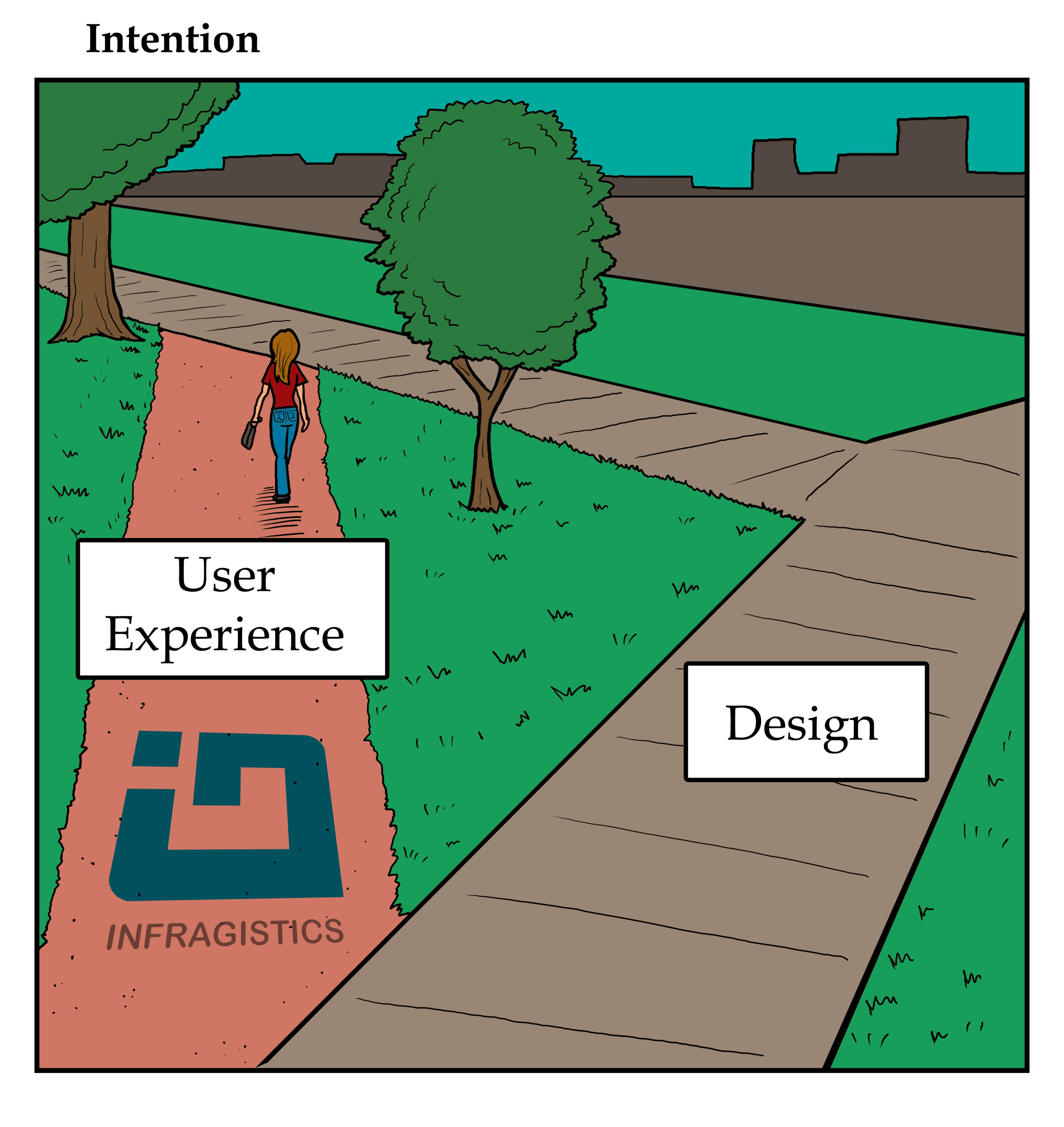
Happy Hump Day! Here's to hoping I can make your day a little brighter with this week's installment of "Developer Humor!" If you have any ideas for a great dev comic, please don't hesitate to leave a comment.

Share With The Code Below!

<a href="http://infragistics.com/community/cfs-filesystemfile.ashx/__key/CommunityServer.Blogs.Components.WeblogFiles/d-coding/3716.Tech-toon-_2D00_-2015-_2D00_-hi-res-13.jpg "/> </a><br /><br /><br />Developer Humor: Intention <a href="http://www.infragistics.com/products/aspnet">Infragistics ASP.NET Controls</a>

Universal Windows Apps: A health check

$
0
0

Last year, we wrote about Microsoft’s new Windows Universal Apps (WUA). WUAs are Microsoft’s recognition that their separate and non-compatible app stores for the Windows 8 PC and Windows Phone weren’t doing a lot to attract developers or customers. UWAs work on any device running Windows 10 and mean that, with a little configuration, developers can buy apps one time and know they’ll work on devices of any size, shape or input method.

Windows 10 was released last summer and is currently running on more than 110 million devices. Over four months into its release, is Microsoft’s new approach to apps paying off?

Why the need for UWAs?

Windows 8 and 8.1 are generally regarded as one of Microsoft’s worst moves of recent years. The so-called ‘metro’ design was almost universally unpopular (certainly with corporate users) and turned a lot of people off the OS. In comparison to Google Play and the Apple App Store, apps built for Windows 8 and Windows phone were few and far between.

As a result of these two failings, both the Windows mobile and PC app stores weren’t going anywhere. Microsoft were dealing with a ‘catch 22’ situation. Customers weren’t interested in the app store because there weren’t many apps. Developers didn’t want to build apps because there weren’t many customers. And so UWAs are Microsoft’s answer. The aim is to help developers build apps in one go, written in whatever programming language they like, and have these work more or less perfectly on desktops, laptops, smartphones, tablets, Xboxes and the HoloLens.

The gamble is that by making it easier to build apps for any device, developers will be tempted back to Windows. So is the gamble paying off?

Do you want the good news or the bad news?

On first impressions, UWAs have been something of a hit. A lot of major apps are now available in the store for multiple devices, including:

  • Adobe Photoshop Express
  • Dropbox
  • Netflix
  • Twitter (and soon Facebook and Instagram) – will bring some of the world’s largest social networks to Windows
  • Shazam

Many of these apps are household names, with millions (if not billions) of users worldwide. Letting their users download their apps direct to their device will certainly help the Windows Store grow and attract new custom.

Business Insider has reported impressive figures for visits to the Windows 10 app store; in the weeks following the app store’s release, Microsoft reported over 1.25 billion visits in just ten weeks. Equally, developer revenue had increased by a factor of four over that same period.

There’s always a ‘but’…

While there’s a lot of potential with Windows 10’s approach to apps, there is still a lot of uncertainty around the future and the relevance of what Microsoft is trying to do. Let’s have a look at some of the doubts out there:

 1. The Verge has reported on a number of major companies not updating or even canning their apps for Windows Phone, including Mint, American Airlines, Bank of America and Pinterest.  Even Microsoft haven’t kept apps for the Office Suite as well updated on Windows Phone as they do on iOS and Android. It’s hardly encouraging.

 2. It’s not really universal. Microsoft has come under criticism for describing UWAs as ‘universal’ because, well, they only run on Windows devices. If you actually want to build an app that runs on Windows, iOS and Android, you really need a platform like Xamarin.

 3. If your customers are only going to use your app on one device, there’s no real motivation to build a new universal app. Say you have an app that’s designed for desktop gaming that you’d already built for Windows 7. Windows 10 is backwards compatible so your app will continue to work on the new OS. So, unless you really want to expand your reach to mobile, there’s not much motivation to build for the new app store.

4. Will popular mobile app developers bother with Windows 10 anyway? Say you work for Snapchat. Your app was designed purely for mobile users and you already have many millions of customer on iOS and Android. Would you be motivated to build a Windows 10 app for the tiny number of potential Windows phone customers? The fact that your app will work on the desktop or Xbox is hardly relevant if your app is all about mobile.

 5. Microsoft wrote off its Nokia acquisitions this summer. This indicates a de-emphasis on mobile from Microsoft, and will make developers more cautious about building an app for Windows Phone when the future is unclear.

So, what has our health check of UWAs shown? To be honest, it’s probably too soon to tell. Windows 10 was released less than six months ago (at the time of writing), so predictions of its success or failure are probably a little premature. We’ll be following the future of UWAs closely however, so keep checking back for more in the coming months.

 Want to build your desktop, mobile or web applications with high-performance controls? Download Ultimate Free trial today or contact us and see what it can do for you.


A Step-by-step Introduction to JavaScript Sets

$
0
0

As mentioned previously, we have a new JavaScript standard commonly known as ECMAScript 6 (ES6). I've spent quite a bit of time recently reading around the new features outlined in the standard that are coming to, or have been recently implemented in, our browsers. One of my favorite additions is the new Set type. A set is somewhat like an array. It's a place to store values: numbers, strings, objects, actual arrays, Booleans, other sets etc. The most notable difference is that it will only store the same element once.

Creating and Adding Elements to a Set

It's really easy to set-up a new, empty, set:

var A = new Set(); //A is a set with nothing in it

Then we can add elements to the set using the chainable add method:

A.add(1).add(2).add("1").add([1, 2, 3, 4, 5]).add({}); //The set now contains 5 elements of various types

Note that 1 and "1" are different — there is no type coercion so both can be added to the set. On the other hand, if we try to add the number 1 again then nothing changes:

A.add(1); //The set still contains 5 elements

However, we could add another empty object to the array.

A.add({}); //The set contains 6 elements, 2 of them are empty objects

Why does this work? Because two objects are only equal if they refer to the same space in memory. The two objects may contain the same properties and methods but they are not considered equal here. The same holds for arrays:

A.add([1, 2, 3, 4, 5]); //The set contains 7 elements, including two arrays

Conversely, the following only adds one array to the set, not two or three because x and y refer to the same object in memory.

var x = ['a', 'b', 'c']; var y = x; //y is an alias of x A.add(x).add(x).add(y); //Only the first call to add adds anything to the set

You can also add elements to a set by passing in any iterable as an argument to the original construction call. The simplest option is an array:

var B = new Set([7, 8, 9]); //B is a set containing 3 elements

Confusingly, strings are iterable (but numbers are not). So this results in a TypeError...

B = new Set(123); //Nope, can't do this

...but the following creates a set with three elements!

B = new Set('123'); //B is a set containing three elements, the strings '1', '2' and '3'

To add a single string to a new set, place it in an array:

B = new Set(['123']); //B is a set containing the single element (string) '123'

There's nothing to stop you making sets of sets using the add method:

B.add(new Set([1, 2, 3])) //B now contains 2 elements, the string '123' and the set of numbers 1, 2 and 3 B.add(new Set([7, 8, 9])) //B now contains 3 elements, including 2 sets

On the other hand, the following just creates a set containing the first three positive integers:

var C = new Set(new Set([1, 2, 3])); //Same as var C = new Set([1,2,3])

You can also clone (rather than alias) another set using new Set:

var D = new Set(A); //A and D are completely different sets, they just (currently) have the same members

Checking for Set Membership

Checking for set membership is also really easy using the has method.

A.has(1); //true A.has(2); //true A.has('1'); //true A.has(75); //false

Of course you can't just check for an empty object or the array [1, 2, 3, 4, 5] for the same reason that you can add more than one such object or array.

A.has({}); //false A.has([1, 2, 3, 4, 5]); //false

You can, however, check for specific objects or arrays (or dates or other non-primitives) that you have references to.

A.has(x); //true A.has(y); //true: y is an alias for x (see above)

Removing Elements from a Set

The delete method removes members from a set.

A.delete(1); //Removes 1 from the set, returns true A.has(1); //false A.delete(x); //true A.has(y); //false: y is an alias for the array x which is no longer a member of A

As noted earlier, the add method is chainable because it returns this. By contrast, if you use pop or shift on a regular array they return the extracted element. The delete method of Setdoes neither of these things, it just returns a Boolean to indicate whether or not an element was deleted. Hence you can't chain delete calls. And of course you can't delete an object or array you don't have a reference to:

A.delete({}); //false A.delete([1, 2, 3, 4, 5]); //false You can remove all elements from a set in one step using the clear method (which returns undefined regardless of whether anything was cleared or not):B.clear(); //B is now an empty set.

Checking the Size of a Set

Like an array, you can check the number of elements contained with a Set. Unlike an array, the relevant property is called size, not length.

A.size; //6: The number 2, the string '1', 2 arrays containing the numbers 1 to 5 and 2 empty objects B.size; //0

Looping Over a Set

A set doesn't allow for any form of random access. For instance, you can't access the first or any other element of the set using square bracket notation like you can with an array. (Having said that, if you try the result is undefined, not an error.) This also means you can't use an old fashioned for loop. for-in loops don't work either. However, there are a couple of options for getting at elements. You can use the new JavaScript for-of loop for looping over any iterable object, and that includes sets. The following simply logs all elements to the console in the order they were added to the set:

for(var element in A) { console.log(element); //Prints out representations of the 6 elements }

And, like arrays, sets have a forEach method. This does the same as the example above:

A.forEach(function(el){console.log(el);}); //Does the same as the for-of loop above

Uses and Limitations

I like JavaScript sets because they seem relatively easy to use. They provide a simple system for holding and accessing a collection of data when you don't want to worry about duplicates and the problems they can cause. Unsurprisingly, they also somewhat resemble the mathematical concept of a set. Because of this it's perhaps slightly surprising that the ES6 specification doesn't include methods for performing common mathematical set operations such as union, intersection and symmetric difference. For the time being at least, you have to implement these for yourself (some pointers can be found here). Moreover, there's no direct way of representing, say, the set of all natural numbers or the set of all real numbers in a JavaScript set (since they're both infinite sets) as you might wish to in mathematics.

Browser Support

Support for sets is already good in desktop browsers. Mobile browsers are still catching up.

Further Reading

I found the online book Exploring ES6 by Dr Axel Rauschmayer a great reference for all things ES6. Chapter 19 covers Sets and the related "collections" WeakSets, Maps and WeakMaps.This blog post on Collections by Jason Orendorff for Mozilla is also well worth a read


Try our jQuery HTML5 controls for your web apps and take immediate advantage of their stunning data visualization capabilities. Download Free Trial today.

Microsoft Edge: A closer look

$
0
0

Microsoft Edge, quite simply, is the modern Internet Browser now available with Windows 10. Microsoft has decided to do away with the much loved (in some parts) and much demised Internet Explorer on its 20th Birthday - Happy Birthday indeed! Bar security patches, no new design features are expected. So from now, as your default browser in Windows 10, only expect to only see Microsoft Edge.

The history of Internet Explorer…

Our abiding memory of Internet Explorer? In the 90’s, Internet Explorer was the only available browser and as a result, pretty popular. However, since the introduction of Google Chrome and Firefox, it’s gone from being the ‘go-to’ browser to one that is, well, much less so.

Even though it continued to be used on large scales throughout the world, largely due the fact it came with Microsoft Windows, its gradual demise was noticeable. Microsoft knew it, and worked towards re-creating its image and value, with http://www.rethinkie.com. However, once again, IE lost the race against the other browsers, mainly due to lack of functionality and performance. It wasn’t particularly fast, security was poor and it lacked customization features, which as you might guess, were available in Firefox and Chrome.

Introducing Microsoft Edge

Knowing that Internet explorer was losing its credibility in the market, Microsoft started working on a new browser instead of fixing the existing one. A good move. If you’re wondering where the name came from, during its build, it was named ’Project Spartan’ - derived from "being on the edge of consuming and creating".

There’s a lot to be admired. Microsoft has its own rendering engine ‘Edge HTML’ to parse the HTML mark-up which is much faster than the old IE. They’ve also removed and rewritten the majority of the source code of Internet explorer to replace it with the Microsoft edge. So let’s take a look at some of the main features on that Edge has to offer:

Simple and Minimal design

Offering a very trimmed design compared to its ancestor IE, Edge is simple and easy to get to grips with. Much like Chrome, it has simple address bar and icons which are pretty self-explanatory. You have all the usual suspects - navigate backwards, forwards, add favorites, search, refresh, homepage etc. Add to that a share feature, a reading list and web note button, to name a few, a great aspect of Edge is everything is available on the same page using the right side pane. As a user you don’t have to navigate around the page for different tabs to change any settings.

The new design is also scalable to any device. It will automatically scale up if you resize the window or view it on other resolution. For today’s Internet users, mobile compatibility is something expected rather than unexpected, nevertheless, it’s a definite improvement compared to Internet Explorer.

Reading View

Reading view is a tool that enables the user to view the webpage in the reading mode. It strips out the unnecessary parts of the website - like videos, ads, images - and only shows the texts for quick readability. No popups and full screen reading view is available. Really helpful on the touch screen devices like tablets, phones.

You can switch the page to reading view by clicking on the book alike icon on the right side of the address bar. A note: if it’s disabled, it means the site is not compatible to view in reading mode.

Web note

Web note is a mark-up tool used to take screenshots of the page and add notes to it or sketches to it. You can write on the webpages themselves with touch or pen features or even type directly from the keyboard. You can highlight particular text or region of the screen using the highlight marker. Great new feature.

Reading List

A user can save an article to read it later in offline mode. It’s highly useful for the tablet devices where you might not have constant online availability or when let’s say you want to save the article for reading it later in your own time.

You can add the webpage in the reading list by clicking on the star icon besides the reading view icon. It will prompt you to save the article in the favorites list or the reading list.

Cortana Support

Cortana is a genius tool behind Windows 10 which works similarly to SIRI of iOS. It acts as your virtual assistant. When you type something in the address bar, such as the weather or requesting directions, it will show up just right below it and help out.

If you highlight or select a word on the webpage you can ask Cortana for more information. It will show the results on the right side of the pane without navigating to new page or a tab.

Note: Currently Cortana support is available only in specific regions and languages like China, France, Germany, Italy, Spain, United Kingdom, and United States.

A browser that can compete with Chrome

Since its fall from the top spot in 2012, Microsoft have been working hard to find a browser that can compete with its competitors. With Edge, they have a genuine chance of regaining some ground and have at the very least made a substantial step forward.

Want to build your desktop, mobile or web applications with high-performance controls? Download Ultimate Free trial today or contact us and see what it can do for you.

UX design patterns and where to find them

$
0
0

It was likely that Christopher Alexander was the annoyance of many an architect during the 1970s. An architect himself, Alexander is noted for his theories on design – in particular his insistence that users know far more about the buildings they need than any architect could. So, he created and validated a “pattern language” to empower anyone to design and build on a large or small scale. It didn’t take too long until this universal template made its way to the web, and web design patterns were born.

In this post we’ll explore what exactly is meant by user experience (UX) design patterns, and some of the best sources for tracking them down on the Internet.

What is a design pattern?

We, as humans, have an innate desire and ability to search for patterns in visual design. This visual perception can be applied to the analysis of information, and is why big data and data visualizations have become so prominent in today’s business landscape. Even without realizing it, we are naturally drawn to patterns, and design patterns are a common visual language that both designers and end users can understand. In terms of user experience, this translates to designers recognizing the habits users take on when interacting with a product, such as how they navigate through pages.

As well as being intuitive, design patterns are convenient, too. Developers are not known for having much time on their hands, so using a design pattern instead of creating something from scratch is a great time-saver.

The proof is on the page

Design pattern or not, there are certain elements that are used frequently in web design due to their appeal and practicality. You’ll be able to find examples of the following on almost any web page:

  • The Gestalt principles

A series of principles describing how people tend to organize visual elements into groups or unified wholes. These include similarity, continuation, closure and more. In web design, all of these principles should be considered to provide the fullest experience for the user.

  • Proximity

As a general rule, people will associate elements that are placed closely together as being related to one another. The same can be said for separated objects depicting dissimilarity. Proximity entails using negative space to either push elements apart or bring them closer together, to create the appearance of grouped items without the need for lines or other indicators.

  • Color

There are few elements that draw user attention as much as color. This may be due to the fact that it can evoke very different reactions depending on the color and the reader themselves. Finding colors that complement each other can further accent content; colors that are next to each other in the color spectrum is a prime example of this.

Libraries

These elements will be factored into any good web design, so your next question is probably: “Well where can I get them?”. Below are some of the best sites for design patterns – whether you’re simply looking for some inspiration or want to embed straight into your own site.

1.     UI Patterns

Patterns are split up into a number of useful sections regarding different areas of a web page and their corresponding user action/reaction. Each pattern contains advice on when it could be used, example screenshots, how the user is likely to engage with the page and how it will provide a positive UX. Additionally, UI Patterns offer persuasive design patterns, such as loss aversion, cognitive biases and more.

For example, Continuous Scrolling presents users with a seemingly endless set of content, omitting the usual ‘next page’ button to aid with the content consumption. This is effective for large sets of data that may otherwise be too big for the page, or if navigating to a second page takes away too much attention from the content.

2.     Patternry

With a refined library, Patternry offers detailed information on a selection of different design patterns. Tags allow users to search through categories such as forms, content and navigation, all of which again contain details on the problem the pattern solves and when, how and why to use it. An HTML category provides code in HTML, CSS and JavaScript formats for quick encoding to your site.

A Progress Bar or Progress Indicator is used to show the application is undertaking a task, and shows the progress of said task. This is a good way of keeping the user informed if the action takes more than a few seconds to complete, making the interface feel more responsive. Patternry provides HTML code for quick and easy embedding.

3.     Zurb

With a huge resource library taken from designers around the world, Zurb hold a multitude of assets to inspire and enable avid developers. Containing over 5000 interface patterns as well as numerous behavioral triggers and code snippets, the range of available content is unmatched. Zurb does lack the informative side of their patterns, however, and so is perhaps suited to more experienced developers looking for inspiration.

4.     UXPin

UXPin is perfect for mobile design patterns, with E-commerce, Music & Video, Social Media and Taxi App template categories. Each category contains a comprehensive selection of what a user is likely to experience on each site. Social Media, for example, includes account creation, profile, navigation drawer, search suggestions, login, feed and more. UXPin is a paid service, but users can sign up for a free trial to see if it’s right for them.

Still not satisfied?

We’re always happy to see examples of great UX design, especially when they come from our own products. If you want to see more examples of apps, web pages or dashboards you can view them on our samples page. With samples for iOS, HTML5, Windows Forms and Indigo Studio, there’s something for everyone!


Want to experience how your app will look and work before writing a single code of line? Try Indigo Studio Prototyping tool today or and see what it can do for you.


Event Recap: Open Source Give Back Day

$
0
0

This is a guest post by Sam De La Torre Baba, an Associate Software Developer with Infragistics. Read on to hear about Sam’s experience with Open Source Give Back Day.

This past January Infragistics participated in Open Source Give Back Day, where we were tasked to give back to an Open Source Community in any way we could, whether it be by adding documentation, fixing a known issue, writing a blog post, etc. With this flexibility, we were given a full day to work on whatever aspect we felt would best benefit us to develop/grow our professional skills. It was so exciting to basically pick and choose what you want to work on for a day!

I decided to work on developing an npm module that would allow users to download a local copy of the Ignite UI files by using what is available in the CDN. If you are not familiar with npm you can read up on it here. If you have a .NET background you can think of npm as the equivalent of NuGet in the NodeJS community. Npm used to be thought of as a package manager used only for backend developers who utilized NodeJS, but due to NodeJS’s recent rise to popularity and tools like Browserify allowing for Node modules to run in browsers, npm frontend packages started to become commonplace. Google’s popular framework, Angular 2, is using npm as its official distribution platform. You can find many front end packages such as jQuery, Bootstrap and Foundation. 

So during the day of the event I was able to publish the npm Ignite UI module such that if you have npm installed in your computer, you can get it by placing this command in your command prompt:

npm install igniteui

The code is currently available here: https://github.com/SamDLT/igniteui-npm. So if you see anything that could use a touchup, find a bug, want to add documentation, or whatever; feel free to send a pull request!

In regards to the event, I had so much fun! I learned so much about NodeJS which I haven’t touched since college (which wasn’t all that long ago to be honest). This all led to me to adopt other projects such as the Yeoman Ignite UI Generator. I’m currently working on a rewrite in my spare time such that users can have additional scaffolding options based on inputs to prompts. You can check out my progress in the Dev branch within the repo. I’m currently looking into applications of the Himawari Node module which provides satellite images of Earth every 10 minutes.

I feel that even with just a single day to give back, it was very productive. I would definitely be in favor of this event being more commonplace as it allows us to take a day to focus on our professional growth and the growth of the community too!

Why Your Company Should Pay Closer Attention to Device Diversity

$
0
0

Do you sometimes long for the good old days of device management? In most organizations, all you had to think about was governing a series of desktop PCs, usually running on Windows. iOS and Android hadn’t even been invented, and the idea that anyone could connect to corporate data from anywhere seemed ludicrous. How times have changed!

Today, the floodgates have opened. Your colleagues likely use a whole range of smartphones and tablets in their personal lives. And, without understanding the complexity and risk this poses, they expect you to make it possible to connect these devices to the company portal. End users, don’t you just love them?

At present, IT managers, faced with this wave of requests - “why can’t I connect my smartphone to the Intranet?” – need to pay real attention to how they deal with this Device Diversity. You can’t take the ostrich position here and bury your head in the sand – ignoring Device Diversity will leave you open to risk.

What is Device Diversity again?

Gartner describes Device Diversity as “the growing variety of devices, computing styles, user contexts and interaction paradigms”. As the name suggests, there are now a huge amount of devices and a number of operating systems which your colleagues use to access company systems.

In a few short years’ billions of smartphones and tablets have saturated the market, all running different Operating Systems:

Source: IDC 2015

For each individual OS, there’s a big variety of system updates. And then there are all the different devices of varying age, size, power and security.

We’re all for Device Diversity (we’re big fans of Xamarin which lets developers build apps for different OS’ in one go). However, managing this diversity is complex, and requires significant governance. If you don’t maintain control over which devices your employees use to access corporate data, you open yourself up to risk. But there’s a Catch 22 here – if you do try and impose controls on which devices your colleagues can use, you face the risk of a staff mutiny.

What’s the problem with Device Diversity?

So, why’s Device Diversity a problem? We wouldn’t want a world where there’s only a handful of devices – diversity makes the market super competitive and very exciting. However, this diversity does pose a problem to businesses in the following areas:

  • Security

If your employees are using older, outdated operating systems, these might be at risk of hacking. The latest OS’ all have the latest security patches too, and should, in theory, be protected against most threats. Older systems are less secure however, and are at greater risk of being breached. While your company portal should have a strong firewall, outdated and corrupted devices present a weakness for nefarious hackers to exploit.

  • Apps functioning on all systems

If you have chosen an enterprise app where users can access the company Intranet from mobile, that app will need to be accessible from all devices. You’ll want updates deployed uniformly on each device type too - you don’t want Android users to be left behind the iOS owners. Keeping this up to date when workers use a wide range of devices and Operating System is really hard.

  • Frustrated users

Tied into the previous point, if your app doesn’t work well on the user’s device, you can guarantee a long stream of complaints and moans. You’ll spend your days fixing these issues rather than doing what you’re really employed to do.

  • Missed productivity opportunities

Again, if your Intranet doesn’t work well (or at all) on your employees’ devices, you’ll have wasted a lot of money on an app. Mobile should make people more productive, but if users can’t actually access their productivity tools from their device, you’re wasting time and budget.

So what am I supposed to do?!

Don’t worry, Device Diversity doesn’t have to be a bad thing. All it takes is a well-planned strategy which corresponds with your company’s and employees’ needs. Follow this consistently and Device Diversity will become your friend (or will at least be manageable).

You basically have two options for dealing with Device Diversity:

1.   Buy one device for all users in the company and end diversity!

This is the ‘anti-BYOD’ approach. If you have the budget, asking all your employees to use one specific device (or one of a limited number) is perhaps the ideal solution. If the devices are good quality and up to date, your employees will probably be pretty happy. What you don’t want however, is to enforce unpopular devices that no one wants to use.

2.   Provide colleagues with a list of accepted providers

Your second solution is to provide a list of ‘approved’ BYOD devices. Encourage 4-7 ‘ideal’ devices, but also ‘tolerate’ a number of other smartphones and tablets that can be used. Circulate an ‘out of bounds’ list too, which makes sure people don’t buy devices that won’t be compatible with the Intranet.

Whatever solution you choose, SharePlus from Infragistics configures with many of the most commonly used devices and OS’ in the field. Your users get a fully managed access to SharePoint from smartphones and tablets, even without an Internet connection. Most importantly, you maintain total control over the devices in your network, meaning Device Diversity is no longer a problem.

Try a free demo of SharePlus Enterprise today, and see how much more you can achieve from SharePoint on iOS.


Why We Should Report More Than Just the Mean

$
0
0

Numbers without context are of very limited use. So it's a good thing that articles in newspapers and reports in the wider world will often compare the figures they relay to the (mean) average. But invariably that simply isn't enough to get a gauge of what the data being reported really tells us. There's an old "joke" about a statistician who drowned in a lake of average depth a few inches (the precise average depth seems to vary depending on who is telling the joke), but over-simplifying by just reporting or comparing with an average really can be highly misleading.

At the time of writing, the White Moose Café in Dublin in the Republic of Ireland has a rating of 3.8 stars (out of 5) on Facebook. From just this number, without looking at the distribution of scores, you might take that to mean something like "People generally think this is a good café which could perhaps make a few improvements to bump it above 4 stars". In fact the establishment has well over seven thousand reviews but only 42 reviewers gave it a 2-star, 3-star or 4-star rating! The overwhelming majority of ratings are either 1 or 5 stars. This rather extreme example of polarized opinions is the result of a disagreement between the proprietor and a vegan customer that led initially to a bombardment of negative reviews from many further vegans and a subsequent backlash from meat-eaters; It's safe to say most of the reviewers have never been to the café. (You can find out much more about this story here.) The average rating doesn't give us any hint of the underlying story.

So hopefully you can see why it's a good idea to go beyond just reporting (mean) averages or comparing one result to the average. We have plenty of other descriptive statistics that can tell us something more about the distribution of a set of results: median, mode, standard deviation, variance, skew, kurtosis, range, interquartile range... But frequently the best option is to visualize the results. Facebook does actually do this with its review system, as the screenshot below shows:

A classic example illustrating the need for visualization is Anscombe's quartet: a set of four small datasets of paired x and y values. All four datasets have identical mean (9) and variance (11) in the x variable and almost identical mean (~7.5) and variance (~4.12) in the y variable. The correlation coefficient for each dataset is also the same (0.82) to two decimal places. Actually plotting the data as a simple set of scatter plots highlights that the four datasets are, in fact, very different.

Perhaps most surprisingly, the linear regression lines for each set are (almost) the same. This is a case of garbage in, garbage out; if you try to fit a straight line to show how one variable effects another and the relationship is not even close to linear then don't expect your line to be even remotely representative of your data. Of course, we're not particularly good at absorbing and interpreting large amounts of data in tabular form so the fact set II isn't linear may not be entirely obvious in, say, a spreadsheet: Plot your data before trying to fit it!

Scatter plots are the obvious choice for paired datasets like Anscombe's. The one dimensional equivalent is the strip plot. Let's just use Anscombe's y values as a quick example:

The strip plots nicely highlights the presence of outliers in Set III and Set IV and show that the bulk of the data points lie between 5 and 10 for all sets.

Strip plots often work well when there is only a modest number of data points for each set. With larger datasets things quickly become overcrowded. One could try to get around this by giving each point a random vertical offset to clear things up a bit, essentially adding jitter to a non-existent second variable, but a more common alternative is to bin the data and create histograms. Below, for example, is a histogram made from 300,000 data points generated by a specific continuous random number generator.

Picking an appropriate bin width is important. Given that the above figure shows continuous data you may be able to tell that the bin width used is really unnecessarily wide. Instead of using bins one unit wide, we can decrease it to, say, 0.1 units wide.

Hopefully this makes it more obvious that the random number generator was pulling numbers from a normal distribution. The mean of the specific distribution was 15 and the standard deviation 2. In the next example numbers are drawn from a different normal distribution.

The normal distribution in this case has the same mean as the previous example — 15 — but the standard deviation is much bigger — 5. This means that the probability of getting a number below 8 or above 22 is much much higher than for the previous example. But there's no way of telling that if you just quote the mean.

Create modern Web apps for any scenario with your favorite frameworks. Download Ignite UI today and experience the power of Infragistics jQuery controls.

Making the most of www.codeproject.com

$
0
0

By now you should be familiar with the challenge of networking on the web. The world around us has become much more connected and we have almost constant access to the internet with mobile devices and the rise of wearable tech. As a result many of us are now far more likely to quickly surf the web for help rather than seek out a colleague who may or may not have the answers.

These behaviors have lead to the evolution of various online communities, where developers of all types and abilities can communicate in order to network and solve problems. Some of these sites can be graveyards for ancient requests, consisting of ‘How can I accomplish basic function X?’ followed by a lazy but functional answer which offers little to no real aspect of improving your abilities as a developer.

Others however are far more focused on the developers themselves and really do help them to become better at their jobs. One such site is CodeProject, which we’re going to take a look at today.

An established presence on the web

CodeProject was created in 1999 with the intention of providing computer programmers with a place to meet and discuss implementation of ideas. The site also acts as a resource for all of the latest technology news, and provides articles with source code that can help with day to day programming issues.

The main selling point of CodeProject is its user generated content, which comes in many forms:

Articles

These are resources by programmers for programmers. They contain top-quality information on how to tackle issues that will come up in the real world. The articles are sorted into “most viewed” and “most popular” in order to help you find the most relevant information.

Tutorials

These are for those who have just started to code.  They contain easy to follow step by step procedures that help beginners to understand the underlying principles of coding.

For example, if you’re aiming to start using SharePoint this year, why not start with a 5 star rated tutorial like SharePoint 2013 - Introduction, Features, and Roles.

Discussions

CodeProject has many discussion boards where you can chat with fellow developers. Whether the aim is to help or seek answers, the discussion boards can be a direct way to achieve these goals. The lounge feature can also be used to have a more laid back discussion with like-minded people but be warned... House rules apply!

Newsletters

Weekly newsletters highlight the latest and most popular articles and news pieces from the previous week. Newsletters can be customized to ensure they only contain relevant information from the vast archives of the site. This is a good way to curate the site’s content and filter out the things that may distract you from your task at hand.

Surveys

Weekly surveys help to paint a picture of popular opinions amongst developers. Whether it’s “How many hours a week do you code?“ or  “Will you write an app for a smartwatch this year?” the results can be used to get a grasp of how the rest of the community feels about the topic at hand. Each survey also comes with a message board underneath so readers can see context to the results.

Features

After checking out all of CodeProject's features we compiled these three tips which can be used to get the most value out of the site:

1. Connect

Try to network with people that you share passions with. Everybody on CodeProject has a personal profile which usually contains social media details. Don’t be afraid to send somebody a message as most users will have signed up with the intention to network or at the very least communicate.

2. Participate

Whether you are a newbie or an expert in your relative field you will always have some experience to offer. Remember that the perspective of a newbie may help to inspire valuable articles and resources from the other users on the site. If writing tutorials is not your thing, then try asking a few questions or checking if you can help with any of the unanswered questions.

3. Protect your Rep

Nobody likes a spammer and CodeProject is no different. It may sound obvious but come across as a real human being who values the community. That means being courteous and specific as well as searching through the resources for others who may have had the same issues as you. Keep your contributions consistent and who knows? Maybe you will be rewarded with the prestigious “Most Valuable Professional” award which is presented to a small handful of people annually based on their contributions in both article submissions and answering questions.

A valuable resource

The reason that CodeProject has amassed 11 million+ users is simple: Computer programmers love to interact with each other. All of the articles and discussion boards can be read without registering but the real magic happens when you sign up. Whether it’s downloading a zip file of the latest scripts or just having your own profile in the “Who's Who” list, you will surely notice yourself becoming a part of the community.

 Want to build your desktop, mobile or web applications with high-performance controls? Download Ultimate Free trial today or contact us and see what it can do for you.

The Microsoft App rename game

$
0
0

Jargon is a funny thing isn’t it? A language that is ‘normal’ to a specific industry can be alien to others and quite naturally hard to pick up - take medical or legal orientations for example.  This level of verbal intricacy can be exacerbated by the frequency at which the validity of these terms can change. Whilst this may not be a risk for most professionals, anyone working within the tech industry will probably have fallen prey to this particular phenomenon. In SharePoint Parlance, one such term would be the term “app.”

For most people familiar with technology, an app has a specific meaning. Furthermore, most vendors have their own form of app store too. What Apple began, Google continued and Microsoft successfully gate-crashed.  An app represents a “thing” that a user can download to meet a need, whether this is a gaming, organizational or functional need.  App stores have conditioned people to seek out what they need and in a way, most users expect this form of transactional interaction across more technological walks of life.

What we want to explore in this post is how jargon changes have been applied to the SharePoint world we all know and love. It only seems recently that Microsoft revitalized the idea of an app store for SharePoint when the 2013 version was shipped. What we’d like to walk you through today is the renaming of these apps with the pending launch of SharePoint 2016 in the spring. Or as we like to call it, “The Microsoft Rename Game.”

App or Add-in?

The first inkling of change came from the Ignite conference at the turn of last year. Whilst we all tend to look out for the sexy headlines (SharePoint 2016 Hybrid, etc.) there is always value in looking at some of the smaller, less publicized stories that are produced at these conferences.

In our instance, the renaming of the SharePoint App Model to Add-in Model.

Sounds odd right?  Well, let’s delve into that.

The reasons behind this change can be summarized as such:

  1. Confusion across Microsoft’s product range as to the exact meaning of the word App
  2. Negativity from the Partner Network over the perceived meaning of the word

The Microsoft Product Range

The biggest reason behind the change is to garner a more harmonized and consistent experience across Microsoft’s products and stores.  Consider the large number of devices that Microsoft is catering for with device based Office products and you’ll get a lengthy list.  This would start with iOS devices, Android Devices and so on.  If a user downloaded what they perceived to be the Office “App” and then subsequently found there were other “apps” inside it, such as Word and Excel, it’s pretty clear to see why there would be confusion.

This conflict is also evident in the fully fledged desktop applications. The Apps tab gives access to both the Office Store and a summary of installed apps. Again, this is further evidence of where an “app within an app” can confuse users.

Feedback from the Partner Network

A secondary but no less insignificant reason, is feedback from the partner network.  An App in SharePoint can appear a simple thing to an end-user but in reality can be the results of significant amounts of work.  The app model allowed SharePoint developers to integrate non SharePoint data and any technology stack of their choosing into the product.  However, the caveat to this is pricing.

If the visible end product looks and feels like an app, those responsible for paying the bills may benchmark the value against a £5 application or some-such from a device app-store.

User behavior & moving forward

On the flip side though, Microsoft are using this perception positively. As users are already familiar with the notion of “adding things to SharePoint / Office”, the name change really becomes quite easy to understand.  So, from here onwards, the new terminology that Microsoft would like to push is:

  • SharePoint Add-ins
  • Office Add-ins

Jeremy Thake, senior Product Marketing Manager at Microsoft, has provided a list of useful terms on his blog which you can check out here. For a quick glance, here’s that all important new naming convention list…


Previous NameNew Name
Apps for SharePointSharePoint Add-ins
App WebAdd-in Web
App PartAdd-in Part
SharePoint App ModelSharePoint Add-in Model
SharePoint Hosted AppSharePoint Hosted Add-in
SharePoint Provider Hosted AppSharePoint Provider Hosted Add-in
Apps for OfficeOffice Add-ins
Office App ModelOffice Add-in Model
Apps for Office in OutlookOutlook Add-ins
Apps for Office in ExcelExcel Add-ins
Apps for Office in PowerPointPowerPoint Add-ins
Apps for Office in WordWord Add-ins


Making things easier

Lastly, please keep in mind that the confusion is only made worse by the state of flux that Microsoft is in. Documentation is still being updated and lots of literature is still to be written. 

The new naming convention will, in the long run, make things a lot easier and straighter forward to understand.  Removing the ambiguity over specific terms across the Microsoft space will only lead itself to both positivity and profitability.


What is a Provider () in AngularJS?

$
0
0

The provider() function allows us to create a configurable service where we can set input per application for the service created using the provider (). For example, if we need to set API key to access a service on the application level, we can set that in the module config and pass input to the provider using the $provide service. All the others ways to create services internally use the $provide service.

Creating a service using $provide service in module.config

Let us start by creating a very simple service using the provider() function.  

app.config(function ($provide) {
    $provide.provider('globalsetting', function () {this.$get =function () {var appname ="Lawyer App";return {
                appName: appname
            };
        }
    })
});

 Let’s explore what is going on in the above snippet. To create a service using provider, we need to use the $provide service. The provider function of the $provide service takes two parameters: the name of the service and the function. A provider function must have a $get function. To create a simple service using the provider(), we need to perform following five steps:

  1. Inject the $provide service in the app config method
  2. Create a provider using the provider() function
  3. Pass two parameters to the provider() function: the name of the service and a function
  4. The provider function must contain a $get function
  5. Return an object literal from the $get function

We can use the globalsetting service created using the provider by injecting it in a controller as shown in the listing below:

app.controller("ProductController", function ($scope, globalsetting) {

    $scope.name = globalsetting.appName;

});

Eventually, we can display data from the globalsetting setting service on the view by using the ng-controller directive as shown in the snippet below:

<div ng-controller="ProductController">
        {{name}}</div>

Creating a service using the provider () as a function of the module object

We have created a service using the provider inside the config of module. There is also another way to create a service using the provider: AngularJS also has exposed the provider() function on the module object. For simplicity’s sake, we can directly use the module.provider() to create a service and register the created service in the config of module.

To create the service using the provider() function on the module object, we need to:

  1. Create a service using the module.provider()
  2. Register the service in the module.config()
  3. While registering the service, we need to append the Provider with the service name. So if the service name is globalsetting, we will register in module.config as globalsettingProvider

Let us recreate the globalsetting service using the module.provider() function:

app.provider('globalsetting', function () {this.$get =function () {var appname ="Lawyer App";return {
            appName: appname
        };
    }
});

In step 2, we need to inject the service to the app config. Do you remember injecting the $routeProvider? In the same way, we need to inject the globalsettingProvider in the app config as shown in the snippet below:

app.config(function (globalsettingProvider) {
});

There is no setter in the globalsetting service, so we are not passing any value to the service created using the provider. We can use globalservice in the same way as when it was created using the $provide service in the config:

app.controller("ProductController", function ($scope, globalsetting) {

    $scope.name = globalsetting.appName;

});

Creating Setter for the provider()

Let us take a look in the globalsetting service. Right now we are hardcoding the name of the app, but in a real life scenario, we may want to pass the name of the app from the main module app. To do this, we need to create a setter for the provider. Setters are nothing but a function like $get in the provider.  We can create a setter for the globalsetting service provider as shown in the listing below:

app.provider('globalsetting', function () {var appname ="LAWYER APP";this.setAppName =function (value) {
        appname = value; 
    }this.$get =function () {return {
            appName: appname
        };
    }

});

Let’s see what’s going on in here:

  1. We created a setter function.
  2. We are passing a parameter in the setter function.
  3. We’re also setting the appname with  parameter passed 

Now while injecting the globalserviceprovider to the app config, we can pass the name of the app.

app.config(function (globalsettingProvider) {
    globalsettingProvider.setAppName("Infragistics App");
});

Eventually globalservice can be used in the controller as shown in the listing below:

app.controller("ProductController", function ($scope, globalsetting) {

    $scope.name = globalsetting.appName;

});

Refactoring factory () to use $provide service

As we discussed earlier, the service() and factory() functions are just syntactic sugar on $provide and internally uses $provide. Let us see how we could refactor a service created using the factory() to use $provide. Here we’re creating a service called greet using the factory() as shown in the listing below:

app.factory('greet', function () {return {
        message:"hello to my app"
    }
});

Internally, the factory() function uses the $provide service. So instead of using the factory() method on the module object, we can create the following as the service:

app.config(function ($provide) {
    $provide.factory('greet', function () {return {
            message:"hello to my app"
        }
    })
})

As you can see, the $provide service exposes a factory() method, which takes two parameters: the name of the service and the function.  So we can conclude that using the factory() function to create a service is a simplified syntax of $provide.factory().


Where to use a Provider

We should use a provider when we are creating a service for the entire application. For example, when we are creating service to retrieve data from the API we need to set the API key once per application. We can set that in the config of app and pass that to the setter function of the provider.

And that about covers it for AngularJS providers! I hope you find this post useful, and thanks for reading!

Understanding the Grid Layout in Bootstrap

$
0
0


With each passing day, new devices with new screen sizes are popping up - and as web developers, we need to create web applications that are responsive to these various screen sizes. There are multiple ways you can create a responsive layout, however I find Bootstrap grid layout to be the easiest. In this post, we will cover various aspects of the Bootstrap Grid system with various examples. To start with let us create a four equal column layout for medium-sized devices in Bootstrap Grid system.

4 equal columns layout

To create the layout, you need to complete the following steps:

1.       Create a div with class container for fixed width or container-fluid for the full width of the screen

2.       Create a div with class row. Div with the class row must be inside container

3.       Create 4 divs for 4 columns.  Div of the column must be the immediate child of the row div

4.       Content will be inside the column div

To create four equal columns in a row, I have created four divs with the class set at col-md-3 as shown in the listing below:

  <divclass="row">

            <divclass="col-md-3">

                <buttonclass="btn btn-success">column1</button>

            </div>

            <divclass="col-md-3">

                <buttonclass="btn btn-info">column2</button>

            </div>

            <divclass="col-md-3">

                <buttonclass="btn btn-danger">column3</button>

            </div>

            <divclass="col-md-3">

                <buttonclass="btn btn-warning">column4</button>

            </div>

        </div>


The Bootstrap Grid system divides the available width of the screen to 12 columns.  So to create four columns, we have used col-md-3 class (for medium devices).


3 unequal columns layout

To create three unequal columns in a row, I have created three divs with the class set at col-md-3, col-md-6, and col-md-4 as shown in the listing below:

<divclass="row">

            <divclass="col-md-3">

                 <h2>some text</h2>

            </div>

            <divclass="col-md-6">

                <h2>some text</h2>

            </div>

            <divclass="col-md-4">

                <h2>some text</h2>

            </div>


        </div>


We have used class .col-md-* to create the layout, one with equal columns and another with unequal columns for medium devices. For other devices, we have other classes available which we’ll discuss later in the post. Let us go further to discuss theoretical concept of Grid system.

Bootstrap Grid System

The Bootstrap 3.0 Grid system was designed with mobile in mind. It is responsive and it gives us classes to create layouts for extra small devices, small devices, desktops, and extra larger desktops. Various classes provided to us for various kind of devices are shown in the image below:


The Bootstrap Grid system divides each type of screen into 12 columns. The width of the columns depends on the screen size, but Bootstrap considers various screens sizes and their columns sizes are as follows:


These 12 columns can be scaled up or down in different variations depending on the screen size, as shown below:

We can create above layout for medium size devices using the listing below:

  <divclass="container">


        <divclass="row">

            <divclass="col-md-1">

                col-md-1

            </div>

            <divclass="col-md-1">

                col-md-1

            </div>

            <divclass="col-md-1">

                col-md-1

            </div>

            <divclass="col-md-1">

                col-md-1

            </div>

            <divclass="col-md-1">

                col-md-1

            </div>

            <divclass="col-md-1">

                col-md-1

            </div>

            <divclass="col-md-1">

                col-md-1

            </div>

            <divclass="col-md-1">

                col-md-1

            </div>

            <divclass="col-md-1">

                col-md-1

            </div>

            <divclass="col-md-1">

                col-md-1

            </div>

            <divclass="col-md-1">

                col-md-1

            </div>

            <divclass="col-md-1">

                col-md-1

            </div>


        </div>


        <divclass="row">

            <divclass="col-md-2">

                col-md-2

            </div>

            <divclass="col-md-2">

                col-md-2

            </div>

            <divclass="col-md-2">

                col-md-2

            </div>

            <divclass="col-md-2">

                col-md-2

            </div>

            <divclass="col-md-2">

                col-md-2

            </div>

            <divclass="col-md-2">

                col-md-2

            </div>

        </div>


        <divclass="row">

            <divclass="col-md-3">

                col-md-3

            </div>

            <divclass="col-md-3">

                col-md-3

            </div>

            <divclass="col-md-3">

                col-md-3

            </div>

            <divclass="col-md-3">

                col-md-3

            </div>

        </div>


        <divclass="row">

            <divclass="col-md-4">

                col-md-4

            </div>

            <divclass="col-md-4">

                col-md-4

            </div>

            <divclass="col-md-4">

                col-md-4

            </div>

        </div>


        <divclass="row">

            <divclass="col-md-6">

                col-md-6

            </div>

            <divclass="col-md-6">

                col-md-6

            </div>

        </div>

    </div>

Rules to use Bootstrap Grid system

To work with the Bootstrap Grid layout, we need to take care of the following points:

·         Rows must be placed either within a container (for fixed width) or container.fluid (for full width) to fetch proper padding and alignment.

·         Columns must be immediate children of rows.

·         Content should be placed inside the columns.

·         Each rows has two available columns.

·         If more than 12 columns are placed within a single row, each group of extra columns will, as one unit, wrap onto a new line.


Creating layout for medium devices

Let us say that we need to create a layout for medium device with following requirement

·         Should have three columns

·         Width of the 1st column should be equal to width of 2 columns.

·         Width of the 2nd column should be equal to the width of 6 columns.

·         Width of the 3rd column should be equal to the width of 4 columns.


This layout can be created as shown in the listing below:


<divclass="container-fluid">

<divclass="row">

            <divclass="col-md-2">

                <h2>.col-md-2</h2>

                <p>some text</p>

            </div>

            <divclass="col-md-6">

                <h2>.col-md-6</h2>

                <p>some text</p>

            </div>

            <divclass="col-md-4">

                <h2>.col-md-4</h2>

                <p>some text</p>

            </div>

 </div>

</div>


This will create a layout as shown below:


If you do not wish to work with the full width of the device and want to use a fixed width, put the row div inside the container class as shown in the listing below:

<divclass="container">

<divclass="row">

            <divclass="col-md-2">

                <h2>.col-md-2</h2>

                <p>some text</p>

            </div>

            <divclass="col-md-6">

                <h2>.col-md-6</h2>

                <p>some text</p>

            </div>

            <divclass="col-md-4">

                <h2>.col-md-4</h2>

                <p>some text</p>

            </div>

 </div>

</div>


Here the layout would be created as shown in the image below which is using the fixed width:


If we put more than 12 columns in a single row then the extra columns as unit will be stacked to the next line.


Creating layout for small devices

Let us say that we need to create a layout for a small device with following requirements:

·         Should have three columns

·         Width of 1st column should be equal to width of 2 columns.

·         Width of the 2nd should be equal to the width of the 6 columns.

·         Width of the 3rd should be equal to the width of the 4 columns.

This layout can be created for small devices as shown in the listing below:

<divclass="container-fluid">       


        <divclass="row">

            <divclass="col-sm-2">

                <h2>.col-sm-2</h2>

                <p>some text</p>

            </div>

            <divclass="col-sm-6">

                <h2>.col-sm-6</h2>


                <p>some text</p>

            </div>

            <divclass="col-sm-4">

                <h2>.col-sm-4</h2>

                <p>some text </p>


            </div>

        </div>

    </div>

This snippet will give you the layout shown in the image below. As you may notice, the width of the second column is thrice of the width of first column. Also the other important point you may notice is that the columns are not stacking vertically, even when the width of the browsers is reduced (simulating small devices).


In the same way, layouts for large and extra small devices can be created using the classes .col-mg-* and .col-xs.* respectively.


Creating layouts for tablet and desktop

We can combine the col-md-* class and col-sm-* class to create layouts for desktops and tablets. We can create a layout of three unequal columns as shown in the listing below: 

<divclass="row">

            <divclass="col-md-2 col-sm-2">

                 <h2>some text</h2>

            </div>

            <divclass="col-md-6 col-sm-6">

                <h2>some text</h2>

            </div>

            <divclass="col-md-4 col-sm-4">

                <h2>some text</h2>

            </div>


        </div>

The above created layout would be responsive to both medium screen size desktops and the tablets.  


Creating layout for tablet, desktop, and mobile

We can combine the col-md-* class, col-xs-*, and col-sm-* class to create layouts for desktops and tablets – let’s see how to create a layout of three unequal columns as shown in the listing below: 


<divclass="row">

            <divclass="col-md-2 col-sm-2 col-xs-2">

                 <h2>some text</h2>

            </div>

            <divclass="col-md-6 col-sm-6 col-xs-6">

                <h2>some text</h2>

            </div>

            <divclass="col-md-4 col-sm-4 col-xs-4">

                <h2>some text</h2>

            </div>


        </div>

The above created layout would be responsive to both medium screen size desktops, mobile devices and tablets.            

Nesting columns

Bootstrap allows the nesting of columns as well, which means we can put rows and columns inside an existing column. Keep in mind that even in nesting, the sum of the total columns should not be greater than 12 in a same row.  To understand this better, let us consider the following scenario:

·         There is a row.

·         There are two columns in the row.

·         The First column is of class col-md-4.

·         The Second column is of class col-md-8.

·         There is a nested column inside the first column.

Here, the maximum number of nested column would be 12 inside the col-md-4. More than 12 columns would be stacked to the next line in the first column.  Let us consider the listing below, where we have kept more than 12 nested columns.


<divclass="row">

            <divclass="col-md-4">

                <divclass="row">

                    <divclass="col-md-2">

                       <h2>text here</h2>

                    </div>

                    <divclass="col-md-2">

                        <h2>text here </h2>

                    </div>

                    <divclass="col-md-2">

                        <h2>text here </h2>

                    </div>

                    <divclass="col-md-2">

                        <h2>text here </h2>

                    </div>

                    <divclass="col-md-2">

                        <h2>text here </h2>

                    </div>

                    <divclass="col-md-2">

                        <h2>text here </h2>

                    </div>

                    <divclass="col-md-2">

                        <h2>text here </h2>

                    </div>

                    <divclass="col-md-2">

                        <h2>text here </h2>

                    </div>

                </div>

            </div>

            <divclass="col-md-8">

                <h1>I am level  - col-md-8  </h1>

            </div>

        </div>

Here we have put more than 12 nested columns in the first column of the main row. Extra nested columns would be stacked to next line as shown in the image below:

Column Offset

Bootstrap allows us to move columns to the right using the class .col-md-offset-*. So let us say we want to move a column by 4 columns to the right, then we will have to use the class col-md-offset-4. This can be done as shown in the listing below:


<divclass="row">

            <divclass="col-md-5 col-md-offset-4">

               <h2>moved 4 columns right</h2>

            </div>

            <divclass="col-md-3">

                <h2>col-md-3  </h2>

            </div>

        </div>


Offset columns are then displayed as shown in the image below:


Column Push and Pull

Bootstrap also allows us to reorder columns, too. We can use col-md-push-* or col-md-pull-* classes to do this:

<divclass="row">

            <divclass="col-md-9 col-md-push-3">col-md-9 col-md-push-3</div>

            <divclass="col-md-3 col-md-pull-9">col-md-3 col-md-pull-9</div>

 </div>

Here, the first column would be pushed by 3 columns to the right and second column would be pulled to 9 columns to the left as shown below:


Conclusion

As we’ve demonstrated, you can use various classes provided by Bootstrap to create responsive layouts for your web applications. In this post, we focused on row and columns classes along with offset, push, pull, and nesting the columns. I hope you find this post useful, and thanks for reading!


Create modern Web apps for any scenario with your favorite frameworks. Download Ignite UI today and experience the power of Infragistics jQuery controls.


Viewing all 2372 articles
Browse latest View live


Latest Images