Quantcast
Channel: Infragistics Community
Viewing all 2372 articles
Browse latest View live

Azure Management API

$
0
0


One of the most exciting evolutions on the web today is the ever increasing number of publicly available APIs as exposed by companies and individuals. These APIs allow their owners to expose data from internal systems to the Internet so external developers can begin playing with them. Websites such as ProgrammableWeb list all those APIs, and the list is growing every day.

What all this means is that, instead of creating an application that leverages your data or services, you simply publish an API, and let other people create applications. Or, you could do both. Facebook, Twitter and Google, for example, all have their own applications, but publish their services and data to APIs too.

Creating such an API is one thing, the other thing is to publish, maintain, and document it. You probably don’t want everybody to have unlimited access to your developments – you might want to have a documentation site with examples and you may also, quite naturally, want to monetize it.

Now here’s the good news: the Azure Management API does all of this, and more! It allows you to publish your API to the Internet, automatically generate code samples and documentation, configure access & throttling, analyze usage of your API, and more.

What are we going to show?

In this blog post, we will publish an internal data source to the cloud by creating an API, published to Azure Management API. This involves the following steps:

  1. Create a Web API
  2. Publish this Web API to an Azure web app
  3. Publish to Azure Management API
  4. Use it in a client project

Create a Web API that publishes data

In today’s post I’ll be creating an ASP.NET Web API project in order to publish a fictitious data-source. This might be an internal database, for example test results, or analysis data, or whatever. For simplicity’s sake, I’m not going to publish a real data source, but create stubs to simulate a data source. In either case, the steps to take are exactly the same.

I’m going to be publishing our fictional data source to Azure as this is the easiest solution. Feel free to follow along – you’ll need a (free) active Azure subscription. Alternatively, you could deploy it to any IIS website, as long as it is available to the Internet.

So, stretch your muscles, crack your fingers and let’s get down to business!

Start off by opening Visual Studio. I’m using Visual Studio 2015, but this should also work in different versions. Click File -> New Project and choose Visual C# -> Web -> ASP.NET Web Application.

Enter a useful name and location, and click OK.

In the next screen you can pick a template. I’m using the Web API template in ASP.NET 4.5.2, and command it to host in Azure:

Also, click on Change Authentication and set it to No Authentication:

Click OK in this screen, and on OK in the New Project screen. In the Azure pop up, you need to enter the details of the Azure Web App. I’ve decided to create a new Azure Web App in Australia East:

Click OK, and your project will be created. This may take a minute, so grab a cup of coffee so you’re ready to go for the next bit!

The default Web API template contains a lot of stuff, most of which we won’t need. But I want to focus on the Azure API Management side, so I’m not going to clean up the project.

The default template contains one ApiController, called ValueController. Hit F5 and navigate to /api/values. You should see the two test values:

In your production API you probably don’t want to begin by using this template, and I’d advise you to start from scratch and only add the things you need. But in our case this default template will work fine.

A Web API service is a RESTFUL service. A downside of this is that you get no machine-readable definition. Azure API Management will require a Swagger or WADL definition. By default this is not available, so I’m going to add this now by adding Swashbuckle. Open NuGet Package Manager, search for Swashbuckle and add Swashbuckle.Net45 to your project:

Click F5, and navigate to /swagger to see this:

Let’s create our Azure Management API

Before Azure can manage our API, we need to publish it to Azure. Right-click the API project and select Publish:

You can leave all the default settings as they are, and click Publish. Wait, wait, wait, and your browser should open and show your public website! Woop woop!

Now, browse to /swagger, and copy the documentation URL to your clipboard or notepad. In my case, it was this URL: http://azureapidemo0955.azurewebsites.net:80/swagger/docs/v1

Next, go to the “old” Azure Portal (manage.windowsazure.com), as this functionality is not available in the new preview portal (portal.azure.com). Click on New -> App Services -> API Management -> Create:

Pick a name, subscription, a region and hit Next:

In the next screen you need to enter contact details:

We don’t need to set Advanced Settings, as the default settings (e.g. developer price tier) suffice. Hit the checkmark to Complete.

You probably want to go do something else for a while, as this may take up to 30 minutes. Grab a bite to eat maybe and come back once you’re done!

Manage the Azure API Management Service

When provisioning is ready, select it (don’t click on the title!) and click Manage in the footer. This will open the Azure API Management Portal.

Click on Import API, select “From URL” and enter the details:

I’ve added the API to the “Unlimited” products group. For some reason, I received the error:

Access denied due to missing subscription key. Make sure to include subscription key when making requests to an API” when testing from the API Portal, as that header was not pre-populated then. Hit Save, and click on Developer Portal in the header:

What you see now, is the public developer portal of your own API! This is the starting point for anyone using your API. People can read documentation, test your API, and sign up to use it.

Click on API -> Azure API Demo -> Values_Get - GET 1 to test the GetAll method. Hit Send and see the magic happen. The Azure API Portal calls your Web API and shows the following result:

We have now set up the basics. The API is managed by Azure API Management, there is a developer portal where users can sign in, and more.

Leverage the protected API from our MVC controller

I’m going to show that I can consume the API from the project created earlier and implement throttling. First, add the product “Starter” to the API. From the Azure API Management Portal, click on APIs -> AzureApiDemo -> Products and add Starter.

Next, go to the Developer Portal and click on Administrator -> Profile. Copy the Primary Key for the Starter Subscription:

Copy this value to notepad.

Our Web API project also contained an MVC part that renders the documentation. I’m going to add some code to display that we can call the API, managed by Azure API Management.

Next, open Controllers -> HomeController and replace the Index method with the following:

public ActionResult Index()

        {

            ViewBag.Title = "Home Page";

            var wr = WebRequest.CreateHttp("https://azureapidemo.azure-api.net/api/Values");

            wr.Headers.Add("Ocp-Apim-Subscription-Key", "b690fce8fe4a44a8b42834c1d040cd31");

            using (var response = wr.GetResponse())

            {

                var html = new StreamReader(response.GetResponseStream()).ReadToEnd();

                ViewBag.WebResponse = html;

            }


            return View();

        }

Replace the subscription key with what you copied earlier.

Last, add @ViewBag.WebResponse somewhere to the View in Views -> Home -> Index.cshtml

If you now hit F5, you will see the response from the Web API, via the Azure Management API Service.

But, when I refresh the browser 6 times, I’ll get an exception:

This is just the beginning

In today’s post what I hope I’ve shown is how you can publish an API to Azure Management API, and protect its usage with usage throttling. But that’s just the beginning - there is so much more that can be done. Here’s a few additional features you should definitely look at:

 1.      Statistics

From the Developer Portal, click Administrator -> Manage

This will bring you to the Analytics view in the Management Portal with a wide range of analytics data.

2. Products

We briefly touched on this by adding our API to the Product “Unlimited” and “Starter”. A product defines who can use it, and how often. For example, the default group “Starter” allows users to run up to 5 calls/minute with a maximum of 100/week.

See the Microsoft site for more information.

3. Connect to internal API’s with Azure Direct Connect

In my example, I’ve published the API to a public Azure Web App. In most cases your API resides on your internal network. With Azure ExpressRoute you can make your API available to Azure Management API via VPN. Your API will still be hidden from the outside world, only Azure can access it. See here for more information.

I’d also suggest you check the Advanced Documentation on the Azure site for even more awesome examples.

All being well, you’ll have learnt how to publish an API to a public Azure Web App today, and had at least one cup of coffee and a light lunch. Get in touch in the comments section below and share your thoughts!

Want to build your desktop, mobile or web applications with high-performance controls? Download Ultimate Free trial now and see what it can do for you!


Developer News - What's IN with the Infragistics Community? (11/3-11/15)

$
0
0

It's allllll about education this week! Whether it's something brand new or one of your particular niche topics, there's always a *little* something you can learn! Check out these 8 articles from the Infragistics Developer Community and see if anything catches your eye! You never know what you might find...

8. Improving with Experience: Machine Learning in the Modern World (Udacity)

7. Top 10 Programming Languages for Learning to Code (InformationWeek)

6. Top 14 Must Have Free Extensions for Visual Studio 2015 (CodeProject)

5. Microsoft CEO: Work is No Longer a Place You Go To (TechRadar)

4. Alda is a New "Music Programming Language" that Anybody Can Use (FossBytes)

3. The 35 Best Windows 10 Apps of 2015 (Alphr)

2. Introduction to Hardware Programming - Part 1 (tretton37)

1. The Full Stack Overflow Developer (NOUPE)

Teaching Kids to Code: The Next Generation (Infographic)

$
0
0

One of the greatest assets and opportunities of the current generation is the accessibility of information. For those who are interested in coding, there is a wealth of knowledge out there just waiting to be explored!

Share With The Code Below!

<a href="http://www.infragistics.com/products/jquery;><img src=" http://www.infragistics.com/community/cfs-filesystemfile.ashx/__key/CommunityServer.Blogs.Components.WeblogFiles/d-coding/4628.Kids-Coding.jpg"/> </a><br /><br /><br />Kids Coding Infographic <a href="http://www.infragistics.com/products/jquery">Infragistics HTML5 Controls</a>

How Mobile Access to Data Can Make You a Better Salesman

$
0
0

Business Intelligence is being used more than ever in marketing, IT, project management, comms, finance and pretty much everywhere in modern business… with one notable exception: sales. While other departments are finding insights they’d never have otherwise discovered and are taking ground from the competition, sales are lagging behind.

Why might it be that salespeople are missing the boat when it comes to data – both in the office and on the road? While technology (specifically, the CRM) is widely accepted as useful for sales best practice, using data to find insights remains firmly out of reach for many salespeople, putting them at a disadvantage.

There are a couple of possible explanations for this situation. Many salespeople see their jobs as about relationships – you can’t turn that into a load of digits. More practically, most salespeople are extremely busy – they simply don’t have the time to sit down and work out how to use spreadsheets to target customers better. We’d argue that this misses the point however; while data is all about numbers, it’s still describing people and their behavior. Using it to make better choices will actually save you time and work on the prospects that really matter to you.

How would sales data look on mobile?

Deciding exactly how your company represents data for your salespeople depends on the needs and goals of your team. From a smartphone or tablet, data would typically be represented as dashboards, graphs and maps. This helps facilitate real-time decisions and is much easier to interact with than traditional spreadsheets – especially on a touchscreen.

The advantage of having all this on mobile? When you’re on the road, you can access all your company’s latest data, find out everything you need to know about a client and impress them with real-time statistics. Tools like ReportPlus allow you to securely access company data from wherever you are, meaning you’ll never again be in a situation where you can’t provide the required information. Let’s look at these advantages in more detail.

Never be behind

Accessing company data from your mobile is all about real-time knowledge. Rather than waiting around for months to receive sales quotas, budgets and targets, a well configured app should feed that to you instantly.

In a traditional sales environment, targets were written by hand on a whiteboard. Information about targets and goals would be fed in once the number crunchers had done their math based on sales in the previous quarter and decided on forecasts. So far, so slow. However, using cutting-edge, real-time technology, that data can be fed directly into the individual salesperson’s mobile app. You’ll always know where you are, how you’re doing and what you need to achieve.

Calculate discounts

When bargaining the traditional way, a salesperson would have to simply remember their exact budgets and know how low they could go when bargaining with clients. This was fine when everyone played by the rules, but if one colleague shook hands on more discounts than they were supposed to, other salespeople would end up with less flexibility.

Instant, cloud-based access to company data once again gives you real time access to budgets and targets. From a couple of taps on your app, you can discover exactly how low you can go on your bargain, without ever risking a loss.

Know your customers

If there were a ten commandments of sales, this would be number one. To build a trusting relationship, you need to know their pain points and help solve them. But you also need to manage that relationship correctly. In the past, salespeople often had to simply remember what a client had previously invested in and expressed interest about.

However, mobile data driven salespeople have a huge advantage. They can find out all about their relationship with the client. How much have they spent in the past? What areas can you upsell in? Have they downloaded eBooks, Whitepapers, or demos recently? When configured correctly, Business Intelligence on your mobile can be a real boon for customer relationships.

Be flexible

The market is volatile. Customers change their interests. New opportunities emerge unexpectedly. And reacting to all this unpredictability requires flexibility, collaboration and the possibility of changing the script. When you’re on the road, being able to access company data from a mobile app means you can react to opportunities more readily.

Say you meet a prospect for a meeting about sponsoring an event. They tell you that their budget has been cut and so they probably won’t be able to buy the sponsorship they told you they were interested in. However, if data was accessible from your mobile app, you’d be able to instantly present alternative information about cheaper sponsorship opportunities and even discover the lowest prices you can offer. The important thing here is that you transform a dead meeting into an opportunity, ensuring the client doesn’t drop out of the sales cycle and still feels valued.

If you’re interested in learning more about how ReportPlus would work on your iOS or Android device, get in touch today.   

Choosing the Right Way to Flatten the Earth

$
0
0

The art and science of drawing our 3D Earth on to a 2D sheet of paper or computer monitor is worthy of a book. Unfortunately, I've only got a few hundred words. As a result, I'm going to largely concentrate on a single, controversial choice: the Mercator projection.

When evaluating map projections we're not just talking about finding a suitable representation for a sphere in Flatland, because the Earth isn't a sphere. It's an oblate spheroid (i.e. flatter at the poles than the equator). Or, at least, it's more an oblate spheroid than it is a sphere. But it's a bit bumpy too. Still, even if it was a perfect sphere, the task of representing the whole Earth completely accurately on a sheet of flat paper is entirely impossible. A flat map cannot simultaneously display area, shape, direction, bearing, distance and scale perfectly all at once. So we have different map projections which do represent one or two of these things accurately and we pick the most appropriate or go for a compromise projection. At least that's how things probably should work.

You're no doubt familiar with the Mercator projection (even if you didn't know the name). It's long been derided for making places near the poles (like Greenland) look very big and places near the equator (like much of Africa) look comparatively small. It has been suggested that this has led tomisunderstanding in the United States about travel to and from Africa in relation to the recent ebola outbreak. It's even been tied to racism by some!

Interestingly, there have been several recent attempts to redress apparent misperceptions about the relative size of Africa by super imposing other countries, like the United States, China and India on top (see, for example, here and here). However, Google Maps, OpenStreetMap, Bing Maps and others use a variant of the Mercator projection termed Web Mercator. Not only do we have the same area issues as with "ordinary" Mercator maps, the Earth is assumed to be a perfect sphere.

So, given all this, why do all these popular "slippy map" applications use (a variant of) the Mercator projection? Should we be using something else?

Bing Maps software architect Joe Schwartz gives an excellent and detailed answer to the first question here. In short, the projection used means north is always up and east to the right regardless of where you may be zoomed in to. Moreover, the projection is (almost) conformal, meaning "small" objects (like buildings) have the right shape. This is critical for street maps.

Using OpenStreeMap and IgniteUI I've created two maps with location markers. For simplicity, I'll show one screenshot for each at an appropriate scale. The first shows the whole Earth with the locations of all urban agglomerations with populations of 300,000 or more as of 2014.

The second map shows a small portion of central London. The locations of seven London Underground stations in this relatively small area are already marked, but I've added my own markers for them too. The magenta-colored circles in the bottom right (i.e. south east) corner are the locations of stations that are on the Piccadilly Line. The black hexagons mark stations that are not on the Piccadilly line. (I used the geolocations given here which obviously don't align perfectly with the markers already on the map.)

The points made by Schwartz and illustrated by these two examples highlight an important issue that I've previously noted in relation to more general data visualization: context is key. The Mercator projection may not be completely ideal for showing your global dataset. But slippy maps have other uses too. Using one to walk a few blocks from A to B (e.g. to get from a station on one train line to a station on a different line) would be a lot more difficult if we had a non-conformal projection where small-scale objects were distorted and angles were all wrong.

None of this is to say that the Mercator projection is the best all-round solution for every scenario. It isn't. In an ideal world we'd be using equal area maps to show data related to areas. Having said that, if we're talking small areas, a Mercator projection should work just fine. On the other hand, we could never use Google Maps, OpenStreetMap or Bing Maps to plot data around the South Pole because the South Pole can't be shown, such is the nature of the projection. All projected maps have limitations, some you may just need to be aware of, others are absolute.

If you're planning to stick a map of the world up on a classroom wall, there are better options than Mercator. Personally I like the compromise of the Robinson projection. National Geographic abandoned Robinson in 1998 in favor of the Winkel-Tripel projection, having previously also used the Van der Grintern projection. There's even some pretty complicated math to back up National Geographic's choice. And when they wanted to focus on the oceans, they decided on something entirely different. The important thing to realize is that all 2D maps are wrong, but some are useful for specific purposes.

Try our jQuery HTML5 controls for your web apps and take immediate advantage of their stunning data visualization capabilities. Download Free Trial now!

Infragistics Named 7th in the Microsoft Partner Top 50 Inbound Marketing Excellence Report

$
0
0

We’re very pleased to announce that Infragistics has been ranked 7th in Fifty Five and Five’s Top 50 Inbound Marketing Excellence Report. The report analyzes the best practices in digital marketing among hundreds of websites, blogs and social feeds of SharePoint and Office 365 product vendors in the Microsoft partner network.

Besides an overview of the Top 50 and detailed commentary on the Inbound Marketing efforts of all the companies involved, it also includes interviews, insights and case studies with industry leaders.

About inbound marketing

Inbound marketing is a term coined by Hubspot founder Dharmesh Shah. In the past, brands would pay for billboard ads, newspaper pull-outs and TV advertisements in the hope that at least some of the people who saw them would go on to invest in their products or services. By contrast, inbound marketing uses the power of the Internet to help people who are interested in the kinds of products you offer find them. Inbound marketing is by no means simple; it takes a consistent approach and well-planned strategy to really work.

Inbound marketing leads to real results:

  • B2B companies that blog just once or twice per month generate up to 70% more leads than those that don’t;
  • 93% of buying cycles begin with an online search, making an SEO-driven website essential;
  • Websites with 51-100 pages generate 48% more traffic than those with 1-50 – and blogs are an important way of building up that number legitimately;
  • 36% of all marketers have found a customer via Twitter.

What is Infragistics’ magic marketing bullet?

Infragistics’ inbound marketing efforts were rated highly by Fifty Five and Five:

“Besides an impressive website, blog and Twitter feed, Infragistics also has a strong presence on LinkedIn and Facebook. We think their approach of placing relevant blogs at the bottom of product pages is a particularly smart move.”

-“Fifty Five and Five” Representative

We scored particularly high, with our blog referred to as “a heavyweight blog with great content”, our Twitter account with 34,000+ followers, and an impressive feed of content tweeted every day.

“For Infragistics the key to successful marketing is useful content. We try to create collateral people want to share with their networks. This in turn leads to backlinks and a better search ranking for us. There really is no magic bullet; good marketing is rooted in hard work and truly useful content.”

-Josh Anderson, Vice President of Marketing

Thank you Fifty Five and Five, we’re delighted to be included in this report and look forward to creating even more great content for our followers!

If you would like to be the first to learn about every new great piece of content we’re sharing, don’t forget to follow our blog and social accounts:


5 trends in Big Data

$
0
0

“Big data” is the common term for the exponential growth and availability of data, both structured and unstructured. Referring to it as ‘big’ data is perhaps somewhat of an understatement – IBM estimated that 2.5 exabytes (EB) of data was generatedevery day in 2012. Don’t know what an exabyte is? It’s 1 billion gigabytes of data: so that’s roughly 915,000,000,000 GB of data generated in 2012.

If all those zeros aren't sinking in, let’s take a top-of-the range iPhone 6s with 128GB storage per device; 1EB would require over 7.1 billion iPhones to store all that data. Remember, also, that this was in 2012 - statistics predict mobile phone penetration will grow from 61% in 2013 to nearly 70% in 2017. So it’s safe to say these numbers are only going to get bigger. And a lot bigger.

So are we equipped for the sheer amount of data that we’re producing? Can businesses use it to their advantage or will it overwhelm them?

Back in 2001, Doug Laney of Gartner was the first to define big data as “the 3 V’s” - Volume, Velocity and Variety – and the issues they pose to businesses. Today, it is generally agreed that there are far more than 3 characteristics of information, but the 3 V’s still act as the core points of emphasis:


  • Volume: As we pointed to above,this one isn’t too difficult to get your head around. As the years go by, the volume of data is going to increase. Thankfully, storing all this data is not really an issue. However, with decreasing storage costs, other issues emerge: how to determine relevance within large data volumes and how to use analytics to create value from relevant data, for example.
  • Velocity: As if ever-increasing quantities of data wasn’t enough, it’s also coming through at an unprecedented speed. Smart labels (RFID tags), sensors and smart metering are driving the need to deal with torrents of data in near-real time. Reacting quickly enough to deal with the velocity of data is a challenge for most companies.
  • Variety: Data comes in all types of formats – structured, unstructured, email, video, audio etc. Managing, unifying and governing different varieties of data is something many organizations struggle with.


Don’t get left behind

 Big data gives businesses a window into extremely valuable streams of information - from customer purchasing habits to inventory status – to better support their company and serve their customers. But, as everything about data expands as we move forward, the same is expecting to happen regarding what it can do for the enterprise. This information is sure to transform business processes over the next few years, so understanding what’s in store is the best way to stay ahead of the curve, and in this post we’ve got 5 trends that we think are going to play a major role as big data becomes ‘bigger’ data.

1.  Involving everyone

It is expected that companies of all sizes will increasingly adopt a data-centric approach as they encourage collaboration among colleagues, and interact with customers. You only have to go back a few years to a time when big data tools were only available to large corporate companies. Now, however, big data will prompt companies to rethink the way their employees collaborate and use data to identify and quickly adapt to opportunities and challenges.

2.  The IoT

Gartner believes that by 2017, more than 20% of customer-facing analytic deployments will provide product tracking information leveraging the Internet of Things. Customers are now demanding a lot more information from their customers, in large part due to the Nexus of Forces (i.e. mobile, social, cloud and information). The IoT is set to spread at as fast a rate as data has, and will create a new style of customer-facing analysis – product tracking. It’s a way for businesses to strengthen relationships with customers, providing uses such as geospatial and performance information.

3.  Deep Learning

Whilst still an evolving methodology, deep learning is a set of machine-learning techniques based on neural networking. The concept is that computers will recognize items of interest in large quantities of both unstructured and binary data, and be able to deduce relationships without the need of specific programming instructions. For example, a deep learning algorithm was applied to Wikipedia, and learned of its own accord that California and Texas are both states in the U.S.A, without first being modeled to understand the concept of a state or country. In terms of big data, deep learning could be implemented to identify the different types of data, and other cognitive engagement capabilities that could shape the future of advanced analytics.

4.  Data agility

The slow and rigid processes of legacy databases and data warehouses are proving too expensive and time-consuming for many business needs. As such, Data agility has come to the forefront as a driver behind the development of big data technologies. Organizations are beginning to shift their focus from simply capturing and managing data to actively using it. Data agility allows the processing and analyzing of data to impact on operations: leaving the company to respond and adjust to changes in customer preferences, market condition, competitive actions and the status of operations.

5.  Self-service

Advances in big data tools and services means IT can ease away from being a bottleneck to the access of data by business users and data analysts. Embracing self-service big data can empower developers, data scientists and data analysts to conduct data exploration directly. Advanced organizations will move to data bindings on execution and away from a central structure, as the quicker nature of self-service will boost the ability to leverage new data sources.

Want to build your desktop, mobile or web applications with high-performance controls? Download Ultimate Free trial now and see what it can do for you!


The Wrong thing more Efficiently is still the wrong thing

$
0
0

Let's say that, like many folks, one of your first tasks each morning is dealing with your email. You arrive at the office, grab yourself a coffee, and settle in to complete this ubiquitous modern task.

Naturally, the first thing you do is open your inbox. Then you open each unread email, select all, and copy it. Next, you open a new instance of Visual Studio, create a console project, add a text file to it, and paste the email text into that text file. By the end of doing this, you have somewhere between 2 and 20 instances of Visual Studio running, depending on how many unread emails you have. At this point, you're ready to read the emails, so you alt-tab among the VS instances, closing each one after you've read the email.

This system works well for you, but there are two major drawbacks. First of all, it's a real hassle to have to create a new project and a text file manually, and then open the text file. It'd be awesome if there were a way that you could make Visual Studio do this for you. And secondly, all of those instances of Visual Studio have a tendency to cause your machine to thrash, and they sometimes just crash.

What to do? I'll come back to that.

New C# Features!

For the moment, I'd like to talk about the latest version of C# (6.0) and how it has introduced some exciting new features. I've personally enjoyed using the nameof feature that allows you to eliminate late binding between strings and names of code elements.  I've also found property initializers to be handy for eliminating boilerplate around backing fields that I don't want.  But there's one particular feature that I haven't had occasion to use: the null conditional operator.  It's this feature I'd like to discuss in more detail.

Consider the following code that takes a house and examines it to determine whether or not a prospective intruder would think someone was home.

public class SecurityAuditor
{
    public bool WouldAnIntruderThinkSomeoneWasHome(House house)
    {
        Light mostProminentLight = house.Floors[1].Rooms["Kitchen"].Lights["Overhead"];
        return mostProminentLight.IsOn;
    }
}


It's a pretty simple concept. It considers a certain light in the house to be the "most prominent" and, if that light is on, it says that an intruder would think someone was home. I doubt I'm going to win a contract from ADT for this, but it's easy enough to reason about.

But it's also not at all defensive. Look at all of the stuff that can go wrong.  Objects null, arrays not initialized or sized properly, dictionaries missing keys... yikes.  To fix it, we'd need something like this:

public class SecurityAuditor
{
    public bool WouldAnIntruderThinkSomeoneWasHome(House house)
    {
        if (house != null && house.Floors != null && house.Floors.Length > 1 && house.Floors[1] != null
            && house.Floors[1].Rooms != null && house.Floors[1].Rooms.ContainsKey("Kitchen"))
        {
            Light mostProminentLight = house.Floors[1].Rooms["Kitchen"].Lights["Overhead"];
            return mostProminentLight.IsOn;
        }
        return false;
    }
}


Wow, that's ugly. And we're not even done. I just got tired of typing. There's still all the checks around the room not being null and the lights. I also might have missed something. Fortunately, C# 6 lets us do something cool.

public class SecurityAuditor
{
    public bool WouldAnIntruderThinkSomeoneWasHome(House house)
    {
        Light mostProminentLight = house?.Floors?[1]?.Rooms?["Kitchen"]?.Lights?["Overhead"];
        return mostProminentLight.IsOn;
    }
}


Those question marks you see in there create a null conditional operator ("?." and "?[") that bake the "if(x == null)" check inline and return null if something along the way is null. By inserting these, we cover all of the defensive programming bases with the exception of checking those dictionaries for key presence. But hey, much better, right?

Well, it is and it isn't. To understand why, let's go back to the "Visual Studio as email client" scheme.

Problematic Coupling

What if I told you that I had the cure for what ails you as you check your email? Now, I know it's pretty obvious how to handle this, but I wouldn't be much of a blogger if I didn't explain things. All you need to do is write a Visual Studio plugin that lets you, with a single keyboard shortcut, create an empty console app, create an "email.txt" file in that app, and dump the paste buffer to that text file. And then, to handle the crashing, you just need to buy more memory. Pretty sweet, right?

Yeah, maybe not. Maybe you'd tell me that this is like treating a compound fracture in your leg by shooting Novocaine into it until your entire lower body was numb, and then continuing about your business. And, you'd be right.

The essential problem here is that this method for checking email is stupid. But, it's stupid in a specific way. It introduces problematic and needless coupling. There's no reason to rely on Visual Studio when checking your email, and there's no need to launch enough instances to thrash your machine. Just use Outlook or your browser for your email.

It's actually the same thing with this code sample, as described by a principle known as the Law of Demeter. All I want to know in my method about an intruder is whether the house is prominently lit. I don't need to know how floors, rooms, and lights all relate to each other to know if light is showing from the outside of the house. Why should I have to change my implementation if the homeowners decide they want to rename "kitchen" to "place where Ug get food?"

Here's what that method ought to look like, removing problematic coupling.

public class SecurityAuditor
{
    public bool WouldAnIntruderThinkSomeoneWasHome(House house)
    {
        if(house == null)
            throw new ArgumentException(nameof(house));

        return house.IsLightVisibleFromDistance(25);
    }
}


Notice that I'm not using the spiffy new operator. I don't need to, now that I'm no longer depending on a heavily coupled implementation in which I'm picking through the guts of someone else's object graph.

If you find yourself using this new operator, it's a smell. Note that I'm not saying the operator is bad, and I'm not saying that you shouldn't use it. Like Novocaine, it has its place (e.g. numbing yourself for the pain of dealing with nasty legacy code). But, like Novocaine, if you find yourself relying on it, there's likely a deeper problem.


Want to build your desktop, mobile or web applications with high-performance controls? Download Ultimate Free trial now and see what it can do for you!


How to create Custom Filters in AngularJS

$
0
0


Have you ever used filters with the ng-repeat directive as shown in the listing below?

<divng-controller="ProductController">

             <tableclass="table">              

                 <trng-repeat="a in products|filter:searchTerm">

                     <td>{{a.name}}</td>

                     <td>{{a.price}}</td>

                 </tr>

             </table>

        </div>


If so, then you’ve used a filter in an AngularJS application. AngularJS provides us many in-built directives like search. If required, AngularJS also allows us to create custom filters, which we’ll explore in this post.

AngularJS gives us a simple API to create a custom filter. You’ll remember that we use app.controller() to create controllers and app.module() to create modules. In exactly the same way, AngularJS has given us the angular.filter API to create a custom filter in AngularJS.  

A custom filter can be created using the following syntax:


To create a custom filter, you need to do the following steps:

·         Create a filter using the app.filter by passing a custom filter name and a function as input parameters to the app.filter()

·         App.filter() will return a function

·         The retuned function can take various optional input parameters

·         The returned function will have custom filter code and it will return the output.


Let us start with creating a very simple custom filter. We can apply this custom filter on a string and it will return the string with each character in capital case.

MyApp.filter('toUpperCase', function () {


    returnfunction (input)

    {

        var output = "";       

        output = input.toUpperCase();

        return output;

    }

})


We can use the toUpperCase custom filter in the view as shown the listing below:

  <divng-controller="ProductController">

             <tableclass="table">              

                 <trng-repeat="a in products|filter:searchTerm">

                     <td>{{a.name|toUpperCase}}</td>

                     <td>{{a.price}}</td>

                 </tr>

             </table>

        </div>


We need to keep in mind that the name of the custom filter is case sensitive. The above created view is reading data from the controller as shown the listing below:

MyApp.controller("ProductController", function ($scope) {


    $scope.products = [

        { 'name': 'pen', 'price': '200' },

         { 'name': 'pencil', 'price': '400' },

          { 'name': 'book', 'price': '2400' },

           { 'name': 'ball', 'price': '400' },

            { 'name': 'eraser', 'price': '1200' },

    ];


})


Now we’ll get the product name rendered in capital case on the view as shown in the image below:

The filter we created above does not take any input parameter, but let us say we want one there. This can be done very easily.  In the above filter we are returning each character of the string in upper case. In the next filter we will pass the position and only the character at that position will be converted to capital. So the filter which takes input parameter can be created as shown in the listing below:

MyApp.filter('toPositionUpperCase', function () {


    returnfunction (input,position)

    {

        var output = [];       

        var capLetter = input.charAt(position).toUpperCase();

        for (var i = 0; i < input.length; i++) {


            if (i == position) {

                output.push(capLetter);

            } else {

                output.push(input[i]);

            }


        }

        output = output.join('');

        return output;

    }

})


We can use toPositionUpperCase custom filter in the view as shown the listing below. As you will notice that we are passing the input parameter to the custom filter using the colon.

<divng-controller="ProductController">

             <tableclass="table">              

                 <trng-repeat="a in products|filter:searchTerm">

                     <td>{{a.name|toPositionUpperCase:1}}</td>

                     <td>{{a.price}}</td>

                 </tr>

             </table>

        </div>

We will get the second letter of product name rendered in the capital case on the view as shown in the image below:


Before we conclude this article, let us create a custom filter which will be applied on the collection of items. Let us say from the list of products, we want to filter all the products greater than a given price. We can write this custom filter as shown in the listing below:

MyApp.filter('priceGreaterThan', function () {


    returnfunction (input, price) {

        var output = [];

        if (isNaN(price)) {


            output = input;

        }

        else {

            angular.forEach(input, function (item) {


                if (item.price > price) {

                    output.push(item)

                }

            });

        }

        return output;

    }

})


We can use the custom filter on the view as shown in the listing below. We are passing the price parameter from the input type text box.

<h1>With Custom Filter</h1>


    <divng-controller="ProductController">

<inputtype="number"class="form-control"placeholder="Search here"ng-model="priceterm"/>

            <br/>

            <tableclass="table">

                <trng-repeat="b in products|priceGreaterThan:priceterm">

                    <td>{{b.name}}</td>

                    <td>{{b.price}}</td>

                </tr>

            </table>

</div>


 With this we will get a filtered array on the view as shown in the image below:

So there you have it – that’s how to create a custom filter! It’s easy – they’re nothing but functions that take one input and optional parameters to return a function. I hope you enjoyed reading!


Deliver modern, responsive web applications with no limits on browsers, devices and platforms with Infragistics jQuery& HTML5 controls. Download Free Trial now and see their power in action!

Why Mobile Support for Enterprise Apps is So Important in 5 Charts

$
0
0

From the food we eat and the way we travel to the way we spend our money, mobile apps have changed the way we interact with the world around us. Since the launch of Apple’s app store back in 2008, developers have built a huge number of tools and solutions to make consumers’ lives easier. In 2015, the number of apps in the major stores looks a little like this:

Fig 1. Apps in the major app stores

Source: Statista. 2015

However, this massive growth hasn’t been mirrored in the enterprise IT market. Although there is a growing number of companies building their own internal apps to facilitate corporate activities, demand is massively outstripping supply. Gartner predicts that by 2017, “demand for mobile app development services will grow at least five times faster than internal IT organizations’ capacity to deliver them”.

Why is there such high demand, and why should you invest in internal apps? In today’s post, we’re going to look at the data behind the demand.

1. Mobile has changed the way people interact with information

Just a few years ago, your employees were mostly productive while using desktop or laptop. While these devices are still important in the workplace, mobile devices are now a fundamental part of the way they live. The following chart shows the huge growth in time spent looking at mobile screens in the USA in the last five years.

Fig 2. Time spent on screens - hours per day on mobile and desktop/laptop:

Source: eMarketer 2015, available here

And this figure is likely to keep on growing. If your workers are spending close to 2.5 hours per day using their mobiles, it makes a lot of sense to allow them to use their smartphones and tablets to be more productive.

2. Mobile apps will make employees more productive

If there’s a single reason that any manager would invest in enterprise apps, it’s to see a productivity boost. And enterprise apps certainly encourage this. From helping employees discover information to finding colleagues to communicating faster, well designed internal apps promise to boost productivity. In a survey with over 300 IT decision makers, respondents were asked to estimate the productivity increase they would expect to see in their organizations if all enterprise applications were mobilized.

Fig 3. Expected productivity increase from mobilization of enterprise apps

Source: Mobile Helix/Vanson Bourne, available here

The research shows most IT decision makers expect mobile would increase workforce productivity by between 30 and 40%. Over the course of an app’s lifetime, this could lead to a huge boost in employee productivity and concurrent revenues.

3. Do specialized tasks faster

Intranets have helped colleagues work faster and more efficiently. They provide a digital environment for employees to get information on everything they need to do their jobs. However, no one can claim Intranets are always the fastest way of doing things. Simply because they put all company information in one place, it makes it more complicated to carry out specialized tasks. Of course, you don’t want to break your Intranet down into separate sites for different teams – that would undermine the purpose of an Intranet. However, mobile apps do mean specific teams can get at the information they need much faster, without having to log in to the general Intranet and navigate to the page they need.

Fig 4. What are the most important types of mobile applications to your organization?

Source: Citrix, available here

By having a specific app directly accessible from their smartphone, employees cut out a lot of the (off-putting) confusion of connecting to your company’s desktop-designed Intranet via mobile and having to navigate to the tool they want. A mobile app makes this much faster and saves them a lot of time.

4. People telecommute more than ever before

Technology has allowed your employees to work from home, and the number of telecommuters is constantly growing. Between 2013 and 2014 alone, the US telecommuting population grew by 6.5%.

Fig 5. USA total telecommuters (millions)


Source: Global Workplace Analytics, 2015

With an ever increasing number of distance workers, there is a pressing need to allow them to be productive wherever they are. Providing mobile support for enterprise apps is therefore absolutely essential.

5. Improves workflows

By going mobile, you can ensure your workflows – the processes and procedures which underpin your day to day activities – improve. Mobile apps mean employees can complete their ‘steps’ in the chain more quickly and conveniently, and aren’t stuck to the desk while doing so.

Say you’re the head of finance and need to check an invoice before it’s sent. A mobile app would let you quickly open up the document and approve the invoice while you’re on lunch, in a meeting or on the train home from work. When you have an enterprise app, you needn’t be at your desk all the time to do every little thing.

Fig 6. Amount of workflow change as a result of mobility

Source: Comptia, available here

As the chart shows, mobile enterprise apps can have a huge impact on the way your business works, making you more efficient, productive and successful.

Looking for an enterprise solution that can help your teams access SharePoint on their mobile devices? Try our free 10-day demo of SharePlus Enterprise today and embrace productivity!

Developing mobile enterprise apps? Our developer toolkits provide a comprehensive range of widgets, charts, UX design and prototyping tools to help companies build performant apps fast. Read our whitepaper about User Experience in enterprise apps to learn more. 

Developer Humor: Athletic Differences

$
0
0

It's the end of the month, and that means it's time for Developer Humor! Hope you enjoy this one!! If you have other favorites you'd like to see illustrated, don't hesitate to leave a comment and let me know. :)

Share With The Code Below!

<a href="http://www.infragistics.com/products/jquery;><img src=" http://www.infragistics.com/community/cfs-filesystemfile.ashx/__key/CommunityServer.Blogs.Components.WeblogFiles/d-coding/8561.Tech-toon-_2D00_-2015-_2D00_-hi-res-12.jpg"/> </a><br /><br /><br />Athletic Differences <a href="http://www.infragistics.com/products/jquery">Infragistics HTML5 Controls</a>

Creating an installation log file for Infragistics installers for 2010 Volume 3 and older

$
0
0

If you have a need to install install NetAdvantage for TestAdvantage 2010 Volume 3 and older and something doesn't go correctly it is helpful and sometimes necessary to create a log file of the installation to analyze what has happened.

  1. Open a Visual Studio Command Prompt.
  2. Navigate to the location of the product's installer file, using the "cd" command.
  3. Execute the appropriate command, based on the extension of your installer program and by appropriately replacing the italicized sections:

For .msi installers:
msiexec /i \.msi /lvx* \.txt

For .msp installers:
msiexec /update \.msp /lvx* \.txt

For .exe installers:
\.exe /lvx* \.txt

Be sure to replace the follwoing four placeholders with the appropriate information for your environment:

  • with the path to the installer’s location
  • with the path to where the log file is to be written
  • with the name of the installer file
  • with the name of the log file to be created

Once you have the log file, please zip it and provide to us through a support request.  New support requests can be made here: https://www.infragistics.com/my-account/submit-support-request

Areas in ASP.NET MVC

$
0
0

What is an Area in ASP.NET MVC?

Areas are some of the most important components of ASP.NET MVC projects. The main use of Areas are to physically partition web project in separate units.  If you look into an ASP.NET MVC project, logical components like Model, Controller, and the View are kept physically in different folders, and ASP.NET MVC uses naming conventions to create the relationship between these components. Problems start when you have a relatively big application to implement. For instance, if you are implementing an E-Commerce application with multiple business units, such as Checkout, Billing, and Search etc. Each of these units have their own logical components views, controllers, and models. In this scenario, you can use ASP.NET MVC Areas to physically partition the business components in the same project.

In short, an area can be defined as: Smaller functional units in an ASP.NET MVC project with its own set of controllers, views, and models.

A single MVC application may have any number of Areas.  Some of the characteristics of Areas are:

  • An MVC application can have any number of Areas.
  • Each Area has its own controllers, models, and views.
  • Physically, Areas are put under separate folders.
  • Areas are useful in managing big web applications.
  • A web application project can also use Areas from different projects.
  • Using Areas, multiple developers can work on the same web application project.


Creating Areas  

Creating Areas in an MVC project is very simple. Simply right click on the project-> Add->Area as shown in the image below:

Here you will be asked to provide the Area name. In this example, let’s name the Area “Blogs” and click on Add.

Let us stop for a moment here and explore the project. We will find a folder Areas has been added, and inside the Areas folder, we will find a subfolder with the name Blogs, which is the area we just created. Inside the Blogs subfolder, we will find folders for MVC components Controllers, Views, and Models.

In the Area Blogs folder we will find a class BlogAreaRegistration.cs. In this class, routes for the Blog Area have been registered.

Now we can add Controllers, Models, and the Views in the Area in the same way we add them normally in an MVC project. For example, to add a controller, let’s right click on the controller folder in the Blogs folder and click on Add->Controller. So let us say we have added a HomeController in the Blogs controller. You will find the added controller in the project as shown in the image below:

You will find that the HomeController has a method called Index. To create a view, right click on the Index action and select Add View as shown in the image below:

On the next screen, we need to select the view template, model class, and others. To keep things simpler, let us leave everything default and click on the Add button to create a View for the Index action in the Home controller of the Blogs Area.

We will see that a view was created inside the Views subfolder of the Blogs folder as shown in the image below:

To verify, let us go ahead and change the title of the view as shown in the image below:

So far we have created:

  1. An Area with the name Blogs
  2. A controller inside that, named Home
  3. A view for the Index action for the Home controller
  4. Change the title of the view

As a last step to work with Areas, we need to verify whether the Areas are registered in the App_Start of the project or not. To do this, open global.asax and add the highlighted line of code below (if it’s not there already):


Now that we have created the Areas, let us go ahead and run the application and notice the URL.


As highlighted, to invoke the controller of the area, we need to use:

 baseurl/areaname/controllername/{actionname}

In this case Home controller of Blog area is invoked by:

Baseurl/Blogs/Home/Index

Summary

As you’ve seen here, Areas are some of the most important components of ASP.NET MVC, allowing us to break big projects into smaller, more manageable units, as demonstrated in this blog’s example. I hope you find the post useful, and thanks for reading!

Have you already tried Infragistics jQuery/HTML5 toolset, an industry-leading native web development solution that enables you to create highly-responsive web design on any device? Download a Free Trial today.

Developer News - What's IN with the Infragistics Community? (11/16-11/29)

$
0
0

Developer News this week is chock full of topics from all over the map! Javascript, Girls in Coding, and Microsoft news can all be found here. Make sure you check out a few and stay up to date!

9. Top 4 Javascript concepts a Node.js beginner must know (The Lean Coder)

8. Steve Jobs Tells the Best Definition of Object-Oriented Programming (FossBytes)

7. 10 hugely important IT trends for 2016 (GizmoABC)

6. 18 Awesome HTML5 and JavaScript Game Engine Libraries (Devzum)

5. The Five Reasons Girls Should Code (HuffPo)

4. Material Design in practice with AngularJS (Codek)

3. Four reasons agile software development isn’t succeeding (Analytics Magazine)

2. Microsoft open-sources Visual Studio Code, launches free Visual Studio Dev Essentials program (Venture Beat)

1. Microsoft Doubles Down on Open Source (Commerce Times)

Leveraging HTTP/2 with ASP.NET 4.6 and IIS10

$
0
0


In the last decade, the Web has taken multiple long strides. From basic HTML, web pages developed a richer look and feel, and are getting more intuitive, user friendly and glossier every day. The key contributors to these changes are some new and revamped technologies, supported by the latest hardware and better internet connectivity. But performance has always been an area of concern with web applications since the beginning.

In the last few years, the eruption of JavaScript libraries, CSS libraries and plugins made it possible for each page to access lots of JavaScript, CSS, images and other resource files. There are many scenarios where a page initiates more than 50 http requests to server. And each request creates a new TCP connection to the server, retrieves the file, and closes the connection. This means there are more than 50 TCP connections made to the server. Creating and disposing of each connection is a heavy process, and apart from that, many browsers also limit the number of concurrent connections, usually from four to eight.

HTTP protocol itself hasn’t changed much in the last 15 years, either. HTTP1.1 which is used nowadays was defined in 1997 and since then, the Web has changed a lot. The IETF (Internet Engineering Task Force) understood the new challenges and has been working on this for a while with POCs. Now they have come up with another new version of the HTTP protocol, called HTTP/2, which is currently in the process of standardization.

What is HTTP/2?

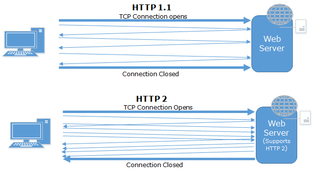
HTTP/2 is the second major version of the HTTP protocol, the main focus of which is to decrease latency to improve page load speed. It is based on Google’s SPDY protocoland covers the following key items:

1-      Loading multiple requests in single TCP connections in parallel

2-      Enabling compression in HTTP headers

3-      Allowing server to push content to the client

How does it differ from earlier versions?

The initial version of HTTP design used a new TCP Connection for each request, which involves setting up connection and other packets which was very time consuming. There were many changes done in HTTP 1.1 where pipelining was introduced, which theoretically allows you to send multiple requests in a single connection, but the request and response was processed synchronously. HTTP/2 is based on the SPDY protocol which opens one TCP connection and uses multiplexing, which allows many requests to be sent in parallel without waiting for the response. Let’s see it pictorially:


Apart from that, it also compresses the HTTP Headers and enables the server push as mentioned earlier. We will see how that affects page load in our example below.

HTTP/2 in action using ASP.NET 4.6

A typical web page references many different resources like JavaScript files, CSS files, images etc. In the example below, I have created a sample ASP.NET 4.6 empty web forms application using Visual Studio 2015 and added different resources in the solution that reference the same in our web page. I then added a Web form to the application and multiple resources as well – see below:

<code>

<headrunat="server">

    <title>HTTP2 Demo using ASP.NET Web forms 4.6</title>

    <!-- CSS resources -->

    <linkhref="Content/bootstrap.css"rel="stylesheet"/>

    <linkhref="Content/bootstrap.min.css"rel="stylesheet"/>

    <linkhref="Content/Site.css"rel="stylesheet"/>

</head>

<body>

    <formid="form1"runat="server">

    <div>

        <!-- Image resources-->

        <imgsrc="Content/images/img1.jpg"/>

        <imgsrc="Content/images/img2.jpg"/>

         <!-- For demo, there are eight images added, but removed here for brevity-->


    </div>

     <!-- JavaScript file resources -->

    <scriptsrc="Scripts/jquery-1.10.2.js"></script>

    <scriptsrc="Scripts/jquery-1.10.2.min.js"></script>

   <!-- For demo, total six file added, but removed here for brevity-->

 </form>

</body>

</html>

</code>


The above page references 19 different resources (3 CSS, 8 Images, 8 JS files) to mock a real time page. After that, I deployed the application on IIS10 on Win Server 2016 (Windows 10 can be used as well). Now it’s time to test the application.

Test Results

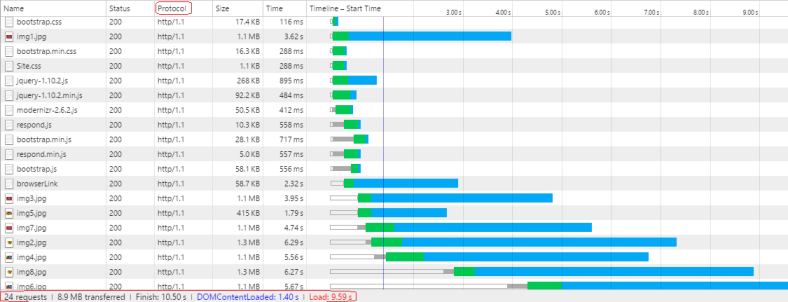
First I will run this application using HTTP 1.1 and analyze the load time for it. Then we will move to HTTP2 to see the differences. Let's run the application and see the network tab of the Developer Toolbar (Most modern browsers provide a Developer Toolbar which can be opened by pressing F12). This will show the number of requests fired for the web page, its wait time, start time, load time and other relevant details.


By closely looking the details in above image, we see that it is using the HTTP1.1 protocol, referenced in the third column (Protocol). Also it loaded all the JavaScript, CSS and image files as expected but their start times vary. It is quite obvious that several requests were able to start once previous requests were completed. The last request had to wait around 4.5 seconds due to the limitation on the number of parallel connections from browser. The total load time for this page is around 9.59 seconds.

Now let’s open the same page by switching the protocol to HTTP2 and see the differences. To do so, we need to change the URL in address bar from HTTP to HTTPS and reload the page and see the network tab in the Developer Toolbar again:


Here the timeline looks completely different and the requests all started at the same time. Also the load time of the page was reduced by 80% which is now around 2 seconds. It clearly shows that all the requests sent at server parallel which was synchronous in http1.1. The last request has a wait time of only 70ms.

Recently we used several techniques like bundling and minification which improves performance but that has several limitations as well (for example, it is applicable only on JavaScript and CSS files). Each type of file must be added in different bundles and even including all the same type of files in one bundle is not recommended. Multiple bundles should be created based on their usages in various pages of the application. HTTP2 relieves the developer from having to use these features and resolves these problems, as it creates only one TCP connection and starts downloading all the different resources at same time which saves lots of time and removes the burden from the developer.

Note – Currently, HTTP2 works only on SSL. So I opened the same page first using HTTP which used HTTP1.1 and then used https: which used HTTP2 protocol (which is shown here as h2)

Conclusion:

In this post, we discussed the current web development practices and performance issues that we face. We continued our discussion on HTTP2 and saw that it can be used with IIS10 (Windows 10 and Windows Server 2016) and ASP.NET 4.6 using Visual Studio 2015. We then created a sample page which included multiple resources including JS, CSS, and images, and saw that using HTTP2 saved us more than 75% load time – which ultimately shows us that the performance issues we’re currently used to, will soon be a thing of the past!


Try our jQuery HTML5 controls for your web apps and take immediate advantage of their powerful capabilities. Download Free Trial now!


Minimalist Maps: Are They a Good Idea?

$
0
0

Data maps are everywhere. And it's not just the conventional ones that use Google Maps, OpenStreetMaps or Bing Maps to show the underlying geographical information. Cartograms, "maps" with land masses resized based on data, are quite popular. I'm not a big fan of them because they require us to judge magnitudes based on the relative sizes of some peculiar and many-sided shapes. Generally, we're not very good at this. However, I do think distorted, simplified or unrealistic maps can be useful. In the recent UK general election several mediaoutlets chose to eschew conventional choropleth maps in favor of ones in which all constituencies were equally sized hexagons. The resultant maps were still reminiscent of the United Kingdom, but the amount of any given color became directly proportional to the number of seats won by a particular political party. Maps of the USA with square states have also been used by media outlets to show data. For example here, here, and here. But what if, instead of distorted borders, we don't show any borders at all?

In the last year or two I've seen an increasing number of what may be termed "minimalist maps". Specifically, I'm referring to the display of geographic or geopolitical data in such a manner that the underlying geography can be seen, perhaps roughly, without ever drawing conventional features of a map like land/sea, country or state borders. Below is a simple example I made. I'm sure you don't need me to tell you it is a "map" of the world. You may even recognize it makes use of the (in)famous Mercator projection. It shows the locations of all urban agglomerations with 300,000 or more inhabitants in 2014 (data published by the UN's population division). Each circle is scaled according to its population in 2010 (data for 2014 wasn't specifically available). I'd normally add a scale to a chart like this, but here I'm primarily concerned with the locations of large cities and so some concept of relative size is enough.

From the map I'm sure you can make out the location of the USA, the thin band that is central America, the Eastern protrusion of Brazil, the Cape of Good Hope at the bottom of Africa and the Indian subcontinent, without requiring any lines. Conversely, there's little detail about the shape of Canada or Australia and the Southern tip of South America is completely missing. There's nothing in the desert area of North Africa, while the cities on its northern coastline are hard to pick apart from those of southern Europe.

It's probably fairly obvious why the map does look familiar despite the lack of sea/land borders:

  • 1) we don't build cities in the oceans;
  • 2) we do build cities by the sea;
  • 3) we're familiar with maps of the Earth, particularly ones that use the Mercator projection.

But it doesn't need to be the whole Earth to look familiar. The next map is clearly of East Asia.

We can still pick out the Indian subcontinent easily in the map above and the eastern coast of China is fairly obvious too.

How about the next example?

Hopefully you identified that was the USA (plus northern Mexico and southern Canada).

This last one reminds me of the night sky on a cloudless night...

Some labels may be needed here to help you get your bearings:

Europe has a large number of large urban agglomerations, but they're frequently not found near the sea.

Of course, we could tell that many European cities weren't built near the sea if we added the land/sea borders. So one obvious question might be: "Is there really any point to this minimalist approach to mapping data?".

For the maps shown here the answer to that question may well be "no". At least, probably not in terms of data visualization best practices. I did, however, find it an interesting test of my geography knowledge trying to label the cities in the last example without looking at a "proper" map.

One small advantage with minimalist maps is that you don't have to worry about the size of the map files you're using, which can be large when maps are highly detailed. If you're using vector images on a website that is certainly a positive thing. But sacrificing clarity in favor of reducing file size is never a great idea.

More important than file size, however, is that other people have made more elegant and more effective minimalist maps than the ones I created above. This article by James Cheshire includes several great minimalist maps that also show where people live. Arthur Charpentier has created several nice examples of minimalist maps with other types of data. And in terms of letting the data speak for itself, I think Michael Pecirno's "Minimal Maps" are exceptional.

Bring high volumes of complex information to life with Infragistics WPF powerful data visualization capabilities! Download free trial now!

Image Manipulation with HTML5 element

$
0
0

Introductions too frequently concentrate on how it allows web developers to draw all manner of graphic objects, from straight lines and rectangles to complex Bezier curves, on to the screen. Here, however, I'd like to focus on another use case: photo-editing in the browser. If you're keen to see what can be done with canvas right away then skip on down to the interactive examples below and come back here when you want to find out how it's done.

[custom]width="650" height="11250" src="http://www.infragistics.com/community/cfs-filesystemfile.ashx/__key/CommunityServer.Blogs.Components.WeblogFiles/tim_5F00_brock.Canvas_5F00_Blog/1512.simple_2D00_image_2D00_manipulation_2D00_with_2D00_canvas.html" [/custom]

Build HTML5 desktop apps with native performance

$
0
0

There is an emerging school of thought that believes that HTML5 is the ideal technology for UI development- even on the desktop.  This concept is being explored and adopted mainly by the financial vertical. There are various reasons for technical decision makers to move in this direction such as:

  • Build a bridge or interim state when moving apps from Desktop to web.

  • With HTML5 quickly becoming the standard in web dev, there will be more HTML5 devs to leverage.  

If you are interested in understanding this concept and how you may leverage it, its worth while to check out OpenFin.  OpenFin's runtime allows you to run HTML5 desktop apps with native performance and interop with WPF, .NET, Silverlight, Java, Flex and Adobe Air apps.  

Some of the runtime benefits include:

  • Popup notifications
  • Window Docking
  • Window Tear-Out
  • Taskbar and System Tray
IgniteUI is the perfect UI compliment to the openfin runtime.  You may use IgniteUI to build powerful HTML5 apps that run on the desktop powered by the openfin runtime.  Infragistics has partnered with openfin to help developers build highly performant, rich desktop apps.  To see an example of an IgniteUI application running on the openfin runtime, please check out our Financial Dashboard demo app on openfin's site :

The Finance Dashboard sample demonstrates the data chart, combo, dialog, and zoom bar controls for the Financial Services industry. The data chart is optimized for high-speed financial charting. This sample uses large datasets with millions of data points and real-time updates. The data chart enables key statistical and technical indicators and comparisons to key competitors. 

News from the European SharePoint Conference 2015

$
0
0

The annual European SharePoint Conference (#ESPC15) is always worth getting excited about, and 2015’s Swedish edition was no exception. The conference is a fantastic opportunity for anyone interested or involved (probably both!) with all things SharePoint. The Conference spanned four days, with a day-long workshop to kick things off and conferences spread out across the remaining three days. ESPC was packed with big names from all around the SharePoint world. There were over 1500 attendees in total, coming from all over Europe, and over 100 sessions were held revolving around one central theme - SharePoint. The conference covered everything you would expect, including the On-Premises and Cloud versions of the platform.

Image Courtesy of ESPC

From IT Pros to budding and veteran developers, ESPC had something for everyone. And, to top it off, it was all held in the beautiful city of Stockholm. So, to celebrate, we thought we’d give you some highlights from the event.

Headline Keynotes

The headlining Keynote came from probably the most experienced SharePoint trio out there: Jeff Teper, Bill Baer and Seth Patton. As you would expect, its focus was on how Microsoft is continuing to evolve the collaboration platform, both in terms of On-Premises and in the Cloud. There was also mention of the new improvements and capabilities in SharePoint 2016, as well as the SharePoint Online, Office 365 and hybrid variants. It was enough to get attendees asking for more, as the three speakers are amongst the biggest names in the SharePoint world:

Jeff Teper, also known as “the father of SharePoint” is leader of the SharePoint and OneDrive team, serving hundreds of thousands of users across a massive 80% of Fortune 500 Companies. Seth Patton is the global senior director for SharePoint and OneDrive product marketing, and has worked with Project, Dynamics CRM and Office 365. Bill Baer is a senior technical product manager and Microsoft Certified Master for SharePoint.

ESPC Community Award Winners

The European SharePoint Conference awards are an integral part of the ESPC and its community. Held in the home of the Nobel Peace Prize - Stockholm city hall - the winners were voted by SharePoint community members. Awards were related to SharePoint and Office 365 as well as Mobile and Social solutions. You can see the full list of who won here.

SharePoint lives on

The rumors can finally subside… it was confirmed that SharePoint 2016 will NOT be the last ever On-Premises version of SharePoint. The numbers make it impossible for Microsoft to end support. Around 60% of companies continue to depend on the On-Premises version, and are unlikely to go elsewhere in the near future. There is interest in Office 365, and rightly so, as it’s been doing fantastically. However, a lot of companies are reluctant to give up on the investments they have already made with SharePoint On-Prem. Plus, Microsoft are directing more attention to the hybrid environment.

While there had been fears that SharePoint On-Prem was on the way out, ESPC indicated that the opposite is true - Microsoft announced the release of the SharePoint Server 2016 Beta 2, which is now readily available. Microsoft say this second iteration is a lot closer to the RTM (release to manufacturing) version, offering deeper insight into what the final version will look like come next year. So, great news for all you SharePoint lovers (which we presume is each and every one of you!)

Live Hackathon

ESPC had its fair share of interactivity, too. Jeremy Thake hosted a 3-hour live hackathon, where participating teams were tasked with taking hold of the Office and SharePoint Add-ins model, a powerful extensibility model that you can leverage as a web developer. See some real-world examples in the Office Store to get an idea of what went on. In addition to an ego-boost, the winning team were awarded a brand new Xbox One. If you think you could do better, make sure you get involved at ESPC 2016!

The latest on OneDrive for business

Hans Brender, a long-time SharePoint MVP who has worked with collaboration tools since the beginning of SharePoint, hosted a talk dedicated to OneDrive for Business and its little brother, OneDrive. Hans gave a great overview of the restriction of files and folders in SharePoint Online and On-Premises. Attendees got to learn about these conflicts and, more importantly, how to resolve them.

  • Mass importing with PowerShell script.
  • How to work offline with documents from SharePoint
  • How to resolve problems with restricted files
  • Other tips and tricks with OneDrive for Business

For more information on the events that transpired at ESPC 2015, you can check out the website. Be warned, though, as the next ESPC is a whole 11 months away, so you don’t get excited too early!

Looking for an enterprise solution that can help your teams access SharePoint on their mobile devices? Try our free 10-day demo of SharePlus Enterprise today and embrace productivity!

Accessible and Affordable Business Intelligence is Fueling Revenue in SMBs

$
0
0

Small to Medium Businesses (SMBs) face a range of specific challenges that larger firms rarely encounter. From cash flow to uncertainty to regulation and more, business owners are often juggling a huge number of pressures. So, when there’s bills to pay, employees to hire, leads to follow up and prospects to approach, things like Business Intelligence and data analysis may feel like factors to “put off until we’re bigger”.

However, research shows BI can help cut costs, target inefficiencies and fuel revenues.  Given the pressures many small businesses face, BI could relieve a lot of the pressure you’re facing and help you grow your business.

How can BI bring these benefits?

Cut costs, boost the bottom line, reduce waste. It all sounds great, but how can BI do this in reality? BI is all about using the data your company collects across its various operations so you can make the best possible decisions about strategy. Whatever size your business, it’s very likely you collect data on all sorts of things - from sales to time spent in meetings to units produced and so on. Business Intelligence should make this data available via simple visualizations so anyone can access data and spot trends and patterns to help improve operations.

For the following examples, we’ll demonstrate how a small chain of outdoor activity centers could increase revenue through the implementation of BI. The firm caters to a range of sports including climbing, hiking, kayaking and trails cycling. Customers can buy lessons at different levels from your instructors, as well as sports equipment from your stores. In exchange for an email address and information about themselves, regular visitors can join your Adventure-Plus scheme for special discounts. They also get to rate your lessons and products anonymously on the website.

Empower employees to boost profits

In a small business environment, employees with a thorough understanding of BI can produce up to 69% more revenue. This sounds a lot, but picture it like this. With data displayed on simple dashboards for employees, they can begin to notice patterns in sales of equipment and lessons. Over the course of the seasons, you’ll begin spotting some interesting trends which can help employees boost cross-sales. For instance, you might get more subscribers for watersports lessons in Spring when the waters are high and also notice a spike in waterproof footwear. By ordering more footwear in advance and training employees to cross-sell, you’ll see a real boost in profits.

Find answers to questions faster

Even the smallest business collects a lot of information, and finding answers to even simple questions can be complicated. Take our example again. You might want to plan your offering of lessons over the seasons by popularity. The previous year (happily) all your courses were close to sold out. You’d love to expand all of them, but don’t have enough employees to increase across the board. So how can you program your year most effectively?

By checking the anonymous ratings left by customers, you can see which courses were most popular and can therefore estimate they’ll be most likely to fill up again if you offer more of the same. Without BI, you would have held this information, but it would have been incredibly lengthy to turn it all into insights. As a result, you depend less on gut feeling and more on fact.

Identify areas for cost cutting

When you’re running a small business, you rarely have the luxury of maintaining non-profitable activities. If it isn’t working, cut it.

Again at our adventure center. Perhaps you notice Advanced Kayaking is taking up a lot of your best instructor’s time, yet she only ever has a couple of students each month. It might be nice to keep that open as an option, but if there’s a lot more interest in beginners and intermediate lessons, you need to cut it. While this example may seem obvious, having a costs to profits graph available can really prove the point. Your employees may feel it’s a shame, but if you can demonstrate visually that you’re losing money, they’ll definitely understand.

Tailor services to customers

Business Intelligence can really help you understand your customers better and provide services they want and will keep them coming back for more. For instance, you might ask new arrivals at your centers to fill in a short form on a Tablet device when they arrive – are they on vacation, what age are they, what level are they? You might also get them to provide feedback at the end of their day into the same tablet.

With this information available, you can begin learning a lot more about your customers and tailoring your services closer to their needs. Do you get a lot of families visiting who are staying for a couple of weeks in the area? This might inspire you to build a series of lessons for kids which take them off their parents’ hands for a few hours over a few days. This leads to repeat custom and avoids a scattergun approach to your services and packages.

Simple, self-service BI

ReportPlus is an intuitive, easy to use BI tool which responds to the requirements of SMBs. You don’t need a data scientist to begin discovering trends with ReportPlus – anyone from the shop floor to head office can begin playing with company data, making predictions and finding better solutions in no time at all. Get in touch today to find out how ReportPlus can contribute to your needs. 

Viewing all 2372 articles
Browse latest View live


Latest Images