Quantcast
Channel: Infragistics Community
Viewing all 2372 articles
Browse latest View live

Analyzing your business at different levels of granularity with ReportPlus

$
0
0

With the release of ReportPlus version 3.0 the ability to link dashboards was introduced for Enterprise users. This means users can establish navigation paths across dashboards. For instance you are able to create one dashboard with a high level view of your business, and allow users to drill down across dashboards with greater levels of detail whenever the user taps on a widget, grid row, or chart column.

The Company 360 Example

Let’s see what this can do for users with one example. The following dashboard shows key performance indicators for different areas of the organization.

Company 360 Dashboard

For users browsing this dashboard, tapping on the operations widget takes them to the Operations dashboard that follows.

IMG 1255

When he’s done analyzing he can go back to the original dashboard with the back button named after the departure dashboard.

In this way a manager could get a first high level view of the business with the first dashboard and then drill down on the specifics of the different areas of the organization.

How to configure the navigation

In order to enable this behavior you have go to the actions panel in the Widget Editor, and configure the trigger event.

IMG 1257

Possible events to trigger the navigation are: Maximize, or Row Tap. Maximize fires whenever the user taps on a widget in the dashboard. The Row Tap event fires when a user taps on a grid's row, or in a Chart data item, such as a chart column. The row tap is able to pass as parameter the value of a column of choice, for the selected row. For instance, if a list of countries is displayed in a widget, tapping on a row may open a dashboard with the details of a specific country selection. In this case the country would be passed as parameter to the opened dashboard, which would preload a global filter with the received country value.

IMG 1258

Once you set the event you select the dashboard to open, and the parameters to pass to the opened dashboard.

Parameters

The dashboard of arrival may receive information in the form of parameters for it’s global filters. In this way it’s possible to preset the filter values when the dashboard is opened, providing the required context for the user navigating the dashboards.

IMG 1259

Parameters may be assigned a literal, fixed value, or they may be assigned the value of one of the global filters of the departure dashboard.

Closing thoughts

In this article we’ve seen how dashboards can be linked to provide a continuous navigation, allowing a drill down experience, which enables you to analyze your business at different layers of granularity.

In the company 360 sample, we’ve seen two dashboards linked together, but there’s no limit in the number of chained dashboards. This opens a number of analysis scenarios when the topics and levels of detail can be defined in advanced. For the rest of cases you can rely on the self-service capabilities of ReportPlus to author dashboards tailored to the specifics of the scenario you come across.


NUCLiOS IGGridView: Custom Header Cell for Sorting

$
0
0
If you're using the IGGridViewDataSourceHelper classes you may know that you can use it to sort the data in your IGGridView. However, we don't currently offer a built in interaction to do the sorting for your user. Because of the pure flexibility of the IGGridView, its pretty simple to add it yourself. To start off, we're going to create 2 interfaces (classes) and 1 protocol( interface): @protocol SortingDelegate < NSObject > -( void )gridView:( IGGridView *)gridView toggleColumnSorting...(read more)

Announcing Infragistics Xamarin.Forms!

$
0
0

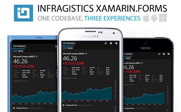
I am very excited to announce a new partnership with Xamarin and our newest product release to compliment our Native Mobile story with Visual Studio – Infragistics Xamarin.Forms.

Over the last few years we have invested heavily in the native UI controls - we have an iOS control set, Android control set and Windows Phone control set.  Up until now, the target developer for these control sets were your objective-C, Java or Windows Developer.  Now with Infragistics Xamarin.Forms, the market is super-expanded - any Visual Studio, C#, XAML Developer can now write once, a single codebase, and then take our new Xamarin.Forms product with Xamarin’s product and ship native apps that target each major platform in no time..

There are a ton of reasons why this is so exciting, but from a pure cost perspective, using the technology from Infragistics & Xamarin, a company does not need to invest in the training and time loss of learning a new platform – using current C# & XAML skillsets native apps can be churned out in no time compared to building a native experience from scratch on each major mobile platform.  Add the long-term maintenance costs of bug fixes, feature changes, UI updates and more, and you are looking at a significant cost savings if you have a single code base to maintain while still having the benefit of native apps on each major platform.  Pretty cool!

So what exactly are we shipping today?

  • Interactive charting, including common series like Category, Stacked, Polar, Radial & Scatter, complete with trend lines, financial indicators, interactions and animations
  • Additional business data visualizations like Pie Charts, Gauges & Bullet Graphs
  • Fully virtualized, data-bound, high performance data grid with pin-able columns, carousel views, selection events & customizable layouts.


If you look at our WPF product, or NucliOS, our native iOS product, and examine the data visualization stack, that’s what you’ll see.  Along with that, we’ve built a brand new cross-platform data grid control that we are shipping as well which matches what you’ll find in NucliOS as well.

Joseph Hill, Xamarin co-founder, who I’ve had the pleasure of talking to over the last few months and finally met in person today, said this - “Infragistics was one of the first vendors to ship Xamarin support with their native UI control toolkit, so we have been longtime fans of their diverse and sophisticated components.  We love the rich imagery and consistent quality of everything that they do and could not be happier to have them on the forefront of the Xamarin.Forms Ecosystem.”

So the next step is to get the bits … if you go to http://xamarin.infragistics.com and enter in your email, you’ll get one back that has the details and the download information.

We hope you enjoy Infragistics Xamarin.Forms!

Thanks,

Jason

Developer News - What's IN with the Infragistics Community? (9/29-10/5)

Galaxy Note 4 and iPhone 6+ Go Head to Head

$
0
0

As it happens every year, Samsung and Apple continue their relentless battle within the smartphone market. The two manufacturers usually compete in more of an indirect way, meaning there are always differentiating features when comparing devices. Unlike their previous engagements, Apple is now in Samsung territory. This year may be a bit different than the previous years since Apple finally decided to have a crack at the trend towards phablet type devices. 

Samsung has been developing the Galaxy Note series since around 2011, so the iPhone 6+ will undoubtedly lack much experience in this delicate craft. Proof of this may be seen in that some users have been complaining about their iPhone 6+ bending just from sitting in their pocket. Obviously, Samsung took full advantage of this to exploit the weakness of its competitor by glorifying the strength and durability of its own creation. The Note 4 is the first time Samsung is using a metal framing for its device and is trying to make sure the market knows about it. 

In terms of performance, both are incredible and the iPhone 6+ seems to win on more of the graphic performance tests. Samsung, however, has managed to create one of the most magnificent displays on the market. The Note 4 features a 5.7” screen with 1440x2560 screen resolution and the Super AMOLED panel has an incredible 515 ppi. The iPhone 6+ has a more standard 5.5” screen with 1080x1920 screen resolution and a smaller pixel density of 401 ppi. The specs are mostly just numbers and to us normal user’s, the difference in pixel density is almost impossible for us to distinguish. The color and display quality is arguably better on the Note and the display measurements slightly favor those on the Note over the iPhone.  Both phones manage to present a gorgeous display and ultimately it will be up to the consumer to choose which they prefer.

Despite the superior hardware from Samsung’s Note 4, Apple’s custom A8 chip outperforms on most performance benchmarks. The two processors competing here is Qualcomm’s 2.7 quad-core Snapdragon 805 vs. Apple’s A8 chipset which utilizes two 1.4 GHz Cyclone cores. RAM is a pretty big difference between devices, Samsung’s being 3GB of LPDDR3 RAM vs. Apple’s low amount of just 1GB. The reason for the Note 4’s underwhelming stats is because of its ridiculously high pixel count. In actual user experience, both perform exceptionally and again, it’s up to the user’s preferences. For more in-depth analysis of all the performance numbers and comparisons, you can check out these benchmarks.

When we get down to the software side of things, it’s of course, Android vs iOS. Android will probably always offer more of the customizable options and iOS will always be more user-friendly, but may lack some of the customization features. This is usually the deal breaker for most. If you use Apple products then it’s always easier to sync your devices than having a plethora of others. Android users will of course be able to mesh easily with most other devices as well. iOS will also be including Apple Pay this year, which is also a new feature added to the iPhone 6. This may also be a deal breaker for some consumers since it is likely to be a huge hit.

For those who want the larger screen version of the iPhone, iPhone 6+ is for you. Those that want the feature rich phablet offerings of Samsung’s Note 4 will be satisfied with their choice. The S Pen is something that will always make the Note a relevant competitor in the phablet market. This time around, it should be an interesting battle between the two competitors. Apple may have their work cut out for them although they did get to release a bit earlier and force Samsung to release before they intended. I think that the Note 4 will do well, as usual, and Apple will get to take this opportunity to learn for their next phablet device.

”ASP

Developer News - What's IN with the Infragistics Community? (10/20-10/26)

$
0
0

Who has shaped development history? How much are developers getting paid today? Last week's most popular Infragistics Developer News articles answer these questions and more!

5. The Birth of Visual Basic (Forest Moon)

4. See Where America's Highest Paid Developers Live (Mashable)

3. The Forgotten Female Programmers Who Created Modern Tech (All Tech Considered)

2. We Need Functional Programming BECAUSE a Large Subset of us are Average or Below (Javalobby)

1. 20 Gorgeous Examples of Timeline in Web Design for Inspiration (Hongkiat)

Feature Spotlight: New Features in the Infragistics WPF XamDataGrid

$
0
0

Since I have been working here at Infragistics, I have been gathering tons of great customer feedback, and have been trying to identify the areas of our WPF product where we can start improving.  It became blatantly obvious that the xamDataGrid was way too complicated, and nearly impossible to use without reading the docs, combing the forums, looking at samples, or contacting support.  Well, that is just unacceptable.  Although our xamDataGrid has more features and is better performing than any of our competitors, it is just too freaking hard to use.  So I set out to fix that in our 14.2 release, and fix that I did!

Field Specific Editors

One of the biggest complaints the xamDataGrid had was with how difficult and non-intuitive/discoverable it was to define simple column definitions and set properties for the editors of those columns.  For example; let’s say that I want to create a simple column that used a masked text editor and set the mask to some custom string.  Sounds like that should be a simple task right?  Well, this is what you would have to do in order to achieve that simple scenario.

<igWPF:Field Name="SKU" Label="SKU">
    <igWPF:Field.Settings>
        <igWPF:FieldSettings EditorType="{x:Type igWPF:XamMaskedEditor}">
            <igWPF:FieldSettings.EditorStyle>
                <Style TargetType="{x:Type igWPF:XamMaskedEditor}">
                    <Setter Property="Mask" Value="########-###" />
                </Style>
            </igWPF:FieldSettings.EditorStyle>
        </igWPF:FieldSettings>
    </igWPF:Field.Settings>
</igWPF:Field

So, I have to define a Field and set the Name and Label, then create a FieldSettings object, then set the EditorType of that object.  Next, I have to create a style that targets the xamMaskedEditor, set its Mask property via a style setter, and assign the FieldSettings.EditorStyle property.  WOW!  That’s crazy complicated.  What XAML developer on earth would just know that’s what they have to do in order to use a mask for a column?  None that I know of.  How about you?

Well, we fixed it!  Now, we have provided you with field specific editors so that you can define a field based on the editor you require, and then have access to that editor’s properties directly on that field object.  So now all you have to do is this:

<igWPF:MaskedTextField Name="SKU" Label="SKU" Mask="########-###" />

Now that is so much nicer, and you don’t have to be a rocket scientist to figure it out.  Look at all that code that you no longer have to write.

ComboBoxField

But wait, it gets better.  You can probably guess that we provide you with field specific editors for all of our supported editors including a ComboBoxField.  Yes, that’s right a ComboBoxField!  Now this is one of my favorite new field editors.  Why do you ask?  Well, let’s do a quick review of what you had to do before these new field editors.

First you need to create a ComboBoxItemsProvider as a Resource.  But the real issue is trying to bind the ItemsSource to a collection on your DataContext.  That’s not so simple.  It really only works when you are using your ViewModel as a StaticResource, and honestly, not many people do that.  So, it becomes a very confusing and difficult task to even bind your ItemSource at all.

<igWPF:ComboBoxItemsProvider x:Key="stateForDropDownsProvider"
                                     ItemsSource="{Binding StateForDropDowns, Source={StaticResource ViewModel}}"
                                     DisplayMemberPath="Name" ValuePath="StateIdent" />

Then you had to create an EditorStyle, and set the ItemsProvider using a style setter to the ComboBoxItemsProvider:

<igWPF:Field Name="StateId" Label="State" Width="78" ToolTipService.ToolTip="The state">
    <igWPF:Field.Settings>
        <igWPF:FieldSettings EditorType="{x:Type igWPF:XamComboEditor}">
            <igWPF:FieldSettings.EditorStyle>
                <Style TargetType="{x:Type igWPF:XamComboEditor}">
                    <Setter Property="ItemsProvider" Value="{StaticResource stateForDropDownsProvider}" />
                </Style>
            </igWPF:FieldSettings.EditorStyle>
        </igWPF:FieldSettings>
    </igWPF:Field.Settings>
</igWPF:Field>

Well, we fixed it!  Not only did we fix it, but we improved the ability to data bind field properties as well.  If you have ever used the xamDataGrid, then you already know that trying to bind anything on a Field isn’t going to work because those Field objects did not inherit the DataContext.  Well, now you can.  Now all you have to do is this:

<igWPF:ComboBoxField Name="StateId"
                     ItemsSource="{Binding DataContext.StateForDropDowns, RelativeSource={RelativeSource Self}}"
                     DisplayMemberPath="Name" ValuePath="StateIdent" />

FieldBinding

While that is nice and all, it is still too much code to write to create the binding.  So, we went ahead and simplified that even more by providing a custom binding markup extension called FieldBinding so that you can do this:

<igWPF:ComboBoxField Name="StateId"
                     ItemsSource="{igWPF:FieldBinding StateForDropDowns}"
                     DisplayMemberPath="Name" ValuePath="StateIdent" />

Now that is looking much better.  This new FieldBinding markup extension is to be used anytime you want to data bind a property of a field to the DataContext of the xamDataGrid.  So for example, you can also do something like this:

<igWPF:MaskedTextField Name="SKU" Mask="########-###" IsReadOnly="{igWPF:FieldBinding IsColumnReadOnly}"/>

But why limit it to just fields?  We can use this for FieldSetting too.  So we can even do something like this:

<igWPF:FieldLayoutSettings AutoGenerateFields="False"
                           AllowAddNew="{igWPF:FieldBinding IsAddNewRecordAllowed}"
                           AllowDelete="{igWPF:FieldBinding IsDeleteAllowed}"/>

Cell Bindings

Now, you may be thinking to yourself “hey Brian, this is freaking amazing like everything else you do, but what if I want to data bind a property from the underlying data bound item to a property on the editor on a row-by-row basis?”.  My answer to you is No Problemo!  We also introduced the concept of what’s called a CellBinding.  You can create any number of CellBindings to create a binding between a property of the editor to the underlying data item, AND to any property of the CellValuePresenter as well.

Prepare to have your mind blown…

<igWPF:TextField Name="Make" >
    <igWPF:TextField.CellBindings>
        <igWPF:CellBinding Property="Foreground"
                           Target="CellValuePresenter"
                           Binding="{Binding Path=DataItem.Color, Converter={StaticResource ColorToBrushConverter}}"/>
        <igWPF:CellBinding Property="IsEnabled"
                           Target="Editor"
                           Binding="{Binding Path=DataItem.IsAvailable}" />
    </igWPF:TextField.CellBindings>
</igWPF:TextField>

As you can probably see, we are creating a binding for the Foreground of the CellValuePresenter and the IsEnabled property of the Editor to different properties on the underlying data item.  Now that is just sick!

Template Fields

So, right about now you are running down the street cheering “Brian for President”, but wait just a minute, because I’m not done yet!  Have you ever needed to use a custom control as an editor in a column?  I know I have.  Before, it was a major pain in the butt, and honestly, I couldn’t even get it to work.  That’s how bad it was.

Well, we fixed it!  We have now added a new TemplateField so that you can now provide your very own custom control for both the display and edit states of a cell.  So, let’s say you want to use the xamColorPicker as an editor in the xamDataGrid.  Well, we don’t have one built in, so you would be responsible for writing all the custom code to make it work.  I’m not even going to add the code to do that because it was so complicated.  Instead, we will jump right into how you do it now with the new TemplateField.

                                         <igWPF:TemplateField Name="Color">
    <igWPF:TemplateField.DisplayTemplate>
        <DataTemplate>
            <Rectangle Width="130" Height="20"
                       Fill="{Binding Path=(igWPF:TemplateEditor.Editor).Value,
                              RelativeSource={RelativeSource Self}}"/>
        </DataTemplate>
    </igWPF:TemplateField.DisplayTemplate>
    <igWPF:TemplateField.EditTemplate>
        <DataTemplate>
            <ig:XamColorPicker Width="130" Height="20"
                               SelectedColor="{Binding Path=(igWPF:TemplateEditor.Editor).Value,
                                               RelativeSource={RelativeSource Self},
                                               UpdateSourceTrigger=PropertyChanged, Mode=TwoWay}" />
        </DataTemplate>
    </igWPF:TemplateField.EditTemplate>
</igWPF:TemplateField>

As you can see, we are providing a Rectangle to represent our DisplayTemplate, and the xamColorPicker as the EditTemplate.  As you can see, the binding syntax looks a little complicated.  So, we decided to make that a little easier for you as well.  We added a a new binding markup extension called TemplateEditorValueBinding which simplifies all of that messy binding syntactical sugar.  So you can simply write:

<igWPF:TemplateField Name="Color">
    <igWPF:TemplateField.DisplayTemplate>
        <DataTemplate>
            <Rectangle Width="130" Height="20" Fill="{igWPF:TemplateEditorValueBinding}"/>
        </DataTemplate>
    </igWPF:TemplateField.DisplayTemplate>
    <igWPF:TemplateField.EditTemplate>
        <DataTemplate>
            <ig:XamColorPicker Width="130" Height="20" SelectedColor="{igWPF:TemplateEditorValueBinding}" />
        </DataTemplate>
    </igWPF:TemplateField.EditTemplate>
</igWPF:TemplateField>

API Improvements

The last thing I want to mention is the improvements we made to the field API.  We tried to identify the most commonly used properties that are exposed off of the FieldSettings class and surfaced them on the Field level.  What do this mean for you?  It means fewer lines of code.

So instead of having to do write this:

<igWPF:Field Name="Make" >
    <igWPF:Field.Settings>
        <igWPF:FieldSettings AllowEdit="False"
                             AllowFixing="Near"
                             AllowGroupBy="False" />
    </igWPF:Field.Settings>
</igWPF:Field>

You can remove the FieldSettings object completely, and just do it like this:

<igWPF:Field Name="Make" AllowEdit="False" AllowFixing="Near" AllowGroupBy="False" />

Summary

As you can see, we have made a ton of improvements to the xamDataGrid, and all of these features are available to you now in the 14.2 release of the Infragistics WPF controls.  My job here at Infragistics is to improve the Infragistics WPF controls to make your job easier.  If you have complaints, I want to know about it.  If you have feature requests, I want to know about them.  If you have positive comments, those are welcome as well.  The point I am trying to make is that you need to let me know what you think, good or bad.  You can do that in a number of ways.  First you can submit your feature requests to the Infragistics Product Ideas website.  If you don’t submit the idea, it will never get considered for implementation.  You can follow and contact me directly on Twitter at @brianlagunas.  You can even leave a comment on this post.  Now you have no excuse of why you can’t provide feedback.

Infragistics Silverlight SR Notes – October: 14.2, 14.1, 13.2

$
0
0

Release notes reflect the state of resolved bugs and new additions from the previous release. You will find these notes useful to help determine the resolution of existing issues from a past release and as a means of determining where to test your applications when upgrading from one version to the next.

Release notes are available in both PDF and Excel formats. The PDF summarizes the changes to this release along with a listing of each item. The Excel sheet includes each change item and makes it easy for you to sort, filter and otherwise manipulate the data to your liking.

In order to download release notes, use the following links:

Silverlight 2014 Volume 2 Service Release (Build 14.2.20142.2021)

Notes in PDF Format
Notes in Excel Format

Silverlight 2014 Volume 1 Service Release (Build 14.1.20141.2138)

Notes in PDF Format
Notes in Excel Format

Silverlight 2013 Volume 2 Service Release (Build 13.2.20132.2251)

Notes in PDF Format
Notes in Excel Format


Infragistics WPF SR Notes – October: 14.2, 14.1, 13.2

$
0
0

Release notes reflect the state of resolved bugs and new additions from the previous release. You will find these notes useful to help determine the resolution of existing issues from a past release and as a means of determining where to test your applications when upgrading from one version to the next.

Release notes are available in both PDF and Excel formats. The PDF summarizes the changes to this release along with a listing of each item. The Excel sheet includes each change item and makes it easy for you to sort, filter and otherwise manipulate the data to your liking.

In order to download release notes, use the following links:

WPF 2014 Volume 2 Service Release (Build 14.2.20142.2024)

Notes in PDF Format
Notes in Excel Format

WPF 2014 Volume 1 Service Release (Build 14.1.20141.2174)

Notes in PDF Format
Notes in Excel Format

WPF 2013 Volume 2 Service Release (Build 13.2.20132.2284)

Notes in PDF Format
Notes in Excel Format

Infragistics WinRT SR Notes – October: 14.2, 14.1, 13.2

$
0
0

Release notes reflect the state of resolved bugs and new additions from the previous release. You will find these notes useful to help determine the resolution of existing issues from a past release and as a means of determining where to test your applications when upgrading from one version to the next.

Release notes are available in both PDF and Excel formats. The PDF summarizes the changes to this release along with a listing of each item. The Excel sheet includes each change item and makes it easy for you to sort, filter and otherwise manipulate the data to your liking.

In order to download release notes, use the following links:

WinRT 2014 Volume 2 Service Release (14.2.20142.2017)

• No bug fixes

WinRT 2014 Volume 1 Service Release (14.1.20141.2126)

Notes in PDF Format
Notes in Excel Format

WinRT 2013 Volume 2 Service Release (Build 13.2.20132.2146)

Notes in PDF Format
Notes in Excel Format

Delighted to Experience Design Week in Portland-Delight Conference 2014

$
0
0

Earlier this month I had the opportunity to travel to the West Coast to take part in Portland, Oregon's Design Week. Among other independently organized events, ISITE Design’s Delight Conference was hosted in the Portland Art Museum along with workshops and interactive breakout sessions. I joined over 400 attendees at the ten-year-old conference to learn about creating experiences that “delight” customers.

To kick off the two-day Delight conference, Genevieve Bell of Intel gave the opening keynote presentation titled, “Being Human in a Digital World”. Her talk initially focused on five unchanging factors that make us human (friends and family, community, something bigger than ourselves, our objects, and our secrets), arguing that success emerges when technology caters to these themes. After labeling friends and family as the driving force behind most technological development, she then focused on how the need for community makes us human.

This topic was also touched upon by Dinovember’s Refe Tuma. His presentation took the audience through the story of how his family’s creative hobby became an overnight internet sensation, gaining massive online exposure after only twenty-four hours. Tuma explained how the newfound community of delighted fans that came rushing in shared and expanded on his original idea in an organic fashion that he stressed should not be forced, but rather allowed to take on a life of its own.

At the top of Bell’s second list (five things that technology changes about humans) is our reputation and how we worry about it. She argued that over time technology has changed society’s views on what should be private versus public knowledge. Even in this digital age where we freely share the details of our lives, we still worry over the judgments made based on what information is in circulation.

The Delight conference’s second speaker, Perry Hewitt, found herself dealing with this same issue. As the Chief Digital Officer at Harvard, she was tasked with transforming the elite university’s online reputation. She outlined the challenges she faced as the brand known historically for inaccessibility and prestige pushed to design its online experience in a more friendly and relatable fashion. Through revamping the news platform and leveraging social media, Hewitt helped create an atmosphere of collaboration on Harvard’s website, putting a new spin on their reputation.

Another human characteristic that Bell touched on was our desire to be different. She described the dilemma of wanting to stand out and have a sense of individuality, while simultaneously leaning toward the current trends. When this theme is applied to emerging technology, it can lead to the misplacement of innovation. Golden Krishna’s well-known presentation titled, “The Best Interface is No Interface” pointed out several cases where the latest touch screen technology is implemented in unreasonable ways, often times detracting from the overall experience. Through several examples, Krishna posed a strong case for allowing a typical process to replace an interface, and while slapping a screen on a product or creating an app with endless features may make it seem more intriguing, a seamless experience that serves the user’s needs is what makes a product truly delightful.

Anyone with a career in design or UX is constantly looking for simple ways to add delight to the experiences they create, and going in to this conference, I thought I had a general idea of what delights me as a human and a user. After hearing the shared stories of innovators who thrive in unique pockets of the design world, I found that there are countless ways to embed delight in a customer’s experience, even if it means removing something we view as a progressive step. It is important to remember that as new technologies aim to cater to our most fundamental human needs, to quote from Genevieve Bell’s closing statement, “what makes us human is what is delightful".

Client-Side Excel Library CTP

$
0
0

If you haven’t seen it already, we recently released a 100% JavaScript-only, client-side Excel library for Ignite UI and I’m super excited about it. It allows you to read, write, and manipulate Excel workbooks. You can even create and solve formulas, all from inside the browser!! It was released in 14.2 as a CTP so we could get your feedback on it, but we will be releasing a complete RTM version in 15.1. You can find information and a live sample of it here. Definitely check out the overview page, which is packed with important information for using this library.

But that’s not even the coolest part. Not only did we deliver a purely JavaScript library for Excel workbooks, but it has all the features of our existing .NET Excel libraries. Did we re-write the entire C# Excel library in JavaScript to provide this level of feature parity? We could have, but it would have taken a lot of effort getting there not to mention the ongoing challenge of maintaining feature parity between the versions and addressing bugs in both implementations. So we came up with something better. We built a C# to JavaScript source-to-source compiler, or transcompiler. We have actually been using this for a few releases now to deliver some of the Ignite UI controls, but it was missing support for some constructs being used in the C# Excel library. So we really beefed up its language support as well as changed its semantic analysis engine. Now based on Microsoft’s .NET Compiler Platform ("Roslyn") for C# semantic analysis, our transcompiler is able to read in our existing C# Excel library and generate semantically equivalent JavaScript code. There are still a few rough edges to smooth out, but we are currently addressing these issues to deliver the highest quality Excel library we can in the next release.

Unfortunately, one of those rough edges was in documentation. We were not able to generate API documentation off the translated JavaScript code in time for the 14.2 release, so the preview is lacking a bit in terms of help. But luckily, since the code was translated from our existing C# code, you can just use the API documentation already available for the C# version and with a few minor changes, know exactly how to use the equivalent JavaScript code. You can find the API overview for the jQuery server-side Excel library here.

So what kinds of changes are we talking about? I have listed the differences below.

Namespace Name

With all of our existing Excel libraries, all types exist in the Infragistics.Documents.Excel namespace. There are a few types in sub-namespaces as well, such as Infragistics.Documents.Excel.Filtering. In the JavaScript code, all types can be found under the path “jQuery.ig.excel.”, or “$.ig.excel.” So in C#, you might create a workbook like so:

usingInfragistics.Documents.Excel;

var workbook = newWorkbook(WorkbookFormat.Excel2007);

But in JavaScript, you would create a workbook this way instead:

var workbook = new$.ig.excel.Workbook($.ig.excel.WorkbookFormat.excel2007);

Or, if you’d like to shorten things a bit, you can even do something like this:

var xl = $.ig.excel;

var workbook = new xl.Workbook(xl.WorkbookFormat.excel2007);

Also, regardless of the namespace in the C# Excel library, it always maps to $.ig.excel in the translated JavaScript. So, for example, the classes in Infragistics.Documents.Excel.Filtering would also exist under the $.ig.excel path.

Member Case

You may have noticed above that the enum member representing the Excel 2007 format was Pascal cased in the C# example and camel cased in the JavaScript example. This is another difference. When translating the code, we follow the JavaScript convention of using camel case for most functions and properties and Pascal case for constructor functions (note, however, that not all Pascal-cased entities should be constructed in your code. Many entities in the Excel library are to be constructed and managed internally and there are public APIs for constructing and obtaining these instances). So, for example, when calling the Recalculate method on a Workbook instance in C#, it would look like this:

var workbook = newWorkbook(WorkbookFormat.Excel2007);

workbook.Recalculate();

But the equivalent function in JavaScript would be called like this:

var xl = $.ig.excel;
var
workbook = new xl.Workbook(xl.WorkbookFormat.excel2007);

workbook.recalculate();

Properties

Complex property get/set accessors are used throughout the C# Excel library. We could have translated these to equivalent get/set accessors using Object.create in JavaScript, but since we want to support older browsers such as IE8, this is not currently an option. So these properties have instead been translated to equivalent functions. And for read-write properties, they are translated to a single function which inspects the arguments collection to determine whether the getter or setter is being used. So, for example, if you want to get and set the value of a cell in C#, it might look like this:

var workbook = newWorkbook(WorkbookFormat.Excel2007);

var worksheet = workbook.Worksheets.Add("Sheet1");

var cell = worksheet.GetCell("A1");


cell.Value = 7;

var v = cell.Value;

But in JavaScript, you would need to use a function call to get and set the value. Here is the equivalent code in JavaScript:

var xl = $.ig.excel;

var workbook = new xl.Workbook(xl.WorkbookFormat.excel2007);

var worksheet = workbook.worksheets().add('Sheet1');

var cell = worksheet.getCell('A1');


cell.value(7);

var v = cell.value();

Indexers

The indexer translation is essentially the same as that of properties. The only difference is that indexers are not accessed by name in C#. Instead there is language support so that square brackets denote the index to pass to the indexer property. Since this syntax has a different meaning in JavaScript, we instead translate indexers into a special function named “item” on the target object. It is used just like the functions translated from properties, except the index gets passed as the first argument. So you would access the first row of a worksheet in C# like this:

var workbook = newWorkbook(WorkbookFormat.Excel2007);

var worksheet = workbook.Worksheets.Add("Sheet1");


var firstRow = worksheet.Rows[0];

But in JavaScript, it would be done like this:

var xl = $.ig.excel;

var workbook = new xl.Workbook(xl.WorkbookFormat.excel2007);

var worksheet = workbook.worksheets().add('Sheet1');


var firstRow = worksheet.rows().item(0);

However, there is a shortcut syntax that can be used in cases like this. When a property is read-only and returns a collection, the translated function can optionally accept indexer arguments when getting the collection. If they are specified, the function will return the element at the specified index instead of the collection. With this convenient syntax, the code above can be simplified to this:

var xl = $.ig.excel;

var workbook = new xl.Workbook(xl.WorkbookFormat.excel2007);

var worksheet = workbook.worksheets().add('Sheet1');


var firstRow = worksheet.rows(0);

Load/Save

Up until now, all differences I have mentioned were due to the translation process and therefore, there is a pretty easy transformation you can do to map from C# APIs to JavaScript APIs. However, for the Load and Save methods, this is not the case. The Workbook’s Load and Save methods in the C# API are synchronous because these operations can be done quickly for most files. However, on JavaScript things are much slower and it is likely that synchronous load and save operations will pause the browser long enough to cause a noticeable delay. So there is a good chance we will implement asynchronous loading and saving in the RTM or a future release. In anticipation of this, specialized load and save functions have been created for the Client-Side Excel library to support a callback style of loading and saving. Currently, these callbacks will be executed before the call to load/save returns since the operation is synchronous, but this may not be the case in the future. To save a workbook, you can use the following code:

var xl = $.ig.excel;

var workbook = new xl.Workbook(xl.WorkbookFormat.excel2007);

workbook.worksheets().add('Sheet1');

workbook.save(function (error, data) {

    // The operation is complete at this point

});

If the operation succeeds, the 2nd argument to the callback function (named “data” in this case) will be a Uint8Array containing the saved binary data. There is also an optional save options parameter which can be specified as the first argument and in the RTM version, these options will allow you to specify the format in which the data should be saved (Uint8Array, Base-64 encoded string, …). Loading documents is done similarly, but instead of calling load of a workbook instance, it is called off the Workbook constructor function, much like a static method in C#:

$.ig.excel.Workbook.load(data, function (error, workbook) {

    // The operation is complete at this point

});

If the operation succeeds, the 2nd argument to the callback function will be the loaded workbook instance. In this case, the 1st parameter to the load function can be a Uint8Array with the binary workbook data or a Base-64 encoded string of that binary data. The load function will automatically detect the format and load the workbook file assuming it is in the any of the following formats: .xls, .xlt, .xlsx, .xltx, .xlsm, or .xltm.

So hopefully this can help you get started with the Client-Side Excel library preview. There are a few things that don’t work properly yet (such as loading files with dates), but what we have provided should give you a good sense of what’s to come in 15.1. Please let us know what you think and if there are any pain points with the API or ways you think we can do better to make this library as easy as possible to use. Let us know at igniteui@infragistics.com. We look forward to your feedback. Thanks!

NucliOS - What's New in 2014.2

$
0
0

Introduction

The 2014 Volume 2 release of NucliOS is packed full of new controls and features to help you easily create stunning apps using Xcode or Xamarin.iOS. Without further ado, the following are the new controls and updates included with this new release.

IGCalendarView (Updated)

IGCalendarView (Updated)

Our feature rich IGCalendarView was updated for 2014 Volume 2 with added functionality for customizing the appointment color.

IGChartView (Updated)

IGChartView (Updated)

Our high performance and feature rich IGChartView was updated for 2014 Volume 2 with the following features:

IGGridView (Updated)

IGGridView (Updated)

Our powerful and feature rich IGGridView was updated for 2014 Volume 2 with added functionality for allowing the manipulation of the cell based on its location in the IGGridView viewport.

IGSideMenuView (New Control)

IGSparklineView (New Control)

The new IGSideMenuView allows for placing a menu on the left or right side of the view that can be exposed or hidden through interaction or code.

FEATURES

  • A menu can be placed on the left, right or both sides of the view
  • Supports custom open and closing menu animations
  • Completely customizable menu content

Download the Trial

Try out NucliOS for free by downloading the fully featured trial.

By Torrey Betts

Infragistics Reporting Release Notes – October: 14.1, 14.2 Service Releases

$
0
0

With every release of Infragistics Reporting comes a set of release notes that reflects the state of resolved bugs and new additions from the previous release. You’ll find the notes useful to help determine the resolution of existing issues from a past release and as a means of determining where to test your applications when upgrading from one version to the next.

The Release Notes are available in PDF format and summarize the changes to this release along with a listing of each item. In order to download the release notes, use the following links:

Reporting 2014 Volume 1

Reporting 2014 Volume 2

Create a Side Menu using NucliOS

$
0
0

Introduction

Side menus are a common UI pattern found in iOS apps. With the release of NucliOS 2014 Volume 2, we included a side menu control that makes it simple to add a side menu to any view. This post walks the basics of creating a side menu with this latest release of NucliOS.

About the Side Menu

The IGSideMenuView is a control that consists of a contentView that overlays a configured menu on the left or right side of the view. The contentView houses all the views that are intended to be visible to the user. When the user swipes or drags from left to right or right to left a menu is exposed.

Creating the Side Menu

Creating the Side Menu

As with any control, the first step in using IGSideMenuView is creating an instance and adding it to the main view.

Objective-C

- (void)viewDidLoad
{
    [super viewDidLoad];

    _sideMenuView = [[IGSideMenuView alloc] initWithFrame:self.view.bounds];
    _sideMenuView.autoresizingMask = UIViewAutoresizingFlexibleHeight|UIViewAutoresizingFlexibleWidth;
    [self.view addSubview:_sideMenuView];

    [self initializeTitle];
    [self initializeChart];
    [self initializeMenu];
}

C#

public override void ViewDidLoad ()
{    base.ViewDidLoad ();    _sideMenuView = new IGSideMenuView ();    _sideMenuView.Frame = this.View.Bounds;    _sideMenuView.AutoresizingMask = UIViewAutoresizing.FlexibleHeight | UIViewAutoresizing.FlexibleWidth;    this.View.Add (_sideMenuView);    InitializeTitle ();    InitializeChart ();    InitializeMenu ();
} 

The side menu is now ready for content views to be added. In this example a title label and bar chart are added to the contentView.

Objective-C

- (void)initializeTitle
{
    _titleLabel = [[IGLabel alloc] initWithFrame:CGRectMake(0, 0, _sideMenuView.contentView.bounds.size.width, 50)];
    _titleLabel.autoresizingMask = UIViewAutoresizingFlexibleWidth|UIViewAutoresizingFlexibleBottomMargin;
    [_sideMenuView.contentView addSubview:_titleLabel];

    _titleLabel.horizontalTextAlignment = IGTextAlignmentCenter;
    _titleLabel.backgroundColor = [UIColor blackColor];
    _titleLabel.textColor = [UIColor whiteColor];
    _titleLabel.font = [UIFont fontWithName:@"Helvetica-Bold" size:16];
    _titleLabel.text = @"Widget Item Summary";
}

- (void)initializeChart
{
    _chartView = [[IGChartView alloc] initWithFrame:CGRectMake(0, 50,
            _sideMenuView.contentView.bounds.size.width, _sideMenuView.contentView.bounds.size.height - 50)];
    _chartView.autoresizingMask = UIViewAutoresizingFlexibleWidth|UIViewAutoresizingFlexibleHeight|UIViewAutoresizingFlexibleTopMargin;
    _chartView.theme = [IGChartDefaultThemes IGThemeDark];
    [_sideMenuView.contentView addSubview:_chartView];

    _amountOfData = 10;
    [self generateData:_amountOfData];
    _chartDataHelper = [[IGCategorySeriesDataSourceHelper alloc] initWithValues:_data];
    _series = (IGBarSeries *) [_chartView addSeriesForType:IGBarSeries.class usingKey:@"series" withDataSource:_chartDataHelper firstAxisKey:@"xAxis" secondAxisKey:@"yAxis"];
}

- (void)generateData:(NSInteger)count
{
    if (!_data)
        _data = [[NSMutableArray alloc] init];
    else
        [_data removeAllObjects];

    for (int i = 0; i < count; ++i)
    {
        [_data addObject:@(arc4random_uniform(40) + 10)];
    }
}

C#

private void InitializeTitle()
{    _titleLabel = new IGLabel ();    _titleLabel.Frame = new RectangleF (0, 0, _sideMenuView.ContentView.Bounds.Width, 50);    _titleLabel.AutoresizingMask = UIViewAutoresizing.FlexibleWidth | UIViewAutoresizing.FlexibleBottomMargin;    _sideMenuView.ContentView.Add(_titleLabel);    _titleLabel.HorizontalTextAlignment = IGTextAlignment.IGTextAlignmentCenter;    _titleLabel.BackgroundColor = UIColor.Black;    _titleLabel.TextColor = UIColor.White;    _titleLabel.Font = UIFont.FromName("Helvetica-Bold", 16);    _titleLabel.Text = "Widget Item Summary";
}

private void InitializeChart()
{    _chartView = new IGChartView ();    _chartView.Frame = new RectangleF (0, 50, _sideMenuView.ContentView.Bounds.Width, _sideMenuView.ContentView.Bounds.Height - 50);    _chartView.AutoresizingMask = UIViewAutoresizing.FlexibleWidth | UIViewAutoresizing.FlexibleHeight | UIViewAutoresizing.FlexibleTopMargin;    _chartView.Theme = IGChartDefaultThemes.IGThemeDark();    _sideMenuView.ContentView.Add(_chartView);    GenerateData(_amountOfData);    _chartDataHelper = new IGCategorySeriesDataSourceHelper (_data.ToArray ());    _series = (IGBarSeries)_chartView.AddSeries (new Class ("IGBarSeries"), "series", _chartDataHelper, "xAxis", "yAxis");
}

private void GenerateData(int count)
{    _data.Clear ();    Random random = new Random (count * DateTime.Now.Millisecond);    for (int i = 0; i < count; ++i)    {        _data.Add (new NSNumber (random.Next (40) + 10));    }
} 

Next, configure the menu. Menus can be on the left, right or both sides of the view. For this example the right side is used.

Objective-C

- (void)initializeMenu
{
    _gridDataHelper = [[GridDataHelper alloc] init];
    _gridDataHelper.data = @[@"10", @"50", @"100", @"200"];

    _gridMenu = [[IGGridView alloc] initWithFrame:CGRectMake(0, 0, 250, 1) style:IGGridViewStyleDefault];
    _gridMenu.selectionType = IGGridViewSelectionTypeCell;
    _gridMenu.emptyRows = NO;
    _gridMenu.rowHeight = 45;
    _gridMenu.theme = _theme = [[IGGridViewDarkTheme alloc] init];
    _gridMenu.backgroundColor = [UIColor colorWithWhite:0.15 alpha:1.0];
    _gridMenu.dataSource = _gridDataHelper;
    _gridMenu.delegate = self;
    _sideMenuView.rightMenuView = _gridMenu;
}

C#

private void InitializeMenu()
{    _gridDataHelper = new GridDataHelper ();    _gridDataHelper.Data = new NSObject[] { (NSString)"10", (NSString)"50", (NSString)"100", (NSString)"200" };    float gridWidth = UserInterfaceIdiomIsPhone ? 125 : 250;    _gridMenu = new IGGridView (new RectangleF (0, 0, gridWidth, 1), IGGridViewStyle.IGGridViewStyleDefault);    _gridMenu.SelectionType = IGGridViewSelectionType.IGGridViewSelectionTypeCell;    _gridMenu.EmptyRows = false;    _gridMenu.RowHeight = 45;    _gridMenu.Theme = _theme = new IGGridViewDarkTheme ();    _gridMenu.BackgroundColor = UIColor.FromWhiteAlpha (0.15f, 1.0f);    _gridMenu.DataSource = _gridDataHelper;    _gridMenu.WeakDelegate = this;    _sideMenuView.RightMenuView = _gridMenu;
} 

The last step is to wire up the menu selection events to perform a custom task and automatically close the menu.

Objective-C

- (void)gridView:(IGGridView *)gridView didSelectCellAtPath:(IGCellPath *)path
{
    IGGridViewCell *cell = [gridView cellAtPath:path];
    _amountOfData = [cell.textLabel.text integerValue];
    [self performSelector:@selector(processMenuSelection) withObject:nil afterDelay:0.75];
}

- (void)processMenuSelection
{
    [_sideMenuView closeSideMenu];
    [_gridMenu deselectAll];

    [self generateData:_amountOfData];
    _chartDataHelper.values = _data;
    _series.dataSource = _chartDataHelper;
}

C#

[Export ("gridView:didSelectCellAtPath:")]
public void DidSelectCell (global::Infragistics.IGGridView gridView, global::Infragistics.IGCellPath path)
{    IGGridViewCell cell = (IGGridViewCell)gridView.ResolveCellForPath (path);    _amountOfData = Int32.Parse (cell.TextLabel.Text);    this.PerformSelector (new Selector ("ProcessMenuSelection"), null, 0.75f);
}

[Export ("ProcessMenuSelection")]
private void ProcessMenuSelection()
{    _sideMenuView.CloseSideMenu ();    _gridMenu.DeselectAll ();    GenerateData (_amountOfData);    _chartDataHelper.Values = _data.ToArray ();    _series.DataSource = _chartDataHelper;
} 

Download the Source Code

The source code for this blog post can be downloaded at the following links.


By Torrey Betts


Developer News - What's IN with the Infragistics Community? (10/27-11/2)

$
0
0

This week is chock full of tutorials and inspiration, so what are you waiting for? Check out the most popular news from the past 7 days in the Infragistics Community!

5. 30 Fantastic Examples of Parallax Scrolling Websites (Inspiration)

4. How Much Do Coders Make? Data From Around the Country (Tech News & Analysis)

3. Oh, Snap! '90s Web Design is Hot Again (Fast Company)

2. Learning a second programming language? Try these 5 sites! (InfoWorld)

1. This isn't a Thumbdrive, it's a PC That Weighs Less than 2 Ounces and Works in any HDMI Port... (Geek)

DePaul University Interviews Alumnus Jim Ross

$
0
0

Infragistics Senior UX Architect, Jim Ross, was recently interviewed by a student from his alma mater, DePaul University, as part of DePaul’s Alumni Sharing Knowledge (ASK) program. In Jim's words, "it was nice to be asked to share my experiences and advice with students at my alma mater, DePaul University." Below you will find the full interview as well as a summary of Jim's responses.

[youtube] width="560" height="315" src="http://www.youtube.com/embed/OxC_b_Qzw4U" [/youtube]

How did you get started in user experience? What advice would you give to someone trying to break into the field? Can you tell us a little about your current role at Infragistics?


I received my Master’s Degree in Human-Computer Interaction from DePaul in 2001. Human-Computer Interaction is the study of how people interact with technology. It combines elements of psychology, design, and computers, and it’s one of the areas of study that lead into the field of user experience. Understanding how people think and how they interact with technology is integral when designing intuitive and satisfying user experiences.

The interview with DePaul University gave me a chance to reflect back on the changes I’ve witnessed in the field of user experience over the last 14 years. I think the biggest change I’ve seen has been the increasing understanding of the value of user experience. When I first started in the field in 2000, I often had to explain usability and its importance to clients and project team members. Since then, the need for usability has become more widely accepted and seen as simply the minimum standard in order to produce a viable product. More people than ever are aware of the importance of carefully designing the entire user experience to provide products and services that meet customer’s needs.

There is still a lot of work to do, but there have never been more opportunities for students and recent graduates to help improve the next generation of user experiences.

Responsive Web Page Layouts Using Bootstrap in Indigo Studio

$
0
0

[youtube] width="560" height="315" src="http://www.youtube.com/embed/lz4x1oCForE" [/youtube]

INTRO:

Hi everyone, it’s Ali. In this video, we’re going to introduce you to some of the great new responsive features found in the latest release of Indigo Studio. Let’s take a look!

Body:

When you pick the browser viewport you will see a couple of new options. One is to start with a Mobile First Approach or you can pick a responsive layout which is more traditional desktop or tablet. So let's just do Mobile First.
You should be seeing a Bootstrap container which has been added to the design canvas. This is because Indigo Studio uses Bootstrap to do the responsive stuff. So in addition to the Bootstrap container, you would see a secondary drop-down. The secondary drop-down actually has the four breakpoints available via Bootstrap. One is for the phone, tablet, desktop and large desktop. You would see that by default we have added something called a row, which is the same as Bootstrap row. And inside the row there are three cells. The row actually has to have at least one cell.

So the Bootstrap container uses a twelve column structure for doing layout. In this case, the cell already has a span of twelve columns. If I adjust it from the right side, you can see that we are adjusting the column span. If I have it at six for the first cell, I select the second cell and also adjust it to six, you will see there is just enough space for the second cell to stack alongside. You can edit a cell by double-clicking or by dragging and dropping something into the cell. And add some content in here, let's add a title. I'm just doing alt-click and searching for a title. You will also notice that elements which are added into the cell also have the concept of column span. So they're not adjusted via pixels but the horizontal width is in multiples of column sizes. So if I want to shrink the size of this title as I am resizing this edge you will see that I'm also adjusting the column span. So while in this edit mode, I can edit the second cell by just single selecting, or I can exit out of here and just try dragging and dropping. Let's crop this image, get it on to the design surface, and from here I'm just going to drag and drop and as I'm hovering on top of the cell, I get this invitation to hold-space. I can hold-space and as you see that the image also gets resized directly.

Now a cell can contain more than one UIL. Let's edit the second cell. The height of the cell is kind of determined by it's contents. As you add more content to the cell, it will resize accordingly. In this case, let's add another title. As you see that it automatically went right below the image and that's typical of the web fashion, where things don't overlap. If there's not enough room, the text will just stack. So, in this cell, we have more than one element. The other thing to notice is that the elements by themselves have a default bottom margin. That's how you'd like to space out elements inside the cell. And that's more web friendly to begin with. Let's exit out of this edit mode.

Quickly duplicate this cell because that's pretty much the layout I would like. So I can use the duplicate function here. For the second block, I can just space select for the special select behavior and I can pick a new image. If I would like to space out this content block, you can just select the last element inside that cell and give it more of a bottom margin. Let's give it a bottom margin of thirty. So you have your basic phone layout done.

Now you would like to create a tablet layout. That's where this Responsive views picker comes in handy. I just select that. There are shortcuts available to quickly switch between the viewports. So I go to the tablet layout. So this tablet layout, what I would like, is these two cells to basically stack side by side, and have this featured article alone spanning the entire width. For that, I can just select that cell and adjust its width to be only six columns wide, same thing for this one. If I want the buttons to actually not be that wide, I can just select the buttons here and give them a span of, say, four. In typical Bootstrap fashion, the customizations you're making for a form factor, say tablet, is actually done on top of the phone form factor. If you look at the Property Editor, we have this section called Responsive Options for Tablet. All of the properties you see in here, they're originally inherited from the phone form factor. But any changes you make for the tablet form factor are actually preserved.

Just to make a little bit more clearer, let's create a desktop layout that is slightly different than a tablet layout. Again, responsive views picker, pick desktop, and in this layout, what I would really like is for this image and text to be side by side. So for that I can just select the image and just adjust its width to say, "OK, you need to have a column span of seven." And for the rest I can give it a column span of five, because that's the amount of space remaining in the twelve column layout. OK, fine. To space out elements from the image I can just select the image and give it a margin on the right side. The changes I'm making here are again, changes on top of the tablet and they're unique for this particular desktop.

In order to see how this actually works responsively, just hit Run Screen. As I resize my viewport, you can see the responsive thing kicking in. Once it hits the tablet view it actually switches to the tablet layout. If I keep shrinking it, it will switch to the phone layout.

Closing:

And there you go. Everything you need to know about the new responsive web page layout capabilities in Indigo Studio, using Bootstrap. For more videos like this, be sure to subscribe to our YouTube channel – thanks for watching!

Indigo Studio

Infragistics Ultimate 14.2 Webinar for APAC Region: Wrap Up

$
0
0

Thanks for attending our webinar this week.  The turnout was wonderful and we enjoyed interacting with all of you.

I’ve compiled the Q&A below, and added / enhanced some of the answers where possible.  If you have any other questions, please email me at araja@infragistics.com.

Q:  WPF Grid performance - any new major changes in this release?

A:  Our WPF Grid is the fastest performing grid on the market.  Performance continues to be a high priority for Infragistics.  Almost every release includes performance changes.  Please contact us if you have a specific performance issue that you’d like us to address.

Q:  I've been reviewing the improvements to the XamDataGrid in Brians blog post. They seem like a great first step, but was wondering, is there more to come ?

A:  Yes, there is much more to come.  The best way to stay updated regarding what’s comings is to join our XAML Insider’s group.  This special group is privy to upcoming features and has a direct line of feedback into product management.  If you’d like to join this group free of charge, please contact us.

Q:  Is it possible for a mobile app to run offline and disconnected, ie. using local data, etc. ?

A:  Yes.

Thanks!

Anand

[youtube] width="560" height="315" src="http://www.youtube.com/embed/NqSp7GWIM88" [/youtube]

Google's Chromecast V2 to release Backdrop API

$
0
0

There may not be anything spectacularly new hardware-wise in Google’s updated Chromecast V2, but there are certainly some software changes. Imagine a smarter screen saver for your TV that can display whatever you want it to. Instead of the default standby mode you get while idle, your Chromecast will be able to display a live feed of your Twitter, up to date info on your favorite sports, and anything else you want displayed on your 50” screen.

As it is now, the only customizable option available on the Chromecast is your Google+ Photo collection. With the upcoming changes, developers would be able to give users a lot more choices and variety. An open API will enable developers to create applications for the Chromecast and allow access to customizable tools that were previously unavailable. There would be a whole new way for people to take control of the standby mode display from Chromecast.

That little $35 dongle could soon be transforming your beautiful flat-screen TV into much more than what it’s been able to do before. Your TV can be the central hub that connects any of the devices in your home and then displays whatever you choose from the control of your computers, tablet, or phone. The options for this small change are actually almost limitless, depending on what developers can create and what Google decides to allow its device to do.

Another feature Google plans to implement is for users to cast their videos and music without connecting to your Wi-Fi network. TVs that are connected with Chromecast will be able to connect to your guest’s device without having to go through the trouble of finding your Wi-Fi password.  Google claims this connection between devices will be established using inaudible ultrasonic frequencies, similar to the high-pitched signals bats use for echolocation.

While these features may not ‘wow’ you, with some of its more modest changes, Chromecast development should be taking off in the near future. Chromecast continues to be a huge hit since its launch in July of 2013 and remains one of Amazon’s best-selling electronics items for well over a year now. The changes being made at least give Chromecast users some things to look forward to and show signs for even greater potential in the future. 

Source: Google Chrome Blog

Viewing all 2372 articles
Browse latest View live


Latest Images