It was barely more than a year ago that I joined Infragistics as Senior Product Manager, and here I am, already writing about a third exciting release since I started working here. Signed, sealed & delivered. Well, almost delivered. The release is done and our official launch is in mid-April. I’m here today to tell you more about all the XAML goodness in this release. Our Engineering, Quality Engineering and product Guidance teams have been hard at work for the past 6 months, and this release doesn’t disappoint.
This post applies to all users of our NetAdvantage for WPF and NetAdvantage for Silverlight products. Both products benefit from the changes and new features described since our Infragistics Shared XAML strategy allows us to target both WPF and Silverlight with the same XAML controls.
If you’re an enterprise developer building applications with WPF and/or Silverlight and haven’t had a chance to try our controls yet, read on to see all the new reasons for adopting our controls, and download a free & fully-supported evaluation version: WPF | Silverlight.
If you haven’t had a chance to review everything we added in our 12.2 XAML controls, you can catch-up and read the 12.2 Line of Business controls post by my colleague Brian Lagunas and my post on 12.2 Data Visualization controls.
13.1 XAML In a Nutshell
So what’s new in terms of XAML controls for WPF and Silverlight in this release? Here’s the skinny:
- Doughnut Chart: New control!
- Geographic Map: New features including support for Esri geographic imagery and server-side data tiles, support for multiple map imagery layers, and more
- Data Chart: New advanced features and series, allowing developers to show even more data points in a single chart, and interact with those points more easily using the mouse and touch gestures
- Pie Chart: New feature to add a hole in the middle
- Treemap Chart: New built-in tooltip support
- Syntax Editor: New features added, including SQL parsing, visible whitespace, current line highlight, ruler margin and more
- WPF Ribbon: Backstage feature added
- Gantt Chart: New feature to save projects to XML
- Menu/Context Menu: Support for MVVM
- Radial Gauge: Preview version of a newer, easier to use Radial Gauge control
I’m sure you’re curious to know more about the details? Keep on reading…
Hello GIS Developers!
Geographic Information Systems (aka Geospatial Information Systems, or GIS) are software systems designed to capture, store, manipulate, analyze, manage, and present all types of geographical data. Hardware peripherals and devices are often used, but the core of GIS lies in software. In the simplest terms, GIS is the merging of cartography, statistical analysis, and database technology.
GIS developers specialize in the design and development of GIS software. Just like enterprise developers, GIS developers rely on external libraries, cloud services and custom controls to augment their productivity and reach new heights in their applications. One such key component of every GIS developer is a full-featured map control.
With the xamGeographicMap control for WPF and Silverlight developers, our goal is to continue to deliver a rich thematic mapping solution to our customers. Redesigned from the ground up based on our Data Chart foundation, the xamGeographicMap shipped a year ago in release 12.1, providing powerful geospatial development capabilities, allowing you to display multiple geographic data series on top of mapping imagery. In release 13.1, we’re taking the mapping game to the next level, allowing you to mix & match tile imagery, server-side data tiles and client-side data layers.
Infragistics Teams-Up with Esri
Thanks to a new partnership between Infragistics and Esri, developers can now benefit from new advanced features in the Geographic Map control normally reserved for dedicated geospatial developers, such as new geographic imagery sources, server-side data tiles, and more. The result is a uniquely powerful geographic map control capable of displaying both client-side and server-side data on various sources of imagery, enabling very advanced geospatial scenarios.
Esri is the leading worldwide supplier of GIS software and geodatabase management applications that function as an integral component in nearly every type of organization.

New xamGeographicMap Features
The rundown of new features in the xamGeographicMap includes:
New Geographic Map Series
- Geographic Proportional Symbol Series
- Geographic Tile Series
- High Density Geographic Scatter Series (updated CTP)
New Geographic Map Features
- Support for multiple layers of tile imagery in addition to the baseline tiles via the new Geographic Tile Series
- New built-in support for all Esri ArcGIS 256x256 Mercator geographic imagery tiles
- Simplified API to support various geographic imagery providers, including:
- OpenStreetMap
- Bing Maps
- Esri ArcGIS
- Cloudmade maps
- Brand-new Geographic Map Browser sample

Geographic Proportional Symbol Series
Similar to the Scatter Area Map Series, the Proportional Symbol Series allows you to show thousands of data points on a map where symbols of different sizes and colors are used to represent geospatial data associated with different areas or locations within the map. This feature was introduced as a preview last year and we are now pleased to release officially as part of the product in 13.1.

Geographic Tile Series and Multiple Tile Layers
Similar to the baseline imagery of the control, the Geographic Tile Series allows developers to overlay multiple layers of geographic imagery, create cutouts to see underlying imagery or use transparency to see through one layer of imagery and exposing the layer underneath. This new feature allows GIS developers to load multiple tile data layers from Esri ArcGIS sources within the Geographic Map control. You can also control the opacity of one layer to see through to the underlying imagery from another layer.

High Density Geographic Scatter Series (updated CTP)
A High Density Geographic Scatter Series in the Geographic Map control can be used to show millions of data points without sacrificing performance. The map plot area with more densely populated data points are represented by condensed color pixels and loosely distributed data points are represented by pixels of another color. Options are available to control the palette of colors used and to change the min/max heat properties of the series in order to adjust how heat colors are mapped.
The HD Geographic Scatter series was made available as a CTP feature in release 12.2, and we are now providing you with an updated CTP in release 13.1, which includes multiple stability and performance improvements. As a preview feature, be sure to try it and take it out for a spin. Give us your feedback so we can address it before we release it later this year.

Support for Esri ArcGIS Imagery
Developers can now use Esri tile sets within the Geographic Map control. Imagery sets based on Mercator projections and tiles of 256x256 pixels in size are supported and are compatible with the tile sets from the other supported providers, such as OpenStreetMap, Bing Maps and Cloudmade. Other tile sizes and projections are not yet supported.
The screenshot above illustrates an example of an Esri overlay containing the Soil Survey Geographic (SSURGO) layered on top of Bing Maps road imagery. Another geographic proportional symbol series layer displays select major cities based on population size. This demonstrates the power of the xamGeographicMap control by combining commercial imagery from Bing Maps, server-side data tiles from Esri ArcGIS and client-side data bound to the application code.
Simplified Geographic Imagery Providers API
The Geographic Map control supports a simplified API to use the various geographic imagery providers. Instead of writing extensive code to load the proper geographic imagery, developers need only set a few properties to display tiles from OpenStreetMap, Bing Maps, Esri ArcGIS, and Cloudmade maps either as the baseline imagery or as part of a Geographic Tile Series.

New Geographic Map Browser
In addition to the Silverlight Samples Browser and WPF Samples Browser, Infragistics is introducing a new standalone Geographic Map Browser sample project that lets you experiment with the capabilities of the XAML Geographic Map at runtime. The standalone Geographic Map Browser ships with full source code for you to explore, and includes the following features:
- Over 55 geographic tile imagery options for the baseline map and additional Geographic Tile Series layers, from various providers like OpenStreetMap, Bing Maps, Esri ArcGIS, Cloudmade and MapQuest
- Additional Geographic Tile Series that can be overlaid on top of baseline map imagery or as composite of multiple tiles from different imagery sources
- Navigation pane with pan & zoom controls
- Location coordinates pane with latitude and longitude of the mouse cursor
- Overview + Detail (OPD, aka “Mini Map”) panel to see your current zoom level, pan the map, change the zoom slider as well as toggle between Drag/Pan or Drag/Zoom modes
- Support for built-in geographic series with configurable spatial data, including:
- Country Shape Files (using the Geographic Shape series)
- Sample Cities and Population Levels (using Geographic Proportional Symbol series)
- Earthquakes (using Geographic Proportional Symbol series)
- U.S. Airline Traffic (featuring the Infragistics Motion Framework)
- Precipitation measurements from U.S. weather stations (using the Geographic Scatter Area series)
The following screenshots illustrate some of the great features of the Geographic Map Browser and the xamGeographicMap control itself.

The Best Data Charts Get Better
The Data Chart is Infragistics’ star control in our suite of Data Visualization controls. The NetAdvantage xamDataChart is already the most powerful XAML charts & graphs control for your custom WPF or Silverlight applications. With over 50 supported chart types, over a dozen built-in trend lines, dozens of financial indicators, and the ability to customize the interactions and style the charts to any look & feel, this already a very mature control in use in thousands of applications today.
Release 13.1 sees the introduction of new features in the Data Chart to improve the experience as to how users interact with their data in their chart – using the mouse or touch gestures. We also continue to strive for the best performance possible, making the fastest XAML chart on the market even faster.
Beyond the new xamDataChart control features, we’re also introducing a brand new Doughnut Chart control, and new features in the Pie Chart and Treemap controls.

New Doughnut Chart Control
The Doughnut Chart – just like the Pie Chart – is primarily used to show statistics expressed in percentages. Both consist of a circular area divided into sections, where each section has an arc length proportional to its underlying data value. Both are used for representing categorical data, are most effective when there are only a few categories, and when each category makes up a relatively large percentage of the data as a whole.
The primary difference between the Pie Chart and the Doughnut Chart is that the latter has a “hollow” or “empty” center, and will typically display multiple series. A given data series is represented by a ring that is drawn around the “hole” and the data in any given ring totals 100%. These rings are displayed in a concentric pattern where each ring representing a data series, either independent from one another or linked via a hierarchy. The sections that make up each ring may differ in size or each section within a ring may be the same size.
Key Features of the Doughnut Chart
- Multiple Ring Series & Data-Binding – The Doughnut Chart supports one or more rings surrounding a hollow or empty center. The center may either be a “blank circle” or may contain a label. Each ring can either represent a separate data series that you data-bind to a collection via the ItemSource property, or can be a ring within a parent-child hierarchy. Support for hierarchical data rings is a CTP feature in this release.
- Configurable Inner Radius– The inner radius of the Doughnut Chart center is configurable, allowing the developer to select the center as an object and extend the boundary or set the inner radius via a property setting.
- Slice / Section Labeling– The Doughnut Chart allows developers to control how each slice or section is labeled. Options are available to automatically select how the labels are displayed inside or outside of the chart, or using the BestFit method.
- Legend Support– The Doughnut Chart supports the automatic display of a legend which identifies each series displayed as a data ring, as well as each slice / section within a data ring. The legend can be configured and docked to any of the chart’s corners or borders.
- Slice Selection & Slice Explosion– Allow users to select slices and change the color of selected slices. Exploded slices are disconnected and drawn at a distance from the origin. This distance is controlled via a configurable property. Slices can be selected or exploded either programmatically or using touch & mouse gestures.
- “Others” Category– The underlying data for any Doughnut Chart can often contains small value items, too numerous to display in a significant manner via separate slices. For such occasions, the “Others” category allows for automatic aggregation of several data values into a single slice. Developers can set the OthersCategoryThreshold property to separate which values get their own slice, and which values will get rolled under “Others”.
- Styling & Themes– The look & feel of the Doughnut Chart is completely customizable, allowing you to style it to your app design and your brand. Simple properties are exposed to easily style the outlines and brush fill colors of the pie slices, allowing you to use solid colors as well as gradients. Alternatively you can use chart themes to give your pie charts and other charts a consistent and color-coordinated look and feel. Simply set the theme property to one of the predefined themes or create your own.

New Pie Chart Features
What’s the difference between a Pie Chart and a Doughnut Chart that only has one series of data? The hole. Period. Some customers have been requesting the ability to insert a hole in the pie chart. You asked, we delivered. You can now turn a Pie Chart into what visually looks like a single-series Doughnut Chart by setting the new InnerExtent property to a positive value. Or you can turn a single-series Doughnut Chart into a Pie Chart by setting the InnerExtent property to zero.
It’s mostly a cosmetic feature, but if you’ve been using Pie Charts all along in your applications and you’ve been missing the hole in them, you can now dig one in without replacing any controls.

New Data Chart Interaction Features
The Data Chart control supports new interactions you can activate when users hover over chart data series using the mouse or touch gestures. These hover interactions can display crosshairs or bar/column highlights that can snap to actual data points. You can also attach tooltips to these hover interactions and lock them on crosshairs or to axes. An image may be worth a thousand words, but you have to see this feature in action to truly appreciate it.

New High Density Scatter Series
A high density scatter series in the Data Chart control can be used to bind and show scatter data ranging from thousands to millions of data points without sacrificing performance. Developers can change the series resolution in order to adjust the performance level of rendering when dealing with massive amounts of data points in the chart. This control was made available as a CTP feature in release 12.1, and now ships as a final RTM feature in release 13.1.
Data Chart Performance Optimization
At Infragistics, we always strives to achieve better performance in our controls. The Data Chart is a real work horse capable of displaying millions of data points in real-time with refresh rates measured in a few milliseconds. When we do identify bottle necks or fringe scenarios where performance can be improved, we introduce new techniques to optimize performance. Release 13.1 of the Data Chart does feature improved performance compared to prior releases thanks to some of those optimization techniques.

New Simplified Treemap Tooltips
The Treemap control is a key component for advanced data visualization dashboards. It lets you show users the relative weighting of data points at more than one level, supporting strip, squarified and slice and dice algorithms. The sheer amount of data you can display in a Treemap can sometimes make it harder to read, and this is where tooltips come into play. Adding tooltips to our Treemap control was always supported but required a certain amount of custom application code. The new Treemap control in release 13.1 introduces the new TooltipStyle, TooltipContentTemplate and TooltipMemberPath properties to let developers display and customize tooltips with no effort at all.
New Syntax Editor Features
We first introduced the xamSyntaxEditor in v12.2, and since then it has been getting even more love. The XamSyntaxEditor is a highly customizable text editing control that provides syntax highlighting and editing behaviors much like the Visual Studio code editor. The XamSyntaxEditor is provided in both WPF and Silverlight versions with an API that is common across both platforms, enabling you to incorporate code editing capabilities into your cross platform applications. In this latest release, the xamSyntaxEditor received even more features to give your users more options for authoring their code documents.
Transact-SQL Language support
The xamSyntaxEditor has provided language support for C#, VB, and PlainText since its release. The xamSyntaxEditor now supports a subset of the T-SQL language to give visual cues, such as colorization, to the user on how the text is being interpreted so that comments, keywords, and language specific entities can be easily differentiated. With support for over 26 different statements, the xamSyntaxEditor can handle the most commonly used SQL statements.

Visible whitespace
Some users may wish to show hidden formatting symbols so that they can clearly see spaces, tabs, and other white space characters. With this latest release of the xamSyntaxEditor, you can now enable the visible whitespace property to have the editor visualize spaces, tabs, and word wrap indicators.

Current Line highlight
When editing and navigating a large document with a lot of text, it can sometime be difficult to keep track of the line you are editing. To help alleviate this issue, we introduced a new feature which allows you to provide a highlight for the current line that contains the caret. You can customize the highlight by modifying the visibility, background brush, and border brush.

Ruler Margin
Losing the current line you are editing is longer a problem when editing large documents with lots of text, but what about keeping track of the character position. It is still possible to lose track of the current character position of the caret. Now, by setting a single property, you can enable the new ruler margin to display a character position ruler at the top edge of each view, and highlight the current caret position. You can easily customize the color of the caret indicator to match the theme of your application.

WPF Ribbon gets the Backstage
Our WPF XamRibbon control received a highly request feature in 13.1 that the Silverlight brother has had for a while now. The XamRibbon now ships with the ever popular Microsoft Office Application Menu 2010, aka “Backstage”. If you have ever used any Microsoft Office product, then you already know what the backstage menu is. If not, let me explain it to you. The xamRibbon contains buttons, menu items, and other tools that allow you to perform actions on a view. While the backstage menu lets you have menu items and tools to do something to a view. The backstage can be used to display controls, and invoke actions on a view like save and print. The backstage can also provide a list of recent documents, access to application options, and actions to exit an application.

XamMenu/XamContextMenu MVVM support
Do you use the MVVM (Model-View-ViewModel) design pattern to develop your applications? Have you been waiting patiently while we added ICommand support to our xamMenu and xamContextMenu? Well, your wait is over! We have improved our xamMenu and xamContextMenu to support the ICommand interface. This allows a developer to data bind a command that is defined in a ViewModel to the Command property that has been added to the xamMenu and xamContentMenu items. As you would expect, we also provide a CommandParameter property for you to pass parameters to your command implementation.

XamGantt save project to XML
One of the coolest features of our xamGantt control is the ability to load a Microsoft Project XML file directly into the xamGantt control. Now this feature becomes even more powerful with the added ability to save the xamGantt project data (i.e. the calendars, resources and tasks) to an xml file that follows the MS Project 2010 xml file format. This does not assume round tripping a Microsoft Project XML file. For example; if you used the LoadFromProjectXml method to load a Microsoft Project XML file into the xamGantt, made changes to the project, and then saved the project data using the new SaveAsProjectXml method, the original file would be overwritten and some information could potentially be lost/changed based on the things we support (e.g. we don't support task types, per task/resource calendars, wbs outline codes, empty rows, timephase data, etc.). If you are creating your data and saving your data from within the xamGantt control exclusively, then you have no worries about potentially losing data during the translation process.

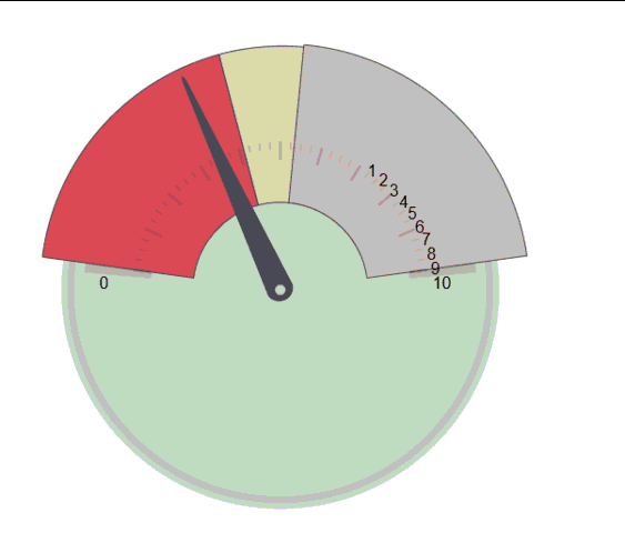
Preview of the New Radial Gauge Control
Infragistics is introducing a new Radial Gauge control available on multiple platforms, including WPF, Silverlight, HTML5 & jQuery (packaged with Ignite UI controls) and iOS (packaged with NucliOS controls). The xamRadialGauge is a preview of the XAML version of this new control available to WPF and Silverlight developers, and is compatible with the Ignite UI and NucliOS versions of the Radial Gauge, both visually and in features. This new Radial Gauge is powerful yet simple to use. Just drop it on your page and you’re ready to go with the default look & feel. Simply tweak the configuration options to your liking to meet whatever custom look you desire in your application.
Key Features
- Fully Configurable Radial Scale – The Radial Gauge control lets you control the Start and End positions of the scale, major and minor tick marks, labels, color ranges and sweep direction. You can create full 360 degree scales, or half circular gauges with 180 degree scales, 90 degrees, 45 degrees or any custom value you want.
- Fully Configurable Needle – The Radial Gauge control lets you control various attributes of the needle, including the needle color, length, point, base, and cap. The following needle shapes are built-in:
- None
- Rectangle
- Triangle
- Needle
- Trapezoid
- Rectangle With Bulb
- Triangle With Bulb
- Needle With Bulb
- Trapezoid With Bulb
- Fully Configurable Backing – The Radial Gauge backing can be configured to display any custom image. You can also control the transparency level of the backing, colors, shape around the gauge edges (fitted or circular), oversweep and corner radius.
- Motion Framework Animations Support – The Radial Gauge control supports animated transitions between configuration states. The control gradually animates as it redraws changes to the needle, needle position, scale range, color range and more. You can control the speed of the animations by setting the desired Transition Duration.
Compatibility Notes
- The new xamRadialGauge is currently introduced as a preview control (CTP) and will eventually replace the existing xamRadialGauge that was already available in release 12.2 and prior releases.
- The current xamRadialGauge is still available in release 13.1. This current xamRadialGauge will eventually be deprecated in an upcoming release and replaced with this new one.
- The new xamRadialGauge CTP API is NOT compatible with the current xamRadialGauge API.
Release 13.1 Looks Awesome! When Can I Get it?
There’s more coming since I can’t cover every single new feature, there’s too many of them. As you an see by now, release 13.1 of NetAdvantage for WPF and NetAdvantage for Silverlight is filled to the brim with new controls and new features. Whether you’re a corporate developer building intranet applications for your workforce, an ISV developer writing software for consumers worldwide, or an independent developer looking to create the next big thing, we have the controls to make you more productive and take your applications to the next level.
If you are not using our WPF controls yet, remember that a free evaluation download is only a click away (click here for the Silverlight download).
If you can’t wait to get your hands on the XAML 13.1 controls outlined here, drop me an email me at activenick@infragistics.com or my fellow XAML LOB Product Manager Brian Lagunas at blagunas@infragistics.com, tell us what control and/or feature you really want to work with now and we just may give you early access.
If you have ideas about new features we should bring to our controls, important issues we need to fix or even brand new controls you’d like us to introduce, please let us know. Follow and engage with us on Twitter via @infragistics. You can also follow and contact me directly on Twitter at @ActiveNick, and Brian Lagunas at @brianlagunas. Also make sure to connect with our various teams via our Community Forms where you can interact with Infragistics engineers and also other customers.
Lastly, when you do build something cool with our controls, please make sure to let us know, we always love to hear from you.
![]()


 As we start rolling out the blogs today on the new features for 13.1., we hope you get as excited as we are about the new stuff we are shipping in 13.1. We are continuing to solidify and expand our story of delivering the only toolset on the market that lets you design & build enterprise-ready applications for every major platform and device. With Ignite UI, you can build high performance enterprise class HTML5 & jQuery based controls that can power desktop, tablet & mobile phone applications.
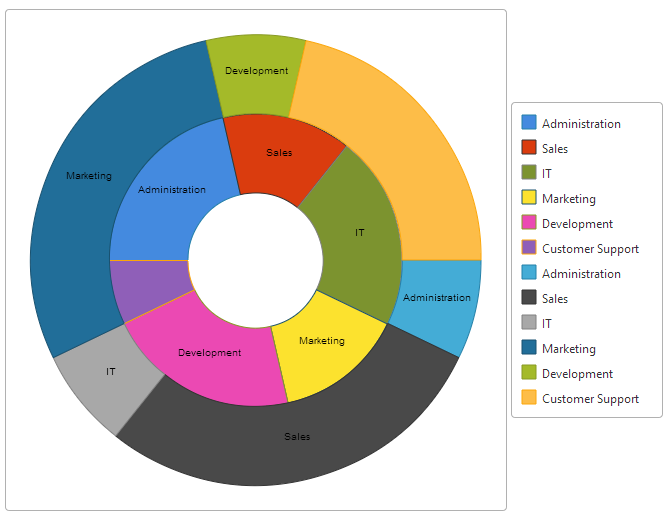


![clip_image002[4]](http://www.infragistics.com/community/cfs-file.ashx/__key/CommunityServer.Blogs.Components.WeblogFiles/ux.metablogapi/6443.clip_5F00_image0024_5F00_thumb_5F00_47864B2E.gif "clip_image002[4]")
![clip_image004[4]](http://www.infragistics.com/community/cfs-file.ashx/__key/CommunityServer.Blogs.Components.WeblogFiles/ux.metablogapi/0676.clip_5F00_image0044_5F00_thumb_5F00_276B3E71.gif "clip_image004[4]")
![clip_image006[4]](http://www.infragistics.com/community/cfs-file.ashx/__key/CommunityServer.Blogs.Components.WeblogFiles/ux.metablogapi/1256.clip_5F00_image0064_5F00_thumb_5F00_353D846C.gif "clip_image006[4]")


