Quantcast
Channel: Infragistics Community
Viewing all 2372 articles
Browse latest View live

NetAdvantage for WPF Release Notes – July: 11.2, 12.1 Service Releases

$
0
0

A new resource now available is a set of release notes that reflect the state of resolved bugs and new additions from the previous release. You’ll find the notes useful to help determine the resolution of existing issues from a past release and as a means of determining where to test your applications when upgrading from one version to the next.

Release notes are available in both PDF and Excel formats. The PDF summarizes the changes to this release along with a listing of each item. The Excel sheet includes each change item and makes it easy for you to sort, filter and otherwise manipulate the data to your liking.

In order to download release notes, use the following links:

WPF 2012 Volume 1 Service Release

PDF - NetAdvantage for WPF 2012 Volume 1 (Build 12.1.20121.2059)
Excel - NetAdvantage for WPF 2012 Volume 1 (Build 12.1.20121.2059)

WPF 2011 DV Volume 2 Service Release

PDF - NetAdvantage for WPF DV 2011 Volume 2 (Build 11.2.20112.2207)
Excel - NetAdvantage for WPF DV 2011 Volume 2 (Build 11.2.20112.2207)

WPF 2011 LOB Volume 2 Service Release

PDF - NetAdvantage for WPF LOB 2011 Volume 2 (Build 11.2.20112.2207)
Excel - NetAdvantage for WPF LOB 2011 Volume 2 (Build 11.2.20112.2207)


Using the Infragistics Pivot Grid in a LightSwitch Application

$
0
0

All of you LightSwitch-using people have one more reason to be happy about our 2012.1 release of Infragistics for LightSwitch line – the Pivot Grid makes its appearance and comes to aid with your LoB development. This post will give you the basics on what to do in order to start using this flexible grid in your applications. Bear in mind that I’m using VS 2012 – you may notice that in some of the attached images. I advise you to use VS 2012 as LightSwitch is bundled together with the IDE – you do not need to install it separately.

Let’s get on with it !

Set it up

First off , you should make a new LightSwitch project to test out the pivot grid in. Once you’re done with that , make sure you have the Infragistics extensions enabled for the current project. Assuming they’re off , this is how to enable them for the project ( and all future projects , while we’re at it )

Right click on the project within your Solution Explorer and click on Properties. You shall be presented with the following screen:

Infragistics LightSwitch 2012 Pivot Grid Extension

Make sure the checkbox corresponding to Infragistics LightSwitch Extensions is marked – you could optionally enable the extensions for all future projects by ticking off the second checkbox in that same row.

For our next step , let us add a data source to the project so we can “wrap” the grid around it and display information. To do this , we right click the Data Sources item in the project ( within the Solution Explorer ) and select Add a Data Source.

Infragistics LightSwitch 2012 Pivot Grid

Here’s the Solution Explorer showing this current project. Once you’ve taken the steps above , follow the on-screen wizard which will help you choose the type/entities of your data source. After providing the data , we should also provide means of displaying it.

Right click on the Screens item ( the one right under Data Sources ) and choose to Add a Screen. Doing so will take you to the screen selection window where you will have the chance to choose between several different screen types – the one you need is the Editable Grid Screen.

The final step is converting the automatically created data grids into the Infragistics Pivot Grid. When you double-click the newly created screen , the following window should be loaded into your designer:

Infragistics LightSwitch 2012 Pivot Grid Screen Designer

The little arrow next to the highlighted Data Grid tells us that you can actually change the type of that item. Click on it and select Infragistics Pivot Grid. The highlighted row , as well as the item called Data Grid Row should get updated properly.


That’s it ! When you run your application , this is what will show up on your screen:

Infragistics LightSwitch 2012 Pivot Grid

The right part of the pivot grid ( the part where you select data to position on the grid ) has been clipped on this image – yet it will be where you expect it to be in your app !

So there you have it – an on-point walkthrough to using the Pivot Grid in LightSwitch applications. Do not hesitate to try it out and drop a comment beneath to say whether it was easy !

Using Spatial Data in ASP.Net MVC with SQL Server 2012, Entity Framework 5 and Infragistics jQuery Map

$
0
0

One of the highly-anticipated features  in the Entity Framework 5 is a Spatial support.

Many developers have been asking since the release of SQL 2008 for support of Spatial data types in the Entity Framework. It was a dream for the Microsoft ORM users to create .NET business applications quickly, using spatial data.  In May of this year the release candidate for Entity Framework 5 (EF5) was announced.This version has increased performance when compared to earlier EF version and also has support for spatial types. The Spatial functionality in EF5 requires .NET 4.5.

The Spatial functionality in EF5 requires .NET 4.5. This means you will need Visual Studios 2012 installed. You can download the release candidate for VS 2012 here: http://www.microsoft.com/visualstudio/en-us

Spatial Data in the Entity Framework

Prior to Entity Framework 5.0 on .NET 4.5 consuming of the data above required using stored procedures or raw SQL commands to access the spatial data. In Entity Framework 5 however, Microsoft introduced the new DbGeometry andDbGeography types. These immutable location types provide a bunch of functionality for manipulating spatial points using geometry functions which in turn can be used to do common spatial queries like I described in the SQL syntax above.

The DbGeography/DbGeometry types are immutable, meaning that you can't write to them once they've been created. They are a bit odd in that you need to use factory methods in order to instantiate them - they have no constructor() and you can't assign to properties like Latitude and Longitude.

It is important to mention that these types are defined in System.Data.Entity assembly in System.Data.Spatial namespace. By now you have probably used types SqlGeometry and SqlGeography types, defined in Microsoft.SqlServer.Types namespace

Creating a Model with Spatial Data

Let's start by creating a simple Entity Framework model that includes entities from sample databases Northwind and SpatialDemo. The entity named world contains a geom property of type DbGeometry. Sample is using SQL Server 2012, but you could run it with SQL Server 2008.

   1: [EdmScalarPropertyAttribute(EntityKeyProperty=false, IsNullable=true)]
   2: [DataMemberAttribute()]
   3: public global::System.Data.Spatial.DbGeometry geom
   4: {
   5:     get
   6:     {
   7:         return _geom;
   8:     }
   9:     set
  10:     {
  11:         OngeomChanging(value);
  12:         ReportPropertyChanging("geom");
  13:         _geom = StructuralObject.SetValidValue(value, true, "geom");
  14:         ReportPropertyChanged("geom");
  15:         OngeomChanged();
  16:     }
  17: }
  18: private global::System.Data.Spatial.DbGeometry _geom;
  19: partial void OngeomChanging(global::System.Data.Spatial.DbGeometry value);
  20: partial void OngeomChanged();


Northwind Entities

IgMapEf5SqlSpatial_Pic01[1]

Sample SpatialDemo database, including spatial data. Table world a filed from Geometry type, named “geom”. This field  contains the contours of countries as polygons

Mvc4EfSpatialDemo_Pic03[1]

Entity world, generated from SpatialDemo database contains a field “geom” from Geometry type.

IgMapEf5SqlSpatial_Pic02[1]

ASP.Net MVC 4 Application with Entity Framework 5 RC and Spatial data

Now it is  a pretty easy to use spatial data in ASP.Net MVC applications.

  • Controller

Controller returns a view that contains a dashboard with Infragistics jQuery  controls.

   1: #region DashboardJs
   2: public ActionResult DashboardJs()
   3: {
   4:     ViewBag.Message = "Spatial Data Dashboard";
   5:  
   6:     return View();
   7: }
   8: #endregion //DashboardJs


  • Spatial Data Maintenance

When you have a data from DbGeometry / DbGeography type you can’t serialize it. There are two options:

  • To convert spatial data type to WKT (Well Known Text) and send it to the client (view) as part of JSON or XML
  • To use your own classes that could be serialized

This sample is demonstrates the second approach

CountryByName method serializes results to JSON to be possible to use it in the view

   1: #region CountryByName
   2: [OutputCache(VaryByParam = "countryName", Duration = 120)]
   3: public JsonResult CountryByName(string countryName)
   4: {
   5:     switch (countryName)
   6:     {
   7:         case "UK":
   8:             countryName = "United Kingdom";
   9:             break;
  10:         case "USA":
  11:             countryName = "United States";
  12:             break;
  13:     }
  14:     var results = spDemo.worlds.Where(x => x.CNTRY_NAME == countryName);
  15:  
  16:  
  17:     List ret = new List();
  18:     foreach (world country in results)
  19:     {
  20:         CountryInfo info = new CountryInfo
  21:         {
  22:             Id = country.ID,
  23:             Code = country.CODE,
  24:             CountryName = country.CNTRY_NAME,
  25:             Population = country.POP_CNTRY,
  26:             Extend = GetGeometryBoundary(country)
  27:         };
  28:         ret.Add(info);
  29:     }
  30:  
  31:     var retVal = Json(ret, JsonRequestBehavior.AllowGet);
  32:     return retVal;
  33: }
  34: #endregion //CountryByName


GetGeometryBoundary is a helper method used to get a list of points, representing an envelope of a DbGeometry instance. Don't forget that DbGeometry/DbGeography point indexes start from 1 !.

   1: #region GetGeometryBoundary
   2: public static SpatialRect GetGeometryBoundary(world country)
   3: {
   4:     List multiPoints = new List();
   5:     var numPoints = country.geom.Envelope.ElementAt(1).PointCount;
   6:     for (int i = 1; i 
   7:     {
   8:         SpatialPoint pnt = new SpatialPoint((double)(country.geom.Envelope.ElementAt(1).PointAt(i).XCoordinate), (double)(country.geom.Envelope.ElementAt(1).PointAt(i).YCoordinate));
   9:         multiPoints.Add(pnt);
  10:  
  11:     }
  12:     SpatialRect rect = multiPoints.GetBounds();
  13:     return rect;
  14: }
  15: #endregion //GetGeometryBoundary


ContryInfo is a helper class used to serialize data

   1: #region CountryInfo
   2:  
   3: public class CountryInfo
   4: {
   5:     public int Id { get; set; }
   6:     public string Code { get; set; }
   7:     public string CountryName { get; set; }
   8:     public long? Population { get; set; }
   9:     public SpatialRect Extend { get; set; }
  10:  
  11: }
  12: #endregion //CountryInfo


SpatialPoint is a helper class to keep a point data. You could use

   1: #region SpatialPoint
   2:  
   3: public class SpatialPoint
   4: {
   5:     public SpatialPoint(double x, double y)
   6:     {
   7:         this.X = x;
   8:         this.Y = y;
   9:     }
  10:  
  11:     public double X { get; set; }
  12:     public double Y { get; set; }
  13: }
  14:  
  15: #endregion //SpatialPoint


SpatialRect is a helper class to keep an extend of the country

   1: #region SpatialRect
   2:  
   3: public struct SpatialRect
   4: {
   5:     public SpatialRect(double pLeft, double pTop, double pWidth, double pHeight)
   6:     {
   7:         left = pLeft;
   8:         top = pTop;
   9:         width = pWidth;
  10:         height = pHeight;
  11:     }
  12:  
  13:     public double left; 
  14:     public double top; 
  15:     public double width; 
  16:     public double height; 
  17: }
  18:  
  19: #endregion //SpatialRect


GetBounds is an extension method used to get a boundary of the list of points.

   1: #region Extensions
   2: public static class Extensions
   3: {
   4:  
   5:     #region GetBounds
   6:     public static SpatialRect GetBounds(this IList points)
   7:     {
   8:         double xmin = Double.PositiveInfinity;
   9:         double ymin = Double.PositiveInfinity;
  10:         double xmax = Double.NegativeInfinity;
  11:         double ymax = Double.NegativeInfinity;
  12:  
  13:         SpatialPoint p;
  14:         for (var i = 0; i 
  15:         {
  16:             p = points[i];
  17:             xmin = Math.Min(xmin, p.X);
  18:             ymin = Math.Min(ymin, p.Y);
  19:  
  20:             xmax = Math.Max(xmax, p.X);
  21:             ymax = Math.Max(ymax, p.Y);
  22:         }
  23:  
  24:         if (Double.IsInfinity(xmin) || Double.IsInfinity(ymin) || Double.IsInfinity(ymin) || Double.IsInfinity(ymax))
  25:         {
  26:             return new SpatialRect(0.0, 0.0, 0.0, 0.0);
  27:         }
  28:  
  29:         return new SpatialRect(xmin, ymin, xmax - xmin, ymax - ymin);
  30:     }
  31:     #endregion //GetBounds
  32: } 
  33: #endregion //Extensions


View

The view presents a dashboard from Infragistics jQuery Grid, Chart and Map.

The most important part in the sample is how to query the controller’s method that returns spatial data (the country extend in this case).

   1: var countryUrl = "/Home/CountryByName?countryName=" + args.row.element[0].cells[1].textContent
   2:  
   3: ...
   4:  
   5: $.getJSON(countryUrl,
   6:   function (json, text) {
   7:       $.each(json, function (index, value) {
   8:           var country = value;
   9:           var extend = country["Extend"];
  10:  
  11:           var zoom = $("#map").igMap("getZoomFromGeographic", extend);
  12:           $("#map").igMap("option", "windowRect", zoom);
  13:  
  14:       });
  15: });


Infragistics jQuery Map instance definition.

   1: $("#map").igMap({
   2:      width: "500px",
   3:      height: "500px",
   4:      panModifier: "control",
   5:      horizontalZoomable: true,
   6:      verticalZoomable: true,
   7:      windowResponse: "immediate",
   8:      overviewPlusDetailPaneVisibility: "visible",
   9:      seriesMouseLeftButtonUp: function (ui, args) {
  10:          var tets = args;
  11:      }
  12:  });


Infragistics jQuery Grid with zoom around the selected customer’s country.

   1: $('#grid').igGrid({
   2:      virtualization: false, height: 280, width: 650,
   3:      dataSource: "/Home/Customers",
   4:      autoGenerateColumns: false,
   5:      columns: [
   6:          { headerText: "Customer ID", key: "CustomerID", width: "120px", dataType: "string" },
   7:          { headerText: "Country", key: "Country", width: "150px", dataType: "string" },
   8:          { headerText: "City", key: "City", dataType: "string" },
   9:          { headerText: "Contact Name", key: "ContactName", dataType: "string" },
  10:          {headerText: "Phone", key: "Phone", dataType: "string" }
  11:      ],
  12:      features: [
  13:  
  14:       {
  15:           name: 'Selection',
  16:           mode: 'row',
  17:           multipleSelection: false,
  18:           rowSelectionChanged: function (ui, args) {
  19:               $("#chart").igDataChart({
  20:                   dataSource: "/Home/Orders?userID=" + args.row.element[0].cells[0].textContent
  21:               });
  22:  
  23:               selected = args.row.element[0].cells[0].textContent; //keep track of selected user
  24:               var countryUrl = "/Home/CountryByName?countryName=" + args.row.element[0].cells[1].textContent
  25:   
  26:  
  27:              $.getJSON(countryUrl,
  28:                 function (json, text) {
  29:                     $.each(json, function (index, value) {
  30:                         var country = value;
  31:                         var extend = country["Extend"];
  32:  
  33:                         var zoom = $("#map").igMap("getZoomFromGeographic", extend);
  34:                         $("#map").igMap("option", "windowRect", zoom);
  35:  
  36:                     });
  37:               });
  38:  
  39:           }
  40:       }
  41:      ,
  42:  
  43:      {
  44:          name: 'Sorting',
  45:          type: "remote"
  46:      },
  47:      {
  48:          name: 'Paging',
  49:          type: "local",
  50:          pageSize: 10
  51:      }]
  52:  
  53:  })


Spatial Data in Action

Run the application and select the “Spatial Data Dashboard” from the menu.

Mvc4EfSpatialDemo_Pic04[1] Mvc4EfSpatialDemo_Pic05[1]

Choose a customer from the igGrid and see how the map shows the country from which the client

Mvc4EfSpatialDemo_Pic07[1] Mvc4EfSpatialDemo_Pic08[1]

You can download source code of the sample here.

To run this sample you could download Northwind and SpatialDemo sample databases

As always, you can follow us on Twitter: @mihailmateev and @Infragistics , all tweets with hashtag #infragistcs and stay in touch on Facebook, Google+ , LinkedIn and Infragistics Friends User Group !

UltraMediaPlayer CAB Walkthrough

$
0
0

Hey everyone,

To help those people that are using Windows Forms and Microsoft CAB, I decided to clean up and update my "Ultra Media Player" Reference application and tell you all about it.

I created a video that walks you through the technical aspects of the application, as well as some aspects of Microsoft CAB (Composite UI Application Block), Infragistics CAB Utility Kit, as well as how you can make an awesome Media Player application using the time proven Infragistics Windows Forms controls ALONG WITH CAB!

Due to quite a few questions on Windows Forms, CAB, and the Infragistics Composite UI Application Block Extension kit, I felt that this reference app and walkthrough would be the best way to communicate things such as:

  • How the Infragistics CAB functionality is set up in the sample app (igFormShellApplication)
  • How Infragistics UI Elements (buttons, menu items, etc) are created in ONE module, then passed off to the SHELL without actually being any references
  • How to create and load Smart Parts into the awesome Infragistics Windows Forms based WorkSpaces such as the DockManager workspace, Tabbed MDI workspace, etc
  • How to use the CAB Event Broker to PUBLISH and SUBSCRIBE to events to update the UI across unreferenced assembly boundaries.
  • I also have an awesome Draw Filter (Infragistics Windows Forms's technique of hijacking the PAINTING of controls to do things YOUR way) that I created to achieve a load-on-demand strategy for accessing media files, extracting a video snapshot and loading it into the Infragistics WinListView control.

Please watch the video and download the sample application (links below). Review the code, comments, and enjoy!

Watch Video Here

Download Sample Application Here

Mobile developers get it all with MobileAdvantage

$
0
0

MobileAdvantage

Targeting multiple platforms is a big challenge for the modern mobile developer. We have a lot of platforms to deal with and a seemingly endless supply of technologies to choose from to build applications with. Wouldn't it be great if a company would package up their best mobile development solutions into a convenient bundle? Well, it's your lucky day!

MobileAdvantage is a new suite that combines the versatility of the multi-platform NetAdvantage for jQuery with the beautifully functional NetAdvantage for Windows Phone and the fully native NetAdvantage for iOS (currently in beta but will be released later this year). You really get the best of all worlds in one nicely priced package.  Whether you are building a cross-platform app using HTML5 and jQuery or a fully native Windows Phone or iOS app, you will find what you need in the MobileAdvantage suite.

Give MobileAdvantage a try today and if you have any questions or comments, please feel free to leave a comment on this post or find me on Twitter @brentschooley.

SharePlus: Security White Paper

$
0
0

The PDF version of this document has been attached to this article.

Introduction

SharePlus Enterprise provides secure access to SharePoint sites from mobile devices. Keeping enterprise data secure is the highest priority of SharePlus. To fortify enterprise data security, core security features have been built into the product at each layer.

The following is a list of security features that are included in SharePlus Enterprise for iOS devices. These features will be described in detail in subsequent sections of this document.

  • Data Storage Security
    • iOS Data Protection
    • Data Wipe
    • Channel (Communication) Security
      • VPN
      • SSL
  • Authentication
    • Passcode Lock
    • Authentication Mechanisms
    • Client-side Certificates
    • Two-factor Authentication using one-time Passwords
  • Authorization
    • SharePoint Permissions
  • Enforcing Business Security Rules by Restricting Specific Functionality
    • Feature Trimming
    • Editor White Listing
    • Trim copy/paste (needs customization)
    • Block Screenshot Capture (iOS feature)
    • Hide Lists via Mobile Navigation
  • MDM Integration
    • Standard MDM Solutions (Mobile Iron, etc.)
    • Good Technologies


Figure 1 Typical Enterprise Deployment

clip_image002[6]

Data Storage Security

SharePlus offers two features to ensure that data is secure on a user’s device:

· iOS Data Protection

· Secure Data Wipe

iOS Data Protection

SharePlus employs Apple’s iOS Data Protection feature to keep application data secure. This native iOS feature enhances the built-in hardware AES 256-bit encryption by protecting the encryption keys with a user’s passcode. This provides an additional layer of protection for application data such as cached documents and user configuration information.

The iOS Data Protection feature protects data at rest. This includes locking or powering down the device.

Secure Data Wipe

An administrator can configure a secure data wipe to activate upon failed passcode entry attempts or failed attempts to authenticate to the server. An administrator can also initiate the secure data wipe on-demand by issuing a remote wipe command from a Mobile Device Management (MDM) server. MDM integration will be discussed in a subsequent section of this document.

The iOS achieves the data wipe by securely discarding the block storage encryption key from iOS Effaceable Storage, which renders all data unreadable.

Secure Data Wipe Triggered by Failed Passcode Entry

SharePlus may be configured centrally to securely wipe all application data upon reaching a configurable amount of failed passcode entry attempts. This feature may be enforced centrally by using the Remote Configuration feature provided by SharePlus.

Secure Data Wipe Triggered by “Authentication Time Bomb”

The Authentication Time Bomb feature allows administrators to set a limit on the number of days that a user can use the application without re-authenticating against the server.

This feature is most relevant when users are using offline functionality. In the offline mode, it is possible to work with SharePoint data cached on the device after the user authenticates with the server. The Authentication Time Bomb allows an administrator to limit the number of days that the application may be used without re-authenticating to the server. All SharePlus application data will be securely wiped from the device if a user reaches the configurable threshold for failed authentication attempts.

Channel (Communication Security)

SharePlus communicates with SharePoint Server by accessing the out-of-the-box SharePoint Web Services over the network.

Channel security may be enhanced by employing a Virtual Private Network (VPN) and/or by using Secure Sockets Layer (SSL) .

Virtual Private Network (VPN)

Organizations often employ Virtual Private Networks (VPN) to enable secure communication over a public network. VPNs enhance communication security by encrypting the data passing through its channel.

SharePlus supports the built-in iOS VPN client. This native client supports the following VPN Tunneling protocols:

· Layer 2 Tunneling Protocol (LT2P)

· Point-to-Point Tunneling Protocol (PPTP)

· Internet Protocol Security (IPsec)

Once the VPN iOS feature has been turned on and a connection is established, SharePlus will utilize the tunnel for server communication. Additionally, the VPN can be set to automatically establish a connection when a SharePlus user attempts to connect to the server. This eliminates the need for the end user to connect to the VPN prior to using the application.

Secure Sockets Layer (SSL)

Secure Sockets Layer (SSL) is a cryptographic protocol used to facilitate secure communication over the Internet. SharePlus supports SSL, access to certificate enabled repositories, and Self-Signed Certificates.

In the case where an Enterprise site uses legacy encryption methods, SharePlus may be configured to set a matching certificate version.

Authentication

SharePlus supports the following authentication mechanisms:

Windows Integrated Authentication

This authentication mechanism uses Active Directory (AD) credentials to authenticate against the SharePoint site. User credentials are transmitted to the server where they are authenticated against an Active Directory Server.

Form-Based Authentication

In this method of authentication, the user’s credentials are passed to the server over HTTP as Form data.

Office 365 Authentication

This mechanism is used with SharePoint Servers hosted by Office 365 on the cloud.

When this mechanism is employed, SharePlus renders a browser-like window displaying the Office 365 logon screen. These credentials are then passed to the server for validation.

Web Login authentication

This mechanism has been implemented to support customized online authentication mechanisms such as Forefront UAG and ISA Server. This authentication method behaves in the same manner as Office 365 authentication. SharePlus presents the user with a browser-like window to enter credentials. The credentials are then authenticated by Office 365 services.

Claims-Based Authentication (CBA)

Versions of SharePoint 2010 or higher support this method of authentication. Claims-based authentication is based on concept of an “identity” that works with any Identity System. An Identity is represented by a security token. When a user attempts to obtain access to an application, the user’s security token is passed to the application. CBA provides a trust-based system between applications and a centralized provider that issued the token.

SharePlus versions 3.2 and higher support CBA.

For additional information regarding CBA, please refer to the following White paper:

http://technet.microsoft.com/en-us/library/hh487289.aspx

Multi-Factor Authentication

Multi-Factor Authentication methods such as the use of an RSA token is also supported by SharePlus.

Application-Level Authentication

Passcode Lock

SharePlus provides an optional Passcode lock. When enabled, a user will be prompted for a four digit pin upon opening the application. This lock may also be set to activate upon a configurable amount of inactivity. The lock settings may be centrally enforced by an Administrator using global configuration.

Figure 2 SharePlus Passcode Lock

clip_image004[6]

Authorization

User access to SharePoint resources such as lists and documents is granted in SharePoint Server using permissions. Since SharePlus authenticates with SharePoint Server’s web services using the end user’s credentials, server-defined authorization rules apply. Therefore, the level of resource access (read/write, etc.) will mirror that which has been set up on the server.

For additional information regarding setting up permissions in SharePoint Server, please refer to the following article:

http://office.microsoft.com/en-us/windows-sharepoint-services-help/permission-levels-and-permissions-HA010100149.aspx .

Enforcing Business Security Rules by Restricting Specific Functionality

Enterprises commonly have a need to adjust application functionality based on security rules. These rules may mandate the restriction of application functionality such as saving a SharePoint document locally or sharing files via the WiFi Share feature. SharePlus natively supports this administrative effort through mechanisms that will be discussed in this section.

Feature Trimming

Feature Trimming allows Enterprise administrators to disable and adjust SharePlus features on a global level. This is facilitated by modifying the SharePlus global remote configuration file. This Enterprise-owned and hosted file is used to set application configuration at a global level. When this file is modified to disable a feature, the change will be affected for all Enterprise SharePlus users.

The following list includes, but is not limited to all functional aspects of the application that may be disabled via the Feature Trimming mechanism:

  • Site Administration
    • Adding Sites
    • Deleting Connections
    • Updates to Connections
    • Credential Storage
    • Remembering Last User Name
    • My Site Support
    • My Profile support
  • Local Files
    • Copy to Local Files
    • File browser
    • Emailing Documents
    • Swiping Documents
    • Tabbed Previewing of Documents
  • List Management
    • Advanced Search
    • Offline Mode
    • Favorites
    • Displaying Items Count
  • Items Management
    • Add
    • Edit
    • Delete
    • CheckOut
    • Approve/Reject
    • Copy URL
    • Email URL
  • WiFi Sharing
    • Allow WiFi Sharing
    • Uploading Documents
    • Downloading Documents
  • Open In Functionality
    • Allow
    • Restrict specific third-party application use
  • Printing
    • Allow Printing
  • Enterprise Search
    • Allow Enterprise Search
    • Include Search Scopes
    • Exclude Search Scopes
  • Global Settings
    • Preview Documents On Tap
    • Remove Local Files After Upload
    • Help URL
    • Enable Logging
    • Disable Auto Lock on Preview
    • Disable Device’s Auto Lock on Sync
    • Connection Timeout
    • Sync Idle Time
    • User Agent
    • SSL Level
  • Location Services
    • Enable Location Services
    • Auto Start


For additional information on remote configuration, please refer to: http://blogs.infragistics.com/blogs/anand_raja/archive/2012/05/01/shareplus-enterprise-configuration-overview.aspx.

Editor White Listing

Administrators can restrict third-party editors using Editor White Listing. This feature allows administrators to control which third-party editors can be used when editing documents from within SharePlus.

Trim Copy/Paste

Infragistics can implement custom functionality to restrict copy and paste functionality prior to application deployment.

Block Screenshot Capture (iOS feature)

An administrator can modify user profile settings within the device to disable the iOS screen shot feature.

Hide lists via Mobile Navigation Settings

Administrators can hide specific lists by using the Mobile Navigation feature of SharePlus. This feature allows administrators to modify the manner in which SharePlus works with a list. These list settings can be set via the custom SharePoint list named “MobileNavigation,” which is depicted in the illustration below.

clip_image006[6]

Figure 3

Mobile Device Management (MDM) Integration

Mobile Device Management solutions (MDM) allow the Enterprise to secure, monitor, and manage mobile devices. For additional information regarding Mobile Device Management, please refer to the following article: http://www.apple.com/ipad/business/integration/mdm/.

SharePlus integrates with all MDM solutions that implement the device management protocol known as OMA Device Management. The Open Mobile Alliance organization has specified this open standard . MDM solutions such as MobileIron and MaaS360 adhere to this protocol.

The following SharePlus-related tasks may be performed by an MDM solution:

· Deployment

· Configuration Broadcast

· Secure Data Wipe

Good Technology MDM

SharePlus also offers advanced integration with the Good Technology MDM solution. In addition to standard MDM integration, the following functionality is available:

· Transmit email using Good Mobile Messaging

· Receive files from Good Native Apps

For additional information regarding Good Technology, please refer to: http://www1.good.com/mobility-management-solutions/mobile-device-management.

Creating a Command Behavior for the XamMenuItem

$
0
0

I was playing with the Infragistics XamMenu control today and made a discovery that I did not like.  It does not provide support for commanding!  That’s right; no Command or CommandParameter property that I can use to data bind a command in my ViewModel to.  I couldn’t believe it.  Don’t you worry though.  I will be fixing that immediately.  When I say immediately, I mean as soon as I can.  I have placed an item in the backlog to implement commanding support for the 13.1 release.  Until then, I need a way to data bind my ViewModel commands to a XamMenuItem, so that when the menu item is clicked my command will execute.

There are a few ways to accomplish the task.  I recently blogged about an approach that would work in this scenario which uses attached properties, but I wanted to show another approach that could also work.  For this scenario I am going to be using a custom Behavior.  I like this approach because of it’s simplicity and control of when the behavior is being attached and detached from the object.

Let’s start by creating a new WPF application, or Silverlight if your prefer, and dragging the XamMenu control onto the design surface of our View.  You need to also add a reference to System.Windows.Interactivity.  Your references should look something like this.

xammenu-behavior-references

Now let’s add a ViewModel that will contain our command that will be executed.

public class ViewModel : INotifyPropertyChanged
{
    public ICommand DoSomethingCommand { get; set; }

    public ViewModel()
    {
        DoSomethingCommand = new DelegateCommand(DoSomething);
    }

    private void DoSomething(object param)
    {
        MessageBox.Show(param.ToString());
    }

    public event PropertyChangedEventHandler PropertyChanged;
    protected void NotifyPropertyChanged(string propertyName)
    {
        var handler = PropertyChanged;
        if (handler != null)
            handler(this, new PropertyChangedEventArgs(propertyName));
    }
}

As you can see, this ViewModel is very simple.  We simply have a single command called DoSomethingCommand which is an instance of a DelegateCommand, also commonly known as a RelayCommand.  Now let’s set the DataContext of our View to our ViewModel.  You can do this in code behind, but I will just wire it up in XAML.

<Window x:Class="XamMenuItemCommandBehavior.MainWindow"
        xmlns="http://schemas.microsoft.com/winfx/2006/xaml/presentation"
        xmlns:x="http://schemas.microsoft.com/winfx/2006/xaml"
        xmlns:i="http://schemas.microsoft.com/expression/2010/interactivity"
        xmlns:local="clr-namespace:XamMenuItemCommandBehavior"
        Title="MainWindow" Height="350" Width="525" xmlns:ig="http://schemas.infragistics.com/xaml">
    
    <Window.DataContext>
        <local:ViewModel />
    Window.DataContext>
    
    <Grid>
        <ig:XamMenu>
            <ig:XamMenuItem Header="Click Me">

            ig:XamMenuItem>
        ig:XamMenu>
    Grid>
Window>

Notice how I added two namespaces to the View.  One is for the System.Windows.Interactivity, and the other is for our local project where our ViewModel exists.  Now let’s create our behavior.  We are need to create a new class that derives from Behavior, where T is the control you want to attach the behavior to.

public class XamMenuItemCommandBehavior : Behavior<XamMenuItem>
{
    public static readonly DependencyProperty CommandProperty = DependencyProperty.Register("Command", typeof(ICommand), typeof(XamMenuItemCommandBehavior), null);
    public ICommand Command
    {
        get { return (ICommand)GetValue(CommandProperty); }
        set { SetValue(CommandProperty, value); }
    }

    public static readonly DependencyProperty CommandParamenterProperty = DependencyProperty.Register("CommandParamenter", typeof(object), typeof(XamMenuItemCommandBehavior), null);
    public object CommandParamenter
    {
        get { return (object)GetValue(CommandParamenterProperty); }
        set { SetValue(CommandParamenterProperty, value); }
    }

    protected override void OnAttached()
    {
        base.OnAttached();
        AssociatedObject.Click += AssociatedObject_Click;
    }

    protected override void OnDetaching()
    {
        AssociatedObject.Click -= AssociatedObject_Click;
        base.OnDetaching();
    }

    private void AssociatedObject_Click(object sender, EventArgs e)
    {
        if (Command != null && Command.CanExecute(CommandParamenter))
            Command.Execute(CommandParamenter);
    }
}

As you can see, I have added two properties,  Command and CommandParameter.  Override the OnAttached method and add an event handler for the AssociatedObject (which is of type T) Click event.  In the Click event handler, we simply add code that checks for a Command, if it can be executed, and then executes the command passing the command parameter.

Lastly, we override the OnDetaching method and unhook our event handler to clean up any possible memory leaks.  Now that we have our Behavior completed, we need to hook it up to our XamMenu.  Add a namespace to the location of your behavior, and then modify your View as follows.

<Window x:Class="XamMenuItemCommandBehavior.MainWindow"
        xmlns="http://schemas.microsoft.com/winfx/2006/xaml/presentation"
        xmlns:x="http://schemas.microsoft.com/winfx/2006/xaml"
        xmlns:i="http://schemas.microsoft.com/expression/2010/interactivity"
        xmlns:b="clr-namespace:XamMenuItemCommandBehavior.Behaviors"
        xmlns:local="clr-namespace:XamMenuItemCommandBehavior"
        Title="MainWindow" Height="350" Width="525" xmlns:ig="http://schemas.infragistics.com/xaml">
    
    <Window.DataContext>
        <local:ViewModel />
    Window.DataContext>
    
    <Grid>
        <ig:XamMenu>
            <ig:XamMenuItem Header="Click Me">
                <i:Interaction.Behaviors>
                    <b:XamMenuItemCommandBehavior Command="{Binding DoSomethingCommand}" CommandParamenter="I did something" />
                i:Interaction.Behaviors>
            ig:XamMenuItem>
        ig:XamMenu>
    Grid>
Window>

We are using the Interaction.Behaviors attached property and declaring an instance of our custom XamMenuItemCommandBehavior class.  We data bind the Command property to our DoSomethingCommand that exists in our ViewModel and we are providing a CommapandParameter.  Run the application, click on the XamMenuItem and see the magic happen.

xammenu-behavior-final

Wasn’t that easy?

XamGrid–Data Bind Checkbox in Row Selector

$
0
0

I was reading the Infragistics forums today and noticed a common question regarding the XamGrid control.  Basically, there is a need to place checkboxes in the row selector of the XamGrid, and then data bind those checkboxes to a property of the bound row object.  The expected behavior is when a checkbox is selected in the row selector column, the data bound property of the object representing the row will be set to true indicating that the object is in a selected state.  This will give the developer the opportunity to distinguish selected objects from within a bound collection that may (and probably should) exist in a ViewModel.  So how do we accomplish this task?  It’s actually quite simple, but there are some things you should consider.

Before we get started coding up our solution, we need to have some dummy data and infrastructure to work with.  Lets start with our Model and ViewModel.  Our Model will be a simple Person object implemented as follows:

public class Person : INotifyPropertyChanged
{
    private bool _isSelected = false;
    public bool IsSelected
    {
        get { return _isSelected; }
        set
        {
            _isSelected = value;
            NotifyPropertyChanged("IsSelected");
        }
    }

    private int id;
    public int Id
    {
        get { return id; }
        set
        {
            id = value;
            NotifyPropertyChanged("Id");
        }
    }

    private double age;
    public double Age
    {
        get { return age; }
        set
        {
            age = value;
            NotifyPropertyChanged("Age");
        }
    }

    private String lastName;
    public String LastName
    {
        get { return lastName; }
        set
        {
            lastName = value;
            NotifyPropertyChanged("LastName");
        }
    }

    public event PropertyChangedEventHandler PropertyChanged;
    private void NotifyPropertyChanged(String propertyName)
    {
        if (PropertyChanged != null)
        {
            PropertyChanged(this, new PropertyChangedEventArgs(propertyName));
        }
    }
}

Nothing fancy, just some simple properties and the implementation of INotifyPropertyChanged.  Now let’s create a ViewModel that will contain a collection of Person objects that we will bind to our XamGrid:

public class MyViewModel : INotifyPropertyChanged
{
    private ObservableCollection<Person> _people;
    public ObservableCollection<Person> People
    {
        get { return _people; }
        set
        {
            _people = value;
            NotifypropertyChanged("People");
        }
    }

    public MyViewModel()
    {
        People = new ObservableCollection<Person>();

        People.Add(new Person() { Id = 1, LastName = "Davis" });
        People.Add(new Person() { Id = 2, LastName = "Bush", Age = 34.5555 });
        People.Add(new Person() { Id = 3, LastName = "Doe", Age = 56 });
        People.Add(new Person() { Id = 4, LastName = "Smith", Age = 23 });
    }

    public event PropertyChangedEventHandler PropertyChanged;
    protected void NotifypropertyChanged(string propertyName)
    {
        var handler = PropertyChanged;
        if (handler != null)
            PropertyChanged(this, new PropertyChangedEventArgs(propertyName));
    }
}

Don’t forget to set the DataContext of your View to an instance of your ViewModel.  I will assume you know how to do this and move on.

Let’s start working on our View.   First make sure you have the following namespaces in your View:

xmlns:prim="clr-namespace:Infragistics.Controls.Grids.Primitives;assembly=InfragisticsWPF4.Controls.Grids.XamGrid.v11.2"
xmlns:ig="http://schemas.infragistics.com/xaml"

The first namespace points to the primitives namespace where we will find the RowSelectorCellControl.  The second one obviously is the namespace for the XamGrid control.  Go ahead and add the following markup to your view.

<ig:XamGrid Name="_xamGrid" ItemsSource="{Binding People}" >
    <ig:XamGrid.SelectionSettings>
        <ig:SelectionSettings RowSelection="None"/>
    </ig:XamGrid.SelectionSettings>
    <ig:XamGrid.RowSelectorSettings>
        <ig:RowSelectorSettings Visibility="Visible" EnableRowNumbering="False" >
            <ig:RowSelectorSettings.Style>
                <Style TargetType="{x:Type prim:RowSelectorCellControl}">
                    <Setter Property="ContentTemplate">
                        <Setter.Value>
                            <DataTemplate>
                                <CheckBox Name="_checkBoxDataTemplate" />
                            </DataTemplate>
                        </Setter.Value>
                    </Setter>
                </Style>
            </ig:RowSelectorSettings.Style>
        </ig:RowSelectorSettings>
    </ig:XamGrid.RowSelectorSettings>
</ig:XamGrid>

As you can see, we have declared a XamGrid control and bound it to the People collection that exists in our ViewModel.  We have declared the RowSelectorSettings and provided a custom style for it.  Our style simply sets the ContentTemplate to a Checkbox.  Exactly what we want. 

xamgrid-row-selector-checkbox-1

If you run the application you will see our Checkboxes are where they should be, but there are two issues with our current state.  One, you have to double click the checkbox to place it in a checked state.  Two nothing happens when you put them in the checked state.  So let’s fix these issues starting with issue one.  In order to have the Checkbox respond immediately to a click we need to handle the PreviewMouseLeftButtonDown event.

<DataTemplate>
    <CheckBox Name="_checkBoxDataTemplate"
                PreviewMouseLeftButtonDown="CheckBox_PreviewMouseLeftButtonDown" />
</DataTemplate>

And our handler looks like this:

private void CheckBox_PreviewMouseLeftButtonDown(object sender, MouseButtonEventArgs e)
{
    var checkbox = sender as CheckBox;
    if (checkbox != null)
        checkbox.IsChecked = !checkbox.IsChecked;
}

Now when you click on the checkbox it will immediately change its checked state.  Next we need to data bind the IsSelected property of our Person object representing a row to the checkbox.  Now this is the really tricky part.  Without the correct binding syntax, this will never work.  So make note of this:

<DataTemplate>
    <CheckBox Name="_checkBoxDataTemplate"
                IsChecked="{Binding Cell.Row.Data.IsSelected, RelativeSource={RelativeSource AncestorType={x:Type prim:RowSelectorCellControl}}}"
                PreviewMouseLeftButtonDown="CheckBox_PreviewMouseLeftButtonDown" />
</DataTemplate>

We are binding to the RowSelectorCellControl.Cell.Row.Data.IsSelected property.  Confused yet?  The thing you really need to understand is that the Cell.Row.Data property is the bound object, in this case the Person object that represents the row.  From this property, you can access all the properties that are declared the Person object.

xamgrid-row-selector-checkbox-2

Now when you run the application, you will notice that whenever you click on a checkbox the Person.IsSelected property value changes to reflect the current selection state.  Pretty simple now that you see the code. 

Highlighting Selection

There are some subtle issues that you may not have noticed right away, and maybe you don’t care about them.  The first thing is that when a checkbox is checked, the row is marked a selected, but the row visually does not accurately represent that it is selected.  What we want to happen is that when a row is selected it should be highlighted.  To fix this, we need to add a little code-behind.

“Take a deep breath… Calm down… It’s okay to have code behind in an MVVM application.  We are only manipulating UI components. No data will be harmed in the making of this MVVM application.”

I made some modifications to our DataTemplate as follows:

<DataTemplate>
    <CheckBox Name="_checkBoxDataTemplate"
                IsChecked="{Binding Cell.Row.Data.IsSelected, RelativeSource={RelativeSource AncestorType={x:Type prim:RowSelectorCellControl}}}"
                Checked="CheckBox_Checked"
                Unchecked="CheckBox_Unchecked"
                PreviewMouseLeftButtonDown="CheckBox_PreviewMouseLeftButtonDown"
                Tag="{Binding Cell.Row.Index, RelativeSource={RelativeSource AncestorType={x:Type prim:RowSelectorCellControl}}}"/>
</DataTemplate>

As you can see I added handlers for the Checked and Unchecked events of the Checkbox.  I am also storing the row index in the Tag of the checkbox.  This will be used to find the row in the event handers.  Let’s take a look at our two event handlers:

private void CheckBox_Checked(object sender, RoutedEventArgs e)
{
    int index = (int)(sender as CheckBox).Tag;
    _xamGrid.SelectionSettings.SelectedRows.Add(_xamGrid.Rows[index]);
}

private void CheckBox_Unchecked(object sender, RoutedEventArgs e)
{
    if (_xamGrid.SelectionSettings.SelectedRows.Count > 0)
    {
        int index = (int)(sender as CheckBox).Tag;
        _xamGrid.SelectionSettings.SelectedRows.Remove(_xamGrid.Rows[index]);
    }            
}

In the CheckBox.Checked event handler we are grabbing the row index from the CheckBox.Tag property.  Then we use that to add the row to the SelectionSettings.SelectedRows property.  This will highlight the row when it becomes selected by the checkbox.  In the CheckBox.UnChecked event, we first make sure we have a collection to remove from, then once again use the row index we stored in the tag property to remove the row from the SelectedRows property.  This will remove the highlight from the row when it is marked as unselected.

xamgrid-row-selector-checkbox-3

Now things are starting to look like they function properly.  Not quite.  Notice what happens when you select a couple of rows then click in any cell of any row.

xamgrid-row-selector-checkbox-4

That’s right… We lose our selection highlights, but our checkboxes are still checked.  As you can see, this may cause some confusion to the user.  So we need to add some code to handle this.  I’m going to take the easy way out of this and say that anytime a user clicks in a cell, only the row that contains that cell will become selected and all others will be de selected.  If you want to have it more complicated to where all the rows stay selected no matter what, you would simply need to keep track of the selected rows in a variable to manually manage them. 

So here’s my quick and dirty fix.  Add an event handler for the XamGrid.CellClicked event as follows:

private void XamGrid_CellClicked(object sender, Infragistics.Controls.Grids.CellClickedEventArgs e)
{
    foreach (Row item in _xamGrid.Rows)
    {
        CheckBox cb = Utilities.GetDescendantFromName(item.Control, "_checkBoxDataTemplate") as CheckBox;
        cb.IsChecked = false;
    }
    CheckBox cb1 = Utilities.GetDescendantFromName(e.Cell.Row.Control, "_checkBoxDataTemplate") as CheckBox;
    cb1.IsChecked = true;
}

Now our selection highlights will function as expected.

xamgrid-row-selector-checkbox-5

Be sure to download the source code and let me know if you have any questions.


UPA takes the lead and changes its name and direction - announced at UPA International Conference in Las Vegas, Nevada

$
0
0

I attended this year’s conference in Las Vegas, Nevada (actually Henderson) from June 5 to June 7, 2012. This year’s theme was all about leadership – what it is and how to use it. The big news coming from the conference was a change in name and focus -- how the UPA is choosing to lead. The Usability Professionals Association (UPA) is now the User Experience Professionals Association (UXPA).

UPA changes its name to UXPAThe UXPA name change was big news at the conference and was the first item discussed before the opening keynote. Ronnie Battista, UXPA Treasure, announced the name change and the process leading up to it, read the announcement here (http://www.usabilityprofessionals.org/uxpa/about/an-open-letter-to-the-user-experience-community/). Lou Rosenfeld, Information Architecture Consultant and Author, responded to the announcement on his blog (http://louisrosenfeld.com/home/), which in turn generated a response on the newly created UXPA Discussion Forum (http://www.usabilityprofessionals.org/uxpa/2012/06/19/response-to-lou-rosenfelds-blog/) . There is a whole lot of buzz around this name change and so here is a brief summary of the key points as I see them:
  • The UPA is an organization that is not fully supporting the evolving profession of Usability, even the term Usability is no longer accurate in describing the profession. At the announcement Ronnie asked how many people had UX in their title – a majority of the attendees raised their hands.
  • The UPA leadership is looking to change, and looking for it to come from its existing membership and perhaps new people that will be attracted by its new name.  
  • Many organizations serve subsets of the UX community, but there is no one organization that can serve as a “big tent” that can pull everyone together. 
  • Lou‘s response was that the announcement lacked a whole lot of details. That the UX community is very loose and fragmented, that others have tried to form an organization to pull everyone together but it failed because of lack of time, commitment and incentive.

So what is in a name? I think quite a bit in this case. Usability professionals have not just been doing traditional usability research; professionals have always been participating in activities to discover what makes a product work best for people. User Experience, I think, is a more holistic term that takes into account that a product has to work, but also, people have to want to use it.

My hope is that the UXPA, will enable our profession to speak with a more united and clear voice.

Windows Phone Data Visualization with Charts in Motion

$
0
0

There are now more than 100,000 applications in the Windows Phone Marketplace, from games like Angry Birds and Civilization Revolution to common mobile apps like Netflix, Audible and Skype, including other gems like Carbon, 4th & Mayor and TouchDevelop. But Windows Phone is not just a mobile platform for consumer applications. Windows Phone can thank its big brother for the "Windows" part of its name as, just like its desktop counterpart, it is an ideal platform for business and enterprise app development. Windows Phone development does benefit from a 10+ year heritage in the .NET world, especially with amazing features like data binding, simplified versioning, reflection, XAML UI’s, simplified cryptography, object serialization and more. If you’re gonna write any business app, you’re gonna need data.

I've always said that "applications without data are sitting ducks" and mobile applications are no exception. Whether the data comes from REST services in the cloud or it's gathered locally and stored in a client-side mobile database, mobile developers can truly benefit from data visualization techniques when designing the user interface of an application. In fact, data visualization is doubly important in mobile applications since you don't have the luxury of large displays to show large data sets in their "raw" form. Grids may be the king of the business desktop, but it’s not necessarily so in mobile applications. The reduced screen real estate forces the mobile designer to optimize the information architecture to properly convey the proper message, or story, to the user on the go.

Storytelling Through Data Visualization

I use the term story because while it's easy to simply shove data in any given user interface, properly organizing and displaying this data for user assimilation is both a science and an art. Looking at the relationships and progression from data to user knowledge, we have:

  • Data is gathered from multiple sources and persisted in a storage medium (e.g. XML or CSV files, databases, spreadsheets, OLAP cubes, etc.)
  • Data is organized, aggregated, filtered, grouped, sorted and transformed based on domain or business rules to become coherent information.
  • Information is laid out using a visual architecture and presented within an application (or report) based on a questions-driven story to be assimilated by a user, thus becoming knowledge.


This "story" is what you need to understand as a mobile designer (or any app designer, really). In the book Beautiful Visualization, Matthias Shapiro teaches us in chapter 2 about the importance of storytelling in information visualization, and how it takes shape by simply asking the right questions, such as:

  • How have the sales been for this quarter compared to the previous quarter? To the same quarter last year?
  • What are the projected trends for the next 6 months and will we hit our target for the year?
  • Which products are the most popular based on sales or satisfaction ratings?
  • From which countries do the people I follow on Twitter come from? What about those that follow me?


Once you ask the right questions, you transform your data into information to get the right answers, and then present the whole as a story that makes sense to the user.

Data visualization can indeed be a form of art since there are 1,001 ways to present the same data, but only a few of them will truly be effective. Looking at the questions above, a products table or grid sorted by sales or customer satisfaction is the best way to visualize the data if you have 100's of products, but a chart with multiple series per quarter would be the best way to visualize past trends and future projections for sales data. You could group your Twitter friends by country in a long list, but a thematic map showing each user as a pushpin or data point would be a much more effective way of conveying the user location story.

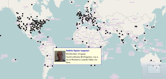
A sample map showing the location of some of my Twitter followers  in early June 2012 (those that shared their location info at least)

Data Visualization Using Charts

While there are many fascinating types of visualizations, in this post I'm mostly concerned with charts-based data visualizations. Charts are quite popular because they are easy to understand and can effectively help visualize hundreds or thousands of data points, millions even. Let's consider common charting scenarios:

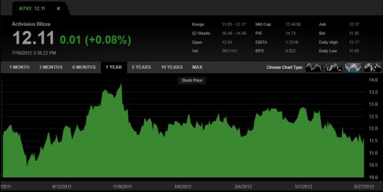
  • Stock price valuation over time during trading hours (line or area chart)

  • Budget allocation by company departments (pie chart)
  • Sales figures by product by quarter


All these charts have something in common: they are two-dimensional, i.e. they show data plotted against 2 axes, such as price over time, satisfaction level by product, sales by quarter, etc. What happens when you need to take a third axis of data into consideration, such as:

  • Cloud cover by geographic region throughout the day
  • Product Sales vs. Customer Satisfaction on a weekly basis
  • Smartphone adoption by country over time


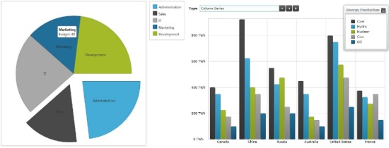
There are exceptions, but when 3 axes of data are in play, time is most often one of them. When representing 2-dimensional data against two or three snapshots or “time stamps" (e.g. this year's sales by product vs. the last two years), we can solve this problem by simply plotting multiple series on the same chart, as illustrated below:


If you need to plot data against a wide range on the third axis, adding dozens or hundreds of series would just make the chart unreadable in the end. Three-dimensional charting is another possibility but save for a few niche scenarios, 3D charts are typically hard to read and remain confined to the realm of fancy marketing presentations only.

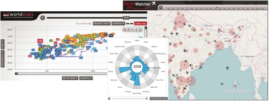
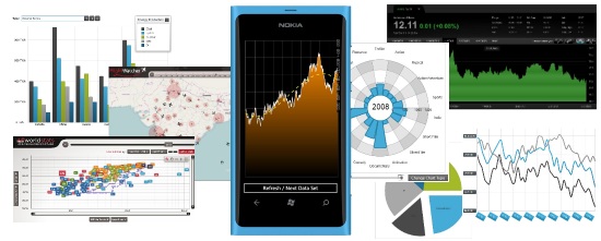
Since time is a linear concept we humans understand all too well, time can be used to cycle through multiple sets of data by "playing" through the sequence, just like we can play through a movie as a sequence if images. The following are examples of three-dimensional data visualizations where the Infragistics Motion Framework is used to play through the third time axis to observe data variations and shifts:


Plotting Data in Motion Using NetAdvantage for Windows Phone, xamDataChart and the Infragistics Motion Framework

The sample I'll walk you through below is based on the xamDataChart control in NetAdvantage for Windows Phone by Infragistics. The xamDataChart control is an enterprise-class charting control that supports 39 chart series types, 13 trend lines, 30+ financial indicators, composite charts with multiple series and the ability to plot hundreds of thousands of data points, even millions. You can find more details on the NetAdvantage for Windows Phone product page here, and you can also download a fully-supported 30-day evaluation version for free here.

The main feature of the xamDataChart that enables the scenario presented here is the Infragistics Motion Framework, which is a powerful data animation engine that can create smooth transitions between data sets. Using the Motion Framework, you can create charts against two axes of data and "play" through the third axis. The Motion Framework then creates smooth animated transitions as the data points, lines, areas, shapes or curves shift from one position to another, resulting in a fluid data visualization experience.

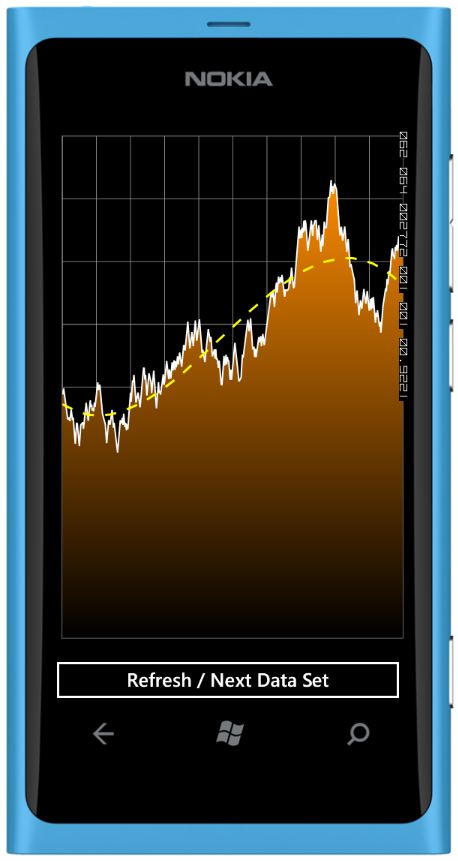
Click the embedded video image below to see the final result of this sample in action directly on YouTube:

WPDVMFYouTube

Building the Windows Phone Motion Framework Chart Sample

Let’s get started and see how you can easily build this in Visual Studio. Create a new Windows Phone 7.1 Application project in Visual Studio 2010.

Drag the xamDataChart to your MainPage.xaml, or you can manually add the following assembly references first:

  • InfragisticsWP7.v12.1
  • InfragisticsWP7.Controls.Charts.XamDataChart.v12.1
  • InfragisticsWP7.DataVisualization.v12.1


Next, add namespace declarations in your XAML header:

Code Snippet - Namespaces
  1. xmlns:igChart="clr-namespace:Infragistics.Controls.Charts;assembly=InfragisticsWP7.Controls.Charts.XamDataChart.v12.1"
  2. xmlns:local="clr-namespace:TestMotionFrameworkWP"

Then add the XAML markup within a simple Grid element to configure the chart, axes, area series, and trend line, as well as a button at the bottom:

Code Snippet - XAML UI Chart
  1. <igChart:XamDataChart x:Name="theChart">
  2.     <igChart:XamDataChart.Axes>
  3.         <igChart:NumericYAxis x:Name="yAxis"
  4.            MinimumValue="0" MaximumValue="40"/>
  5.         <igChart:CategoryXAxis x:Name="xAxis"
  6.            ItemsSource="{StaticResource data}"
  7.            Label="{}{Label}"/>
  8.     igChart:XamDataChart.Axes>
  9.     <igChart:XamDataChart.Series>
  10.         <igChart:AreaSeries
  11.        x:Name="series"
  12.        ItemsSource="{StaticResource data}"
  13.        XAxis="{Binding ElementName=xAxis}"
  14.        YAxis="{Binding ElementName=yAxis}"
  15.        Outline="White"
  16.        Thickness="2"
  17.        TrendLineType="CubicFit"
  18.        TrendLineBrush="Yellow"
  19.        TrendLineDashArray="5"
  20.        TrendLineThickness="3"
  21.        MarkerType="None"
  22.        ValueMemberPath="Value"
  23.        TransitionDuration="0:00:01">
  24.             <igChart:AreaSeries.Brush>
  25.                 <LinearGradientBrush StartPoint="0,0"
  26.                    EndPoint="0,1" Opacity="1.0"
  27.                    ColorInterpolationMode="SRgbLinearInterpolation">
  28.                     <GradientStop Offset="0" Color="DarkOrange"/>
  29.                     <GradientStop Offset="1" Color="Black"/>
  30.                 LinearGradientBrush>
  31.             igChart:AreaSeries.Brush>
  32.         igChart:AreaSeries>
  33.     igChart:XamDataChart.Series>
  34. igChart:XamDataChart>
  35.  
  36. <Button x:Name="refresh" Content="Refresh / Next Data Set"
  37.        Click="refresh_Click" Grid.Row="1">Button>

Some notes about the XAML code above:

  • The chart has 2 axis declarations, X & Y. The Y axis has a range of 0 to 40, while the X axis is driven by the data resource, which is an instance of the TestData(see declarations below).
  • The chart displays a single Areaseries, without any markers. the xamDataCharts supports multiple series to create advanced composite charts.
  • The area uses a gradient brush from Black to DarkOrange, which is defined as a child element of the AreaSeries.
  • Note how the yellow trend line is defined at the series level.
  • Note the TransitionDurationproperty which is used to tell the Motion Framework how long to animate the data when the dataset is refreshed.
  • A Button is also included to allow the user to refresh the data.


Code Snippet - XAML Data
  1. <phone:PhoneApplicationPage.Resources>
  2.     <local:TestData x:Key="data" />
  3. phone:PhoneApplicationPage.Resources>


Let’s now define the TestData class, which is used to generate random data within a preset range:

Code Snippet - TestData Class
  1. public class TestData
  2.     : ObservableCollection<TestDataItem>
  3. {
  4.     private Random _rand = new Random();
  5.  
  6.     public TestData()
  7.     {
  8.         for (var i = 0; i < 500; i++)
  9.         {
  10.             this.Add(new TestDataItem() { Label = i.ToString(), Value = 0 });
  11.         }
  12.  
  13.         RefreshValues();
  14.     }
  15.  
  16.     public void RefreshValues()
  17.     {
  18.         double curr = 20.0;
  19.  
  20.         for (var i = 0; i < Count; i++)
  21.         {
  22.             if (_rand.NextDouble() > .5)
  23.             {
  24.                 curr += _rand.NextDouble();
  25.             }
  26.             else
  27.             {
  28.                 curr -= _rand.NextDouble();
  29.             }
  30.  
  31.             if (curr < 0)
  32.             {
  33.                 curr = 0;
  34.                 curr += _rand.NextDouble();
  35.             }
  36.  
  37.             if (curr > 40)
  38.             {
  39.                 curr = 40;
  40.                 curr -= _rand.NextDouble();
  41.             }
  42.  
  43.             this[i] = new TestDataItem() { Label = i.ToString(), Value = curr };
  44.         }
  45.     }
  46. }
  47.  
  48. public class TestDataItem
  49. {
  50.     public string Label { get; set; }
  51.     public double Value { get; set; }
  52. }


About the TestData class:

  • The TestDataclass contains 500 randomly generated data points.
  • Each data point is generated by adding or subtracting a random value between 0.0 and 1.0 to/from the previous value. This insures the linear data is volatile enough while still producing consistent trends.
  • Since the TestData class is bound directly in the XAML markup, you’ll see the randomly generated area series displayed within the designer in Visual Studio.

That’s it! You’re done. Simply run the application and tap the button to refresh the data, putting the Motion Framework in action. As you refresh the data, the new graph is not plotted immediately, instead, the Motion Framework creates a smooth transition to show the data shift from the origin data to the destination data. The trend line gets updated and animated as well, providing the user with an accurate simulation of the change in trends.

You might notice some color banding in the Black-to-Orange gradient in the area series. That’s because Windows Phone uses 16-bit colors by default. You can switch to 32-bit colors by setting BitsPerPixel="32" property within the element in the WMAppManifest.xml file (you can insert it right after the Publisher property. Be aware that not all Windows Phone devices support 32-bit colors, and even if they do, the graphics performance might be degraded in 32-bit color mode. That’s why it’s recommended to play it safe and use the default 16-bit colors.

Click here to download the complete Visual Studio solution and source code covered in this post.

Motion Framework on Other Platforms

Note that in this post I used Windows Phone as my platform of choice to illustrate my example, but you could easily reproduce these techniques on other mobile platforms like iOS or in HTML5 using our charts and Motion Framework in NetAdvantage for iOS and NetAdvantage for jQuery. These three products are now available as a bundled called MobileAdvantage. The same applies on the desktop with the xamDataChart in NetAdvantage for WPF or Silverlight.

Summary

Charting three-dimensional data using controllable animations can be quite a powerful data visualization technique, allowing you to easily tell the story of your data and facilitate its assimilation by your users. Mobile applications can greatly benefit from this practice given how complex data sets can easily be navigated through on smaller screens. The Infragistics Motion Framework built within the xamDataChart in MobileNetAdvantageis the perfect tool to very quickly animate such visualizations with very little code.

Do you have data that needs to be visualized on mobile charts? How did you deal with data sets that required a third axis? Do you use 3D charts? Post your comments here or contact me on Twitter at @ActiveNick.

SharePlus + SharePoint: The Secure Dropbox Replacement

$
0
0

DropBox is in the news again, with major questions around the security of the application.  I wanted to re-post this blog that I published originally for the SharePoint Conference in Australia in March.

SharePlus - The Trusted, Secure & Native Mobile Client for SharePoint

Working with enterprise customers who have massive investments in secure SharePoint infrastructure, I've been involved in meetings where the security issues around cloud-based document sharing applications like Dropbox or even Live Mesh come up. Corporate data is all about security, and pretty much every corporate IT department has data security at the top of their minds - all of the time. Which is where the easy access to applications like Dropbox on mobile devices can wreak havoc on an existing security infrastructure – anyone with Internet access can install Dropbox, copy files to it, and in turn sync with any of their personal computers and mobiles devices that live outside of the corporate firewall. Next thing you know, they are sharing a folder with a customer because the email system doesn't allow large files as attachments, so in turn, not only are files in an unsecure cloud storage that corporate IT has no controls over (and most of the times no knowledge of its use), but the unknowing end user has involved customers with this potential security gap.

A seemingly easy route to avoid this potential security headache is to give your users a secure, familiar and easy to use mobile solution to access corporate data: SharePoint Personal folders + Infragistics SharePlus. It's super-simple to add a SharePoint documents library as a shared folder in Windows Explorer allowing easy drag & drop of files, and it's even easier to securely access and synchronizes SharePoint sites with SharePlus.

So the argument for using SharePoint as a Dropbox replacement is hardly an argument – your corporate data is already secure on SharePoint, so why not make that secure access ubiquitous across corporate and personal devices? You might say "well, that sounds easy, but even with SharePlus, documents can be synced and stored locally with an iPad, so my content is still in the open". That is partially true, however, with SharePlus under the control of corporate IT, you have multiple security options:

  • Windows & Forms Based Authentication 
  • Microsoft ISA Server & Forefront Authentication 
  • Client Certificate Authentication, HTTPS SSL Self Signed Certificates 
  • Hardware based encryption of locally stored SharePoint files 
  • Centralized configuration management – including top level and sub-level site access 
  • Passcode lock at application level – with reset option after multiple attempts 
  • Multi-factor authentication with challenge / response questions like 'where were you born' 
  • Integration with 3rd party security and encryption tools 
  • Most SharePoint infrastructure is behind a firewall as well, so even better is that SharePlus access to documents needs to happen via a secure VPN tunnel in a firewall configuration 


I am not implying that a silver-bullet security solution exists, but there are plenty of options, which also happen to integrate nicely with your current IT infrastructure – no need to build secondary infrastructure to enable secure access to corporate documents. There will be IT folks that say there is a silver-bullet: don't allow mobile device access to corporate data. Unfortunately, this argument will never win. Tablets and phones are everywhere; every executive has an iPad2 and is waiting for his new iPad3. You can't stop the move to mobility and tablets. It's the future and it's happening now. Eventually the issues of secure access to documents on mobile devices will have to be addressed by every security czar in every corporation.

SharePlus + SharePoint solution is a solution that works for you.

Read this post for a complete technical whitepaper on how SharePlus handles security and how you can ensure your data is protected.

Optimizing XamDataGrid Scrolling Performance Using Simplified Templates

$
0
0

The XamDataGrid control is a highly-functional high-performance grid control that’s a part of the NetAdvantage for WPF (samples), along with other controls for line of business applications, such as editors, docking, ribbon, scheduler, and others. These controls have been used in a number of industries to build richly-styled and highly-functional applications. However, users are using increasing quantities of data, which puts strain on the performance of highly-customizable UIs. In this blog post, I’ll present one approach to improving performance of the XamDataGrid to help you achieve up to  20% decrease in scrolling speed. For additional guidance on XamDataGrid performance optimization, please see this blogpost.

In this blog post I will present simplified cell templates for XamDataGrid, and illustrate how they can significantly improve scrolling performance. Please download the sample project – it enables you to switch between the different cell templates of a XamDataGrid, and allows you to benchmark the time it takes to scroll through the dataset. Please remember to unblock the ZIP archive before extracting it. The project is built using Visual Studio 2010 and .NET Framework 4. It uses the latest available service release of the 12.1 WPF product, so you can build and run it without any additional downloads. Fully-functional free 30-day trial of the NetAdvantage for WPF product, which includes the XamDataGrid is available.

Please see below a screenshot of the XamDataGrid with the default cell templates, together with the time it takes for the grid to page through the entire dataset.


The above screenshot shows the default cell value template you get in the XamDataGrid cells – editors enabling your user to easily edit cell values for the corresponding data types. Each of these editors is made up of UIElements which need to be managed by the CLR.  The more sophisticated an editor, the more UIElements need to be managed, and the higher the price we pay in terms of performance.  With this in mind, we can improve XamDataGrid scrolling performance by using simpler ways to present a value, thus cutting down on the number of UIElements to be managed by the CLR.

CellValuePresenter Templates

A XamNumericEditor or XamCurrencyEditor uses 7 elements to display a single value because the user can edit the value using spin buttons. You can see the element tree below:


However, very often, especially when dealing with large volumes or rapidly updating data, most of the data shown is not editable. Setting the AllowEdit property in the FieldSettings doesn’t use a simpler template for presenting the value, just disables the editor and doesn’t improve performance.  When we’re dealing with read-only data, we only need to present the data as a read-only label, instead of an editor. This will help us cut down the number of UIElements and hence improve performance. The simplest possible template is one where we use a single TextBlock element to present a value with a Border element, so we can have border and background styling. You can see the element tree of this template below:


You can see that a default CellValuePresenter is composed of 12 elements, while a slimmed-down one only has 3 elements. This is a 4-fold decrease in the number of elements per cell. The more cells you have in view, the bigger the total number of UIElements saved by using simple read-only styles. The more UIElements saved, the more performance will improve.

Performance Comparison

You can easily see the effect using slimmed down templates has on performance. The sample is a large dataset, with more than 50 columns, and 2000 rows. This data is grouped using three columns to provide a realistic scrolling scenario where group header rows are also present along with regular data rows. To test performance run the sample application, click the Expand all button, then click the Benchmark scrolling button. This will page through the entire dataset, and report the time that took on the top-right for the current CellValuePresenter template. You can change the CellValuePresenter template using the radio buttons on the top-left side. Go through the different templates (normal, read-only, grid lines read-only) and click the Benchmark scrolling button. The results will vary depending on the number of cells shown, with a smaller grid shown leading to better performance.

Using the window size as provided by the sample (1024x768), we had the following times:

Normal template: 12.561s

Read-only: 9.502s

Grid lines read-only: 10.29s

You may get different results due to the hardware you’re running the sample on, but you’ll certainly see about a 20% improvement in scrolling time when using read-only templates versus standard ones.

Editor recycling

When we changed the CellValuePresenter to use a simple TextBlock, it doesn’t contain a ValueEditor anymore. This prevents the XamDataGrid from determining if it should instantiate a cell if it isn’t in view (horizontally scrolled out of view). Since this uninitialized cell may affect the height of the record, the XamDataGrid lacking any other information will hydrate it. However, setting the ForceCellVirtualization to true (in the XAML code), we tell the XamDataGrid that the cell is safe to be virtualized. Once we’ve set this property to true, this lets us benefit from the slimmer CellValuePresenter.

Note: Setting ForceCellVirtualization to true doesn’t guarantee that the XamDataGrid will re-use the CellValuePresenter for another field’s cell when the user scrolls horizontally. If the data types, or styles don’t match, the XamDataGrid won’t re-use it for that field.

Implications

Using a slimmer CellValuePresenter template can impact your existing codebase in two ways – styling and value formatting.

You may need to change styles you’re using to target the elements of the slimmed down templates instead of the standard CellValuePresenter template elements. The read-only styles provided in this sample (both the regular and grid-lines one) include a border element which can be used to set the background and border of the cell. Depending on the richness you require, you may add additional elements you’d like to target using your styles.

The TextBlock doesn’t format the cell values the way a XamNumericEditor or XamCurrencyEditor can. With these full-fledged editors you have complete control over value formatting, with currency symbols, thousand separators and decimal places as examples. When using a simpler template with a TextBlock, you’ll need to format values as strings before you provide them to the UI layer, because without an editor in place they won't get formatted automatically.

Summary

The XamDataGrid control is the mainstay of line of business applications. Its flexibility, feature-richness, stylability, and performance have ensured its wide use in WPF applications in a variety of sectors with demanding requirements. In this blogpost, I described one way to enhance its performance in specific when dealing with read-only data. This sample also gives you the ability to easily compare the scrolling performance with different XamDataGrid settings because of its ready-to-use automatic scrolling and timing capabilities. In case you’d like to improve scrolling speed, armed with this sample and the guidance above, you will be able to customize the XamDataGrid to get the maximum level of performance and improve the experience your users have when using your application.

HTML5 Report Viewer – Taking your Reports further!

$
0
0

The NetAdvantage Reporting began as a tool that was meant to overcome limitations – namely, such of existing solutions heavily relying on Windows Forms designer and naturally restricting the area of usability among other things. It became the industry's first XAML based tool with plenty of functionality and flexibility letting you easily design report WPF, Silverlight and Windows Forms based applications. With the last release another step was taken to overcome limitations with the

New HTML5 Report Viewer

Now you can enjoy the awesome Reporting integration with Visual Studio and all the benefits – intuitive designer, charting, expressions and rich data connectivity. And once happy with the results you can deliver them to a broad range of devices and platforms!

This viewer is jQuery based and as such relying on all the well-know combination of technologies (HTML5/JavaScript/CSS). This means web or even desktop applications delivered on desktop and mobile devices. In fact the viewer is optimized for Windows 7 and 8 as well as iOS devices. As you’d expect touch gesture support is available with swipe between pages, tap to show/hide the toolbars, pinch and spread to control zoom or double tap to switch between fit-to-page and 100% zoom and more.

The HTML5 Report Viewer being a jQuery based widget also provide with a rich client experience and the ability to apply styles using the standard jQuery UI CSS Framework themes or create one of your own via the Themeroller. That also means that if you are already using a theme in your application the viewer will fit in nicely.

Using the Infragistics HTML5 Viewer

The HTML5 viewer, like other jQuery controls, requires a web application of your choosing and some resources. The latter you will find in the Reporting installation folder:

NetAdvantage Reporting HTML5 Viewer resources folder

You can either copy the contents of that folder in your application (or any other way of hosting it on your server) or you could use the Infragistics CDN.

Designing the report

Since this is unrelated to the viewer, the experience with the report designer is pretty much the same as with others. I would suggest the best place to start is our documentation where you can find complete information about the designer, helpful ‘How to’ sections and complete walkthroughs for common tasks.

As always you start by creating a Class Library project and adding Infragistics Report item to it. This gives you the design surface along with report data source explorer window and custom toolbar items. From the data explorer (or by clicking the report surface cue) you can add a data connection. For demo purposes we would use the Northwind sample database and the dialogs will provide you with the standard options to select the tables you want, write SQL query or create it with the SQL Builder. I used the last in order to create a hierarchical data source that takes elements from the Categories Table and joins them with the sales information from the Sales by Category View and adds the product ID to that from the Products Table. The resulting query looks like this:

 1: SELECT    Categories.CategoryID, Categories.CategoryName, Categories.Description, Categories.Picture, [Sales by Category].CategoryID AS Cat, 
 2:                 [Sales by Category].ProductName, [Sales by Category].ProductSales, Products.ProductID
 3: FROM    Categories INNER JOIN
 4:                 [Sales by Category] ON Categories.CategoryID = [Sales by Category].CategoryID INNER JOIN
 5:                 Products ON [Sales by Category].ProductName = Products.ProductName

In the designer we would use a group where the header would contain the category name and description and the body will show the products’ sales for that table as a chart and a table. Here’s how the finished report looks like in the designer:

NetAdvantage Reporting designer surface with groups with chart and table setup.

The Web Application

To use the HTML5 viewer you would need to host it and the resources described above(copy the ‘js’ folder to your project). One you have that add a reference to the report class library project. Also using the Add > New Item.. menu choose Infragistics > Reporting > Infragistics Report Service and add that to your project as well. Doing that will add all the required references as well register http handler for the resources, service endpoints and a few other settings. The service will be the main star of your reporting solution and will create reports, manage sessions and provide recourses for the viewer. And you don’t need to write any code for that!

You would need a connection to the data source (SQL Express server in this case) from your web project. The report you designed has added the required connection string to the Class Library project’s ‘app.config’ file, so copy that into the ‘web.config’ of your web project. This is how it should look like:

  1.   <add name="ReportingClassLibrary.Properties.Settings.sqlDataSource1"
  2.       connectionString="Data Source=.\SQLExpress;Initial Catalog=Northwind;Integrated Security=True"
  3.       providerName="System.Data.SqlClient" />

and it goes under the “configuration > connectionStrings” section.

At this point you should have a working Reporting service and the report itself and all you have to do is display it. You need to reference the resources and you can use the Infragistics Loader to handle most of that for you (yes, it comes with the reporting installation too). Here’s the resources in the MVC project I’m using:

  1. <script src="@Url.Content("~/Scripts/jquery-1.7.2.min.js")" type="text/javascript">script>
  2. <script src="@Url.Content("~/Scripts/jquery-ui-1.8.20.min.js")" type="text/javascript">script>
  3. <script src="@Url.Content("~/Scripts/modernizr-2.5.3.js")" type="text/javascript">script>
  4. <script src="@Url.Content("~/js/scripts/infragistics.loader.js")" type="text/javascript" >script>

Then you have to add the container DIV element and the initialization scripts to your page ( be it a simple HTML file, your ASPX page or the CSHTML view):

  1. <div id="report">div>
  1. <script type="text/javascript">
  2.     $.ig.loader({
  3.         scriptPath: "@Url.Content("~/js/scripts/")",
  4.         cssPath: "@Url.Content("~/js/css/")",
  5.         resources: "igReportViewer"
  6.     });
  7.  
  8.      $.ig.loader(function () {
  9.         $("#report").igReportViewer({
  10.             height: 600,
  11.             renderSettings: {
  12.                 definitionUri: 'ReportingClassLibrary;component/Report.igr',
  13.                 serviceEndpointUri: "ReportService.svc/ajaxAddress/"
  14.             }
  15.         });
  16.     });
  17. script>

And that’s all, really. Although you might have to add one small adjustment if you are using MVC and it is to prevent requests for resources from being handled by anything else but the report service. To do that in the Global.asax.cs file add the following line to the RegisterRoutes method:

  1. routes.Ignore("{*allReportingResources}", new { allReportingResources = @".*\.igrResource(/.*)?" });

Results

With barely any coding required out-of-the-box you get plenty of functionality. The server side will take care of generating the reports and providing resources, the viewer will provide a nice interface to that functionality and will display the reports and handle interactions:

NetAdvantage Reporting HTML5 Viewer with active toolbar

The toolbar offers pretty much the same the same capabilities you can find in other viewers – exporting to PDF, XPS and two versions of Excel format.

NetAdvantage Reporting HTML5 Viewer available exporting options

You also get a print functionality that would launch printing dialogs (those are browser specific) and since the Reporting HTML Viewer uses Modernizr it would detect when you can’t use that feature on the current browser and remove the button. The zoom feature offers a slider controlled scale along with two presets – fit to page (will fit the entire report page in the viewer) and fit to width (will match the with of the report to that of the viewer).

Touch!

As mentioned before the viewer is optimized for touch devices and offers gesture support and specialized touch elements such as the left and right side of the viewer surface that provide page navigation when tapped. Already mentioned some and in our help you can find a full list of the gestures usable with the HTML5 Report viewer.

Customization

Being a jQuery widget the report viewer offers a full-blown API. That means you get a fair bit of control over the client – you get options that help you set up the viewer the way you want, including an option to delay the rendering of the report itself (by disabling the auto render). You also get pretty much all the toolbar functionality exposed in methods and a property to control if toolbar should be available. That in turn means you can embed the viewer, disable the toolbar and add external controls using those methods. You also get more than a dozen events to always know and have control on what’s going on.

The methods include two methods that are not by default found in the toolbar, so to show you those here’s an improvised additional page navigation for the report viewer that can be just perfect for a touch device (you can switch pages with tap/swipe already) and adding shortcuts to first/last page is just an extra convenience:

  1. <div id="nav" style="display:inline-block; height:40px">
  2.     <a onclick="first()" style="float:left"><- go="" to="" the="" first="" page="" span="" style="color:#0000ff" data-mce-style="color: #0000ff;">a>
  3.     <a onclick="last()" style="float:left; margin-left:10px;">Go to the last page -> a>
  4.     <p id="pageInfo">p>
  5. div>

And the script that makes this tick:

  1. <script type="text/javascript">
  2.     function first() {
  3.         $("#report").igReportViewer("moveToFirstPage");
  4.     }
  5.     function last() {
  6.         $("#report").igReportViewer("moveToLastPage");
  7.     }
  8.     //Delegate
  9.     $(document).delegate("#report", "currentPageChanged", function (evt, args) {
  10.         $("#pageInfo").text("Current page: " + args.newValue);
  11.     });
  12. script>

Style

Also part of being jQuery widget (and I already mentioned this) is being compliant with the whole styling framework and other default and custom themes. For example in the demo I have have downloaded the Excite-Bike theme from jQuery UI ThemeRoller’s site. What you can do with it is add the reference manually, OR you can do this trick – add the theme files to the themes folder in the Reporting recourses folder and rename the jquery.ui.custom.css to infragistics.theme.css:

NetAdvantage Reporting HTML5 Viewer resources forlder with another theme added.

That is the default name the Loader looks for and now you can ask for the theme to be loaded by adding the last line:

  1. $.ig.loader({
  2.     scriptPath: "@Url.Content("~/js/scripts/")",
  3.     cssPath: "@Url.Content("~/js/css/")",
  4.     resources: "igReportViewer",
  5.     theme: "excite-bike"
  6. });

And the result:

NetAdvantage Reporting HTML5 Viewer with standard jQuery UI Excite-Bike theme applied

Conclusion

The HTML5 Viewer for NetAdvantage Reporting is here to help you deliver reports on a wide range of devices and platforms. The viewer builds on the solid base of jQuery UI and CSS and all the benefits such as client side API and styling that come with them. It is as easy to use as the rest of the reporting toolkit and at the same time offers enough knobs to tweak if you feel customization is required.

This viewer is also a joy to use on mobile devices with all the common gestures at your disposal – smooth scaling with pinch/spread, swiping to change pages, panning, dedicated area for tap-navigation.

Using the Infragistics HTML Report Viewer with web applications you now have the option to create reporting solutions using native environments or the universal web and truly take that awesome Reporting functionality further to different platforms and take it with you on the move.

Download the sample ASP.NET MVC project and pay a visit to our online samples for more reporting awesomeness. As always, you can follow us on Twitter @DamyanPetev and @Infragistics and stay in touch on Facebook, Google+ and LinkedIn!

Touch Support in NetAdvantage for ASP.NET 12.1

$
0
0

We , the people of today , have mobility rooted deeply into our lives. We are constantly on the move , be it due to work routines or leisure activities. We are also used to being surrounded by high-tech gadgetry – it helps us in our everyday tasks and brings entertainment right at our fingertips , literally. Along came a new way of interacting with devices: enter touch screen. It brought the traditional way of “pointing at” and “touching” things we desire back to a field where peripheral devices were a must. Surely , “mobile” is the new hype and it has settled in for a long ride.

In compliance with this , the 12.1 release of NetAdvantage for ASP.NET brings touch support to the table for every control in the package ( of course , this means the controls that can be interacted with ). As of 12.1 , you should expect the controls to behave very similarly ( sometimes even identically ) on a PC and a mobile device with touch screen.


What this means for you as a developer is that all of your future ASP.NET projects will be tablet-ready , with the controls being able to handle all the corresponding touch device events. While we’re on this subject , I’ll elaborate on what issues you will run into ( and why ) when giving your controls a test drive under a touch environment.

Drag & Drop – there isn’t any. This is not good news , not at all , but there is a good explanation for this one. The default action of a touch device when subjected to a hold-and-move motion ( which is exactly how you would expect to perform a drag and drop on such a device ) is to scroll in the moved direction.

The lack of drag & drop means you’re left without column reordering in the Data Grid and Hierarchical Data Grid – well , it’s there but it won’t work in the conventional way. You will be able to utilize this behavior using the code behind. The same applies for the group by feature. No drag & drop also means you would be better off not to count on the splitter as it is a control that ( unless used for collapsing and expanding page segments ) is entirely reliant on this feature.

Selections – be aware that when working with controls that support multiple selections , this will not function properly on a touch device. To understand why this is so , let’s think about how we select a group of things on a computer.

  • Drawing a selection rectangle over the desired items – this breaks down to us clicking and holding at the top left point of the desired rectangle and dragging the pointer towards the bottom right point. As we’ve covered in the section above that is about drag & drop , when we try to repeat the same actions on a touch device we will end up with a scroll gesture being performed.
  • Using the shift and control key modifiers. The shift key lets us specify a from-to range of items whereas control is for a finer selection of multiple items. Well , the issue here is obvious – having these two keys on a device with a touch screen would kill the purpose of a touch screen.

WebVideoPlayer – it’s worth mentioning that the video player will try to fall back to the default device video player if the Modernizr Javascript library is undefined on your page. If , however , you have the library loaded up ( it’s a requirement for the video player to be rendered correctly ) then you will get the WebVideoPlayer , themed accordingly and with all the options coming with it.


With these differences aside , the controls should be performing in similar matter as when interacted with on a PC. Why don’t you try it out and head over to the NetAdvantage for ASP.NET samples page on your tablet and check out how specific controls work.

Changing Reports’ Connection Strings at Run-Time

$
0
0

Still on the subject of creating awesome reports, after sharing the goodness of using HTML5 Report Viewer, it’s only fair to mention another handy feature that came along with the last release. The NetAdvantage Reporting is designed to be extensible by leveraging Managed Extensibility Framework(MEF). That allows for great flexibility via run-time customization and the Reporting is already exploiting some of those extensibility points with run-time data source (sample here)  and URI resolving (sample here) providers. And I’m sure we’ll be seeing more of those in the future , focusing on the latest changes so far – one more provider is now available:

Database Connection Provider

Or simply put – the connection string switch tool. What it allows you to do is change the connection string in runtime – this is useful if you need a report that can swap between two different data endpoint setting sets. This can include different databases on the same server or on different servers; pretty much anything the connection string includes as options, integrated or SQL authorization and even changing between encrypted and non-encrypted connection whether the reports are accessed from the domain or  outside and so on . Come to think of it changing tables provides plenty of functionality alone – swapping tables with same design and different data and our samples show what is probably the best usage of such feature:

Sample Reporting Solution changing connection string to show localized versions of the data.

A single report that can handle out the same data localized by having the database doubled in different languages ()

Then you also have the cases of separate databases containing similar data like people profile and PTO-s, but from two different organizations with the same accounting company. In such a case the said accounting company could use software with a unified report design and easily change between clients’ data on the fly.

Then again I came up with one more possible use for this feature – BIG DATA. Take AdventureWorks () Order Details in Purchasing. The whole 8800+ of them. I made a Report using that and while it handled it brilliantly (first page loads instantaneously and then you just see the page count growing, responsive UI and all), but even though I have my first 100 pages of report in no time with that much data it takes a while to get up to over a thousand report pages. If you are like me and you don’t like loading as much and there is a way to split the data, then the connection string provider is your new friend – you can group your data in meaningful pieces and then consume it in pieces.

This feature is for the most part available for all Reporting platforms, however, you may notice the documentation mentioning a limitation with Silverlight (due to lack of SqlConnection). That only affects report cases where client-side rendering is used and it is completely usable with server side rendering. Since the official sample above uses server rendering and HTML5 Viewer, the Silverlight version is an interesting one to see along with a desktop demo as well and that’s coming right up.

Walkthrough

DATA

So for this example the Order Details of Purchasing have been chopped down into more manageable pieces – in this case the first and second 500 rows, based on ‘PurchaseOrderDetailID’. Of course, that isn’t what you’re supposed to do – in a real world scenario the data would be split based on say different sales regions, quarters, months or any other way you can meaningfully split reporting data into smaller pieces. Furthermore, the whole point of making reports can be digesting the huge data easily, so this scenario is for when the ready-to-digest report data is too big as well and a way exists to split it without hurting the report itself. Here’s an illustration of how the data looks like in those databases (the new ones only contain the table to be used):

 A comparison between the whole table and the two splits of Purchasing’s Order Details

The idea as explained is to have two separate databases with the same schema for the used table – no matter for which of the scenarios described so far.

THE REPORT

Designing the report doesn’t really require too much effort to accommodate this feature – you do need to design it against one of the intended data sources, but that’s ok since the schemas are presumably the same and the data connection string will get evaluated before loading data from the default (the one you designed with) source is used.

The Report Designer inside Visual Studio with the layout and the Data Explorer showing the additional parameter

One important thing to note is that there is a parameter added to the report. This will be used to hold the setting based on which the data connection string is picked. Now if you have looked into the online sample you will notice (as it is a web application) uses session user identity. That goes to show that, while using a parameter is the intended and easiest way without the need for additional coding, it is by far not limiting – whatever you have access to in the respective platform can be used instead. In this case however, the idea is to be able to control this in some way in code and also do that in a non-web environment. For that reason the parameter is used, it is hidden – as the user is not to be bothered to enter a value on every load – and it is nullable so code doesn’t need to provide/handle default value as well:

Report Parameter's options set to allow for null/Nothing values and hide the parameter from the end-user

THE PROVIDER

In the same project as the report (be it the class library or in the case of Win Forms/ WPF you can have all in one place) we need to implement the data connection provider. Like the others it’s an Interface(IReportDbConnectionProvider) you have to implement. Not to worry, of course, there’s a template ready for you to add:

Infragistics Report Database Connection provider template available in Visual Studio.

Then again this particular interface only defines a single method, so not too much work there. For the GetConnection, the Reporting Engine will pass the name of the data source (SqlDataSource1 from above, for example) and the report’s collection of parameters. For the MEF-based extensibility to work the provider needs to be marked with the ReportDbConnectionExport attribute and provide a search patter. Based on that pattern the engine will match providers and reports. Not the template does this for you, except the fact that the default search pattern in a wildcard and will match all reports – so if you have more than one it’s good to edit that one out. Here’s the complete snippet on that one:

  1. [ReportDbConnectionExport(ReportSearchPattern = "Report1")]
  2. public class ReportDbConnectionProvider1 : IReportDbConnectionProvider
  3. {
  4.     public DbConnection GetConnection(string name, IDictionary<string, ParameterValue> reportParameters)
  5.     {
  6.         if (reportParameters.ContainsKey("Option") && reportParameters["Option"].Value != null)
  7.         {
  8.             if (reportParameters["Option"].Value.ToString() == "Part1")
  9.             {
  10.                 return new SqlConnection(@"Data Source=.\sqlexpress;Initial Catalog=advWrksP1;Integrated Security=True");
  11.             }
  12.             if (reportParameters["Option"].Value.ToString() == "Part2")
  13.             {
  14.                 return new SqlConnection(@"Data Source=.\sqlexpress;Initial Catalog=advWrksP2;Integrated Security=True");
  15.             }
  16.         }
  17.         // will fall back to the default (designer) connection
  18.         return null;
  19.     }
  20. }

Report1 is obviously the name of the report file and the connection strings are to the two databases shown above. As explained, you can provide all sorts of strings here.

THE SILVERLIGHT SOLUTION

NetAdvantage Reporting is nicely integrated with Visual Studio, so there really isn’t much work to be done. The designer makes creating the report structure very easy and along with adding the report to the solution it will display a dialog asking if you want to be able to view this report in Silverlight by adding a Report Service to your Web project. And then all you have to do is add a XamReportViewer to your page and pick an available report:

The XAML version of the easy-to-setup interaction when picking a report for the viewer.

It really is that easy! Of course you could add this manually, the Infragistics namespace ‘xmlns:ig=http://schemas.infragistics.com/xam'l’ and references to the following assemblies:

InfragisticsSL5.Reports.v12.1, InfragisticsSL5.Reports.Client.v12.1, InfragisticsSL5.Models.Presentation.v12.1, InfragisticsSL5.Models.Data.v12.1, InfragisticsSL5.Controls.Reports.v12.1 – all found under Bin in the Reporting installation folder;

are required:

  1. <ig:XamReportViewer Margin="12,35,12,12" Name="xamReportViewer1">
  2.     <ig:XamReportViewer.RenderSettings>
  3.         <ig:ServerRenderSettings DefinitionUri="/ClassLibrary1;component/Report1.igr" ServiceEndpointUri="http://localhost:1221/ReportService1.svc/soapAddress" />
  4.     ig:XamReportViewer.RenderSettings>
  5. ig:XamReportViewer>

In the very same manner ( report and a service in a web application) is how this is done with the HTML sample.

THE DESKTOP SOLUTION

Even though the demo is done in Windows Forms solution, I feel there is no need to create a WPF one as well as the differences are too minor (mostly XAML naming). The approach is very much the same – use the report and provider, add a report viewer to the window, pick that report from the dropdown and enjoy. Again two notes – make sure the report and the provider are in the same project and the app.config either copied over to the project where the report viewer/service is or just the connection string OR you can simple ignore that, as I said the provider will be called first before reverting to defaults and therefore you can return the default connection string there instead of null and ignore the app/web.config part.

THE ACTUAL CHANGE

Finally, you need to set the report parameter at the report viewer level. The Viewers have somewhat different namespaces and mostly identical API-s, say you have 3 buttons this is how the code looks like for the Windows Forms Ultra Win Report Viewer:

  1. private void button1_Click(object sender, EventArgs e)
  2. {
  3.     this.ultraReportViewer1.Parameters.Clear();
  4.     this.ultraReportViewer1.Parameters.Add(new Infragistics.Win.UltraWinReportViewer.Parameter { ParameterName = "Option", ParameterValue = "Part1" });
  5.     this.ultraReportViewer1.RefreshReport();
  6. }
  7.  
  8. private void button2_Click(object sender, EventArgs e)
  9. {
  10.     this.ultraReportViewer1.Parameters.Clear();
  11.     this.ultraReportViewer1.Parameters.Add(new Infragistics.Win.UltraWinReportViewer.Parameter { ParameterName = "Option", ParameterValue = "Part2" });
  12.     this.ultraReportViewer1.RefreshReport();
  13. }
  14.  
  15. private void button3_Click(object sender, EventArgs e)
  16. {
  17.     this.ultraReportViewer1.Parameters.Clear();
  18.     this.ultraReportViewer1.RefreshReport();
  19. }

As for Silverlight/WPF Xam Report Viewer the Parameter type is in a different namespace and the viewer’s method is simply Refresh:

  1. private void Part1_Click(object sender, RoutedEventArgs e)
  2. {
  3.     this.xamReportViewer1.Parameters.Clear();
  4.     this.xamReportViewer1.Parameters.Add(new Infragistics.Controls.Reports.Parameter { ParameterName = "Option", ParameterValue = "Part1" });
  5.     this.xamReportViewer1.Refresh();
  6. }
  7.  
  8. private void Part2_Click(object sender, RoutedEventArgs e)
  9. {
  10.     this.xamReportViewer1.Parameters.Clear();
  11.     this.xamReportViewer1.Parameters.Add(new Infragistics.Controls.Reports.Parameter { ParameterName = "Option", ParameterValue = "Part2" });
  12.     this.xamReportViewer1.Refresh();
  13. }
  14.  
  15. private void Clear_Click(object sender, RoutedEventArgs e)
  16. {
  17.     this.xamReportViewer1.Parameters.Clear();
  18.     this.xamReportViewer1.Refresh();
  19. }

As you can see all you have to do is change the report parameter’s value ( I clear and add every time to skip checks, probably better ways to handle) and refresh the whole report, which causes yet another call to the data connection provider and this time with parameter present a different connection will be returned. And that’s how you change connections in run-time with very little effort.

Wrapping Up

Changing Infragistics Reports Connection Strings at Run-Time is an awesome new feature available for NetAdvantage reporting using Windows Forms, WPF, Silverlight ( server-side rendering) and web application with HTML viewer. There are plenty of situations where changing a connection string can provide functionality even with only considering the actual options the strings have and then considering you can change databases with truly practical applications as a single report handling localized databases, business software generated (such as accounting) databases with identical schema and completely different organizations, regions; if the requirements permit it can be used to reduce the total size of the report by splitting the source or perhaps even change between databases if one goes down and so on! Those are only a few uses and I bet you can come up with your own, so links below can get your started on tinkering a future reporting solution:

First off for the data – the two splits of Purchasing’s Order Details you can find here. Then you have the  Windows Forms demo (this one uses the original AdventureWorks as original source, you can download following the link mentioned ()) and then the Silverlight demo (only using the two databases). Check out the help documentation and pay a visit to our online samples for more reporting awesomeness. As always, you can follow us on Twitter @DamyanPetev and @Infragistics and stay in touch on Facebook, Google+ and LinkedIn!


SharePlus: How to use Client-side Certificates

$
0
0


Introduction

This article will discuss how to use client-side certificates for authentication in SharePlus.  The article is aimed at those who will be administrating SharePlus within an enterprise.

You may deploy your client-side certificates manually, or via an MDM server.  This article focuses on the manual approach.


Steps

Step 1: Copy the client-side certificate to the iPad running SharePlus

Connect your iPad and PC that to the same WiFi network.  Enable WiFi sharing on SharePlus (screen shots below).


Tap on “Local Files” on the home page.

1


Tap the WiFi sharing button.

2


Toggle the Wifi sharing feature on by tapping “Off.”

3

On your PC, open a web browser and navigate to the URL of the SharePlus file share.

4 

6


Click the “Browse” button on the web page and select your client-side certificate from your PC.

7


Click “Submit”

8


Toggle off WiFi sharing by tapping the “On” button.

10


You will see the client-side certificate in your SharePlus local files.

12


Step 2: Associate the client-side certificate with a set of SharePlus credentials


Tap “Edit” on the home page of SharePlus to configure the site that you would like to use the certificate with.

13


14


Tap the expand arrow on the account that you would like to use the certificate with.

15


Turn “Use Certificate” on.

16


Tap “Certificate File” and select your certificate.

17


Save the settings.

19


The next time you connect to your site, your certificate will be used.

What is Metro Design? - Metro Design Series Part 1

$
0
0

One of the hottest topics in the software design world right now is "Metro design". You can't go too far in the Microsoft blogosphere without running into a post talking about Metro design. Given that the Metro design language is used in Windows Phone, Windows 8, on the Xbox and Zune, and on Microsoft's websites, you're going to be hearing a lot about it.  I've even spoken about it at a few conferences (sessions: TECHbash, Philly Code Camp, and soon at ThatConference)  Unfortunately, there's a lot of confusion as to what Metro design is and isn't. There are also a lot of misconceptions about where Metro came from and where it is going in the future. Over the next few blog posts, I hope to alleviate some of these issues and introduce the core concepts that will help you use Metro design effectively. So, what exactly is "Metro"?

Subway

What is Metro?

Metro design is at the heart of Windows Phone 7 and Windows 8 Metro Style Apps. Taking inspirational cues from Bauhaus design, International Typographic Style, and cinematography, Metro design brings an application to life while presenting content clearly and beautifully.

Ok, I know what you're thinking: "that sounds like great marketing material". I understand where you're coming from in thinking that. Let me try again in a more straightforward fashion.  Many of these points will be expanded upon in upcoming posts.  

Inspiration

Metro was inspired by some very well respected design movements, many of which are still in use today.  For instance, International Typographic Style (also knows as Swiss Design) is all around us on road signs and in subways stations and airports.  You see it everyday, you just may not have known it.  I'll elaborate more on the inspirations in Part 2.

Principles

A set of principles help define what makes for good Metro design.  These principles are:

  1. Pride in craftsmanship
  2. Be fast and fluid
  3. Authentically digital
  4. Do more with less
  5. Win as one

I know, again, these sound like marketing speak but I assure you they are not.  They are the foundation upon which you will have success with Metro design.  Each of these will easily require their own post so I'll come back to them later.

Applied Metro Design

Once we understand what Metro design is and how to use it, it will be helpful to see where to use it and how Metro design fits into those areas of the software landscape.  Metro design is similar on all platforms where it is used, but there are different mechanisms available to accomplish some of the ideals.  I'll take a look at Windows 8 Metro Style apps and Windows Phone apps in the posts in this section.

Wrap-up and a look ahead

So, given that intro, it looks like the schedule for this series is as follows:

  1. What is Metro Design?
  2. Metro Design Inspirations
  3. Principles: Pride in craftsmanship
  4. Principles: Be fast and fluid
  5. Principles: Authentically digital
  6. Principles: Do more with less
  7. Principles: Win as one

I look forward to bringing you the rest of this series.  In the meantime, if you have any questions please feel free to comment below or find me on Twitter @brentschooley.

Whats in a name? The fate of "Metro"

$
0
0

I recently kicked off a post series entitled "Metro Design Series" which is going to cover a wide gamut of topics on Windows 8 and Windows Phone design.  Unfortunately, it looks like I'm probably going to have to give these posts a new title.  A tipster provided The Verge with a copy of an internal memo that indicates Microsoft will be rebranding "Metro" and telling employees to refer to apps as "Windows 8 style UI".  I previously commented about the awkward use of the term "Windows 8 Style Apps" during the unveiling of Office 2013 Preview on July 12.  Mary Jo Foley states that the reason for the name change appears to be due to a copyright dispute with a company named Metro AG in Germany, although this has not been confirmed.

Microsoft's Metro statement

What now?

Where do we go from here?  Well, it seems we're in a bit of a waiting pattern.  It is very clear at this point that Microsoft will be replacing "Metro" with something.  What will the new name be? I'm not sure but the best proposal I've seen so far has been "Modern UI" which I commented on here.  As I stated there, I believe "Modern UI" would be an interesting throwback to the Modern design movement (or Bauhaus) which was one of the inspirations for the Metro design language in the first place.  It's pretty easy to draw a parallel to the goals of the Modern design movement and the goals of the Metro design language.  Both aim to get us to stop hiding our design behind embellishments and frills and let the content of the design stand out clearly.  

What will Microsoft rename "Metro"?  Hopefully we'll find out soon.  I'm very interested in your thoughts on this topic.  Please comment below or find me on Twitter @brentschooley.

Infragistics supports the Imagine Cup Worldwide game design finalists

$
0
0

Reblogged from http://davidburela.wordpress.com/2012/07/13/infragistics-supports-the-imagine-cup-worldwide-game-design-finalists/

As I previously mentioned, this year I was the Imagine Cup game design sub-captain for the Windows / Xbox track.

I just returned from the worldwide finals, and was amazed by the passion and enthusiasm from all of the students. While I was there, I saw the great XNA games that the students were making in the Windows Phone 7 games track. The quality of these games were amazing for a bunch of students doing it in their spare time.

I decided on the spot to give all of WP7 games teams a copy of our NetAdvantage for Windows Phone. The students were doing an outstanding job, and I wanted so see their apps look polished and sold on the marketplace as soon as possible.

Videos and screenshots of the top 10 Windows Phone 7 games are online for viewing.

During the Imagine Cup, the students had a chance to set up their own personalised stalls and demonstrate their games to all those interested. I managed to grab a few photos of the students while they demonstrated during the showcase.

IMG_9740IMG_9738IMG_9726IMG_9734IMG_9729IMG_9722IMG_9732IMG_9736

Again, congratulations to all the teams. Your hard work paid off. Now take the Net Advantage controls, polish your apps, and release onto the marketplace ASAP!

Infragistics supports jQuery Sofia group

$
0
0

Infragistics will help the new jQuery Sofia group, registered in jQuery Meetups. This is an open community for people who want to exchange information and ideas for jQuery, JavaScript, HTML5, ASP.Net and other WEB related technologies. jQuery Sofia group help these people from Bulgaria (Sofia Region) to be more familiar with technology and become better professionals.

Members of the Evangelism Team in Sofia will help with nice technical content and consulting for young web developers. Infragistics has a great experience with jQuery components and WEB applications. The company will share part of its technical expertise with developers from the region. Regular meetings of the group will begin in the autumn of 2012. Webinars are planned for participants from and outside the region. Currently group events will be held at the office of Infragistics Bulgaria at 110 B, Simeonovsko Shosse Bul., Office Floor III, 1700 Sofia, Bulgaria

jQuery Sofia Group logo

jQuery Sofia Group logo

jQuery Sofia Group page in jQuery Meetups

jQuery Sofia Page in jQuery Meetups

jQuery Sofia Group page in Facebook

jQuery Sofia Group page in Facebook

jQuery Sofia Group events location

jQuery Sofia Group events location

Viewing all 2372 articles
Browse latest View live


Latest Images